20 Fall Color Palettes for a Warm Fall Aesthetic
By Rachel • 6 min read, Oct 3, 2023

Ahhh, autumn. The season of mulled wine, pumpkin patches, and day trips on roads lined with vibrant oranges, yellows, and burgundies. Fall color palettes come in a variety of rich shades and tones. It’s the perfect time to find inspiration in fall colors and use them to warm up your designs.
Exploring different color palettes is a great way to generate design ideas. We’ve rounded up our favorite fall color palettes, and included tips on how to use them. We’ll also get into some color theory so you can learn what makes a good color combination, and how to choose colors for yourself.
As an added bonus, all hex codes are included in each fall color palette, and listed from top to bottom!
Red fall color palettes
Rich, bold, and often associated with passion and love, red is a beautiful and attention-grabbing color. Brighter reds might come off as alarming, but when used in tandem with deeper shades, this monochromatic palette keeps it clean and polished.
1. Fall foliage

Hex Codes: #8e101c • #9f1006 • #D23736 • #511a1f • #380507
Red is one of the most iconic fall colors. Here in a monochromatic color palette, it’s lush and saturated. Red and dark purple make a beautiful fall color combination. Great for eye-catching visual assets.
How to use monochromatic colors
A monochromatic palette is an easy way to separate elements and create visual hierarchy.
When designing with a monochromatic palette:
- Play with different complementary shades
- Make text readable by using a light background and dark text, or vice versa
- Save the stronger hues for secondary items and accents
2. New York Fashion Week Fall 2023/2024 Pantone Colors

Image Source: nylon.com Pantone Colors: Lava Falls PANTONE 18-1552, Samoan Sun PANTONE 14-0851, Orange Tiger PANTONE 16-1358, Rose Violet PANTONE 17-2624, Amazon PANTONE 18-6024
These NY Fashion Week Pantone colors are full of contrasting shades that suit the hybrid lifestyle. The warm shades of red, pink, and orange are exuberant, while the yellow and green have a more calming and nature-inspired look and feel. With graphic design trends and fashion trends merging to bring back the 90s these shades are great for color blocking or using individually.
3. Witching hour
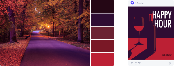
HEX codes: #250715 • #2f0d33 • #6b2232 • #7a1826 • #bc2034
Another trick to developing fall color palettes is pulling colors beside each other on the color wheel. This is called an analogous palette. In this example, we chose red, and beside it is purple and orange. It’s a fool-proof way to match colors and create an elevated monochromatic feel.
A simple palette can create very interesting designs. Leveraging different tones and shades of colors in the same family help bring depth to flat illustrations.
Orange fall color palettes
Another way to use orange is to pull in darker hues closer to the brown family. These toasty colors pair nicely with darker greens. A muted color is one that is less saturated, less bright, and softer. They tend to be easier to work with when designing.
4. Rosemary & cinnamon
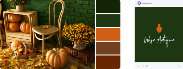
HEX Codes: #132504 • #1f3613 • #ce5f15 • #704020 • #682702
In the above example, there is a strong contrast between white and deep green, making it easy to read and eye-catching. The vase gives a pop of vibrant color while keeping it balanced, with both colors working together because of their warm tones.
5. London Fashion Week Fall 2023/2024 Pantone Colors

Image source: fashionista.com
Pantone color codes: Molten Lava PANTONE 18-1555, Dragon Fire PANTONE 16-1460, Meadow Violet PANTONE 19-3526, Abundant Green PANTONE 18-6026, Spicy Mustard PANTONE 14-0952
Pantone’s 2023/2024 fall colors are bold, brash, and full of expression. Inspired by London Fashion Week street style, these brights can be used to electrify your designs with reds and yellows or add serenity through blue and violet. The classic beige and grey are still trending this season, but with a pop of color that brings sunshine to a cloudy day.
6. Oh my gourd!

HEX codes: #b52604 • #e24a07 • #ff9136 • #0c4052 • #125066
Oranges and blues are made for each other — this is because they sit opposite each other on the color wheel, making them complementary colors. Here, we’ve pulled a vibrant palette with brilliant oranges and blues.
Just because it’s fall doesn’t mean you have to stick to muted palettes — you can use vivid colors too!
Using complementary colors in design
The Instagram post above is a great demonstration of using complementary colors. With blue as the background, the orange really pops, making it very eye-catching! This is a great trick to use when designing social media posts where an emphasis on a stat is needed.
7. Pumpkin spice

HEX codes: #59320a• #994900• #c45400• #d17200• #f2e3d6
Pumpkin spice not only smells good and tastes great, but also brings rich and warm colors. This monochromatic palette is a fall staple and is seen throughout the season in food, fashion, and decorations.
Yellow fall color palettes
Yellow is fall’s eye candy! Here we’ve pulled three shades of vibrant yellow and then balanced them out with an off-white beige and a green accent.
8. Starbucks Fall colors

Image source: Starbucks Hex codes: #C68032, #DBBD9F, #CE807A, #822D5C, #395A42
Whether you like pumpkin spice or not, there’s nothing like grabbing a warm drink and walking among the foliage.
A classic fall palette filled with jewel tones inspired by Starbuck’s new fall lineup. These fall colors are cheerful, and warm, and exude cozy fall vibes.
9. Stayin’ in

HEX codes: #d17d05 • #f9b419 • #ffdb43 • #f4efe9 • #5b6633
Since the yellows are so bold, we suggest using beige as the core color in your designs, and both yellows and green as accents.
10. Pot of gold

HEX codes: #9f630e • #e4ac3b • #f7c946 • #f9e0ca • #ddb79e
Less bold, but still warm and inviting, this fall color palette includes beige with pink undertones to add depth.
Ask yourself if it’s a warm palette or a cool palette. That way, when introducing neutrals (like beige, browns, and greys), you know whether to select warmer or cooler neutrals.
Green fall color palettes
We’ve been looking at a lot of warm palettes but we can’t forget the cool, crisp tones of autumn too! Cool tones give a calming effect, especially when mixing muted colors.
11. Halloween green

HEX codes: #BDEE34, #0D0E15, #EF992B, #931DEF, #22AECC
Halloween is a great excuse to use clashing, gaudy colors to make a bold impression. This slime green and grape clash with the orange to create an eye-catching dynamic. Use dark colors as the background and create visuals with these bold shades to harness the spirit of Halloween.
12. Idle afternoon

HEX codes: #D9dad7 • #979f83 • #374f3f • #192e25 • #553b28
The faded grey and green in this palette are sophisticated, but the nearly black green and brown bring in that cozy fall feeling.
Notice how the colors in the featured logo are used. Using grey as the main font color creates a visual hierarchy, balancing the logo out with the symbol and slogan in a soft green.
13. Fall roadtrip

HEX codes: #474c33 • #938a5d • #e1bf86 • #bf642f • #242c31
Instead of the cooler greens and greys in the previous palette, we’ve chosen greens with warmer undertones to pair with the tan and orange. The tan and slate are neutrals that help to mellow out the palette.
14. Black cat

HEX codes: #010101• #2b2c2e• #778e5c• #d8ed8a• #ededed
When working with dark shades such as grey or black, incorporating green into your color palette can be an excellent harmonizer. Much like the logo in the example above, this bright green can add energy to your design while also appearing professional and approachable.
Purple fall color palettes
Fall is an incredibly colorful season full of royal colors like deep eggplant purples. Let’s explore some purple fall colors.
15. Autumn harvest

HEX codes: #391615 • #5e2d3b • #92425f • #eaddd0 • #d2c1b0
Another way to elevate a fall color palette is to bring in some neutral colors. Here, we used beige with undertones of purple and pink to make sure they blend seamlessly with the purples.
Using neutral tones in fall color palettes
Neutral tones are a nice alternative to having a stark white background in social posts and an easy way to make your primary brand color pop! You’ll see tons of food, travel, and fashion Instagram accounts with this aesthetic, making neutrals a popular strategy for social media branding.
16. Mulled wine

HEX codes: #163763 • #eec73f • #d63e16 • #600248 • #380528
This palette is a little more complex, using four different colors. When introducing colors into a palette, you must understand how colors combine. We’ve talked about monochromatic, complementary, and colors that sit next to each other on the color wheel. But in this example, we’ve taken colors that form a square on the color wheel and developed a palette from there.
Using a range of colors in a palette
Don’t be afraid to mix various colors—with more colors that harmonize well together, illustrations become more realistic. When creating a design, you can draw your attention to different elements if you have a lot of information to include!
Blue fall color palettes
As much as we love to keep toasty in the fall, we can’t forget about the more moody tones too. While blue isn’t common in fall color palettes, it reminds us of the cooler days when winter starts nudging in.
17. Lakehouse

Hex codes: #C0CFDE, #FCF6ED, #F3EBE0, #DCBF95, #F6AA6A
Calm and reflective, this color palette is soothing and tranquil. The cream and linen create the perfect backdrops for the soft tangerine, misty blue, and sand. It’s a great option for home decor, elegant designs, fall wedding invitations, and even nail colors!
18. Dancing in the rain

HEX codes: #04203c • #234d74 • #355e84 • #6c92ab • #c8d7e6
Reminiscent of crisp fall air, this fall palette uses muted blue hues. When creating a monochromatic palette like this one, use a mix of mid-tone blues as well as lighter and darker shades for contrast.
The wordmark logo example above pairs a dark blue background with light blue text, expertly using contrast. The mid-tone blues are perfect for accents and decorators.
19. Sweater weather

HEX codes: #693329 • #985144 • #cfd3d7 • #1c4463 • #182e3d
This fall color palette includes warm red-browns to complement the deep blues and striking cool grey. Like a pumpkin spice latte on a rainy day, the browns add warmth to the fresh blues.
This social post is an invite to a meetup and uses browns to create an inviting feeling. Blues act as a nice decorative color, but the important details are highlighted in white, making them easy to read.
20. Cup of tea

As fall comes to an end, cool blues prepare you for the winter ahead. This calming blue palette is tied together with a light creamy brown that gives this palette a calm and balanced appearance.
Read this blog if you’re looking for winter color palettes!
Choose your own cool fall color palette
While we’ve supplied you with 20 autumn color palettes to choose from, you might just want to make your own. Take this infographic as a choose your own adventure and combine colors as you see fit. Pair lighter shades with darker ones for some contrast. Or, pair similar shades for a more monochromatic feel.

Choose your own warm fall color palette
We’ve pulled together some more traditional fall colors here for you to choose from. Fall supplies a bounty of color choices to use as brand colors. Make your own color palette by selecting a few of your favorites.

Remember, there are so many ways to create a beautiful color palette! Here are a few we’ve covered:
- Monochromatic: picking different shades from one color
- Complementary: picking opposing colors on the color wheel
- Selecting colors that sit next to each other on the color wheel
- Selecting colors that form a square on the color wheel
Need more inspiration? Check out our post on logo color combinations to see what colors pair well together.