22 Brand Guidelines Examples to Inspire Your Brand Guide
By Enina Bicaku Sep 27, 2023

Brand guidelines, also known as brand style guides, are the rules that help you express your brand consistently. But, knowing what to include in brand guidelines can be tricky. To help you form yours, we’ve highlighted top brand guideline examples from famous brands around the world.
We’ll also dive into what makes these brand guideline examples unique and tips and tricks on designing your own.
What to Include in Your Brand Guidelines
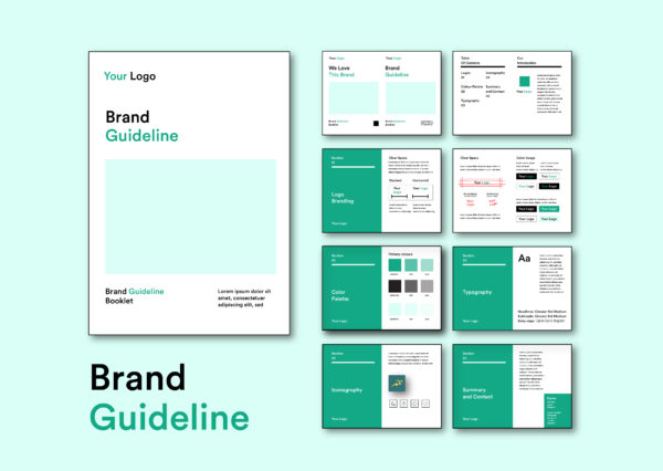
Brand guidelines keep your brand consistent and help build trust and authority for your business. From visual aspects like photography styles and logos to the brand voice and tone used when speaking on the company’s behalf.
Here’s what to include when creating your brand style guide:
- Logo: Acceptable logo usage, including colors, sizes, and variations
- Colors: The brand colors that represent your brand, both the primary and accent colors.
- Typography: The brand fonts, along with size guides and how to use them
- Design elements: Shapes, illustrations, and other visual elements that represent your brand.
- Photography: The style of photos in marketing materials and where to source them.
- Mission statement and values: What your brand is about and why your company exists.
- Voice and tone: Words and phrases that should/shouldn’t be used when speaking on behalf of the brand, and the brand voice and tone (ie. compassionate, professional, fun).
22 Inspiring brand guidelines examples

We’ve highlighted 15 incredible brand guidelines examples that creatively use their visual identity to express their product, personality, and purpose.
1. Moleskine

Moleskine’s brand guidelines echo the simplicity and elegance inherent to the brand.
The Moleskine logo, a classic monogram, embodies the essence of minimalist design. With its unadorned and clean lines, it perfectly reflects the simplicity and functionality of Moleskine notebooks.

The brand’s color palette is a monochromatic scheme, mainly black, white, and various shades of grey. It’s a strategic choice that aligns with the brand’s minimalist aesthetic and its values of sophistication and elegance.
It also ensures a high level of contrast, enhancing the readability and visibility of the brand’s content across various platforms. It’s one of the most timeless brand guidelines examples!
2. Duolingo

Duolingo’s brand guidelines signify the essence of its brand – fun, educational, and approachable.
Duolingo’s owl mascot, Duo, adds a human touch to the brand identity, making it more relatable and fun. The sans serif font choice aligns with the brand’s ethos of simplicity and accessibility. It emphasizes making language learning easy!
3. Allbirds

The Allbirds logo, is a minimalist cursive font with an “s” that represents a bird. This minimalist design strategy is extended to their product range as well, encapsulating the brand’s ethos of simplicity and sustainability.
The color palette of Allbirds is grounded and natural, mirroring their eco-friendly business practices and bolstering their brand consistency. The brand colors are shades of green, blue, and brown, representing earth, water, and trees.

Allbirds chose a simplistic, sans-serif font that complements their minimalist branding. This typeface ensures readability across various platforms, aligning with the brand’s spirit of simplicity and functionality.
4. Frank body

The brand’s quirky and bold text-based logo, captures attention and mirrors the brand’s commitment to straightforward, no-nonsense skincare.
The coffee scrubs, one of their iconic products, are frequently featured in their visuals, signaling their unique approach to skincare.

The brand uses light jewel tones of pink, peach, blue, green, and purple in various combinations to create a unique look for each product or need. It uses little else except their typewriter-like logo font, with an empowering, laidback, and friendly brand voice.
5. Pineapple Collective

Inspired by the colors of the arid climate that olive trees grow in – Pineapple Collective’s brand guidelines create a muted desert-like feel with clay browns, cactus greens, and warm mustard yellows. Their olive oil product packaging and web design are a perfect example of well-aligned, seamless brand guidelines.

The brand also uses a quirky sans serif font across their website and product packaging, with only the “V” having a unique cursive flair.
6. Amika
![]()
Amika, a renowned haircare brand, has established a strong and vibrant brand identity through its bold use of colors, typography, and geometric shapes.
Amika’s neon color palette is characterized by hot pink and electric orange, alongside a range of other vivid hues. This bold use of color not only sets Amika apart from other haircare brands, but also embodies its energetic, unconventional, and playful personality.
-

- source:https://www.ethicalbunny.com/product/amika/

Amika opts for an eye-catching and bold lowercase font. The typeface ensures readability while creating contrast in a sea of geometric neon shapes. The logo symbol, a unique and instantly recognizable

Amika leverages striking imagery in its branding, using vibrant photographs of diverse individuals with different hair types. This effectively communicates the brand’s commitment to inclusivity and its belief in the beauty of diversity. Its visuals empower a great brand story!
7. Later Media
![]()
Later, a social media scheduler, uses secondary colors to create a colorfully rich user experience. Using a grainy gray as a standard background, its bright and varying accent colors distinguish it from other platforms. Its a unique approach to tech brand guidelines examples!

These colors, lend the brand a vibrant and lively aesthetic. It creates a sense of energy and creativity! Each accent color offers a different emotional correlation and category.
The brand also uses whimsical geometric symbols and shapes to fill in the negative space, still guiding the viewer’s eye.
8. Sonos

The Sonos brand guidelines embrace simplicity, quality, and the modern beauty of their products and brand. The guidelines outline their modern font in both header and body text, in one of their signature colors. The brand colors are inspired by their southern California office, with the sand, sky, and pine balanced by sunset-themed rust and rose.
The illustrations have crisp lines and a soothing geometry to them – further enhancing their brand and making their guidelines easy to follow.
9. Glossier
The Glossier brand guide is concise and simple to follow. As the “cool-girl” beauty brand, their brand guidelines highlight the importance of negative space (white space) and minimalistic use of their minimalist color palette.
The guide itself follows Glossier’s brand guidelines, providing employees and other company representatives with a clear example of how advertising and marketing materials should appear.
10. Oatly

Oatly provides a clear, one-page guideline that includes acceptable fonts, phrases, illustrations, and color combinations. It also includes real examples of brand packaging and t-shirt design uses for their brand.
Oatly highlights its bubbly illustration typography, which is a critical part of its visual brand identity. As an animated brand, it emphasizes display fonts and a pastel color palette to maintain uniform packaging and digital branding.
11. Airbnb

Source: design.studio/work/air-bnb
Airbnb is another company that offers very clear brand guidelines. Its single-page UI Toolkit has examples of the colors and color combinations that brand representatives are permitted to use.

Source: maxrosero.com/airbnb
As an app logo, the instantly recognizable “Bélo” logo symbol, is one of its defining features. There are strict mentions of displaying their icons, buttons, and clickable features in the right colors and shapes.
12. Uber
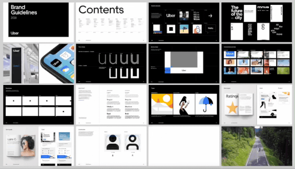
Uber’s brand guidelines dive deep into how to use spacing in its logo and fonts. Having ample space is key to maintaining its modern and minimalistic look. The guide covers app guidelines as well as the animations and imagery acceptable for their brand. Uber keeps things simple with a black-and-white color palette and crisp imagery.
13. Casper

Source:https://behance.net/gallery/61593209/Casper
Casper’s brand guidelines go into great detail about visual design restrictions while providing great visual examples of approved advertising campaigns throughout.
The brand is disruptive in nature, so its brand guidelines are strict with its use of colors, fonts, and original illustrations to maintain its unique vibe. Even the brand voice is bespoke to their personality!
14. Headspace

Source: https://useallfive.com/work/headspace
Headspace’s guidelines are calming to look at, and highlight imagery and animation as their main form of communication. Their wording is simple and direct, with tons of negative space to create an airy and approachable look. It’s exactly what you’d expect from a brand trying to make meditation easy and accessible to everyone!
15. Instagram

Source:https://about.instagram.com/brand/
Instagram uses its brand guidelines to address logo placement in ways that other companies don’t. It includes examples of how placement should and shouldn’t look, as well as how to group its logo alongside others.
It started the gradient graphic design trend, making it incredibly irresistible as an app, and impactful as a brand.
16. Mailchimp
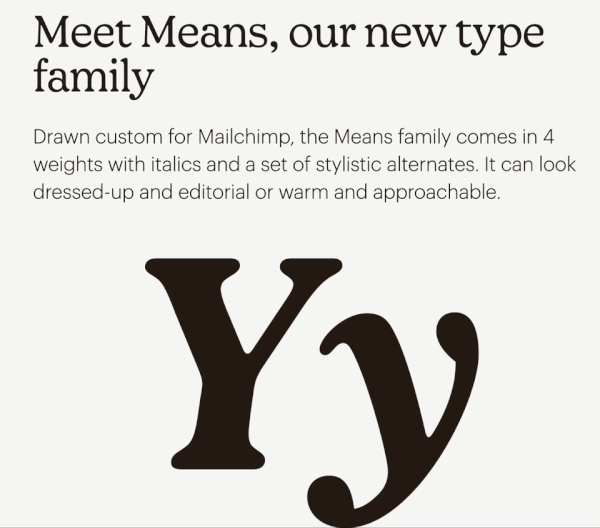
Mailchimp’s brand style guide goes into design elements in a comprehensive way. It explains why the company should be represented in a particular way, as well as how the viewer should feel when encountering Mailchimp marketing.
Mailchimp’s brand guidelines are cohesive and focus on expressing their friendly and human brand personality through their brand elements.
17. Chobani

When it comes to typography, colors, and graphics, Chobani is among the best brand guidelines examples. It provides samples and color codes for all brand colors and specific illustrations to be used. The brand displays their multitude of brand colors effectively by enlarging the main colors and minimizing the accents.
As a disruptive brand, it differentiates itself through its visual identity (and products). Their distinct serif font and colorful brand photography are all aligned with its aesthetic and maintained through their unshakable brand guidelines.
18. YouTube

When you visualize YouTube, chances are you picture a lot of negative space around the brand’s logo. It’s not by accident, the brand uses space deliberately to create more impact!
The company puts a lot of care into ensuring its logo is represented clearly and without clutter surrounding it. It also offers concise guidelines on what not to do with its logo.
19. Snapchat


Snapchat’s brand guidelines offer the dos and don’ts of using its branding. As a predominantly mobile company, it focuses on logo usage, main colors, and font use. It’s straightforward but clear, with detailed use cases.
20. Salesforce
Salesforce’s brand guidelines are displayed in a way that’s incredibly user-friendly. The online guide is easy to sift through, with voice, colors, typography, and logo guide split into sections and explained in intense detail.
The brand uses animation and imagery to illustrate their brand guidelines and offer downloadable guides for each section.
21. Dropbox
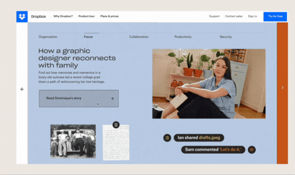
Dropbox brand guidelines go beyond providing the standard logo, color, and typography guide. The brand includes information about acceptable shapes, and how an on-brand customer journey should look for dropbox.
What’s unique about dropbox is its intense detail in how to use its brand in various layouts and compositions. It also divides product and marketing visuals by using illustrations within the product interface, and photography for marketing materials.
22. Spotify

Spotify’s brand guidelines make it easy for designers to access the information needed to create marketing materials for the brand. It covers how branding can be used within external platforms and apps, and when its content is shared.
It includes RGB color codes, acceptable font uses, and examples of how to use their branding in partnerships.
Brand guidelines keep your brand together
Your brand guidelines ensure brand consistency. If you don’t use guidelines, your brand will look inconsistent in the eyes of your viewers.
Use these brand guidelines examples as the scaffolding when you create a brand style, and make it easy to express your beautiful brand everywhere.