Report: These Are the Top Logo Trends for 2021

2021 marks a generational shift for all of us.
Worldwide, we’ve shifted from in-person gatherings to virtual ones. From in-office working to working at home, from restaurant dining to parkside picnics; from a sense of spontaneity to a newfound need for caution.
This shift, while ongoing, has had notable impacts on the world of branding and design.
With global internet use skyrocketing, and lockdowns affecting how businesses connect with their consumers, the need for ecommerce rocked traditional retail businesses. But if we’ve learned anything from last year, it’s that humans are adaptable as hell. And this year’s logos will indeed reflect that.
According to Shopify’s 2020 ecommerce report, 10 years of ecommerce growth happened in just 90 days at the height of the pandemic. The need for fast, smart, and effective design was stronger than ever last year. We felt this at Looka, with an over 48% rise in online search for “logo makers” during the first wave of lockdowns in 2020. People needed logos—and they needed them fast.

Not only was there a rise in new online businesses, but we saw an entirely new set of niche businesses arise over the course of 2020, notably in the cleaning/sanitization field, facemasks, and food delivery, creating a demand for new symbol choices and squeaky clean color palettes.
In this 2021 logo trends report, we’ve based our predictions on the trends we’re seeing from Looka customers designing their own logos, parallel with some of the biggest rebrands and recent logo updates. In this report you’ll find:
- An analysis of the budding logo trends for 2021
- Forecast for top logo colors and color combinations for 2021
Upcoming logo trends of 2021
Trends don’t happen in isolation. They are the effect of a broader context. This year’s top logo styles show how a global phenomenon, like a pandemic, made waves in the world of branding and logo design.
1. An urgent need for versatility
With millions of consumers migrating to online shopping for things they’d traditionally purchase in-store, 2021 will see the need for highly versatile logos.
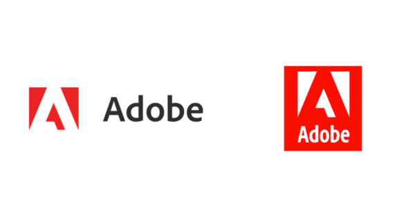
In some cases, we see monograms replace wordmark logos, see Adobe and Rudsak as examples.
In other cases, we see logo symbol choices made to double as patterns for branded packaging to increase delight and win customer loyalty from folks who’ve never interacted with the brand in person. See the Looka customer example below.
Logos that double as easy graphics on social media or website symbols, aid in easier visual recall of new online brands. The below are great examples from Looka customers.
As more and more businesses move online, the burden a logo carries has increased. Logos need to be sharp, easily read, well-defined. They must function across platforms, from social media to websites. And across realities, from online to in-hand. As this logo trend continues in 2021, we’re likely to see an increase in monograms and brandmark logos that can meet the fluid demands of both brand and consumer respectively.
2. Stripped down and back to basics
Similar to a need for versatility, but deserving of its own category, drastically minimal logos with non-nonsense design are set to become a huge trend in 2020 logo design.
Take Mr.Pringle as an example. One of the most beloved logo mascots received a major facelift last year, and the internet had a lot to say about it. Hair replaced two indicative arches for eyebrows, and a mustache was stripped down to two brown organic shapes.

Source: Under Consideration
We’re seeing logos transition away from being highly-decorated to the rawest elements they contain. Maybe, designers believe the consumer’s eye has evolved enough to fill in the details. We don’t need any more fluff. BMW and Nissan followed suit, with two logo redesigns that move right back to basics.
Looka customers are feeling the move towards raw design with an increase in hyper-minimal logos showing up.
- Logo made in Looka
- Logo made in Looka
- Logo made in Looka
The success of these minimalist logos is that they’re eye-catching without being distracting. They are engaging but also highly communicative of the most important details. When we drop the fluff, we end up with focused logos that withstand the test of time. An important outcome for brands both old and established, as well as new and growing.
3. Back to the future
Too much time cooped up indoors lead to a wave of nostalgia reflected in design last year. Retro and vintage-style logos were seen across the board from Looka customers to bigger logo redesigns like Popeyes and Watties.
These logos serve as an ode to a different time but have the precision of design that’s driven by an urgency only a pandemic can create. We miss what once was, but know there’s no going back. How can we honor the past whilst solidifying our place in the future?
- Logo made in Looka
The answer lies in doing away with distracting elements and focusing on the essentials— something we are all-to-familiar with in 2021. Clean lines, intentional color choices, and font styles that speak for themselves are all characteristics of these new-and-improved retro logos. Keep an eye out for this trend this year.
4. Negative space and optical illusions
- New Dictionary.com 2021 logo
- New Thesaurus.com 2021 logo
Logos can be an excellent opportunity to communicate multiple meanings with the use of negative space and optical illusions. There’s no better example of this than the recent Dictionary.com and Thesaurus.com logo updates.
Upon first glance, what do you see? An open book? Or an open door? Either way, the multiple meanings is a brilliant use of negative space to convey what these businesses do– open new worlds of understanding through knowledge.
- Logo made in Looka
- Logo made in Looka
As opportunities to engage with design expand with more diverse platforms, we see the use of negative space and playful illusions becoming increasingly popular in logos.
5. Even bolder colors
Design trends are usually felt across mediums as interest sways towards a certain look. Trends in logo design are backed by insights found across other marketing and small business platforms like Pinterest, which predicts an increase in search for “neon aesthetics” in 2021.
- Old Baskin Robbins logo
- Updated Baskin Robbins logo
We’re seeing the trend toward bolder, neon colors in logos. Most recently, the 2021 update of the Baskin Robbins logo which injected some much-needed life into it’s rather bland and lifeless blue-pink color combination.
Small brands are also opting for bigger colors as the online marketplace becomes increasingly saturated with competition (thanks COVID-19). Colors do the job of catching a person’s eye and calling attention to particular details, an important role in the big job a logo does for an online brand.
Top logo color trends of 2021
We know color has a deep connection to human psychology. Every color on the spectrum evokes a unique emotional response. Color is an important thing for all brands to consider. To make our predictions for logo color trends in 2021, we’re looking back on some customer data from 2020. Let’s take a closer look at the upcoming logo color trends.
1. Neon green, slate gray, and white
A combination of slate grey, white, and neon green was the top color combination for Looka customers in 2020, with over 6% “favoriting” logos with this color scheme.

Green stimulates a sense of harmony in the brain. It evokes feelings of calm, nature, and stability. Dark gray (almost black!) creates a sense of power, strength, and force. In some ways, these two colors are opposing in the responses they provoke, but when paired together we see a careful balance of strength and structure, power, and rootedness.
Our 2021 prediction: prepare to see a lot of greens, and greys in 2021. We’ve spent more time in nature than ever before, and we’re seeing more nature-based colors reflected in our logos!
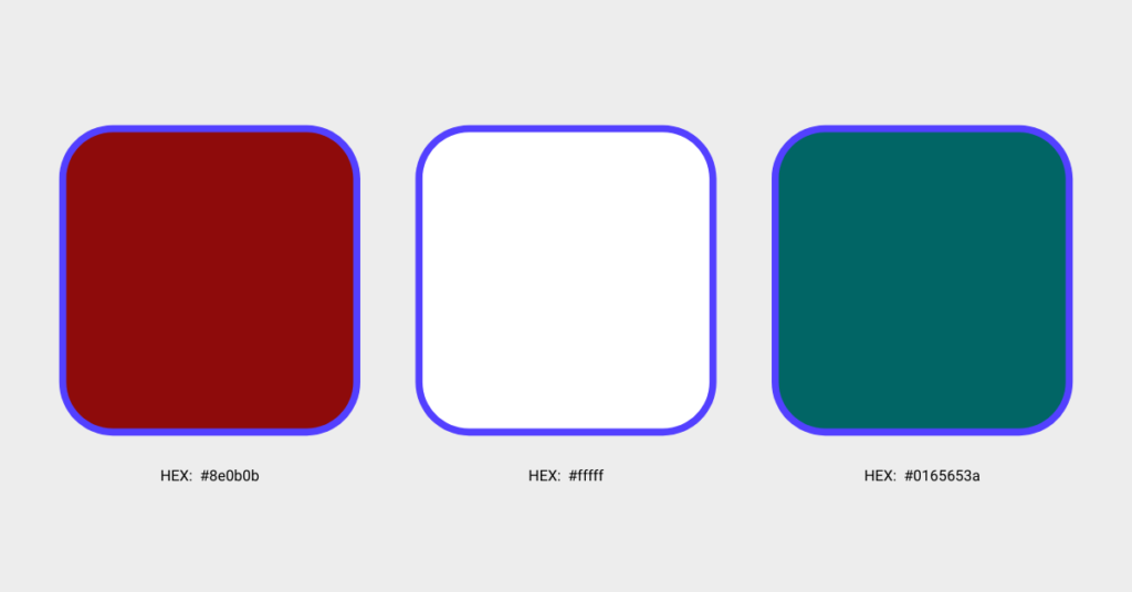
2. Deep red & dark teal
Coming in at a close second, Looka customers favorited 5.8% of logos with iterations of a deep red, as well as a dark teal. In many cases, we see them paired together.

- Logo made in Looka
- Logo made in Looka
- Logo made in Looka
As consumers, we’re used to seeing red and white used in logos. Brands like Coca-Cola, Pinterest, Target, and Netflix have secured this color combination as a timeless classic. However, by throwing a third hue into the mix, an opposing color on the color wheel, the logo’s story changes.
Red is a color known to incite passion, it’s a color that humans associate with danger, excitement, and aggression. We’re feeling a lot this year, it makes sense this color is trending. But, when paired with a muted dark teal, the mood is softened.
Teal is a more analytical color, associated with logic and objectivity. By pairing a warm red, with a cooler teal, the logo is perhaps balanced out and made more dimensional. Reminding us the goal is to find balance in times of high-emotion.
Our 2021 prediction: the use of complementary colors is one of the basic graphic design rules a person has in their tool-kit. As logos become more and more simple, the use of contrasting complementary colors will return to the forefront of logo design.
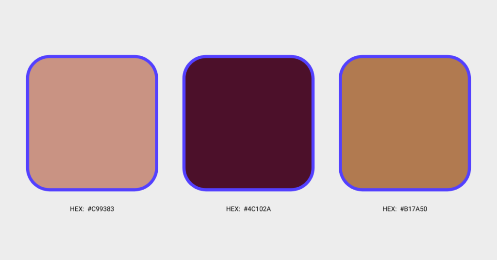
3. Earthy shades of brown and taupe
These down to earth shades appeared in over 4% of Looka customer logos last year, signaling a transition to softer, more analogous tones in logos in branding.

Warm tones like these are considered soft, relaxing, and grounding. They evoke a sense of strength and resilience. We see these tones frequently used in aesthetic logos, a recent trend in social media oriented logo and brand design.
- Logo made in Looka
- Logo made in Looka
Our 2021 prediction: We’ll see more analogous warm-toned logos as the trend continues sweeping social media in 2021.
Design your new logo now!
We’re excited about the logo trends of 2021!
- The urgent need for highly versatile logos became prominent as most businesses moved online in 2020
- A move toward straight-to-the-point minimalist logos is reflective of how little time we have for “fluff” these days
- We’re sensing a wave of nostalgia as more and more logos turned to a retro-style this year
- Surprising color combinations like neon green and slate grey entertain while creating a sense of harmony


