Peace, Love and 17 Examples of ’70s Logos
By Nisha Mar 19, 2021

If you close your eyes and think of the ’70s, a lot of images swoop in at once. Bell-bottoms, protests, roller discos, and all things psychedelic. Without thinking too hard, we bet you’re able to conjure images of ’70s style branding and design. Mustard yellow, bold, chubby fonts, and drop shadows were all signature elements of ’70s logos. It was an era of over-the-top fashion, and over-the-top branding and we’re here for it!
Below, we’ll review some of the most iconic logos from the 1970s and walk you through their key characteristics so you can easily make your own funky, ’70s-inspired logo.
1. HBO
HBO became the first satellite TV channel in 1975. Around the same time, Art Director of Life-Time, Betty Brugger, redesigned the HBO logo to reveal its, now iconic,three-letter wordmark. There’s something going on with that “O”, can you take a guess? Betty layered added an additional circle inside the letter “O” to mirror the power button on a TV or remote control. Brilliant!
![]()
2. Polaroid
Colored Polaroids were released in 1972 but reached their peak popularity mid-70s. By 1977, Polaroid held two-thirds of the instant camera market worldwide. The font is crisp and rounded, with tight letter spacing. The rainbow emblem meant to display the range of colors the brand’s product is able to achieve, an impressive feat for the time.
![]()
3. Atari
We can’t talk about the ’70s without talking about Atari! A third-party company for Nintendo, Atari was the leader of the video game market from 1975 to the early 1980s. Atari’s playful serif font with rounded edges signal a retro vibe.
![]()
4. Kodak
It’s the mustard-yellow and muted red color combination that puts this logo at the forefront of ’70s design. Bright colors in muted tones are a key element of old-school, retro logos.
![]()
5. Nintendo
If you haven’t guessed by now, red was an obvious color choice for logos from the ’70s! Nintendo has switched their logo more times than any brand ever should—that’s 17 times to be exact. This particular version was unveiled in 1970 and the gaming tycoon has stayed closest to this design ever since.
![]()
This ’70s design put a funky font in a pill-shaped container, with a clean red and white color combination. The design choice meant to modernize the brand while appealing to both American and Japanese markets at the time.
6. Woodstock
Can we talk about the ’70s without talking about Woodstock? I don’t think so. Woodstock logo designer, Arnold Skolnick was asked to design a new logo and poster for the festival in a mere 4 days. Skolnick focused on a simple and balanced logo, in opposition to the busy, psychedelic designs of the era.
7. Chupa Chups
A legendary logo design created by the master himself, Salvador Dali. Chupa Chups approached Dali to redesign their logo in 1969 (OK so not technically the ’70s, but we’ll let it slide). The artist developed the still-used bright yellow daisy and requested the logo be placed directly atop the lollipop so that the logo always remained intact.
![]()
8. Biba
Biba was a UK-based department store that was wildly popular in the 60s and ’70s. This is an elaborate logo with a highly characterized font and ornate emblem. Remember that the best way for brands to reach customers in the ’70s was through print ads, so having a maximalist logo was a safe bet for brands trying to catch people’s eyes.
![]()
9. Space Invaders
Space Invaders hit arcades in 1978 and gained an almost-instant cult following. This logo has character. It uses a bold serif font and hovers on a vertical tilt to create a sense of movement and dominance. The drop-shadow and red/yellow color combination are signature elements of a ’70s logo design.
![]()
10. Joseph Enterprises
We can thank Joseph Enterprises for the sensation that was the Chia Guy aka Chia Pet in the ’70s, 80s, 90s, and well…even now! The gadget company uses a chunky monogram logo with rounded negative space to define the lettering. The use of soft rounded shapes within the letters and sharp angular lines without creates an excellent contrast that really captures the eye.
11. The Love Boat
Futura Black in all caps is the ’70s font choice for this funky logo. It’s a lot. But listen, so were the ’70s. It was an era defined by bold, whacky, and highly characterized font choices just like this one.
12. Tang
If you show anyone who lived through the ’70s the Tang logo, they will instantly recall the sweet and chalky flavor of this unnecessary orange juice substitute. The Tang logo contains many elements of a traditional ’70s logo; drop shadows, chubby loops, and long, exaggerated stems and descenders in its lettering.

13. Apple
Apple unveiled this psychedelic logo with its first consumer product, the Apple II, in 1977. Doing away with the rule of thumb to stick to less than three colors in a logo, this emblem represents the colorful era from which it originated.
![]()
14. Star Wars
The first logo design for Star Wars was designed in the ’70s and evokes the rolling of text in the film’s opening. Bold, angular, and…ahem…yellow…this clearly a ’70s design.
![]()
15. Rolling Stones
Debatably the most iconic logo of the ’70s is the Rolling Stones “tongue and lips” logo. The emblem was designed by the English art designer John Pasche for the rock band The Rolling Stones in 1970 after the band commissioned him through the Royal College of Art.
![]()
16. Logan’s Run
When we think of ’70s fonts, there’s no better representation than the Logan’s Run logo. This film gathered a huge following when it premiered in 1976 and we love the drama of its logo. Mirroring a neon sign with a massive drop shadow, this logo somehow captures the psychedelic vibe of its time while still looking modern.

17. Good Year
Good Year’s 1970’s logo redesign was the first time the company incorporated its brand colors into the logo. We love the symbol between text and the thick, weighted font. Notice the font combines hard lines and angles, with soft rounded edges to create balance and intrigue.
![]()
Key elements of ’70s style logos
- Retro color palette: If you hadn’t noticed by now, red and yellow were the obvious choice of the era. Opt for bold colors in muted tones to add that retro ’70s feel
- Chunky font choices: heavyset, chunky fonts were a popular choice in the ’70s
- Drop shadow: adding a drop shadow makes a logo pop, a great choice in an era of print advertising
- Angles: setting wordmarks on an angle, or playing with the vertical alignment of a logo was a part of ’70s design style
- Characterized typeface: unlike the minimalist logos of today, logos from the 1970s were characterized by fonts with a lot of personality
Designing a ’70s style logo in Looka
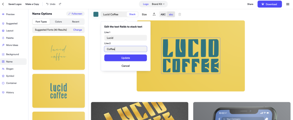
Behold a ’70s style logo for a made-up coffee brand, designed in Looka. We’ll walk you through how we achieved this look— it only took about 1 minute!
![]()
First, we found a retro ’70s color combination. Here, we’ve selected the Quirky Color Scheme under Palette Options, which offers a range of funky and off-beat color combinations. Perfect for designing a groovy logo like this one.

A key component of any ’70s logo is the font choice. We found our font under the Block Font Type. Perfect! But we want to logo to look a little more dynamic.

We’ve chosen to stack the two words in the logo so you can see more of the texture in the font. Notice how much the words pop now?
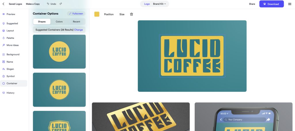
It’s looking great! But there’s even more we can do. Adding a Container around the logo articulates the font and brand name even more. We think this looks like a well-established 70s coffee brand now.
Making a logo in Looka is so fun, you’ll probably just end up designing logos for the heck of it! Here are a few more 70s style logos designed in Looka.
