Core Appeal: The Apple Logo’s Story and Symbolism

Since 1976, the Apple logo has grown from a humble seed into one of the most recognizable symbols ever. But how did this fruity little icon become the most famous apple since Adam and Eve?
In this blog, we follow the history of Apple’s famous logo, from its Isaac Newton-inspired beginnings to its current place as an emblem of modern technology and all the iterations in between.
We’ll also give you tips along the way on how to create your own iconic logo design. So, keep your eyes peeled!
The creation of the Apple
Apple has one of those rare logos that, like the Nike logo, was perfect the first time around.
Well, almost.
The first logo, designed by co-founder Ronald Wayne, showed the famous Isaac Newton apple story, plus a quote from William Wordsworth about being edgy. It was bad.

While unique, the first Apple logo was convoluted and lacked immediacy. Luckily, in 1977 graphic designer Rob Janoff was tasked by Steve Jobs to design a new logo for the growing tech company, Apple Inc. And thus, the famous Apple logo was born.

The design took Janoff about two weeks, costing Steve Jobs around $100,000. While expensive, even by today’s average cost of a logo, this was a figure Jobs would pay once more to legendary designer Paul Rand for his work on the NeXT logo.
Janoff’s 1977 logo is still in use today, albeit with some minor changes. It’s become one of the most recognized logo emblems in the world. The Apple logo is now a symbol of Steve Jobs’ philosophy that ‘Simplicity is the ultimate sophistication.’
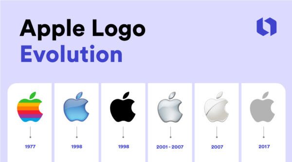
The evolution of the Apple logo

The logo has undergone several changes since Apple started in 1976.
The 1977 logo featured today’s bitten apple shape, plus an iconic rainbow stripe pattern. Some have speculated that the rainbow logo was created as an homage to Alan Turing, or was more broadly inspired by the colors associated with the LGBTQ+ movement. However, Janoff has denied these as his initial inspiration.

Instead, Janoff states that the colors in the 1977 logo refer to the Apple II’s screen color capabilities. The bite mark was not a reference to the half-eaten apple found near Turing after his death but was instead a way to show that the Apple symbol was, in fact, an apple (and not a cherry) when viewed at a distance.
- The 1977 logo was used until 1998 when Apple briefly tried a translucent blue logo.
- In 1998 Apple introduced a plain black version known as the monochromatic logo, which was used briefly until 2001.
- From 2001 until 2007, Apple used the famous chrome logo, which featured some of the highlights and contouring as the short-lived 1998 glass-themed logo.
- In 2007, with the launch of the iPhone, Apple introduced a logo known as the ‘Sliced Apple’ logo. This logo featured a more streamlined, minimalist design, with the apple shape sliced in half.
- In 2017, Apple returned to a monochromatic logo, this time opting for a dark gray color. The current Apple logo is known for its reflective quality and placement on Macbooks, iPhones, and other Apple products.
Key elements of the Apple logo design
The Apple logo is one of the most iconic logos in the world, thanks to its clean, economical design.
Heavily influenced by Steve Jobs’ love of ‘stark, minimalist aesthetics’ (due, in part, to his interest in Zen Buddhism), the Apple logo is a masterclass in simplicity, from its shape, color, and Apple’s wider use of font throughout its brand identity.

Source: apple.fandom.com/wiki/Apple_logo
Check out the above image of Janoff’s carefully laid-down geometric measurements for the original 1977 Apple logo, refined by Landor Associates in 1990.
Apple logo font
The font used in Apple’s branding is Myriad Pro, a sans-serif font designed by Robert Slimbach and Carol Twombly for Adobe. This modern font’s clean lines and simple design complement the logo’s minimalist aesthetic, helping to create a cohesive and clean identity for the brand.

Source: commons.wikimedia.org/wiki/File:Apple_II_Plus,_Museum_of_the_Moving_Image.jpg
Apple logo colors
The colors of the Apple logo have changed over the years, but the original rainbow-colored logo designed by Rob Janoff in 1977 remains perhaps the most iconic. As times changed, Apple opted for a more minimalist palette.
Apple logo controversy
Apple and its iconic logo are no strangers to controversy, both in and out of the company.
Steve Jobs returned to Apple in 1997, sparking a major redesign of the company’s branding, including a new version of the Apple logo that removed the rainbow colors. While some praised the new style, fans of the original logo felt that the change was unnecessary, stripping the brand of its character.
The apple symbol and name were also the subjects of a major lawsuit when Apple was sued by the Beatles’ label, Apple Records. The case was settled out of court, but the legal battle continued for years, with several subsequent lawsuits filed by both parties.
The impact of the Apple logo
Along the way, the Apple logo has become synonymous with some of the most famous marketing campaigns ever made. In the late 1990s, for example, Apple unveiled its famous “Think Different” tagline in an effort to further carve out its legacy as a creative, standalone brand.
The campaign was designed to tie Apple to important cultural figures like Albert Einstein, Martin Luther King Jr., and Mahatma Gandhi, thereby aligning the Apple brand with their visionary ideas.
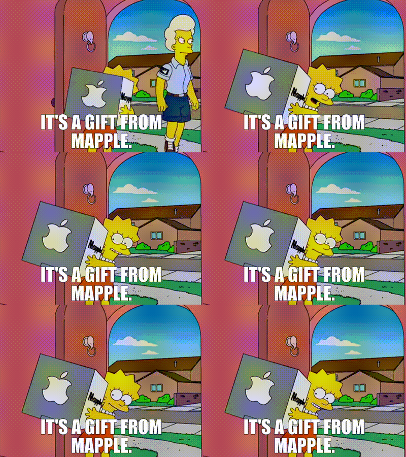
The Apple logo has also had a lasting impact on popular culture and art, from Banksy’s Steve Jobs piece to everyday parodies of the Apple logo and even Simpsons episodes!

From a design perspective, the Apple logo has had a major impact on logo design, which can be seen in the widespread minimalist visual approach so often used by tech brands in recent years.
The future of the Apple logo

It’s difficult to predict where the Apple logo is headed, but it’ll likely continue to grow to reflect changes in the brand and the tech industry as a whole. We’re unlikely to see the logo change in its core details (lol), but we will see minor variations as the company evolves.
For example, Apple often redesigns its logo for marketing materials, and we’ll likely continue to see this as the company launches more products.
Similarly, as consumers become aware of the impact of tech products on the environment, brands like Apple can be expected to find new ways to communicate their commitment to sustainability through visual identity, including their logo.
Finally, Apple’s continued research and development into immersive technologies could also be a factor in future logo designs.
As the extended reality sector expands, it’s plausible that Apple’s logo will evolve to include elements related to virtual, augmented, and mixed reality technologies.
Frequently Asked Questions
Why is Apple’s symbol a bitten apple?
The bitten apple logo was designed to make the apple distinctive from other fruit. The logo was also intended to differentiate Apple from other hard-edged tech companies and signifies ‘biting into all the knowledge users would get out of this computer’ (according to a 2018 interview Rob Janoff gave with Forbes).
What is the meaning behind the Apple logo?
The apple signifies knowledge and the company’s unique approach to design and technology. It’s associated with Apple’s high-quality products and is a marker of the brand’s ethos of simple sophistication.
When was the Apple logo created?
The first Apple logo was created in 1976. Co-founder Ronald Wayne designed an illustration of Isaac Newton sitting under an apple tree. Rob Janoff introduced the now-iconic Apple icon in 1977. It was based on Steve Jobs’s desire for a simpler, more approachable logo.
Who designed the Apple logo?
Rob Janoff, a graphic designer hired by Steve Jobs in 1977, designed the Apple logo. It cost $100,000 and took roughly two weeks to complete.
How to design your own iconic logo: take a bite out of Apple’s playbook!
Overall, the Apple logo is a great example of effective design using minimal information. It relies on sound geometry, simple storytelling, and beautiful execution.
If you’re planning on designing your own iconic logo, consider the following points:
- Make your design simple. Can you remove any features of the logo without taking away from the core concept?
- Execute your design cleanly. Great logos are well-crafted, with minimal clutter and unnecessary information in the end product.
- Tell a story with your logo. This could be relevant to the kind of work you do or a more general story that sets the tone for your brand’s character.
- Design a logo suited to your brand. Explore different logo trends for inspiration, and tie your aesthetic to your brand character.
- Make your logo design unique and easily recognizable. But beware: even bad logos can be memorable! Your logo should stand out without trying too hard.
If you’re looking to design your own juicy logo to represent your brand, get started now and check out Looka’s logo maker!
Design an iconic logo now!
Good luck!
