The Best and Worst Logo Evolutions of All Time
By Oliver • 4 min read, Nov 15, 2019
Logos are a bit like teenagers. Sometimes they go through phases. And sometimes, a whole bunch of them give in to peer pressure and all start to look the same (looking at you, high-end fashion).
Thanks to the internet, every logo blunder is out there somewhere, just like your scene haircut, Myspace selfies, and My Chemical Romance quotes.
So get ready to snap your fingers at the best, and scream internally at the worst logo evolutions of all time.
The Best Logo Evolutions
We’ll start with the sweet, and end with the bitter. Below are some of the best logo evolutions we’ve seen in history
Pepsi
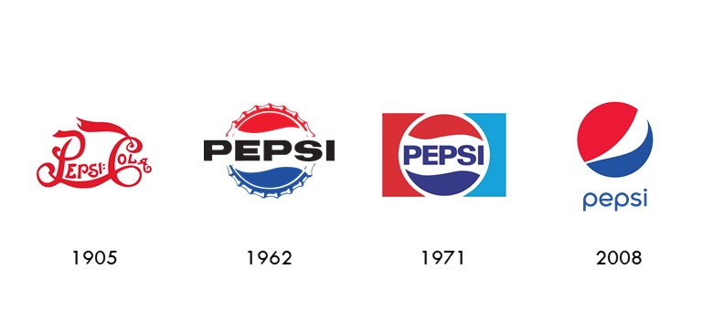
Watching the Pepsi logo change over time is a bit like watching a really, really old car get refurbished. From ‘awful Willy Wonka parody logo that I sketched while drunk’, to Pepsi’s classic flare logo, it’s safe to say that sometimes, time really does heals all wounds.
Ikea

Before they found their iconic, structured, yellow and blue logo in the 1980s, Swedish homeware giant Ikea started out with what looked like the Chupa Chups logo (only it wasn’t designed by Dali). After whatever happened in 1954, they eventually settled on a monochrome version of their current logo, adding color in the 80s. A great example of how logo color combinations can turn a good logo into a great one.
Uber

Uber has a pretty unique origin story that’s reflected in the evolution of their logos. After changing their name from Ubercab, Uber’s logo also evolved to look less like a European supermarket chain. Now, they have one of the most beautiful brand identities out there.
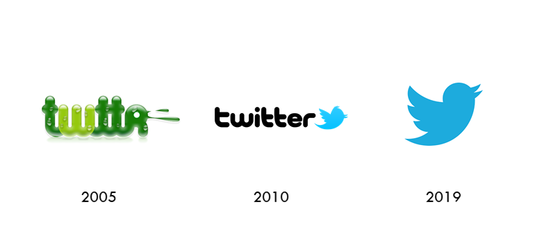
Watching ‘Larry’ the bird’s evolution as a logo is like watching a Pokemon evolve. As one of the most recognizable logos ever, Twitter’s logo has gone through a number of subtle refinements over time that give it its immediacy and dynamism.
Apple

Although it’s pretty cool, Apple’s original Isaac Newton-inspired logo looks like something you’d find on a treasure map. The company since struck gold with its famous apple logo in 1976, with a bite mark added to make it look less like a cherry.
Nike

Carolyn Davidson’s ‘Swoosh’ is one of the most iconic logo designs ever. Despite this, Nike’s owner Phil Knight originally vetoed the design. Luckily, however, the logo grew on Knight and eventually stuck. Nike has since removed its text from the logo, opting to boil its brand character down to one potent symbol.
Dunkin Donuts
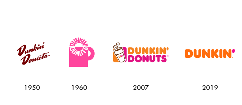
From 1950s roadside Americana to 2019’s plump Dunkin’ logo, the Dunkin’ Donuts brand is another classic example of logo refinement. As brands grow in recognition, logos often become leaner, less cluttered, and more potent. Removing ‘Donuts’ from the logo in 2019 may have been a bold move, but it’s a testament to the brand that we still know exactly what to expect.
Airbnb

In 2014, Airbnb’s logo got a much-needed update. It wasn’t horrible to begin with, but it did make Airbnb look a little bit like an ice cream company. Highlighting themes of love, location, and togetherness, the new ‘Bélo’ logo is a great example of how to use logo shape to convey meaning.
YouTube
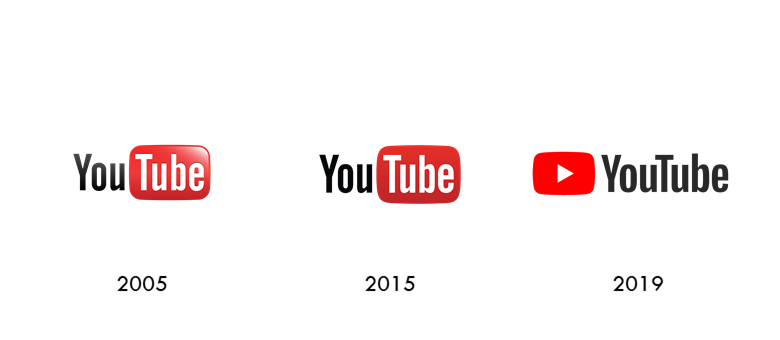
Okay, so this one’s up for debate. A lot of people feel that the original YouTube TV logo made more sense. However, adding the play symbol signified a social shift from ‘the tube’ to online video. It’s also a more tactile logo that demands to be ‘pressed’, just like watching a video on your phone. At any rate, adding a bit of saturation to the red helped liven up an otherwise plain logo.
Time for a logo refresh?
The Worst Logo Evolutions
We’ll never know what these brands were thinking entirely, but we can at least point out how terrible their decisions were.
Coors Light

You’re at your favorite bar after an insane week at work. All you want to do is chill, play some pool, and drink a beer in the glow of a big neon bar sign. Suddenly some dude comes over, breaks the sign with your pool cue, and starts pouring your beer all over your crotch. That’s a pretty accurate metaphor for how badly Coors Light spoiled the fun with their new logo.
Saint Laurent
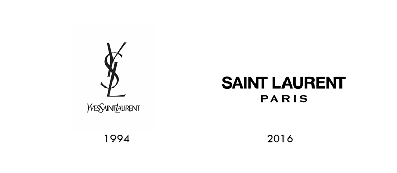
In 2012, Yves Saint Laurent took one of the most unique monogram logos ever and turned it into a Paris street sign. By ripping out the heart (and name) of their eclectic founder, they managed to hurt their brand in the process and set off what would become a domino of sans-serifs in the fashion industry.
Burberry

Seriously, we’ll never know what made the entire fashion community hate serifs. In 2018, Burberry jumped on the sans serif bandwagon and got rid of its iconic jouster in the process. Since when did being fashionable become so…unfashionable?

Ok, this one might be a little controversial, but hear us out. At first, Instagram’s logo was okay. Not outstanding, not terrible, just okay. But at least it had character. Instagram’s new washing machine – er, I mean, camera – logo, is a good example of going too basic. If it wasn’t for the fact that half the world used Instagram, a logo like this would be unclear and, frankly, forgettable!
Reebok
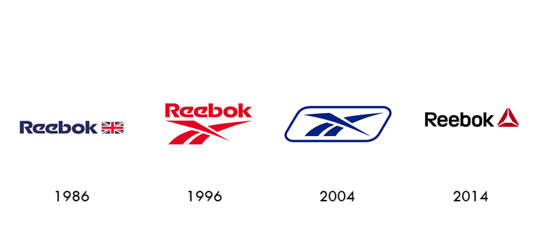
This could just be our 90’s nostalgia coming out, but the new Reebok logo just isn’t what it used to be. Always a bit of a problem child, Reebok has struggled to find a solid identity. While the company finally came close with its signature crossed chevrons, it dropped the ball in 2014 with a vaguely triangle-shaped logo.
Capital One

“Hey guys! People like, motion and stuff, right? Well, I found the ‘add shape’ button in Powerpoint and this swishy thing came up, and I think we should use it in our logo!”
– Actual transcript from a 2008 agency meeting for Capital One’s logo redesign.
Samsung
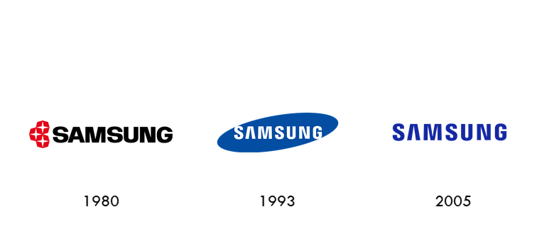
Probably the least controversial logo evolution ever, but still. Without the blue container, Samsung’s logo feels emptier somehow. Missing its original 90s dynamism, the Samsung logo now feels like any other vaguely tech-slash-telecoms brand out there.
Gap
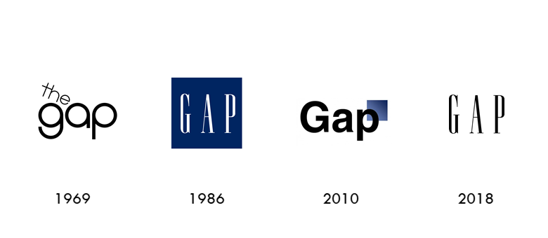
The Gap opened its doors in 1969 on Ocean Avenue, San Francisco. Starting out with a friendly, summer-of-love style logo, the company only found its iconic monogram logo in 1986. Then 2010 happened. After debuting a new logo that upset people more than the Financial Crisis, Gap went back to their old logo – after just one week. Oops!
American Airlines
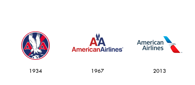
Using animal symbolism in logos is a great way to embody your brand’s character. Taking an existing animal logo and turning it into a paper airplane, however, is a great way to undermine a national icon. An otherwise solid execution for an off-target rebrand.
Logos are super important. Keeping your brand identity up to date is a vital way of maintaining your connection with your customers, but it’s a delicate art.
So whether you’re debating which color to use or considering using a slogan, studying how famous brands change their logos over time can be a great source of guidance.
But remember, expressing yourself through your brand is just like real life: you don’t have to be anyone else. Sure, there are general standards of logo formats that suit specific industries, but communicating your character starts with you.
Think it’s time for an update? Get started with our logo-maker today!