Brand Colors: How to Choose the Perfect Palette
By Jasmine Williams Jul 27, 2022

Picking the right brand color palette is not just about choosing colors that look good to you or work well together. Your brand colors should represent your company as a whole.
Like a logo, your audience can learn about your brand personality, aesthetic, and industry from your brand colors alone!
With so much on the line, you’re probably wondering how you can pick the perfect brand colors for your brand and business. We’ll help you come up with the perfect palette by giving you a rundown on colors and their associations, as well as a step-by-step guide on choosing colors that will help you define and distinguish your brand from others.
Below, we’ll go over:
- Why brand colors are important
- Colors and cultures
- Iconic brand colors examples
- How to choose the right brand colors for your business
Let’s dive in!
Brand colors: Why are they important?
Your brand identity is your company’s overarching image, personality, and concept.
A well-developed brand should make your audience feel something when they see you. Since most colors already have emotions tied to them, you can use them to connect your company to specific moods or feelings.
We surveyed 2200 entrepreneurs in 50+ countries. We asked them to describe eight different colors in one word. Here are the typical feelings and qualities our respondents connected to these colors.
- Red: passion, love, blood, power, anger
- Orange: warmth
- Yellow: happy, bright, sunshine, light, wealth
- Green: optimism, life, growth, nature
- Teal: calm, peace
- Blue: cool, calm, trust, loyalty, conservative
- Pink: feminine, youthful
- Purple: cool, vibrant
Use these associations to your advantage by picking brand colors that connect your company with a particular mood or feeling.
For example, say your brand has a fun, joyful energy, like a fitness company or snack brand. Warm colors like orange and yellow could work well. Think Orangetheory or Smart Sweets.

Source: Smart Sweets
If your brand experience is calmer and more peaceful, such as a wellness company or loungewear brand, cooler colors like green or blue may work better (e.g., Mindmed, Tentree).

Source: www.rgd.ca for Tentree
Color and culture
Culture is another factor to consider when picking brand colors. Factors like politics, history, myths, religion, and language can also impact how your audience perceives specific colors.
Here are a few examples:
- White is the color of purity and perfection, thanks to religion (white wedding dresses) and the mythical idea of the white knight.
- For other cultures, white is associated with death, ghosts, and phantoms.
- Red is a lucky color in Chinese culture
- In Indian culture, red is an auspicious color worn by the bride on her wedding day
- South Africans associate red with mourning. This is because the red section of the country’s flag represents the blood shed during its struggle for independence.
Narrowing one color down to a single mood or feeling is impossible. But it’s still important to understand these cultural and emotional associations as they can color (pun intended) how people see your brand.
Famous examples of brand colors
Many of the world’s most successful and influential brands are recognizable from their brand color palette alone. But what makes their brand colors so iconic? It often comes down to how brands use colors’ emotional and cultural meanings to highlight key aspects of their company’s personality or mission. Let’s dive into some examples!
1. Uber

Wolff Olins, the advertising agency behind Uber’s 2018 rebrand, claimed its goal was to create “a universal ‘beyond-simple’ brand.” A straightforward black and white color palette certainly conveys this.
The color combination also has ties to luxury in western culture, such as black tie parties or black cars (which relates to Uber’s origins). Additionally, a simple color scheme makes sense since Uber is known for its quick and straightforward app experience.
2. Starbucks

Starbucks states on their creative website:
As a food and beverage company, Starbucks’ more subdued and natural green color palette stands out from competitors like Mcdonald’s and Dunkin’ Donuts, which use warmer red and orange tones.
3. Netflix

Netflix’s brand is one of the most recognizable and memorable streaming platforms out there, in no small part thanks to its signature bright red brand color.
Red is the color of love and pleasure, as well as hate and anger. Since Netflix is in the entertainment business, red relates to the emotional highs and lows people feel when they watch a good movie or television show. It’s also the color of stage curtains, old movie theatre seats, and red carpets.
How to choose brand colors
1. Brush up on color combinations
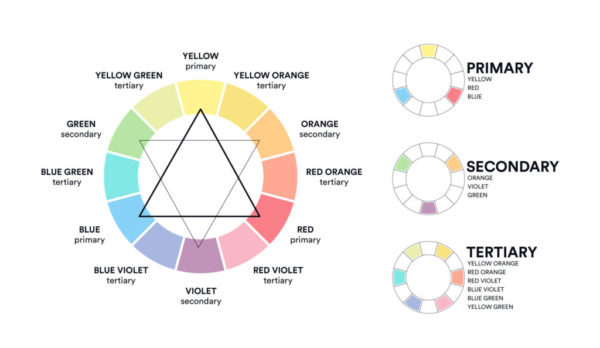
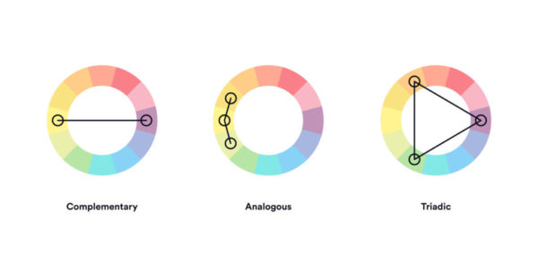
Remember that color wheel we mentioned? With the color combinations below, you can create a strong brand color palette for your company that works every time:
- Complementary colors are opposites on the color wheel, like red and green or blue and orange. You often see this color palette in the food and beverage industry as it stands out on store shelves or street signs (e.g., Fanta, Heineken, Mountain Dew, Taco Bell).
- Analogous colors sit next to each other on the color wheel, like red, orange, and yellow or blue and purple. Analogous brand color palettes often have a dominant color, a supporting color, and an accent color (E.g., Mastercard, BP).
- Triadic colors are evenly spaced around the color wheel and often make for very bright and dynamic color palettes. The visual contrast and harmony can help your brand pop (e.g., Burger King, Popsicle).
- Monochromatic colors are different shades and depths of the same hue. These color schemes can be simple to create and look very harmonious (e.g., Oreo, PayPal, Shopify).
Through AI, Looka’s Logo Maker produces color variations of your logo that better complement each other and pass color contrast tests. These color combinations ensure your symbol, brand name, and slogan are easily legible, and look great!

2. Check out your competition
When you look at other brands in your industry, ask yourself: What colors are dominant and why? Then, think about how you can differentiate yourself but still align with your industry.
For example, Lyft, a competitive ridesharing app to Uber, has a bright pink logo – starkly contrasting Uber’s simple black and white color palette. By picking such a vibrant color, Lyft stands out in the market and positions itself as a more fun and youthful alternative to Uber. They also stand out more as an app logo on your phone!
3. Align your brand personality to your audience’s needs
If your brand was a person, how would you describe them? Are you bubbly and fun? Or more serious and professional? There’s no right or wrong answer, but the brand colors you pick should match your company’s overall vibe.
You can also use brand colors to highlight how you serve your audience. For example, Contracts Market is an online business that sells contract templates for small business owners.
The legal industry can be somewhat conservative and aloof, but Contracts Market’s bright color palette immediately makes the brand more approachable and accessible.
4. Create your brand color palette
Now that you understand how colors impact how people perceive your brand, it’s time to make your brand color palette! Here are some tips and tools to help create a great color palette.
- Get inspired by nature. From sunsets to beach scenes, we’re often surrounded by beautiful color combinations. Use an app like Adobe Capture to pull out color palettes from your favorite photos.
- Experiment with colors. Try various logo color combinations to see what resonates the most with your brand vision. Finding the perfect colors for your project can take time, so try out of the box combinations until you land on the perfect one.
- Use a brand colors generator. Apps like Coolers, Color Hunt, Muzli Colors, Adobe Color, and Color Space make the process fun and simple by allowing you to build a full palette from a single color.
Looka automatically applies color combinations that work well together based on the look you select. As you can see below, brand colors can make your brand look modern and luxurious, or quirky and fun.


Formulas for brand colors
Keeping in mind that your brand color palette should have two to five colors maximum, here are some brand color formulas to help you create a great color palette:
1. One main color: Companies like IBM, Spotify, and Apple keep things simple by having one striking primary brand color.

2. One main and one accent color: Brands like McDonald’s, Pepsi, and Ikea kick things up a notch with their dual-color brand palettes.
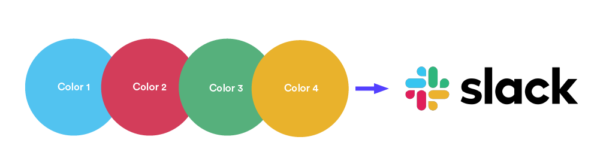
3. One main color and 3-4 accent colors: Slack, Microsoft, and Burger King have more complex but memorable color palettes by pairing a bold signature color with complementary accent colors.
Where should you put your brand colors?
Short answer: everywhere! You should use your brand colors for any digital or physical assets related to your business, such as:
- Logo
- Business cards
- Invoices
- Social media assets (banners, posts, etc.)
- Website
- Apparel and accessories
Remember: your brand colors are a part of your company’s visual identity. If you want your audience to associate your brand with your brand colors (like Ikea or Starbucks), then you should use your brand colors anywhere your brand ‘shows up’ – online or in real life.
Show your true brand colors
Colors can inspire certain feelings and moods. They can also connect us to our histories and cultures. In short, they can be pretty powerful tools in your creative arsenal – if you use them wisely. So when picking a brand color palette, keep all these factors in mind, but don’t forget to have fun! Get creative and play with different colors until you find the right combination for your brand.