8 Cannabis Brands That Signal a Changing Industry
By Kaejon • 6 min read, Oct 24, 2018
With the legalization of recreational marijuana across Canada and parts of the U.S., it’s no surprise that cannabis has become one of the most talked-about industries of 2018. As cannabis products become more mainstream and cater to a broader audience outside of those who use medical marijuana, cannabis brands have to stand out while also clearly conveying what their product is, along with the age limits and safety warning associated with usage.
We looked at eight cannabis brand designs — some from established companies, and some in the “concept” stage on Behance — to see what great branding looks like in this space.
But first, a few words on cliche cannabis branding. The cannabis logo we’ve all witnessed includes a green marijuana leaf symbol — you know the one. A 5-7 pointed leaf that leaves no room for doubt:
 You could argue that this is an identifiable symbol, but this also makes your brand look like hundreds of other cannabis brands. It’s associated with past perceptions of the industry when cannabis wasn’t legal (and consequently, more subversive).
In other words, it’s hard to look like a higher-end cannabis company if you use a literal-looking marijuana leaf in a predictable shade of green. Logos that rely on trends often fail to be memorable because they’re not unique.
A new breed of cannabis companies are still (sometimes) using leaf symbols, but they’re doing it differently, as you’ll see with the below examples of good cannabis branding.
1. Beboe

Beboe is a Cali-based luxury cannabis brand created by artist Scott Campbell and tech and fashion executive Clement Kwan. Selling everything from vape pens to pastels, Beboe uses baroque-inspired branded weed with aspects of Campbell’s traditional tattooing background creeping in.
The packaging: Beboe has elaborate swirls of gold and silver surrounding its packaging, creating a magical and whimsical look. It’s beautiful, aesthetic, and stands out instantly from the status quo. It has pastel brand colors and tons of white space to create a minimalist vibe.
2. Cannadis
The logo: Oh, Cannadis. This well-balanced red logo can’t help reminding us of the Canadian flag. Its clean, easy-to-read font with the symbol floated to the right is an original layout that stands out while keeping it simple. Also of note: the weight of the symbol matches the weight of the wordmark, making it both memorable and versatile — this logo design will work at both large and small sizes across applications.
Image source: Behance

The packaging: The brand’s packaging follows the same style as the logo: clean and simple with great visual hierarchy, so you know what the brand is right away, and the other information is secondary. The slim canisters are minimalist and small enough to carry with you — they’re a common package style used in other consumer goods, so people know how to use them. The bold red is easy to spot and stands out both online and offline.
3. Kiva
The logo: Kiva’s distinctive, all-caps wordmark logo gives the brand’s products a more serious vibe than regular candy. And while a hand-drawn marijuana leaf appears on the company’s packaging and chocolate, there’s no leaf symbol in this cannabis/CBD logo. Many people make the mistake of thinking that if their logo design is simple, it’s boring. But as Kiva shows, sometimes simplicity is precisely what you need to stand out.
Image source: Kiva
 The packaging: The organic, vintage style of Kiva’s packaging perfectly captures the company’s sophisticated “connoisseur” positioning in the market. The layout of information is on point: right away, the package tells you how much THC is in the product, something most consumers want to know. The warning at the bottom also stands out without taking away from the other messaging. The “natural” looking packaging makes the product appear healthy and trustworthy.
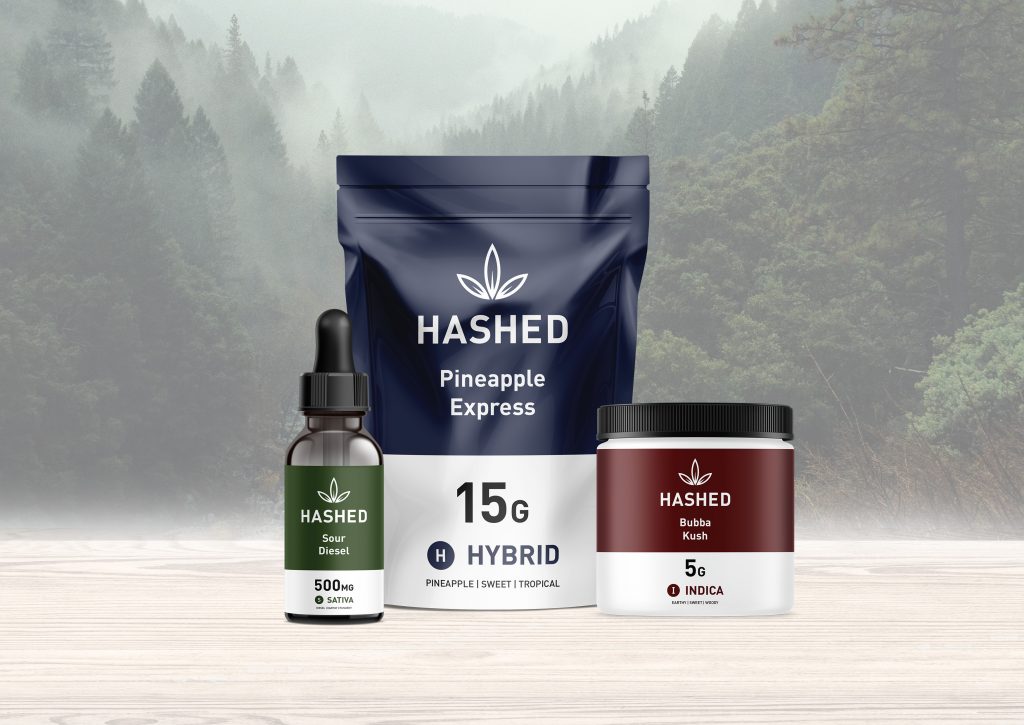
4. Hashed
The logo: While the Hashed logo uses a leaf symbol, it’s clean, simple, and fresh-looking — not as literal or cliche as the leaf symbols seen above. With a modern all-caps wordmark and a stacked layout that gives plenty of attention to the leaf-inspired symbol, this logo is unified and scalable (and stands out even at smaller sizes).
Image source: Kaejon Misuraca

The packaging: A well-designed label is essential in the cannabis industry, as it needs to communicate the product offering, as well as details like size, strain, and characteristics. The Hashed label uses a clean, sans-serif font to match the logo so that all the information is legible while giving clear visual hierarchy to elements that are more important (product size and type). All the products have a similar design (and use the same font as the logo in the label), but each type of strain is a different colour. This helps viewers easily pick out cannabis types and potencies!
5. Marley Natural
The logo: The Marley Natural logo contains three elements: a monogram (M), a symbol, and a wordmark. It can be used in both horizontal and vertical arrangements, making it flexible for use on different packages and platforms. While the logo itself is black-and-white, it’s accompanied by three colored dots that symbolize Bob Marley and Rasta culture: red, yellow, and green. The wordmark is clean with a hand-drawn lion symbol (to represent the legend of Bob Marley) and a stylized monogram.
Image source: Marley Natural
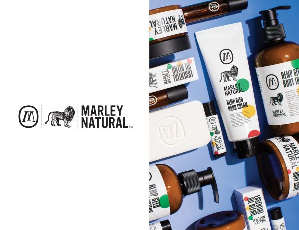
The packaging: As a brand that sells cannabis-infused body products — body lotion, lip balm, soap and more — Marley Natural falls more into a lifestyle category, and its packaging follows suit, looking both natural and high-end. The logo stacks well on different package sizes and the three colored dots make for a memorable brand identity that stands out against other products.
6. The Canna Farmacy
The logo: This cannabis brand’s design is simple, quirky, and elegant all at the same time — no easy feat! The name is long, but the designer has stacked it in a nice tight lockup and slanted the word “the” to draw attention to it first (a.k.a. strong visual hierarchy). The typeface is readable and scalable but also unique, with slants and curves that draw the eye in and make the brand look high-end.
Image source: Behance
 The packaging: The all-white packaging is clean and consistent, and allows the colored bars — which indicate the medicinal properties of each strain of cannabis — to stand out. While each label contains a large amount of text, the name of each product is easy to spot. Each strain has a different colored dot and uses clever iconography to communicate the different flavors in each product. Take this as a lesson in organizing information well in a small space!
7. Tokyo Smoke
The logo: This cannabis brand’s logo stands out with its squared-off oval shape and the type arranged vertically, making memorable when it appears on posters, signs, and products. While the typeface is thin, which makes it harder to scale, the bold red symbol can be used on its own with the wordmark to the right of it. The brand identity feels sleek and high-end, and this logo is a perfect match.
Image source: Tokyo Smoke
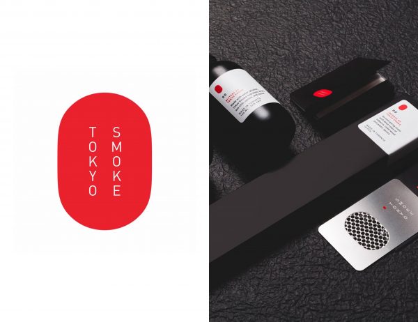
The packaging: Tokyo Smoke’s packaging is something that you wouldn’t usually see in cannabis products, making it stand out. The black matte packaging looks luxurious (and intriguing) while still being approachable. Red and black text on the white labels stands out, making the brand easy to spot and remember.
8. Kola
The logo: The short, easy-to-remember company name is set in a simple logo that features a tail on the “a” that subtly references a cannabis leaf. Lowercase wordmarks tend to be inviting and approachable, and the simplicity of the wordmark and rectangle symbol means this logo looks good in a metallic gradient. The block to the left of the logo leads your eye into the logo from left to right and helps guide your eye to the start of the logo.
Image source: Behance

The packaging: The holographic foil of the logo design set against black packaging is both modern and clever, subtly referencing the “trippiness” of cannabis. Depending on the way the light hits the foil, you’ll see it as a different color, making it memorable without having traditional “brand” colors. The packaging is both modern and exciting, making it look more like a premium brand.
As you can see, creating great cannabis branding is about more than picking a 7-pointed green hemp leaf, and slapping it over some text.
In fact, many of the best designs are devoid of any cannabis-related imagery, helping them appear more professional, unique, and memorable — this is especially important in a consumer space that’s only going to get more crowded!
p.s. Want to design a logo for your own cannabis brand? Check out our free online logo maker or our guide to logo design for non-designers.