The Top 36 Logo Fonts and How to Choose the Perfect One
By Nisha • 5 min read, Jul 3, 2023
Font choice is a critical element of logo design. By changing your logo font, you can completely change your brand’s mood and message. Your font even has the power to influence your customer’s thoughts and emotions!
But with so many font choices out there, how do you know you’re selecting the right one?
This blog will help you become an expert on logo fonts. From the types of fonts, tips for making a logo font selection, and actual font examples, we’ll cover it all here.
The 4 main types of logo fonts
Generally, there are four main types of fonts to choose from. Each offers unique characteristics that can help to convey a brand’s personality.
![]()
Serif logo fonts
A timeless classic, serif fonts are traditional and sophisticated. A serif logo font is for brands that exert timelessness and legacy. Examples include Rolex, Prada, and Mercedes-Benz!
![]()
Sans serif logo fonts
Sans serif fonts are more minimalistic and straightforward.
This logo font style is a go-to for online brands due to its crisp readability on screen. Examples of sans serif logo fonts include Google, Netflix, and Meta! below.
![]()
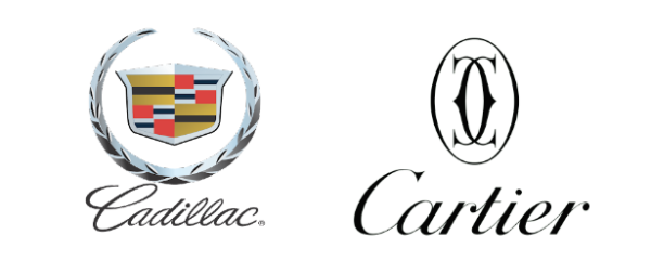
Script or cursive logo fonts
Cursive fonts (also known as script fonts) are formal, elegant, and feminine. Ideally, business names with a script font should be short to maintain legibility.
Cursive fonts are either casual or formal. Formal script is elaborate and artistic. Think of Cadillac or lavish Cartier. Casual script looks more like real handwriting. Like Ray Ban or Virgin!

Display logo fonts
Display or decorative fonts come in all kinds of variations and are unique. Display fonts are made from scratch for a specific brand!
Memorable logo fonts can help distinguish your brand. The Disney font below is a rendering of Walt Disney’s signature. This custom font, called “Waltograph” is iconic and fun, pulling from the magical theme of their stories.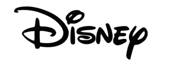
Pro tip: “It’s fine to use interesting fonts when the rest of the design is simple. Emphasize the font as the primary design element and highlight a particular message above all else.” – Jason Van Tassel, Owner, MouthMedia
How many fonts should you use in a logo?
Use no more than two fonts in your logo. You can use a main font for your business name or monogram, and another one for your slogan. Any more than two will look messy and cluttered. Great design is all about deliberate choices with minimal design elements!
How to combine logo fonts
Here are some font pairing choices to try out:
- Serif logo text + sans-serif slogan
- Handwritten or script logo font + sans-serif slogan
- Modern logo font + slab-serif slogan
- Funky logo font + sans-serif slogan
-

- Created on Looka logo maker
-

- Created on Looka logo maker
-

- Created on Looka logo maker
-

- Created on Looka logo maker
How to choose the perfect logo font
There are a few important factors to consider when choosing a font for your logo. Let’s go through them here.
1. Consider your brand personality

To choose the perfect font for your logo, you need to align with your brand personality.
- If your brand is sophisticated and authoritative, a serif font would work better for you.
- If your brand is modern and edgy, a sans serif font might be a better choice.
Check out these logos made with the Looka logo maker:
-

- Created on Looka logo maker
-

- Created on Looka logo maker
Use your brand personality as the foundation for choosing the perfect logo font. This way, you’ll have powerful branding that’s well-aligned to your target market and brand purpose.
2. Connect with your target market
Keep your target audience in mind and align your logo font to your customers’ needs.
If you’re in consulting or real estate, your audience will need a trustworthy and experienced brand. So, opt for a more traditional and mature serif font to connect to your audience.
Here are a few examples:
Created on Looka logo maker
Creative industries like design or technology that want to seem at the cutting edge, could use a modern sans serif font for their logo. This will resonate with their target audience more than a traditional serif.
Check out these examples:
![]()
Pro tip: “Picking the right fonts for logos has a deep psychological impact on your visitors. Experienced designers pick their fonts carefully and deliberately. We often spend hours selecting a font for a design.” – Brad Shaw, President & CEO, Dallas Website Design
3. Prioritize legibility
Legibility is critical in designing a logo that communicates your brand identity. Strike a balance between readability and something unique to your brand.
-

- Created on Looka logo maker
-

- Created on Looka logo maker
Here are some pro-tips on legibility:
- Color combinations are critical. Reading light-colored text on a light background makes your logo very hard to read. Opt for colors that create contrast.
- Scripted fonts can be hard to read. Scripted fonts need lots of breathing room around them. So, consider increasing the space between letters and the line height (space between lines of text). Also, Avoid all-caps with script fonts!
- Review the basics of visual hierarchy. Get a feel for how to use alignment, space, color in a logo.
- Pair a thin logo font with a symbol or monogram If you want to use a thin font in your logo, pair it with a symbol or monogram. That way, in places where thin fonts don’t scale well (i.e a favicon) you have the option to use your monogram or symbol!
See how impactful and legible the monogram social media profile photo is?
![]()
4. Think about scalability
Your logo will appear in various mediums from digital to print. To maximize its impact, consider this:
Where will your logo be seen?
Account for readability and the amount of time your logo design has to catch someone’s attention. Ask yourself how and where customers will see your logo and adjust your logo font to have the greatest impact in these settings.
What’s the goal of your logo?
Will your logo be on apparel? Or will it be on digital assets? The font choices should differ based on the primary medium your logo will be on.
5. Don’t rely on color

Source: https://justcreative.com/logo-design-tips/
Color should be secondary to your logo fonts.
A colored logo won’t be available for every medium, so, be comfortable with a simple black and white version. If your brand personality isn’t communicated without color, select a more powerful font that better defines your business.
Simplicity is key to great logo design. Use two font pairs or less, and stay away from unnecessary symbols, containers, and complicated fonts. Only use what adds value!
Top 36 best logo fonts for iconic branding
Let’s dive into some iconic logo fonts from both past and present.
Classic and modern logo fonts
These logo fonts have stood the test of time and have been used internationally for decades.
1. Proxima Nova

Modern and geometric, Proxima Nova was designed by Mark Simonson in 2005. Brands like Spotify and Mashable use Proxima Nova to elicit a modern, edgy look with an approachable aura.
Modern brands that exist largely in digital mediums (like websites and apps) have used this incredibly versatile font.
2. Didot
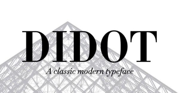
A real classic, Didot is a serif font that originated in the 1800s and has held its own since. You’ll find it mainly used in the fashion industry, from Vogue magazine to clothing brands like Georgio Armani.
This font (like most serifs) bodes well for more sophisticated and traditional branding. However, it may be hard to read in long-form digital formats.
3. Bodoni
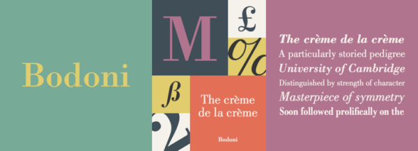
Bodoni took the modern font world by storm in 1798. Designed by Giambattista Bodoni, it’s widely used in the fashion industry by brands like Gucci and Elizabeth Arden.
This font has a stark contrast between thick and thin strokes, giving it an elegant and sophisticated look. Believe it or not, the band Nirvana used Bodini for their logo!
4. Garamond
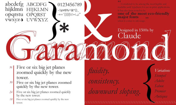
Garamond originated in the 16th century by designer Claude Garamond. It’s readable and holds the title as the most legible serif body font.
Fashion brands like Rolex and Abercrombie and Fitch have used it as their logo font. Notably, sophisticated serif fonts have been embraced by the high-end fashion industry due to their authoritative and luxurious appeal.
5. Helvetica
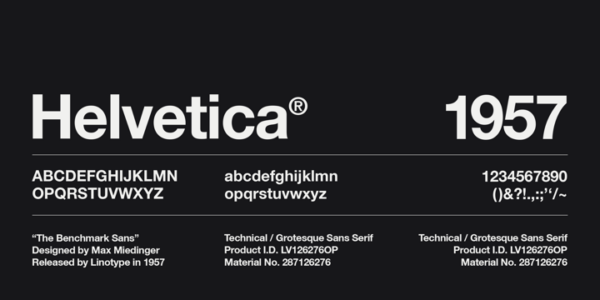 Bold and beautiful, Helvetica was designed in 1957 by Max Miedinger and is one of the most widely used sans serif fonts. It’s been used by brands like Apple, Adobe, and Xerox, due to its modern and powerful look.
It’s best for brands that are looking for a simple yet powerful way to brand a modern and edgy business.
6. Futura

What does fashion house Dolce and Gabbana have in common with Domino’s pizza?
The Futura logo font. Futura was designed by Paul Renner in 1927 and is a powerful sans serif. It’s widely used for digital as well as printed assets, making it a loved and versatile font to this day.
7. Avante Garde
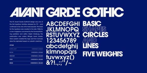
Released in the 1970’s Avante Garde is anything but retro. Designed by Herb Lubalin and Tom Carnase, it’s a geometric sans serif for bold brands like Adidas and Remax.
It’s an extremely versatile font and is better suited for edgy and contemporary brands that push traditional boundaries.
8. Avenir
 An organic rendition of geometric sans serifs, Avenir is made for long-form reading with its eye-pleasing shapes. Designed in 1988 by Adrian Frutiger, it’s been used by Toyota and AliExpress to get their message across.
Futura is great for minimalistic logos and long-form copy.
9. Myriad
 A true powerhouse, Myriad Pro has versatile and diverse usage options. It has a slant on the “y” and “e” giving it an identifiable quirk.
Brands like Apple, Walmart, and Linkedin have used Myriad due to its effortless versatility. Released in 1992 by Adobe Systems, it encompasses a new age look.
10. Open Sans

Open Sans is a humanist sans serif font designed by Steve Mattson in 2010. It has sublime legibility in any format, and variable weights to suit a logo font or lengthy copy.
Open Sans is amongst the most popular humanist sans serif typefaces with brands like Google, IKEA, and WordPress using it for their branding. It has a friendly and open appeal, best for modern and contemporary brands.
11. Akzidenz-Grotesk
![]() Released at the turn of the century in 1896, Akzidenz-Grotesk was designed by Berthold Type Foundry in Berlin. Coined as the original “Helvetica” Akzidenz ushered the use of geometric sans serif fonts into the new decade.
Released at the turn of the century in 1896, Akzidenz-Grotesk was designed by Berthold Type Foundry in Berlin. Coined as the original “Helvetica” Akzidenz ushered the use of geometric sans serif fonts into the new decade.
Akzidenz-Grotesk is used in the New York subway signage, as well as in posters from that century. Both bold and assertive, it’s Solidified as an internationally used font.
12. Univers
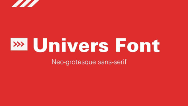
Released by Adrian Frutiger in 1957, Univers was the first font family to have a comprehensive number of weights and widths. The letterforms are a bit slanted, moving away from more rigid sans serifs in that era.
It’s used by brands like British Petroleum(BP) and Unicef to name a few.
13. Choplin
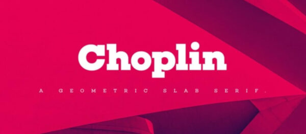
Choplin is a geometric slab serif with clean-cut serifs balanced by smooth curves. Designed by Rene Bieder, it’s both unconventional and bold. Seen in editorial settings like magazines and photography, Choplin is a font with messaging you can’t ignore.
14. Montserrat
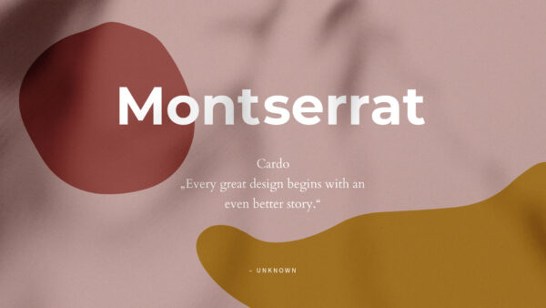
Montserrat is the embodiment of urban typography in the early 20th century. Designer Julieta Ulanovski created this font to preserve her city, Montserrat, in a timeless way.
Montserrat is a versatile font with a balance of traditional and modern elements.
15. Gill Sans

Designed by Eric Gill in 1928, Gill Sans led the way to a humanist sans serifs, inspired by traditional lettering. This makes Gill Sans easy to read, yet modern in appearance.
Pixar and BBC use Gill Sans, with a newer rendition focusing on digital legibility. This font is best for brands that are both modern and traditional.
16. FF Blur
![]()
Designed by Neville Brody in 1991, FF Blur is a well-rounded font with no edges and versatile usage. It’s a display font that works well for headings, titles, branding, and packaging. It’s got a blurred-out look that’s one of a kind – legible but dreamy!
17. Cooper BT
![]()
Cooper is a fun, friendly, and human serif font. Brands like Mailchimp use this as their brand font to give off that bubbly, human vibe.
Contemporary and new logo fonts
Let’s dive into the latest and greatest logo fonts out there!
18. TT Hoves
![]()
TT Hoves Pro is a professional font that evokes a sense of clarity and reliability. It’s a modern geometric sans serif oriented towards digital branding for consultancies or tech. Created by TypeType.
19. Gelica
![]()
Free-spirited and funky, Gelica is a fun logo font that alludes to a nostalgic 70s feel. It works well for bubbly brand personalities and logo design. Designed by Eclectotype, Download it for free here!
20. Goia
![]()
Goia is artsy and abstract. Sharp edges and unique letter shapes create a morphed look that’s perfect for branding online stores, creating design assets, and modern logo design.
21. Quiche sans
Quiche Sans is a traditional twist on the modern serif font. It adds elegance and luxury through decadent curves and varying strokes. It’s the perfect logo font for professional logo design in consulting, restaurants, and personal branding!
22. Cenzo Flare
![]()
Block fonts are trending! Big, bold, statement fonts like this one are popular in graphic design, branding, and web design. This one has a mid-century modern flare that creates a retro appeal through slightly curved edges.
23. Neulis
![]()
A hybrid of a sans serif and script font, Nature Alive is a creative logo font that adds a whimsical air to any design. It’s ideal for creative industries or headings for blogs or websites. Designed by Adam Ladd.
24. Belleza
![]()
Belleza is a free modern font family with a crisp sans serif style. It has varying stroke thicknesses to create an abstract look. Its lines are distinct enough to add a sense of individuality, without being boring. This font style is perfect for logo design, headings, and any digital use.
25. Cocosignum
![]()
Cocosignum is a mid-century modern sans serif font that took inspiration from the Italian thirties. It’s retro and one of a kind, making it perfect for branding handmade products, or creating logos in more traditional industries. Try stacking it on top of bold shapes for maximum effect!
26. Mohr
![]()
Less is Mohr! This bold sans serif font is the perfect statement choice for minimal logo design. It has versatile design elements and a structured look. Designed by the legendary Latinotype.
27. Albra
![]()
Serif typefaces like Albra are perfect for logo design in traditional industries like fashion and gastronomy. It has small quirks that make it unique and distinguishable, and it pairs well with script font styles!
28. Organetto
![]()
Organetto is a simple sans serif inspired by the bold retro look of art deco posters. Its commanding as an all caps font, and the geometric letters are great for business logos. Designed by Latinotype!
29. Bolkit
![]()
Bolkit is a contemporary typeface with psychedelic elements and an elegant style. With sharp geometric serifs and wide apertures, it creates whimsy and negative space. It’s ideal for minimal logo designs and print-based branded materials.
30. Taberna
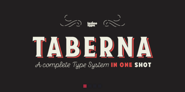
Taberna is a Wes Anderson-themed font that’s decorative, retro, and bold. It’s the right font for brands that want a bold vintage look. It’s one of few complete font families that offers versatile options that all pair well together.
31. Centrio 2023
![]()
Retro fonts evoke a sense of nostalgia and fun. They’re carefree and groovy – making them ideal for brand logos that want to allude to fun, escapism, and simplicity in their brand identity. Centrio is one of the best fonts for bold and fun designs, with limitless serif customizations.
32. Gopher
![]()
Modern fonts can be fun too! Gopher is a geometric sans with tons of personality and unique horizontal apertures. It has divine legibility mixed with quirky strokes – the perfect logo font! It’s one of the best fonts for a website brand logo, and it works well with different fonts.
33. Grayson
![]()
Is it futuristic? Is it retro? Grayson is the perfect melding of retro and modern characteristics. It’s fluid enough to be used in any design project that wants to allude to the past and present. Perfect for logo design in modern industries as well as traditional ones. Designed by hip fonts in late 2022.
34. Saveur sans

Saveur sans is The Gatsby in a font. Inspired by art deco, it has bold geometry, unparalleled symmetry, and monospaced lettering that commands negative space. Its a simple font for a timeless logo in traditional industries and design projects.
35. Otterco
![]()
Otterco is a bold sans display font with geometric lettering. It has close kerning between letters and single width strokes for a uniform look. Its one of the best modern fonts to design logos in tech, consulting, construction or personal branding. And, it works well with different fonts for logos!
36. Yoshida
![]()
A statement font fit for a bold brand identity, Yoshida is commanding in its simplicity. It makes a splash as a stand-alone element in logo designs! With elongated bold letters and rounded lettering, its impact is one of a kind. It works well with various other fonts for logos as well!
Logo font takeaways
Choosing fonts for logos takes time but is a pivotal part of branding your business. Keep these main takeaways in mind as you design your logo.
- Consider your brand personality
- Connect with your target audience
- Prioritize legibility
- Think about scalability
- Don’t rely on color
- Keep it simple
Use Looka’s logo maker to create a logo that’s both unique and timeless!