How to Design a Circle Logo (With Examples and Inspiration!)

Logo design can take many shapes and forms. But one that’s an all-around winner, is the circle logo design. Circles signify unity, stability, and wholeness. As the shape of the earth and sun, circles are also a symbol we associate with the planet and nature.
Circles can be used as symbols or monograms in a logo, or as the shape container where the entire logo lives. Circles are the most popular container choice among Looka users!
To explore circle logo design — and help you decide if you should choose one —We’ll look at a few famous circle logos along with circle logo inspiration to get you started.
Contents
Famous Circle Logos for inspiration
Let’s get into some circle logo design from famous global brands.
1. Headspace
Headspace, a popular meditation and mindfulness app, has a simple yet effective logo: an imperfect orange circle.

Why it works: Circles have long been associated with balance and harmony, which aligns with Headspace’s mission to help users find inner peace and clarity. The imperfection of the circle makes it that much more approachable. A perfect circle wouldn’t feel as organic or human!
Orange is often associated with happiness, creativity, and enthusiasm – all qualities closely tied to mindfulness. The Headspace logo is the perfect example of a circle logo design that conveys its brand values and resonates with the right people.
Get inspired with our free circle logo maker! It’s free to try
2. Reuters
Reuters is a global news organization. Its circle logo, a circle made of a swirl of smaller circles is brilliant in its simplicity and symbolism.

Why it works: The circle logo creates a focal point, adding a sense of Reuters’ position as a central source of news worldwide. Additionally, circles imply concepts of inclusivity and unity, reflecting the organization’s mission to deliver comprehensive news to its global audience. The simplicity of the logo ensures it’s easily recognized and remembered.
3. AT&T
AT&T is a telecommunications provider with a circle logo design that features a blue globe with white lines going around it. The circles in the logo serve two purposes: representing the globe and symbolizing connectivity.

Why it works: The circular shape of the logo not only reflects the earth but also represents the idea of being interconnected all around.
Additionally, the white lines circling the globe emphasize the idea of connectivity and unity. Overall, the AT&T circle logo effectively represents its global reach and interconnectedness through a simple circle design.
4. Starbucks
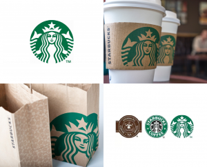
Starbucks is such a recognizable brand, that it dropped the wordmark from its logo in 2011. The famous siren mermaid figure — now with an ever-so-slightly asymmetrical face — remains contained in a green circle. The badge design pops on coffee cups, bags, signage, and more.

Why it works: When you’re first starting your business, it’s hard to achieve brand identity without text in your logo. But since Starbucks has been around for many years, its brandmark can stand on its own.
Having just the mark enhances the strength of the logo for scaling purposes, legibility, and functionality. Starbucks doesn’t have to worry about having a different logo across platforms or applications. The brand isn’t afraid to use off-center placement on its packaging.
5. Nivea
Nivea released a new round logo in 2013. A white wordmark set in a dark blue circle is reminiscent of the brand’s classic tins of body lotion. While the previous rectangular logo left a ho-hum impression on its branded packaging, the blue circle logo design is immediately recognizable and has a modern appeal.

Why it works: Most of Nivea’s products have circle target areas, whether the lid of a bottle or the screw-top of a tin. When the company decided to rebrand with a round logo design, it matched its products perfectly.
When you look at the updated products, it looks like the package and logo were designed together to keep the brand identity. And when you see that dark blue circle, you think of Nivea. Truly, a perfect circle logo!
6. Pinterest
When Pinterest updated its wordmark to a sans-serif font in 2017, its “P” badge remained the same. (It’s also the red circle logo seen by most of its users via the app.) The scripted “P” looks inviting and slightly imperfect, with the bottom of the letter breaking through the bottom of the circle.

Why it works: Pinterest launched with a script font wordmark and a “P” circle monogram in the same typeface. This logo design meant that when you saw each element on its own, you could easily tie them back to one another.
However, because Pinterest developed a strong brand identity over the years — and the monogram “P” is now recognizable on its own. The company was able to rebrand and use a more modern, sans-serif typeface for its wordmark while still keeping its famous red badge.
7. BMW
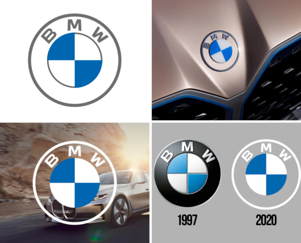
BMW has one of the most iconic logos in the world, and the design underwent a major overhaul in 2020. The gradient and 3D elements were dropped in favor of a paired back, minimal logo. The result is a more retro-style logo that also looks better in print. The blue-and-white design was inspired by the Bavarian flag and is a good example of a monogram mark curving into a circular shape.

Why it works: BMW has kept its logo consistent for 100+ years because it follows basic design principles: contrast, hierarchy, legibility, and scalability. You can clearly tell each of the logo elements from one another.
The monogram is a bold, sans-serif typeface, making it the most dominant element of the logo (as the company name should be). And when scaling down, the text remains legible — a very important thing to think about when creating a logo!
8. Beats
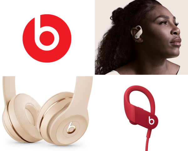
The Beats headphones logo is another great example of a circle logo. Negative space is used to define a lowercase “b” that intentionally doubles as a headphone symbol. The logo is clean, refined, and uses a classic red and white color combination to make a bold impact.

Why it works: The simplicity of the Beats logo is what defines it. Without a wordmark or added design elements, it’s easy to scale down and place on the product. The logo also has a transparent background for easy product placement.
Circle logo inspiration
We’ve curated some circle logo inspiration to get you started. Once you find something you like, hop on the Looka logo maker to start modifying your AI-generated new circle logo templates! Save time with our ever-growing collection of logos and endless customization options.
Tips on how to design a circle logo
Circle logos come in many variations—some include the company name within the shape (like Nivea and BMW), and some fall outside of it (like Pinterest).
Here are a few questions to ask if you’re thinking of designing a circle logo.
- Why do you want a circle logo design? Think about how the shape could strengthen your brand and business, as seen in the above examples.
- Does your company name fit into a circle logo container?
- Will it be legible when scaled down?
- Are you willing to use a monogram or curve the text to better fit the space?
- Do you prefer a solid, filled circle logo like Nivea’s or a circle outline?
Once you know what kind of logo you want — and why you want it! — check out these design tips and examples.

Tip #1: Keep it short
Using horizontal text in a circle logo? Your company name should be 1-5 characters, max. Otherwise, use an acronym or initials in the circle and place the wordmark beside it!
The goal is to keep your logo legible when it’s scaled-down. Think about what your logo would look like as a favicon, a profile image on social media, or on business cards. You want a design that looks clear and legible across all channels.

Tip #2: Aim for brand consistency
If you decide to include a wordmark in your logo alongside a circle monogram, keep the logo font the same in both the wordmark and the monogram to reinforce brand recognition.
Choosing the right typeface also has a major impact on your monogram. In the above example, we used a bold sans-serif typeface to stay legible at all sizes, and there’s a unique triangle shape on each character to make it more recognizable.
Tip #3: Curve your logo text
Use curved text in emblems, badges, seals, and crest-style logos to create a more vintage look. Logos with curved text can often accommodate more information while staying balanced.
Curving your logo text is a great way to put emphasis on the symbol. In the example above, the team name is seen arching over the symbol of a bobcat. Notice how well both the name and symbol stand out when printed on a shirt?
You can now create logos with curved text in our logo maker!

Tip #4: Create visual hierarchy
When designing a circle logo, think about what elements are going to be part of the logo. You want to use the space wisely to create visual hierarchy.
The above logo example contains six different elements: company name, slogan, monogram, year, symbol, and a container.
Since there are many elements to work with, curving the text in the company name and slogan provides plenty of space for other elements. The monogram is right in the middle to attract attention to the name of the company.
Circle logo FAQs
Let’s get into some FAQs about circle logos and how to get the circle effect.
How do I make a logo into a circle?
Designing a logo in a circle can be achieved using various graphic design tools such as Adobe Illustrator, Photoshop, or instantly through Looka. Here’s a simple step-by-step guide:
- Go to Looka.com and create a free account to save your circle logo ideas.
- Create a free logo!
- Add a circle element by going to the “container” section, and selecting a circle shape
- Curve the text of your business name by scrolling through the “modern” option in the suggestions tab
Remember, the most compelling circle logos are simple and minimalistic. They use the circle to convey values and personality!
What is the circle concept in logo?
Universally, circles represent notions of totality, wholeness, and infinity – the unbroken line with no beginning or end. In the context of logos, a circle can convey a sense of community, unity, and trust. It can also suggest movement and innovation, especially when combined with other elements.
How do I make my text logo round?
Crafting a round text logo requires a blend of creativity and design skills. Follow the steps below:
- Open your design software and create a new document.
- Choose the ‘Ellipse Tool’ or an equivalent tool and create a perfect circular outline.
- Select the ‘Text on a Path’ tool or equivalent. Click on the circular path and type your text.
- You can adjust the text’s position, size, and rotation to suit your design preference.
- Once you’re satisfied, save your round text logo in the appropriate format.
Or, you can simply use the Looka logo maker to make a design-approved round text logo with no design experience!
Who uses a circle logo?
Here are a few notable brands that use a circle logo:
- Lufthansa
- Headspace
- Pepsi
- Target
Time to design your own circle logo!
Want to create a circle logo that perfectly rounds out your business and unifies your brand? Remember to use a short name or monogram if your text is running horizontally. Choose a strong typeface to ensure both scalability and the best use of negative space.
To test-drive circle logo designs, get started with our logo maker and go to the Container section on the left nav when you’re ready to edit a circle logo template you like.


