Combination Logos: A Quick Guide (with 20+ Examples!)
By Oliver Sep 6, 2023

From indie breweries to tech behemoths, combination logos are one of the most popular ways to highlight your brand character in the blink of an eye.
In this blog, we’ll take you through what you need to create a winning combination logo, from key design elements, to some do’s and don’ts of combination logo design, plus a ton of examples along the way.
So get ready to combine your brain and your eyeballs, because we’re about to get our knowledge on!
What is a combination logo?
-

- Created on Looka logo maker

-

- Created on Looka logo maker

Basically, a combination logo is one that combines graphics and text.
Some of the most established logos of all time, like that of Apple, Nike, and Amazon, are combination logos.
- From a design perspective, a combination logo can be loose, i.e. a simple (but separated) pairing of a logomark and text, which is common for tech and SaaS businesses.
- A combination logo can also be tight. This approach includes a tighter integration of text and graphic, where neither element can be easily separated from the other (think Burger King’s logo).
Each end of the combination logo spectrum has different pros and cons, but to sum it up:
Tight visual design
![]()
Pros:
- More visual appeal and immediacy
- More original, unique logo styles
Cons:
- Harder to design and create
- Less flexible: design elements are inextricable from one another, so the primary logo has to be used everywhere, even at sizes it might not be as effective or legible
Loose visual design
![]()
Pros:
- Super flexible logos. Logo icons can be used independently of text, and vice versa.
- Easy to create
- Easy to apply
- Simple, functional visual appeal
Cons:
- Less exciting and original (sometimes)
- More common and less unique
Design your combination logo now!
When and why to use a combination logo?
So when should you use a combination logo? And when is it appropriate to use a simpler, loose combination logo, versus a tighter one?
Here are a few key points on why and when to use a combination logo:
- A combination logo can be used in any industry. They’re often seen in sports and apparel, food and drink, technology, and education – but you’ll see combination logos used everywhere.
- Loose combination logos are ideal for tech businesses and startups, given their functional simplicity and flexibility.
- Tight combination logos are better suited to industries like fashion, food, and hospitality, given the space for more unique visual designs in these verticals.
Combination logo examples
Here are some great combination logo examples featuring a range of styles, from recent logo redesigns to iconic logos and brand-new designs.
Lay’s
![]()
Lay’s logo features a cursive logo font on a red and yellow logo symbol. The punchy colors are a great example of color psychology in design and help incentivize action from the viewer (to buy these chips!)
Amazon
![]()
The history of the Amazon logo culminates with a masterclass in logo design. We’ve talked about it at length already, but to sum it up, the logo uses a mix of visual metaphor and clean font design to achieve a balanced, powerful combination wordmark logo.
Nike
![]()
Although Nike now uses the Swoosh logo as its main brand mark, you can’t think of Nike without seeing the classic font in your mind’s eye. The combination logo version is a household symbol for a reason, standing for Nike’s no-nonsense message, motion, and craftsmanship.
Spotify
![]()
The Spotify logo is a great example of a looser design style. It makes sense to have a logo design that can be broken apart easily, to be used in isolation for the app.
Spotify is one of many brands that uses an emblem logo that splits off to become an app icon.
Wise
![]()
Wise had one of the best logo redesigns of 2023. Interestingly, Wise’s combination mark is roughly the same weight as the font. Paired with their unique color palette, this gives an immediate and memorable effect.
Adidas
![]()
Another iconic sportswear brand with a famous combination mark logo design. The well-known Adidas stripes pair perfectly with the sans serif font (ITC Avant Garde Gothic Std Demi – for you typography nerds).
Domino’s Pizza
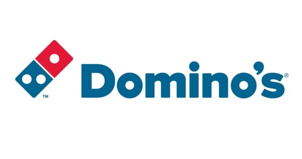
Domino’s brand logo is another powerful pairing of shape, color, and text. In particular, the modern font style goes perfectly with the playful domino symbol.
Tesla
![]()
Although it looks like the logo for a video game where angry robots fight each other with swords, Tesla’s unique combination logo is undeniably recognizable. The angular, jagged monogram logo combines emphatically with highly unique and stylized typography.
Salesforce
![]()
The cloud-based software company logo is a dynamic mix of font, color, and shape – a great example of how to combine multiple elements in an simple way.
Dropbox
![]()
Another combination mark logo that joins loose elements to create a flexible logo that’s instantly recognizable.
Sundance Film Festival
![]()
This is a conceptually brilliant logo and another from our best redesigns of 2023. Sundance’s cinema logo design relies on a tighter style, but this time with a simpler execution.
Badger Brewery
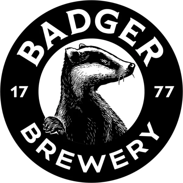
Designed by Robot Food in August 2023. The Badger Brewery logo is sharp, inviting, and beautifully produced combination logo design.
Mastercard
![]()
Mastercard has built so much brand equity in its logo design that it now uses the Mastercard circles in isolation.
However, the MasterCard combination logo was a great example of how to effectively pair shape, color, and text in an immediate and recognizable way.
Okta
![]()
The access management company Okta got a solid logo redesign and brand identity update in August, courtesy of Athletics (in collaboration with Okta’s own creatives).
The abstract logo icon is mysterious and reads like a cryptographic symbol. The font is more approachable and softens the security theme. Ultimately, both logo elements here complement each well.
How to design a combination logo: a quick 5-step guide
When you break it down, designing your own combination logo isn’t too tricky. But, there are some important design ideas to keep in mind when you’re going through the process.
Here’s a simple 5 step approach to creating a combination logo of your own:
1. Think of the layout


A good combination logo typically comes in one of three layouts:
- Stacked
- Horizontal
- Integrated (i.e. tight)
Generally, in a loose combination logo like Dropbox’s or Spotify’s, the logo icon is placed to the immediate left or immediately above the company name (though on occasion, designers break this template if they have a strong, conceptual reason to do so).
Layout is an important aspect of the visual hierarchy of your logo, which refers to where your eye is naturally drawn. Additionally, make sure your layout feels balanced.
Does one element draw focus too much? The immediacy of great logos is largely down to the balance of their visual elements.
2. Choose a font


If you take a look at our 2023 font trends, you’ll see the impact different fonts have on the feel of a logo. Choose a font that emphasizes core aspects of your brand identity, and the character you want to portray.
When choosing a font for your logo, think about the following:
- Is your font legible?
- Is your font too common? (conversely, is it too unique?)
- Is it suitable for your industry? Wacky fonts might work on a food truck, but they won’t fare too well for a tax consultancy.
3. Decide on a logo symbol


Your logo symbol is a microcosm of your brand identity, whether abstractly or concretely. Logo symbols can emphasize the qualities you want to stand out in your logo, or directly show something about the nature of your business.
When picking a logo symbol, consider the following:
- How literal or abstract do you want to get with your symbol? Is it something your target audience will immediately get, or will it grow on people as they interact with the rest of your brand?
- Does your logo symbol compliment your logo font properly?
- Would your logo symbol work well as a standalone–e.g. as a social media icon, or does it only work in combination with your text (there’s no wrong approach to this one.)
- Is your logo symbol a good reflection of who you are and what you believe in, and does it sit well within your broader brand identity?
4. Choose your brand colors


Colors play a huge part in the success or failure of a combination logo, and in logos more generally. The psychology of color can influence customers’ associations with a brand, so pick your colors carefully.
Different colors (like bright red) draw the eye much faster than others, so your balance of color can influence your visual hierarchy as a result.
When selecting your logo colors, keep in mind:
- Do your color choices work together?
- Do your logo’s colors help, or hinder, its visibility?
- Are your colors appropriate to the industry you’re in?
- Are there certain colors that create obvious associations that would elevate your logo?
- Does your logo even need color? Does adding color to either your logo symbol or font enhance the logo’s overall impact?
5. Test, and revise


All logos evolve over time. Every famous brand goes through numerous iterations of its logo, and you shouldn’t be afraid to either. Logo design involves a process of iteration, by bringing out the elements that work, and ditching the ones that don’t.
On top of this, the function your logo serves will likely change as your brand evolves or as your company shifts its focus. Don’t be afraid to switch things up as you learn!
Highlight your brand character with a combination logo design
Combination logos are a great way to tie a logo icon with your business name, and set the tone for how you want your business to be perceived. Here’s our list of do’s and don’ts for when designing your own combination logo!
- Do make sure your business name is clearly legible
- Don’t go overboard with design elements or color
- Do make your logo scalable
- Do keep things simple
- Don’t make your logo too similar or reminiscent of another famous logo
- Do think about how to meaningfully connect word and supporting imagery and graphic elements
- Don’t make a logo that you can only use in one context, that’s inflexible, or inaccessible
Ultimately, starting simple will help you think carefully about how to represent your brand with the least visual information necessary. If you’re ready to start designing your own combination logo, check out our logo maker!