4 Tips for Creating a Winning Custom Packaging Design

Custom packaging: two words that can spark both excitement and panic in new businesses.
As exciting a brand asset as your packaging is, designing it can be an intimidating process – but it doesn’t have to be. Depending on what you’re selling and where you’re selling it, your packaging needs will differ.
Think about it like a marriage between practicality and aesthetics. If you stray too far in one direction, the other will likely falter. The key is to find the right balance for your business and brand identity.
Where to begin? Check out these four tips for creating a winning custom packaging design.
1. Think about your packaging needs
Before you start picking out your Pantones, hold fire: First, you need to nail down what you’re aiming to accomplish with your product packaging design.
Whether you’re a brand that’s just launching, or one undergoing a refresh, this is the most important step in the design process. Custom-branded packaging is a method of transporting products, building a brand, and delivering on a marketing strategy, all rolled into one. Ask yourself the following questions:
What selling channels will I be using my packaging in?
Every selling channel has its own requirements, and this determines what your main priorities need to be when designing your custom packaging. Practical considerations, such as how protective your packaging is, outweigh aesthetics in some channels and vice versa in others.
If you’re an ecommerce merchant, for example, you need to factor shipping considerations (weight, distance, etc.) into your packaging design. Whatever design you choose, it needs to facilitate transporting your goods safely and efficiently.
Shipping is less of a concern for brick and mortar retailers, where the packaging is more about enhancing the appearance and aesthetic of products and the in-person shopping experience.
What kinds of products do you require packaging for?
You can’t start planning your design until you know what you’re using your packaging for! Your product range will dictate what packaging elements are the most suitable for your needs. For example, if you’re a coffee shop, you’ll be looking at packaging for coffee beans, beverages, and merchandise.

For large or fragile items, custom boxes or tubes with some internal filler are your best bet. But if you’re selling small or lightweight goods, such as jewelry or accessories, boxes are probably not the best option (unless it’s for wholesale orders). Mailer envelopes present a much more efficient and cost-effective alternative.
If you pair these packaging types with custom tissue paper for protection, you can still give customers a memorable brand experience.
What brand values do I want to communicate?
Your packaging is one of the biggest canvases you have available to you as a brand. For this reason, custom packaging involves more design considerations than you might think.
While you want it to be consistent with your other branding materials on elements like color palette and typeface, you also have a lot more room to get creative! Consider sitting down with a notepad and pen and asking yourself:
This will help you to zero in on those ingredients that make up your brand’s story and is essential to helping you choose a packaging design that maximizes its potential. Why? Because no matter how attractive your design might be, it still needs to be fit for purpose!
2. Choose your branding elements carefully
Custom packaging is a visual pitch to your customer to help foster brand recognition. For this reason, many brands make their logo the centerpiece of their packaging design.
But it’s by no means the only way of creating a unique design. Your design should aim to engage and delight your customer, so this means thinking a little outside of the box (pun intended!).
Aim for simplicity to stand out
Because you want to be noticed, it can be tempting to go for a design that has a lot going on. However, this can backfire; too much visual noise, and it’s difficult for your customer to take everything in.
When competing brands are trying to outdo each other in terms of colors or patterns, a pared-back design can actually make you more noticeable!
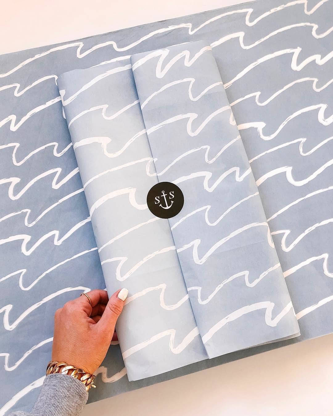
As a nautical-themed clothing brand, Shore Society has a lot of room to create a packaging design that’s on-brand without including their branding elements in an obvious way. They keep the design minimal by using a single color and hand-drawn lines to represent ocean waves, as well as the brand’s rustic and laidback feel.
Their custom sticker design uses another thematic visual element in the form of an anchor, with the two ‘S’ letters serving as an abbreviated monogram form of their brand name.
Variations on your brand elements and theme will keep your design fresh and unique. In your branding strategy, it’s easy to get stuck in a rut of using the same symbols for the sake of consistency. But changing this up a little ensures your brand stays dynamic as it grows and evolves.
Focus on what makes you different
Even though retail is a saturated sector, it’s important to remember that your brand is still unique. Why? Because the people behind it bring in their own experiences and skills that no one else has! Especially for those who run creative businesses, custom product packaging presents a fantastic opportunity.
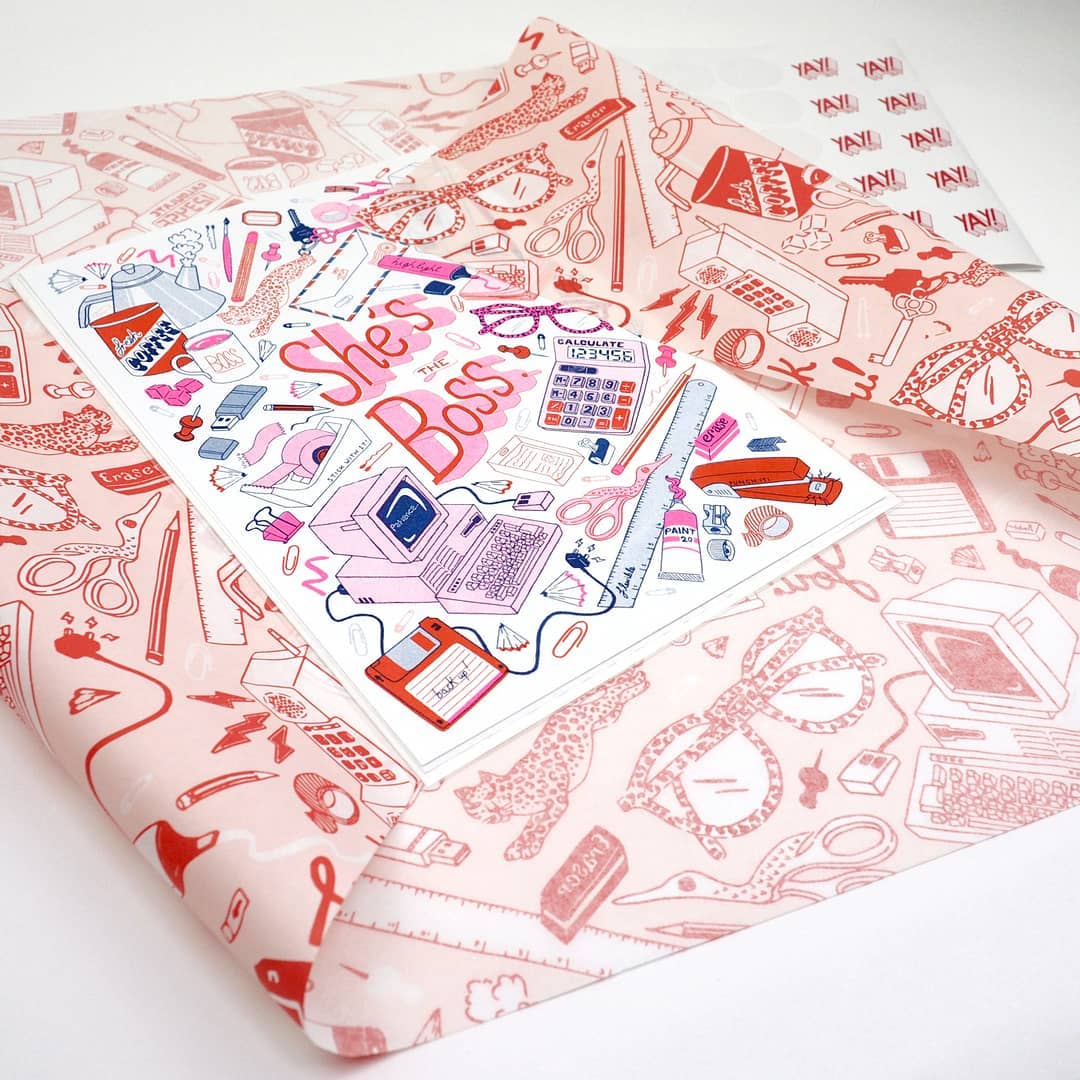
For artist and illustrator Jacqueline Colley, her packaging design is an extension of her own artwork. Because her designs are quite literally her brand, sticking with her signature style is bound to resonate with her customers. So, her packaging becomes a value-added extra.
If you have a focus in a specific industry or aesthetic, going thematic with your design imagery really sets you apart from the crowd.
Link back to your key selling channels
When designing your packaging, it’s important you consider the customer experience in the context of the buying phase they’re in.
Remember that they’ll have the most prolonged engagement with your packaging in the post-purchase period. The moment of anticipation as someone prepares to open their package is a great time to draw attention to important marketing channels.
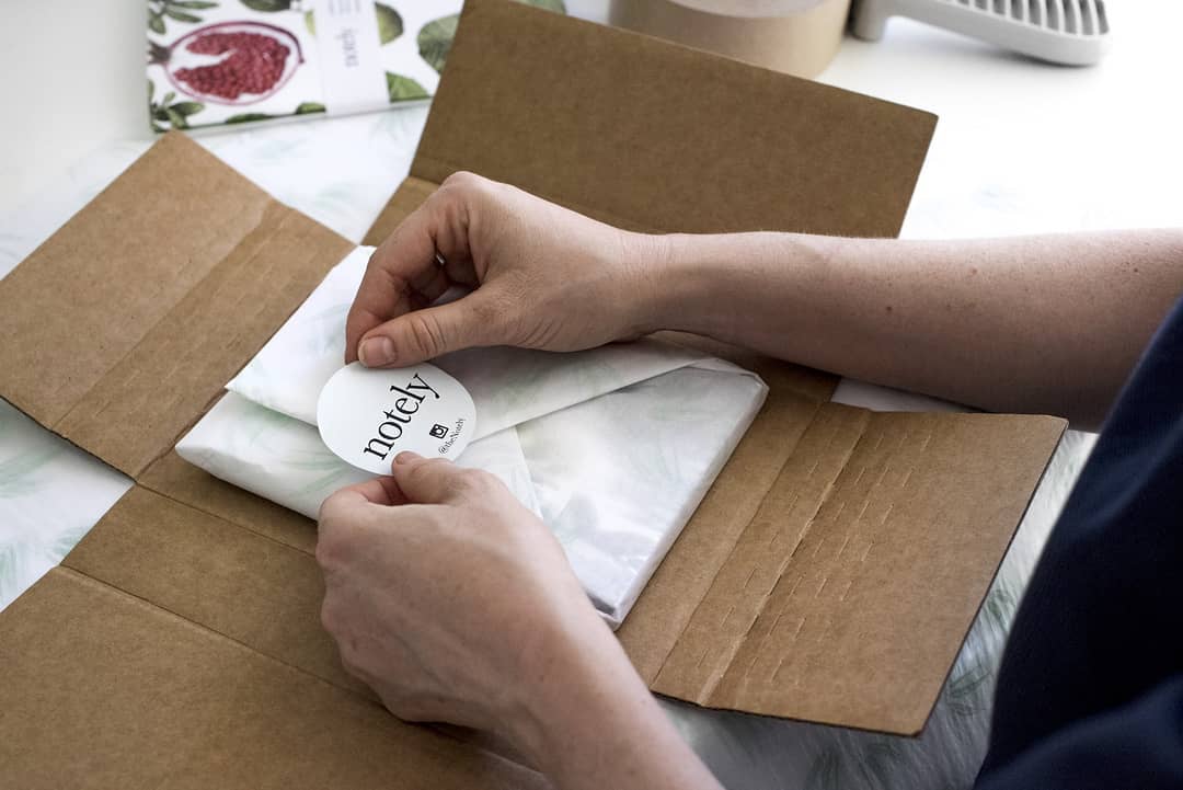
Stationery brand Notely deliberately keeps their packaging design simple, so their branded stickers with their name and Instagram handle take prominence. This is a smart post-purchase marketing strategy because they’re targeting the customer right when they’re feeling the most excited about the product and are likely to share it, increasing the odds of repeat purchases or word-of-mouth recommendations.
3. Consider how you can use your packaging design to tell a story
In the age of social media, packaging isn’t just packaging; it’s a storytelling device for your brand. Not all that long ago, your product packaging would only have been seen by your customer. Today, it has an audience of thousands.
On platforms like Instagram and Pinterest, a picture needs to say a lot to really gain traction. Our feeds are so crowded with brands that it often takes something out of the ordinary to grab our attention — and your packaging design is an excellent vehicle for some more imaginative content!
Try flat lay photography
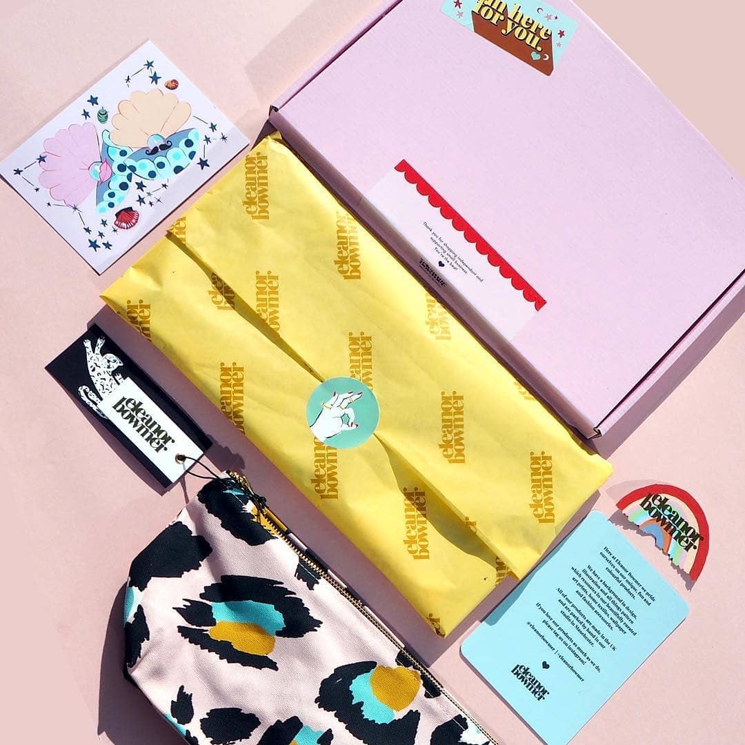
Flat lays, as seen below, are a fantastic way to showcase your products by theme or collection.
It’s also a much-used content style, which can make it difficult for your offerings to stand out. Regardless of what you sell, a flat lay photograph needs to tell a story about your brand to be effective.
Textiles designer Eleanor Bowmer uses her bright yellow custom tissue paper to create a strong focal point in her visual content. The inclusion of her packaging tells a story about how she puts together her customer orders.
Instead of only showing off her product range, this narrative is far more unique and engaging to an online audience.
Be quirky
Something that’s sure to get attention online is using your packaging in novel ways. When you can’t interact with customers in person, it can sometimes feel challenging to get the essence of your brand across. A bit of creativity goes a long way towards showing your audience what kind of brand you are.
In this Instagram post, Noodoll doesn’t use their packaging materials as packaging at all, but as blankets for their cuddly toys! It’s cute, clever, and most importantly injects some personality and humor into their feed.
4. Keep it green
When brands think about product packaging design, they usually jump straight to decisions about aesthetics. However, the sustainability of your design is just as important a consideration.
In 2019, nothing says “out of touch” like saddling your customer with packaging materials they can’t responsibly dispose of!
Last year, a social media campaign against Walker’s Crisps encouraged consumers to send their empty crisp packets (which aren’t recyclable or biodegradable) to the company’s headquarters in protest, which resulted in a pledge from the brand to make all their packaging plastic-free by 2025.
As we move into the future, more and more brands will be adopting green practices. Just take a look at design and illustration company Dear Prudence, which takes an eco-friendly approach to their product and packaging with reusable tissue paper.
The takeaway? Wasteful packaging shouldn’t be your customer’s problem. Consumers are increasingly conscious of their environmental footprint; they want to support brands who can help them in this area, not sabotage their efforts.
That said, sustainable packaging is intimidating to many businesses. Why? Because it gets confused with the idea of “zero waste” packaging. This simply isn’t realistic for a lot of brands, especially if they need to use more protective types of product packaging.
Instead, it’s far better to direct your efforts towards reducing the impact of your packaging design wherever possible, rather than not trying at all. Do the former, and your customer will definitely be grateful. Do the latter? Not so much!
Here are a few ways you can make your product packaging design more friendly to the planet:
Stay away from plastic where possible
From an ethical standpoint, plastic is very problematic: 91% of it never ends up being recycled. Contributing to the growing issue of plastic pollution is not a great look for your brand!
Instead, maximize the use of renewable alternatives. Here are some sustainable packaging examples:
- Paper
- Cardboard
- Corn starch
Use soy-based inks
Many factors influence the sustainability of your packaging, and the ink used for printing your design plays a big role. Traditional petroleum-based inks are harmful to the environment and can be expensive for custom designs.
Soy or other vegetable-based inks are totally renewable and cheaper in cost. They also produce more vibrant and longer-lasting colors!
Encourage reuse
Make a point of suggesting that customers reuse your packaging elements instead of throwing them away. For example, packaging your products in branded tote bags instead of soft plastic helps to reduce waste in the long run and gives your brand some free advertising.
In 2019, custom packaging gives your brand an edge in your marketing efforts by setting you apart in the eyes of your customers. But not all custom packaging is created alike!
The difference between good and bad packaging really comes down to how it supports your company. To create packaging that’s a real asset to your branding strategy, you need to give some serious thought to your needs, your brand story, and the materials you’re using.
Your brand identity is what makes you different from your competitors — if you can communicate this through custom packaging design, you have a winning recipe for making your mark as a merchant.
About the Author
This blog post was contributed by Beth Owens from noissue.


