6 Do’s and Don’ts of Using a Logo Slogan

If we asked you to close your eyes and list five slogans off the top of your head, you could likely do it in under a minute. You can probably even picture the exact branded logo slogan in the context of an ad, or product packaging.
This is the power of a good slogan. They’re short, catchy, simple yet descriptive, and thus, very memorable.
What is a slogan?
A slogan (otherwise known as a tagline, or strapline) is a catchphrase that communicates further information about your product, service, or brand. Slogans can either be clear representations of what you offer or used to evoke an emotion associated with your brand. For example, “Wedding Photographer” or “Just Do It”.
We see and hear slogans everywhere; in commercials, radio ads, packaging, digital ads, and sometimes in logos.
If you’re designing a logo for your business and trying to figure out whether or not to include a slogan, there are a few things to consider. More often than not, a logo slogan can detract from the logo itself unless it’s done right — that’s why we decided to write this blog!
Logo slogan do’s and don’ts
Below, we’ll go over the do’s and don’ts to keep in mind before you jump on the logo slogan bandwagon, along with some helpful examples.
1. Do: make your logo slogan descriptive or emotive
The best slogans either tell you a little bit more about the product or service being offered or make you feel something.
To answer these questions, you may want to take a step back and assess what distinguishes your brand from your competitors and others in similar markets.
If there is something distinctly unique or different about your product or service, you might want to use your slogan to call this out. If it’s your brand personality and values that distinguish you from others, you might want to go the emotive route.
Deciding this will help you pick the right words to use. You want to be careful not to be too descriptive. Logo slogans are meant to be a little mysterious and leave a person wanting more.
Take these examples:
Descriptive slogan examples
The Goldfish slogan “The Snack that Smiles Back” is both descriptive of the actual product, and emotive. The implication is a joyful snacking experience, where both snacker and snack are smiling.

Subway’s “Eat Fresh” slogan, while riddled with controversy, concisely describes the (questionably) healthy nature of subway sandwiches.

Emotive slogan examples
Adidas’s slogan, “Impossible is Nothing” evokes an emotional response of power and agency. The ability to overcome obstacles and face challenges is the message Adidas wants to associate with their brand.

The L’Oreal slogan, “Because You’re Worth It”, implies that purchasing their products and using makeup is a way of almost treating yourself. It plays off of a core psychological principle of needing to be “worthy” or “enough” to validate doing something.

In recent years, many companies have moved from clear, descriptive slogans to much more esoteric ones that incite a feeling. Take Fedex for example.

Fedex Slogan 1978-1983. Source: Forbes.com

Fedex Slogan from 2009-present. Source: leanagileguru.com
The newest FedEx slogan, “the world on time”, still communicates the sense of prompt delivery that its original slogan did without being overly wordy. Ideally, your logo slogan highlights a key benefit, while still leaving something to the imagination.
2. Don’t: make your logo slogan too long
Great logo slogans are usually short, (around 4 words or less), and attention-grabbing by way of humor or some other creative hook.
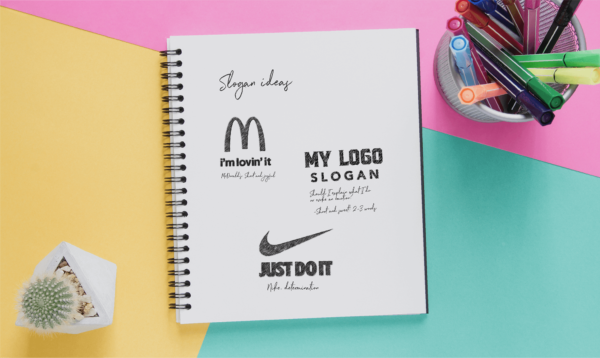
Nike and McDonald’s have two of the most memorable logo slogans out there.


It’s no coincidence that they’re three words in length. The fact is, these catchy slogans are short and therefore, easy to remember. They don’t necessarily tell you anything about what the company does, but they evoke strong feelings. In McDonald’s case, it’s a sense of ease and joy. In Nike’s case, it’s a sense of determination and action.
But there is another reason that these slogans are so memorable, one that is more practical. Shorter slogans are just plain easier to work with.
Three letters can easily fit underneath a logo without detracting from the logo design. From a design perspective, they can actually help to balance out the logo. Longer logo slogans can disbalance the design, and make the logo less impactful and harder to read.
If you’re thinking of using a logo slogan, try to come up with something simple and use as few words as possible. Avoid long words and cramming multiple ideas into one sentence. If you’re struggling to keep your slogan short, you should avoid including it in your logo — save it for other marketing materials!
3. Do: consider other places for your slogan
This leads us to an important consideration. If your logo slogan just isn’t working out, don’t worry! There are plenty of opportunities to use your slogan that aren’t directly in your logo.
Other worthwhile places to put your logo include:
- Website navigation bar, or footer
- Business cards
- Printed marketing materials like flyers, posters, and coupons
- Retail storefront
- Voicemail
- Company clothing
- Digital ads
- Company jingle
- Company promotional items like notebooks, pens, and water bottles
Your slogan might actually resonate better and have more of an impact if it’s placed somewhere other than in your logo.
Say you run a small restaurant or cafe, if your staff wore t-shirts or hats with your slogan on them, this would likely leave a stronger impression because your customers are interacting with them every day.

4. Do: be careful with font pairings
Choosing a font for your logo slogan is a critical step. You’ll want to make sure you’re using the right font pairings so you don’t overcomplicate the look of the logo. You don’t want to distract the eye away from your company name!
A couple of rules of thumb to keep in mind are:
- Keep your slogan font simple
- Avoid scripted fonts and stick with sans serifs or serif fonts instead
- Keep the same font family for both your company name and slogan, but reduce the weight of the slogan
All of these logo design rules help to communicate hierarchy, which in turn helps tell the eye what to look at first.
5. Don’t: have a slogan just because
While the idea of a slogan seems nice, your slogan should serve a purpose. Maybe your brand name is a little vague and you want to clarify what you do. This is a solid reason to include a slogan in your logo.
Ideally, a slogan ages with a brand and doesn’t need to be changed for many years. For this reason, try not to contextualize it to any current news or trends. Be honest in how you’re representing your product or service in your slogan. If you’re not, you’ll likely end up having to change it.

Take Campbell’s Soup for example. In the ’80s, the soup company’s slogan “Soup is good food” was countered by the FDA since the soup contained way beyond the recommended daily sodium intake. As a response to this controversy, Campbell’s changed its slogan to, “Mmm! Mmm! Good!” to move the emphasis away from health, to taste.

In 2017, TD Bank changed its slogan from the longstanding “Banking can be this comfortable” to “Ready for you”. This move catered to the company’s evolving target market, from Baby Boomers to Millenials who care less about comfortable banking and more about convenience.
The move was also made to instill further confidence in their customer’s financial futures.
Many really successful and recognizable brands like Starbucks, Lululemon, and Zara have stayed clear of using logo slogans, and their logos still look great! If you don’t have a substantial need or reason for including a slogan in your logo, we recommend you avoid using one.
6. Keep it timeless
To avoid having to update your logo slogan after a few years, try to stick to simple language. Don’t use references from pop culture, or trending words or phrases, as these will quickly feel out of date.
Instead, aim to communicate your brand personality or product, or evoke an emotion you want related to your brand.
Does your logo really need a slogan?
Let’s recap – adding a slogan to your logo adds more information about your company and generates a feeling associated with your brand. However, logo slogans can also detract from the design of the logo overall if they are too long or complex. If you’re thinking of adding a slogan to your logo you should keep these points in mind:
- Your slogan should call out your main differentiator, whether your brand personality or your product/service offering
- Logo slogans are best kept short
- Consider placing your slogan somewhere other than your logo that might have a stronger impact
- Slogans should aim to be timeless
- Have a clear reason for including your slogan in your logo, if you don’t, avoid using one
Test your logo slogan using our logo maker!


