18 Famous Triangle Logos + Tips to Create Your Own
By Sarah Turner • 6 min read, Aug 22, 2023

Triangle logos tend to stand out in a crowd. Where circular logos signify unity, and square logos signify structure, triangles involve a more playful geometry that can make for a striking logo.
This blog will help you understand their meaning and provide examples of famous brands that use triangle logo designs. We’ve also provided some tips for you to consider before designing your own logo!
What do triangles mean?
In the real world, triangles are associated with stability. Think of bridges, fulcrums on seesaws, and steel trusses in industrial buildings— all stable structures thanks to the geometry of triangles.

Well-known brands like Chevron, Delta, and CAT use triangle shapes to display innovation, stability, and direction.
Triangles offer flexibility in design that other shapes don’t. By changing the orientation of a triangle, you get an entirely different look, feel, and meaning.
- Triangles pointed upwards often connect to masculinity and power.
- Inverted, a triangle connects with femininity and motion.
- Triangles have an element of mystery and intrigue, historically associated with groups like the Stonemasons, the Illuminati, and Celtic Druids.
Using triangles in logos
Triangles can be designed in diverse ways, and how you use them can significantly change how your audience perceives your logo. We’ve got some examples of famous triangle logos below that portray a wide range of emotions to help you create your own!
Edgy triangle logo design
The harsh lines and angles of a triangle lend themselves perfectly to more edgy brands. This style is more popular with alternative musicians, fashion, and sports brands.
Check out these edgy triangle logos:
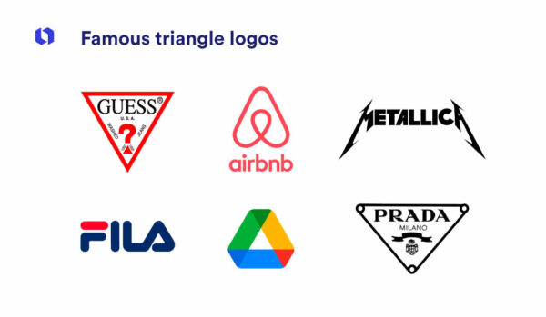
Guess
 The bold, sharp triangle shape of the Guess logo, combined with the bright red color makes a stand-out design that communicates strength and passion. We see triangles integrated throughout— from the outline and the dot of the question mark to the angle of the tagline. The logo speaks to Guess’s glamorous and free-spirited target audience.
Metallica
 Now, this is an edgy logo! Known for trashing guitars, harsh vocals, and gothic lyrics, Metallica is the epitome of counterculture. Their logo is a perfect example of incorporating triangles into wordmarks.
The acute angles and exaggerated corners portray the severe and unforgiving character reflected in Metallica’s music and brand. The triangular shapes on either end of the logo create symmetry and almost resemble the shape of electric guitars! The logo uses shapes to invoke the feeling of their music.
Palace Skateboards
 Palace Skateboard takes all associations of hard triangle logos and expertly mixes them with the bright playfulness of 90s pop culture. The design represents everything skating is — fun, technical, and challenging. The logo does this using an optical illusion to create a 3D triangle with the wordmark placed along each side.
Prada
![]()
The Prada logo is traditionally seen contained within a triangle. The inversion of the triangle shape creates a visual hierarchy that draws the viewer’s eye down the line. By following the natural direction of the shape, we learn new information in every line. From where Prada originates to the year of its founding and its crest.
Volcum
![]()
Volcum is a boardsport lifestyle brand. Known as the “Stone” the Volcum emblem uses black and white triangles to create a 2D effect, giving it depth and dimension like a real stone. The layering of triangles offset at different angles gives the logo an edgy appeal but is softened by the circular container.
Soft triangle logo design
Not all triangles have to have hard edges! Softer corners can drastically change the feel of a triangle. The stability of the shape is retained but with a friendlier and more welcoming vibe. This can make a brand seem more accessible and inclusive to all.
Here are just a few examples of famous triangle logos with a softer side.
Airbnb
 In our modern world, trusting someone enough to stay in their home is a big deal. It’s a stroke of marketing genius that the Airbnb logo is a soft triangle design. The shape retains feelings of strength and stability, but the rounded corners are much more welcoming. Airbnb Co-founder explained the symbol is meant to represent the feeling of ‘belonging’. The logo includes circular elements to generate a sense of community.
The symbol also resembles an “A” or even a house, which ties back into the brand name and mission!
Reebok
 In 2014, Reebok switched to a soft, segmented red triangle logo. The company had always reached professional athletes but wanted to shift to a more inclusive brand that targeted the general public. The curved edges and squared-off corners are a simple change, but the effect transformed the brand’s personality and relatability to buyers.
Spire Holistic Health
 Rounded triangles are a perfect choice for health companies; they’re trustworthy and welcoming. Spire is one of the many health companies that capitalize on this concept. Their triangle design with a circular bottom looks like a leaf – another powerful symbol in natural medicine.
Spire uses a green color scheme, closely associated with well-being, nature, and calm. Color makes a notable difference to the feel, so be sure to properly consider how the shades you choose affect your logo.
Ready to make your own triangle logo?
Citroën
![]()
The new Citroen logo marks the company’s shift towards electric vehicles. Hence the balance of herringbone arrows contained in an oval, balanced by a curvy sans serif font.
Citroën is renowned for its innovative approach to automobile design and engineering. The logo’s unique and unconventional design reflects the brand’s willingness to break away from traditional norms. The chevrons create a sense of dynamic movement, which aligns with Citroën’s reputation for cutting-edge technology and forward-thinking designs.
Logos with triangles as symbols
Many companies use objects that are already triangular – mountains, arrows, leaves, bridges, you name it – to help communicate the finer details of their brand personality.
Here are some triangle logos that are more than just geometric shapes.
Toblerone
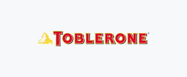 Toblerone, one of Switzerland’s greatest exports, is a chocolate giant – both in size and popularity.
The mountain in the logo is actually the Matterhorn, the most famous peak in Switzerland. There’s also a bear hidden in the symbol, which is the coat of arms for the city, Bern, where Toblerone originates. This logo may look simple at first glance, but it carries the story of its origins, making it visually impactful.
Google Drive
![]()
Notice how many triangles this incredibly smart logo contains? Each triangular side is a different color representing the suite of product offerings of Google Drive: blue for Docs, green is for Sheets, and yellow is for Slides.
The larger triangular symbol acts as a container for each smaller one, conveying a sense of security and safety of your data in an enclosed structure.
Google Play
 The Google Play logo is reminiscent of the play button on TV remotes, DVD Players, and Radios (remember them?). Google capitalized on that familiarity and added their own flare. It incorporates the company’s color scheme – green, blue, red, and yellow – while adding a slight gradient in each section for a more updated look.
Qantas
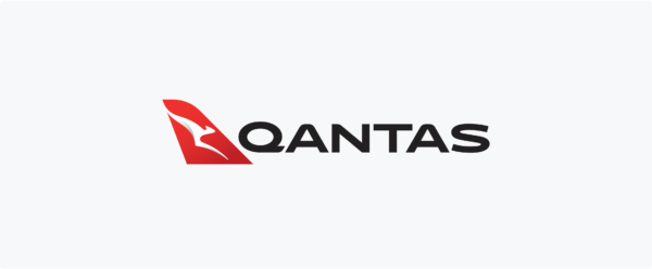 The real brilliance of the Qantas logo exists once you’ve taken a flight and realized the logo is an exact replica of the tail of all Qantas planes.
If – like most of us – you love traveling, then you’ll be familiar with that feeling of joy when you see your plane waiting at the gate. Replicating that image with their logo also replicates the same thrill you get the moment you see the plane. The triangle Qantas logo is yet another example of using shapes to invoke a feeling associated with the brand!
Logos with triangular fonts
Not every brand needs a symbol. In many cases, your brand name alone is strong enough to portray your message. This doesn’t mean you have to sacrifice the power of shapes; you can add triangular elements to your logo font!
CAT
 The CAT logo is an example of incorporating triangles into a font. The basic slab lettering is masterfully embellished with a simple yellow triangle. The company creates equipment for building sites and, since we already know how vital triangles are in architectural design, it’s the perfect choice of shape.
Plus, the color matches those used on hardhats and other construction clothing, so it’s familiar to those in the company’s target audience.
Machine Gun Kelly
 MGK is a rapper and musician known for his controversial lyrics and style. Although his logo is just his name, the addition of exaggerated points to all the corners harnesses the power of sharp triangles perfectly. While there’s no explicit triangular symbol, this adjustment to the font packs a punch. The bold color scheme – which is usually a variation of red, white, and black – only adds to the powerful and aggressive overall feel.
Fila
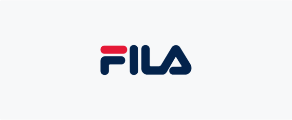 This Italian company originally made clothing for people in the Alps, hence the triangular “A” at the end of its logo. By turning the last letter into a shape, the logo’s meaning transforms into a subtle nod to its mountainous origins. It also grounds the wordmark and provides a sense of durability — something the brand clearly values considering it was founded in 1911!
HGTV
![]()
Home and Garden Television, famously known as HGTV, is well-loved for its garden and home improvement content.
The triangle atop the letters looks like a roof- a nice nod to the industry and audience they serve. It’s balanced by the inverted triangle of the “V” at the end of the logo. The use of a chunky sans serif font helps to give weight and stability to the logo.
RVCA
![]()
RVCA uses two triangles in its logo—one upright and one inverted representing the brand’s ethos “The Balance of Opposites”. The clothing apparel’s logo is minimalist, and geometric, appealing to its board-riding customer base in California.
Tips for creating a triangle logo
Now that you have a comprehensive understanding of the types of triangular logos out there, it’s time to consider your own design. Let’s recap what each type of triangular logo will mean for your company.
- Edgy triangles are harsh and often used by brands that are trying to establish themselves outside of the mainstream.
- Soft triangles are inclusive and welcoming. They’re great if you want to portray your trustworthiness while still being inviting and accessible.
- Triangles as symbols can deepen the message of your logo and give your customers extra information about your brand personality or history.
- Triangular fonts are a great way to add more dimension to a simple wordmark and provoke an emotional response.
Other elements worth considering include:
Filling in the triangle will make a loud statement, an outline works as a container to highlight the information inside of it.

Play with the placement of a triangle in your logo. Try above, behind or below your company name and see what works best!

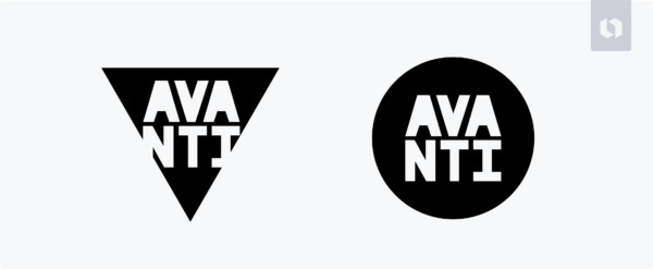
Is a triangle definitely the right shape? Consider how the logo would change if you used a circle or square instead.
And there you have it! Now you have all the tips and things to consider to design a standout triangle logo. Share your logo designs with us on social media by tagging @lookadesign and using the hashtag #lookadesign.