25 Font Pairs to Build Your Brand (+ Examples!)
By Kaejon • 8 min read, Jul 26, 2023

Combining different font pairs is like shopping for new clothes. Each piece has to complement the other, and the overall look must represent your style. You want to choose the best font combinations that visually represent your brand and your values.
For example, if you’re a financial services company, it wouldn’t be appropriate to choose a decorative font that suggests artsiness instead of security and trust. A tech company may steer clear of script fonts as they can be hard to read online.
So how do you choose the perfect font pairing for your business? How do you find free fonts that can communicate what you’re all about? We’ve got you covered below!
What is a font pair?
A font pair is a set of two complementary fonts that give you options when it comes to designing branded assets. This pairing provides go-to fonts to use for both heading copy (on websites, business cards, invoices, posters, and more) and body copy, which makes up the bulk of the content you’ll write.
Or, your logo may be a monogram that doesn’t include a font to work with. By having strategically chosen font pairings that work well together, you’ll be better able to achieve interest, readability, balance, visual hierarchy, and contrast in your branding.
What is visual hierarchy in typography?

Visual hierarchy is the arrangement of content to communicate information — it directs viewers to the most important information first, and then guides them through the rest of the content with visual cues. Visual hierarchy is achieved through fonts, colors, images, sizing, and more.
In font pairings where one font is more prominent than the other, people will be guided to look at the heading font first. It’s what you want your readers to see before they get into the rest of the content, so they know what that content is about.
For more guidance, we’ve included 25 of the best font pairings in different font styles. Let’s dive in!
Top 25 font pairs for a perfect match
From modern to script font pairs, we’ll cover all font styles below. We’ve also included free and accessible Google fonts for you to use!
Font pair #1: Montserrat Bold and Roboto Slab
Sans-serif fonts are excellent for general readability. They work well for both large and fine print, as well as in lower resolutions, which makes them perfect for digital uses like websites and ebooks.
Sans-serif fonts also bring strength, clarity, and a clean, modern look to any project. Thick sans-serifs can be tough and hard-working, while thin-line versions look glamorous and noble.

In the above pairing, we’ve chosen Montserrat in bold as the heading font — a clean, eye-pleasing sans-serif — and matched it with Roboto Slab in regular, which adds visual interest while remaining clear and readable.
You can see how well this pairing works on a business card, where the name is the most important element, followed by contact information.

Try different logo font pairs on Looka!
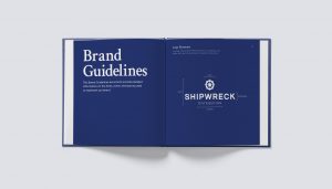
Font pair #2: Crimson Text and Montserrat
Serif fonts boast a classy, high-end, authoritative look. Think of Times New Roman, one of the most popular font choices around. Most newspapers use serif fonts, and they’re also popular in books, brochures, and fine print.
While they have more detail than sans-serif fonts, serif fonts are still ultra legible and our eyes are accustomed to their shape. As such, serif fonts can easily be paired with other serif fonts or sans-serif fonts. This is one of the best font combination for brands looking to create a clean, crisp, easy to digest image.

In the above pairing, we’ve chosen Crimson Text in semi-bold as the heading font, and Montserrat as the paragraph font to keep things clean and simple.
We’ve shown off the fonts in a brand guidelines book, where you can see visual hierarchy at play.
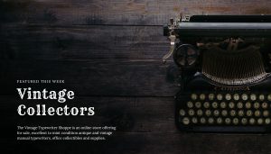
Font pair #3: Rye and Lora
Vintage logos have seen a surge in popularity in the past few years, with vintage-looking fonts also on the rise. These types of fonts work well for businesses like bespoke goods, craft stores, barbershops, and coffee shops, thanks to their detailed and nostalgic vibe.
Due to their intricacy, vintage fonts pair best with classic serif fonts to ensure readability while maintaining a consistent vintage look.
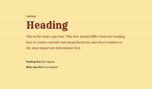
In this pairing, we’ve used Rye as the heading font and Lora as the body copy font. See how well this combination works on this website banner for vintage typewriters.
Font pair #4: Sacramento and Playfair Display
Handwritten and script fonts are elegant, creative, intuitive, and add tons of visual interest to branded applications. However, script fonts can be hard to read at a glance, which is why they’re best suited to headings and not body copy or long paragraphs.
Because of their decorative nature, script fonts pair well with serif or slab-serif fonts for an easy-to-read and unified look.
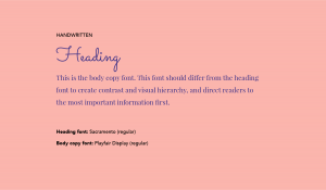
In the above pairing, we’ve chosen Sacramento, a quirky script font with a big personality, and paired it with Playfair Display in regular.
See this font combination in action on a restaurant menu that’s breezy and inviting while still being easy to read and navigate.

Font pair #5: Fira sans and Montserrat
Most modern fonts are sans-serif, lending to that clean and easy-to-read look that translates well across applications and screen sizes. It’s why most tech companies you see today use this style of font.
To keep things interesting when using two sans-serif fonts in a pair, use a bolder version of your chosen header font.
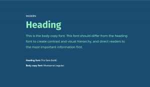
In the above example, we paired Fira Sans in bold as the heading and Montserrat as the body copy, which is super easy on the eyes.
You can see how this Monstserrat font pairing works in a social media card, where Montserrat is used in both italics and all caps.

Font pair #6: Arvo and Montserrat
Slab serif is a type of serif font that’s bolder and blockier than traditional serifs. It brings an old-school, nerdy charm to a project or brand, and harkens back to a typewriter font.
Because of their inherent boldness, slab fonts are good for logos and heading fonts. They can also be used for body copy, as we saw in a previous example, but this is a less frequent application.
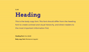
In the above example, we combined Arvo in bold as the heading font and Montserrat (again!) as the body copy font.
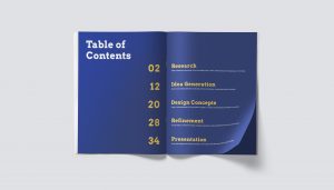
You can see how this pairing works in a book, as seen on this table of contents page.
Font pair #7: Arbutus and Montserrat
We classify “funky” fonts as bold, out-of-the-ordinary styles that add major visual impact. They usually evoke a particular feeling in a viewer due to their highly stylized look and pair well with clean, sans-serif fonts for balance and hierarchy.
While it can be tempting to go with a funky font, beware of using ones that are super trendy or that don’t match your brand personality. These types of fonts are never a good choice for body copy, so stick to using them in headers.
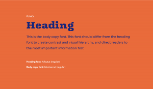
In the above example, we used Arbutus as the heading copy, an edgy font. To balance out the geometric forms of Arbutus, it’s paired with Montserrat (Montserrat font combines with everything!) in a regular cut.
See how this works on a website heading, where the button and “Featured Items” tag are in Montserrat, and the “This Week’s Arrivals” are in Arbutus.

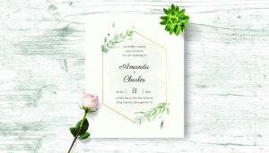
Font pair #8: Parisienne and Lora
Like handwritten fonts, calligraphic fonts are delicate, elegant, and a unique way to represent your brand when used correctly. They often bring a gentle, soothing vibe wherever they appear.
Because of their complexity, calligraphic fonts should only be used as heading fonts, as they’re tricky to read when put into longer paragraphs.

In the above example, we’ve used the sweeping Parisienne as our heading font, and paired it with Lora, an easy-to-read serif font.
See how well this works on a wedding invitation, where the bride and groom’s names act as the “heading” and the rest of the details are the body copy.
Modern font pairings
Futuristic, edgy, crisp, and oozing professionalism. Check out these modern font combinations!
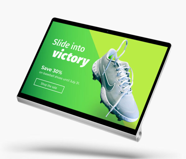
Font pair #9: Bungee and Open Sans
Bubbly fonts are fun, friendly, and statement-making. As we’ve pointed out with other highly stylized fonts, it’s best to use these types of fonts in headings only, as they’re too bold for body copy. Also, beware of styles that are too trendy, or that may look dated quickly.
Due to their “look at me” nature, bubbly fonts are best paired with a simple serif or sans-serif fonts so as not to overwhelm the reader.

In the above example, we’ve used Bungee in a bold cut as the heading and the simple Open Sans as the body copy.
Here’s how it might look on a social ad for an ecommerce website:

Font pair #10: Orbitron and Roboto Slab
Futuristic fonts evoke a particular feeling and often make people think of robots, computers, or space. With that in mind, be cautious when using this type of font as it will only work for a handful of brands.
Due to their shape and attention-grabbing qualities, futuristic fonts often pair well with slab-serif or serif fonts for a visually balanced look.
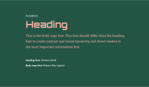
In the above example, we’ve paired Orbitron in a bold weigh with Roboto Slab in the body copy, a simple yet impactful font.
You can see how this font combination would look on a magazine page or a social media post for a technology brand.

Font pair #11: Playfair Display and Montserrat
Serif fonts are great for reading print, they’re a classic magazine heading typeface. They can elevate a message and convey a sense of elegance while still being authoritative.
These types of fonts pair well with a clean sans-serif font to draw attention to the heading and convey an overall look of elegance.
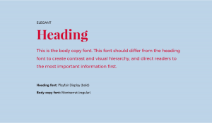
In the above example, we’ve used Playfair Display in a bold weight as the heading and Montserrat as the body copy font.
See how this looks on a simple wedding thank-you card, where the “Thank You” serves as the heading because it’s the first thing the sender wants the receiver to see.

Font pair #12: IvyMode and Century Gothic
Sometimes you need a font combination that’s worthy of the runway. If you own a brand in fashion, beauty, home design, or offer a professional service this font pair is for you.

If you’re looking for a Century Gothic font pairing, you might want to try something slim and sophisticated like IvyMode. Century Gothic is a round sans-serif loved by people in the design industry.
This font is versatile and goes well with almost anything. IvyMode is a stylized serif font with slender lines and bulbous loops. This font pair works well for web design, editorial magazines, and personal branding!

Font pair #13: Gotham and Open Sans

Gotham, a geometric sans-serif typeface, is universally appealing with its clean, strong lines. It’s paired with Open Sans, a humanist sans-serif known for its clarity and friendliness. This duo is versatile and highly legible, making it an excellent choice for a wide range of businesses.
It’s fitting for a tech startup’s logo, ad designs, or web design representing a blend of innovation and accessibility. This font combination could also work well within the healthcare industry, where clear communication is paramount.
Google font pairings
Need some accessible and free font pairs? Let’s get into some of the best google fonts!
Font pair #14: Poppins and Avenir
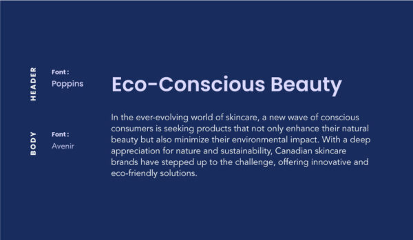
The Poppins and Avenir font pair is modern and sophisticated, balancing functionality and style. Poppins is geometric with round and spacious letterforms. Avenir, adds a humanist touch with its organic and dynamic strokes, creating a warm contrast to Poppins.
The Poppins and Avenir duo works well for logos in the technology or creative industry. Ideal for startups, design firms, or tech companies aiming to present an image of innovation and approachability.
Font pair #15: Bebas Neue and Nunito

The Bebas Neue and Nunito font pair is ideal for brand identities with a bold, contemporary look. With Bebas Neue’s tall, impactful characters and Nunito’s soft, rounded approach, this pairing suits tech companies, startups, or modern brands impeccably.
This blend of strength and gentleness can work well in logos and headers, making a memorable first impression. Geometric typefaces are great for legibility too!
Font pair #16: Oswald and Abel

Oswald, with its narrow and condensed letterforms, offers a modern and sleek aesthetic. Abel, a simple geometric typeface, complements it with clean lines and a neutral style. This font pair suits tech companies, digital agencies, or any business aiming for a minimalist, streamlined visual identity.
Its straightforward and contemporary look would also work well for logos requiring a compact, yet distinctive, typography.
Font pair #17: Garamond and Lato

Garamond, an elegant and timeless serif typeface, is often used for large text blocks due to its readability. Paired with Lato, a simple and clean sans-serif font, it creates a perfect balance between classic and contemporary.
This font pair would be ideal for businesses in the publishing or education sectors, and it could also work well for a minimalist and classy logo design. Check out an editorial example of a serif and sans serif font combination below!
Font pair #18: Proxima Nova and Helvetica

Proxima Nova and Helvetica, both round and narrow typefaces, offer a sleek, simple design that works well in a variety of contexts. Proxima Nova is known for its geometric aesthetics and versatility, while Helvetica stands out for its legibility and ubiquitous appeal.
This font pair works well for tech startups since they exude efficiency and innovation. Moreover, these fonts could be effectively used in creating logos for businesses in the finance industry, where clarity and professionalism are paramount.
Font pair #19: Bourbon and Sofia

Bourbon, exudes a sense of authority with its towering and bold characters. Paired with Sofia, a gentle and rounded sans-serif, the combination creates a balance of innovation and functionality. This font pair is an excellent choice for a sporting brand or a creative agency. It has a professional and stark vibe!
Script font pairings
Let’s get into some elegant fonts to add luxury and sophistication to designs.
Font pair #20: Pacifico and Verdana

Pacifico, a playful script font, brings a sense of fun and creativity. Verdana is a straightforward sans-serif, with clarity and readability. This font pairing would be perfect for a creative agency, restaurant, or an industry where whimsy and approachability is the goal.
Font pair #21: Futura and Caveat
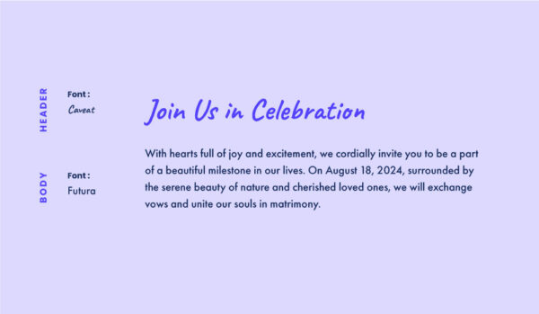
The clean and geometric lines of Futura provide a professional and contemporary feel. Caveat adds a touch of playfulness and creativity with its hand-lettered style.
This balance between formality and casual charm makes this font pairing appropriate for innovative, creative, or approachable design. This duo would be well-suited for the logo of a skincare brand, a catering business, or even a lifestyle blog.
Font pair #22: Raleway and Lobster

Raleway and Lobster make an interesting font combination. Raleway, with its elegant and refined shapes, provides a crisp, professional touch. Lobster is a retro font with a playful quality and brush script design.
This font pair is ideal for industries seeking a mix of professionalism and approachability. Think of speakeasy bars, artisanal bakeries, or boutique businesses. It’s also an appealing option for logos, particularly for brands with a sense of fun and creativity.
Font pair #23: Cerebri Sans and Satisfy

Cerebri Sans, a versatile sans-serif typeface, strikes a balance between function and form. It offers a sense of structure without losing its friendly character. Satisfy is a fluid, handwritten script font, bringing a touch of elegance and personalization.
This font pairing would work for a boutique brand, a personal blog, or an artisanal business. It conveys originality and warmth!
Font pair #24: Alice and Courgette
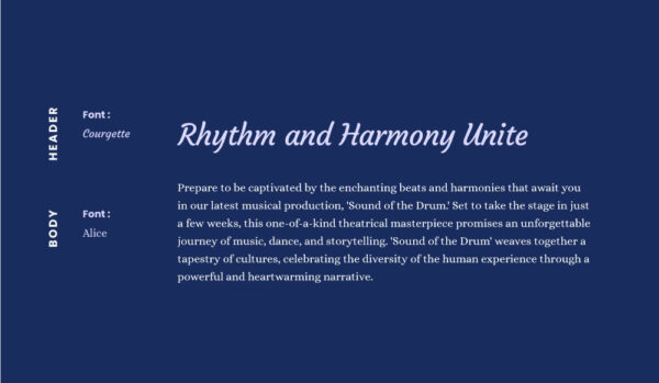
The Alice and Courgette font pair, suits designs that want to convey an atmosphere of elegance and luxury. This font combination is particularly ideal for the fashion industry, upscale boutiques, or event-planning businesses.
It could work for logos for high-end restaurants or hospitality services, creating a unique blend of handwritten and traditional aesthetics.
Font pair #25: Cooper BT and Roboto Mono

Cooper BT, a rounded serif, and Roboto Mono, a monospace sans-serif, create a retro font pairing. But from two different eras! The bubbly 70s vibe of Cooper BT is contrasted by the stark 90s look of Roboto Mono.
This combination would be well-suited for a business with disruptive and innovative values. but, with a huge dash of fun. This pairing works well in the thrift clothing or food and beverage industry. Especially for establishments aiming for a vintage yet contemporary aesthetic. It’s a blend of old and new!
What should I know about heading and body font pairs?
- Heading fonts should always use a more bold version of a particular font. For example, if you’re using Avenir as your heading font, you’ll want to use a bold version of Avenir versus a version that’s narrow or light.
- Body copy fonts can be in a regular cut of a chosen font. This is so as not to “yell” at the reader or cause confusion about what information is most important.
Do I need two fonts for my brand?
Nope, not always. Sometimes all you need is to use different versions or weights of one font family. Using Avenir as an example again, you could use a bold version of it for your heading copy and regular for your body copy. But sometimes the font used in your logo only has one weight, is custom, or doesn’t work well as heading or body copy. Which means a font pair is necessary!
Try different font pairs!
Font pairs can be unfamiliar territory for many new business owners, especially those without a design background.
But knowing what fonts will best communicate your brand and complement your logo means you’ll be ready for any marketing application — and you’ll make design decisions easier and be able to better explain your brand identity to anyone who works on your business.