Font Trends 2020: The 15 Best Fonts to Use This Year
2020 is going to be split right down the middle when it comes to font trends.
One one side, we’ll see the modern sans serif fonts that have dominated the digital space continue to flourish, and on the other, colorful and expressive ‘character’ fonts will become more popular with brands and designers alike.
Monotype, one of the most renowned typeface foundries in the world, summed it up in a recent ebook, 5 Type Trends for Brands in 2020:
Let’s take a look at the font trends that will define the next year, and learn from the best about how to choose fonts for your logo and brand identity as a whole. You’ll notice checkpoints along the way where we’ve demystified some of the font and design jargon you find out there. After this, you’ll be a design pro!
Geometric sans fonts
If the internet had its own handwriting, it would be a geometric sans. These are clean, utilitarian fonts that work well in both print and digital mediums, making them insanely popular with, well… pretty much everyone.
Here are a few of our favorite geometric sans fonts that will dominate font trends in 2020.
Helvetica Now
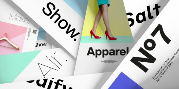
Helvetica is one of the most iconic fonts ever created. It’s a go-to for designers and brands around the world thanks to its simple, clean appearance, making it versatile across print and digital platforms.
Recently, the team over at the Monotype foundry released a revamp of the old classic, calling it Helvetica Now.
- What is a foundry? The name for a design studio that specializes in creating fonts. It refers to the original foundries that created solid metal and wood typefaces for letterpress printers back in the day. Pretty cool right!
Giving Max Miedinger and Eduard Hoffman’s original 1957 typeface a long-awaited facelift for the digital era, the Monotype team used dozens of creatives, using keywords like ‘clear, legible, modern, and geometric’ to inform their design process. To make for a truly flexible font, they also added tons of different weights in the process.
“Helvetica Now opens up new perspectives for design because it offers significantly expanded scope in terms of both functionality and form.”- Markus Hanzer, Designer
Untitled Sans
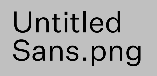
Inspired by Jasper Morrison and Naoto Fukasawa’s “Super Normal, Sensations of the Ordinary”, Untitled Sans is the ultimate normcore font. Unassuming, inconspicuous, and beautifully legible, Untitled Sans is favored with designers particularly for headlines and continuous reading.
Part of the beauty of Kris Sowersby’s 2017 cult font is that it doesn’t draw attention to itself. In an age of relentless information-stuffing, sometimes things need to be completely flat to serve their purpose. You wouldn’t want a one-lane highway to suddenly start ‘expressing itself’ with creative bends and potholes just as you overtake a semi. In the same way, Untitled Sans reminds us that things often work best when you don’t notice them.
Design your logo now!
Public Sans

A public font for public digital space. Public Sans was created in 2019 as part of the United States Web Design System 2.0—a set of coding and design guidelines that make it easier for government websites to make websites that follow similar structures and speak a common visual language. (Yes, the US government has its own font now.)
Public Sans, which is completely free and open-source, was modeled off Libre Franklin and comes with additional weights. It’s a bold, no-nonsense font, similar to Helvetica Now in that it contains no elaborate counters, terminals, or other unnecessary fanciness.
Expressive Sans Serifs
A ‘serif’ typeface has little tails at the end of each stroke. ‘Sans’ is french for ‘without’ – so a sans serif just means a font without those little tails. But sans serif doesn’t have to mean without character. 2020 font trends will see designers turn increasingly towards expressive sans fonts that add a little more flavor than their practical geometric forebears.
Goldplay

A soft, playful serif with a subtle edge. Based on the iconic Isidora Sans design, Latinotype designer Enrique Hernandex V softened up the terminals to create a more fun and friendly font, while retaining the bold headline quality of its predecessor.
- What is a font terminal? The end of a stroke on a letter, like the foot of a P, or the end of an L.
Designed in 2019, Goldplay comes in 2 versions, each with 7 different weights from Thin to Black (AKA not so thin), making it a great example of an expressive sans serif font created to suit multiple mediums, including logos.
Olivetta
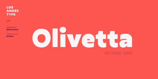
It’s a tradition of typeface designers to iterate on previous models, and Olivetta is no different. A powerful update of Antique Olive, Olivetta is a cheeky, retro statement font that includes a number of weights for different executions.
We particularly love the little counters in the “e” and “a”. There’s a cheeky, wink-like quality, which makes sense given that Olivetta was inspired by the ‘ironic’ typefaces of the last decade.
- What are font counters? Fully enclosed letter holes, like o, e and a.
Olivetta also hints at a resurgence in retro-inspired fonts, specifically adapted for digital display, which we think will become more popular this year.
Versus
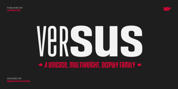
If you didn’t get the hint from the name, the style of this font alone might give away what inspired it. Fights. More specifically, Latin American wrestling and boxing.
Designed by Marce Moya Ochoa for Latinotype, there’s a dramatic, storyteller quality to this font that we love. According to the designer, the font best suits short and block text applications – like posters or billboards – thanks to its mix and match widths and weights. It also works great with logos, thanks to its stylistic alternates and original ligatures.
- What are font ligatures? Where two letters are joined up into a single glyph, like an ampersand (&).
Madera
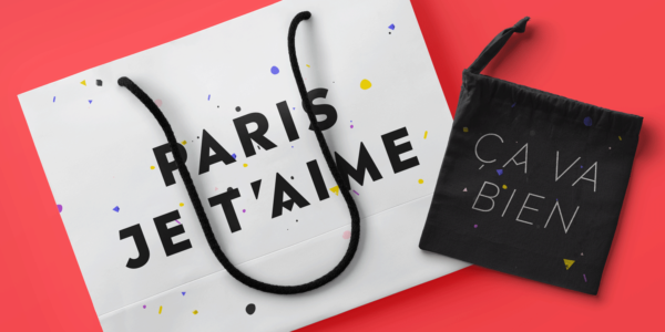
Madera was designed by Malou Verlomme in 2018 as a geometric sans with a little more originality and flavor. A real designer’s font, Madera works across both print and online, with sharp apexes and unique crossbar alternates that give it a powerful graphic feel.
- What is a typography apex? The point of a character where two strokes meet, like the tip of an A.
- What is a typography crossbar? The horizontal bar, or stroke, across the middle of uppercase A and H.
Madera is a great font for graphic posters, event swag, landing pages, and of course logos!
Sama Latin

All the way from India, Ektype foundry’s 2019 Sama Latin is a vibrant yet effortlessly cool font that could work well across multiple platforms. The rounded terminals complement crisp, cloud-like curves, giving Sama Latin a refreshing feel. (Does anyone else want a smoothie right now?)
Sama, which approximately means ‘natural ambiance’ in Hindi, is a vibe-setting, plump typeface with 6 weights, perfect for UX design and wider brand identity usage. Ektype are also worth checking out for their huge range of high-quality Indic scripts. Seriously cool!
Trust Sans

Empathetic. Contemporary. Versatile. No, this isn’t the sales copy for your new companion doll. These are the words that informed designer Antonio Mejía when he was creating Trust Sans.
Specifically designed for big corporates who need to appear less ‘Sans Trust’, this is a friendly, approachable font packed full of personality.
Increasingly, we’re seeing big business get friendlier, with fonts like Trust Sans leading the way for a more empathetic style of branding that will continue to flourish in 2020. A great example being Trade Me’s rebrand a couple of years ago:

Character Serifs
We’re calling it: these will be on top of the 2020 font trends. Foundries continue to craft versatile digital serifs, and brands continue to adopt them.
As companies like Mailchimp have shown, strong statement serifs with bold color palettes are becoming a huge trend for brand design. It’s only going to continue.
Mailchimp’s 2010 rebrand included a switch to Cooper Light, a move that was seen by many as the spearhead in a retro serif-digital fusion that continues to grow among brands.

Here are a few of the best character serif fonts to watch out for in 2020.
Jazmin

Inspired by Globe Gothic, Jazmin is another retro-revamp for the digital era. A subtle, knife-edge serif adds bite to a softer hippie undertone, giving Jazmin a truly unique feel. Suited for editorial headlines, short text, logos, and brand design, Jazmin is a hugely versatile font with 8 weights, plus a more playful counterpart.
Breton

Another great brand font for 2020, Breton is a geometric slab serif inspired by the city of Boston.
- What is a slab serif? A serif typeface characterized by thick, block-like serifs.
Designed in 2019 by Daniel Hernández and Rodrigo Fuenzalida, Breton juxtaposes wide rounded characters and skinny non-rounded characters, giving it a unique rhythm that’s hard to place (is it elegant? Retro? British-style?). Ultimately, Breton’s unique personality makes it perfect for editorial and logo design – but it might not work so well for continuous reading!
Recoleta

If Recoleta doesn’t make you immediately want to jump on your Vespa and grab a double espresso, then get outta here! Inspired by 1970s classic fonts like Cooper and Windsor, Jorge Cisterna’s Recoleta is a beautiful slab serif that effortlessly blends firmly planted serifs with expressively cool counters. It’s got a confidence that would be perfect for coffee shops, record stores, bars, and chocolatiers—to name just a few.
Financier Display
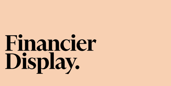
Financier’s aesthetic combines digital savvy with British heritage, building off Eric Gill’s original letterforms for Perpetua, a well-known serif. Originally drawn up for the rebrand of the Financial Times in 2014, Financier Display was created with both the broadsheet and the mobile screen in mind. Slick, authoritative serifs like this are a great choice for tech-driven brands and consultancies who are tired of the same old clean serifs that have dominated the last decade.
Take Beamery, for example, who uses a crisp serif on their talent platform.

Moranga
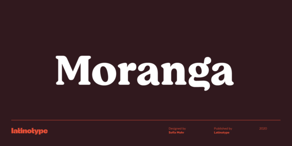
Released January 2020, Moranga is another stunning modern-retro typeface, reminiscent of Jazmin. Similarly 70s inspired, Moranga took design inspiration from Café Brasil’s funky, flowing letterforms, and Cooper’s weighty, retro feel. A perfect font for brand identities looking to add a friendly flavor to an undertone of cool.
Cookery

And finally, Cookery: a beautifully flowing, hand-drawn brush typeface with irregular baselines. Scripts like this are a really great way to add dynamism and enthusiasm to your logo, which is why you often see them used in vintage logos.
- What is a font baseline? The bottom line on which the letters sit.
Increasingly, brands looking for the human touch in the digital age are moving away from purely geometric sans fonts. If you really want to get personal, a hand-drawn script font like Cookery is a great way to showcase the dynamism and character of your brand.
While these font styles probably aren’t suited for continuous reading, pairing them with other fonts is a great way to give your brand a character boost.
Pick the best font for you!
Choosing the right font can be daunting, particularly when there’s so many to pick from. However, this process doesn’t have to be about following or bucking a trend at all. Trends are just a useful way to see what big brands are doing with fonts. When looking at font inspiration, ask yourself these questions:
- What kind of statement are they making with this font?
- What’s the nature of their work?
- How do you think the font correlates with their personality?
- How does the font work within their space, and make them unique at the same time?
When in doubt, go with your gut, and pick fonts that suit the character of your brand. If you’re designing a brand identity, a good rule of thumb is either pick one font for everything, one sans serif and one serif, but very rarely two serifs – since they compete for attention.
Overall, font trends are less like strict rules and more like informative guidelines. Your brand is about you, and your font choice can reflect that. Still, it will be interesting to see what road brands choose to go down this year. Keep your eyes peeled for those retro serifs!