Font Trends for 2021: The Top 15 Fonts of the Year
By Oliver • 6 min read, Jan 15, 2021
2021 is set to be an interesting year for font trends. We’re going to see an explosion of movement and character, juxtaposed with a growing need for certainty and solidity.
At one end of the spectrum, expect to see a lot of bold sans serifs, progressing through to more expressive sans serifs, as designers look to get away from purely functional font styles (though these won’t disappear altogether.)
We’re also going to see a development in the trend of character serif fonts, which we touched on in last year’s top fonts rundown.
So without further ado, let’s take a look at the best fonts to use for your logo or brand in 2021!
Geometric Sans Fonts
Geometric sans serifs are readable, reliable fonts that provide a balance of impact and readability. You’re going to see a lot of them this year, with businesses increasingly hoping to instill a feeling of safety, reassurance, and solidity.
From a design perspective, expect more emphasis on readability and clarity in these font styles, with solid weightings remaining popular as brands look to make clear, impactful statements.
Let’s take a look at some of the best!
Holgada
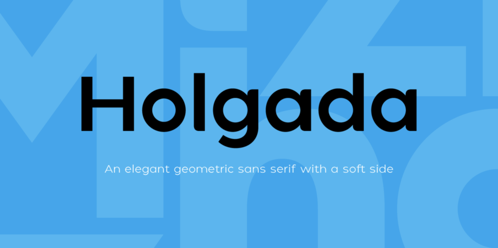
Holgada is a solid and clean geometric sans designed by Pablo Balcells’s foundry Graviton. With rounded terminals to give a softer edge, Holgada packs a punch but still feels friendly enough. A good logo font with multiple weightings, lots of versatility, and not too much craziness. Something we could all do without in 2021!
Adapta
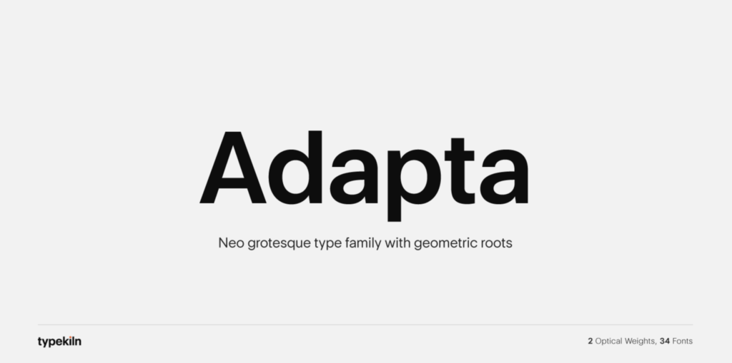
As the name suggests, Adapta is an adaptable typeface with 34 fonts, ranging from logo-ready display sizes to thinner text. Designed by Krishna Kireeti for Typekiln, Adapta supports 88 languages and comes with a whole range of alternates. It’s a beautifully warm and easygoing font that could be used for logos, print, and online text.
- What is a foundry? A foundry is a studio that creates fonts. The name comes from the old iron and wood letterpress factories of days gone by.
Albula Pro
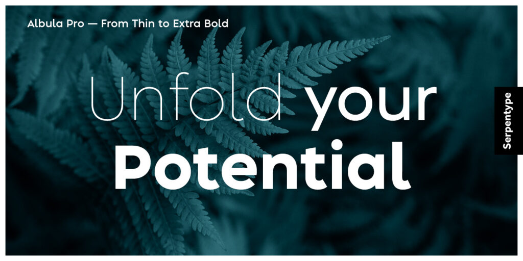
Albula Pro is a stunning geometric sans serif with sharp, confident lines and impeccable symmetry. It reads easily, makes a statement, and holds its weight. Derived from the stark geometric architecture of the Albula region of Switzerland, this bold sans serif is a great example of how you can use places and culture to inform your own design style.
Facundo
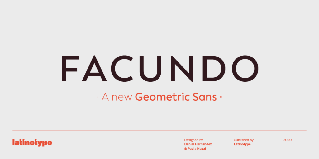
Facundo is a brand new Geometric sans from the legendary Latinotype foundry. While the font was informed by simple geometric shapes, its subtle alterations set it apart from other utilitarian sans serifs.
Magazine Grotesque

Another absolute SLAPPER from the team at Latinotype. According to its designers, Magazine Grotesque is for headlines and titles (meaning it’d be a great logo font.) Simple yet special, the font’s unique features – such as over-extended outstrokes on the ‘a’ and ‘e’ letterings – make this one of our hot picks for one of 2021’s most popular fonts.
- What’s the difference between a font and a typeface? A font is one version of a typeface, e.g. Narrow, or Extra Bold. A typeface, on the other hand, covers the entire family of fonts included under the same name, e.g. Helvetica.
Expressive Sans Serifs
Like their geometric counterparts, expressive sans serif fonts rely on bold, structured shapes for clear communication, but with that little bit extra. These sans serif fonts will offer brands a way to express the pent-up energies of last year while keeping things grounded in something solid and reliable.
Lufga
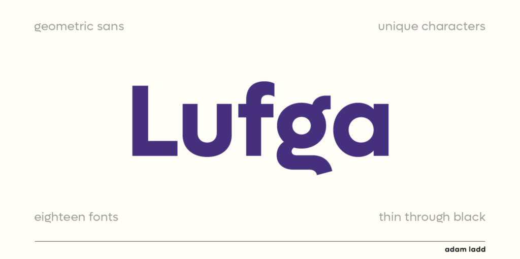
Lufga is a total babe of a font, and will likely be trending for most of 2021. Released last November by Adam Ladd, this is a fun and punchy typeface that’s going to feel most at home in outdoor and print executions, but could also work across your wider brand identity as well.
Design your logo now!
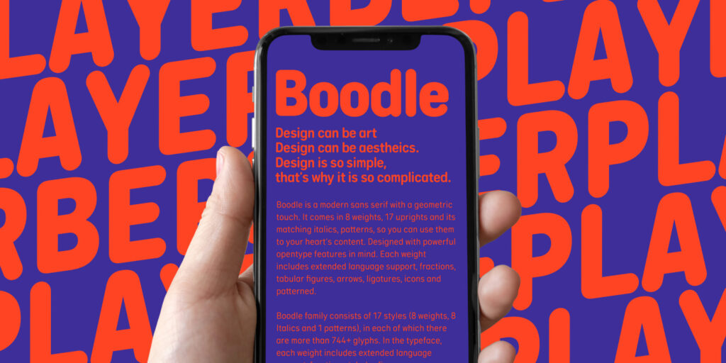
Boodle
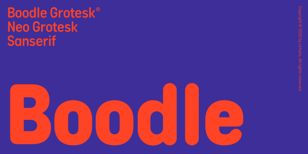
Like a grumpy dad in a funny hat, there’s something endearing about Boodle’s juxtaposition of silliness and seriousness. It’s a font made for a brand that wants to be formidable, without losing its human touch along the way.
- What is a sans serif? ‘Sans’ is french for ‘without’ – so a sans serif just means a font without a serif. What’s a serif you ask? It’s the little tail at the end of each letter stroke!
Cocogoose Pro

With a name like an off-brand jet ski, Cocogoose Pro is a playful editorial-style sans serif family that’s packed full of character. As comfortable in a magazine as it would be in a tech startup logo, this popular typeface got a total redesign in late 2020, with TONS of new weights and widths added for the modern era. Seriously worth checking out, this one!
Bauziet

Bauziet is kind of weird, but we like it. At first glance, this modern grotesque seems like many others, but a closer look reveals some intriguing design elements. In particular, we love how the use of negative space cuts up intersections between strokes, giving Bauziet a distinct visual rhythm.
Halenoir
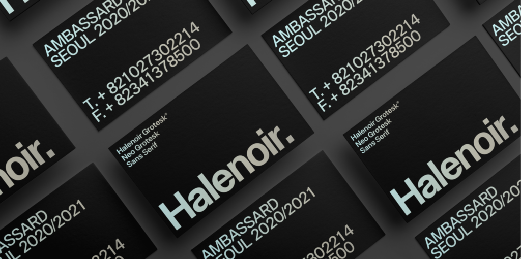
Halenoir is Bauziet’s subtler cousin. Using similarly distinct stroke intersections, the Halenoir lettering is both classy and potent. Released on December 12, 2020 by Ckhans fonts, this gorgeous sans serif looks great across all weight ranges and would work as a logo font, in headlines, or as long form text.
Character Serifs
It’s 2021, and there’s a new serif in town (LOL).
As we usher in a new digital Roaring Twenties, character serifs are becoming increasingly sophisticated and refined. With designers increasingly creating display-ready serifs, brands and startups are returning to these more sophisticated font styles.
Here are a few of our favorites so far!
Abstract
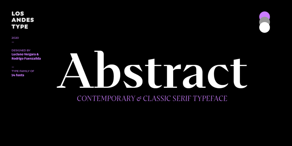
Contrary to what the name suggests, Abstract is a decisive and straightforward serif family that also reads beautifully. Both font cases have their own distinct values and would be well-suited to elegant logos or brand identities looking for a touch of quirky class.
Juana

Juana is a robust serif typeface with a broad visual range, giving us the vibe of a 1970s Santiago newsroom. Designed by Ely Hernandez for Latinotype, Juana is a perfect example of the new-retro trend that’s spreading throughout the design world right now.
TT Ramillas

Published by TypeType at the end of last year, Ramillas is a sturdy, dignified font system. According to its designers, the typeface is ‘a fully reconsidered high-contrast traditional serif…perfectly adapted to modern realities and requirements.’ (Be sure to take a look at the outline versions too – the lettering would be perfect for a sophisticated monogram logo!)
Quincy CF

Quincy is a serious serif with a fun side. Flowing legibility and stamp-like quality to its lettering make Quincy one of our favorite fonts of the year. Expect to see this one dominating websites, logos, and packaging in the months to come!
Temeraire

Quentin Schmerber’s Temeraire takes inspiration from gravestone artistry, as seen in its hand-cut lettering style. Showcasing a ‘conspicuous inconsistency’, this stoic, serious font becomes more playful – once you dive into its italics and alternate letters.
Pick a 2021 font that’s right for your brand
Picking a font isn’t necessarily about copying what the popular brands are doing. It really comes down to matching your design style to the vibe you want to give your customers.
For instance, if you’re an upbeat tech company, you might favor something bold, fresh, and immediate, like one of the great sans serifs we just looked at.
Alternatively, there might be an aspect of your company that calls for something more refined and elegant. A character serif font could be the perfect fit in this case!
Ultimately though, the fonts we’ve picked for you this year should cover most scenarios. When choosing your logo or primary brand fonts, have a think about the following:
- Who is my customer, and what’s important to them?
- How does my font choice relate to their experience?
- How does my font capture my brand’s personality?
- What colors would work in my font?
- How will my font work in the contexts it’ll be seen in?
As long as you feel comfortable that your logo or brand fonts suit the tone you want to convey, you’re good to go! See how easy our logo maker is by designing a logo using these top font trends!