Font Trends for 2022: Best 15 Fonts to Use This Year

In 2022, three different font design styles will trend. As designers aim for approachability and solidity in the present, they also look back with wonder to the past.
How does this play out in the most popular fonts of 2022?
On one hand, we’re going to see a movement towards more charismatic sans serifs, an evolution from the functional sans serif fonts we touched on in 2021’s most popular fonts post.
On the other hand, nostalgia reigns supreme, with display fonts that gravitate more towards design styles of times-gone-by.
Finally, humorist fonts will become more popular, with brands increasingly aiming to add a bit of levity to their identity, after a heavy couple of years for everyone.
Ready to take a look at the best fonts for your logo or brand in 2022? Here we go!
(Check out 2023 Font Trends here!)
Charismatic sans serifs
Charismatic sans build off the sturdy, functional geometric sans serifs that were popular last year. From more functional, modern logo fonts like Axalp Grotesk and Actay, to more playful fonts like TT Arlen and Bradbury Five, these fonts represent a movement away from purely utilitarian styles to ones with more character.
Expect to see a lot of these sans serifs in 2022.
Axalp Grotesk (Jan 2022)
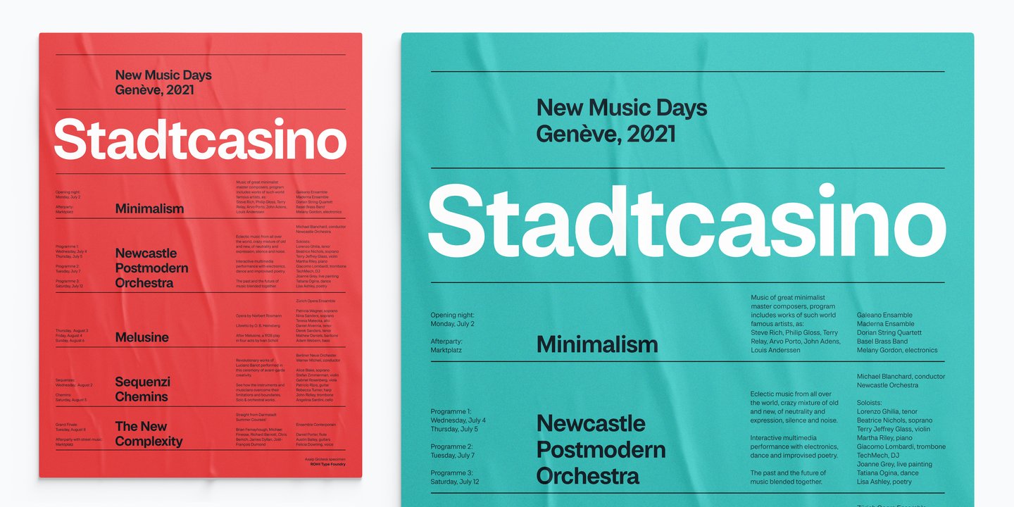
Axalp Grotesk, a ‘modernist charismatic sans’, is an impactful yet inventive geometric sans serif with multiple weights. We love this font for its versatility; it looks great in its boldest form or as a thin, all caps font. Designed by Roch Modrzejewski and published by ROHH in January 2022. Axalp’s clean, bold design would be great for tech logos, brand identities, and websites.
HD Colton (Feb 2022)

Bold, impactful, and flexible. Designed by Daniel Jones and published by the London-based HyperDeluxe in February 2022, this 90 style font family has weights suited for any medium, from apps to logos, and yes, even planes!
Shorai Sans Variable (Feb 2022)
Designed by Akira Kobayashi and Ryota Doi, and published by Monotype, Shorai Sans Variable is a great font for 2022. This font is a Japanese language-only font that balances the subtlety of traditional hand-drawn brushstrokes with clean, geometric outlines. An intellectual-looking sans serif, Shorai’s simplified letterforms and vast weight ranges give creatives a solid yet holistic brand typeface.
Rosales (Jan 2022)
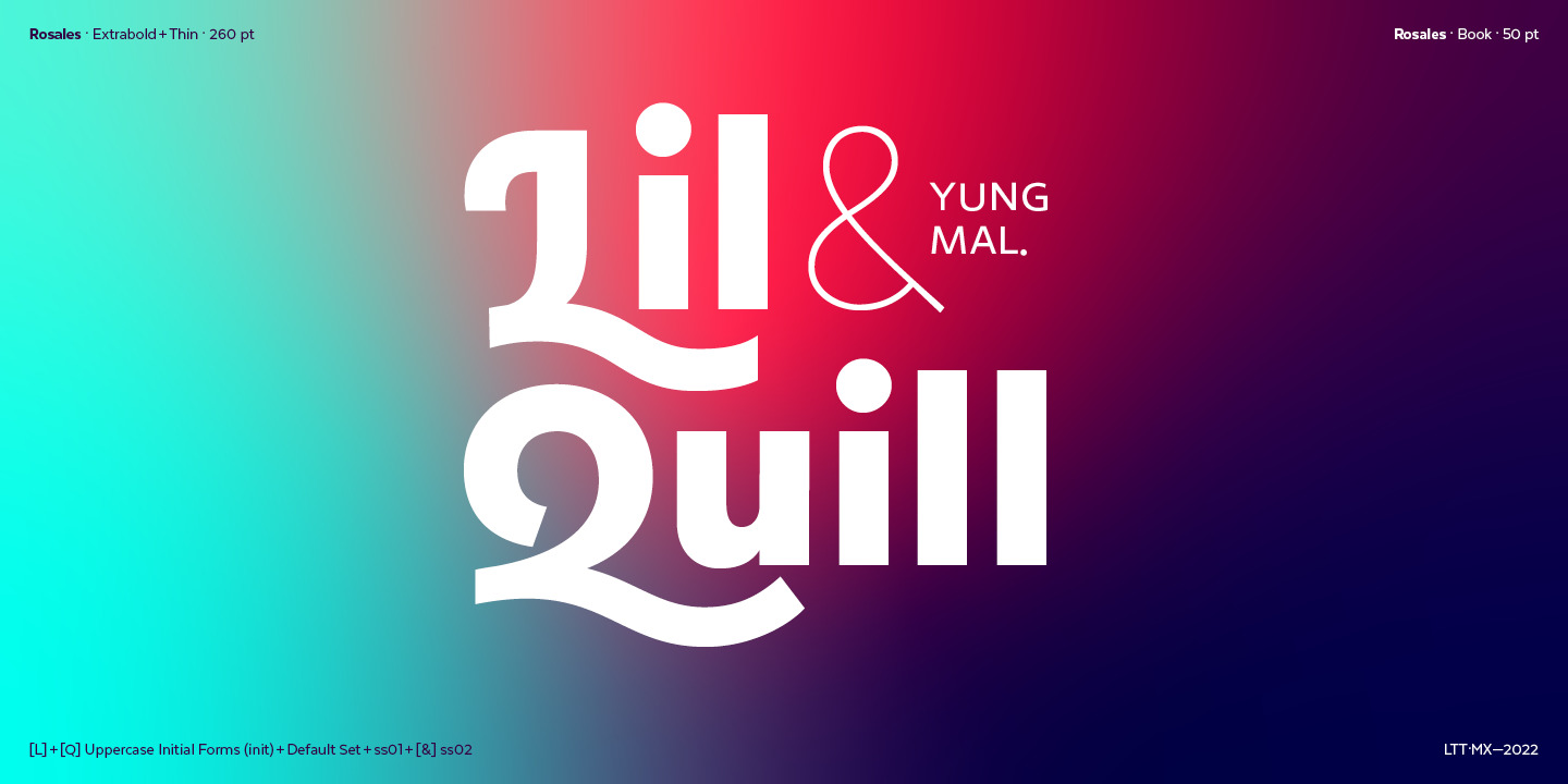
Rosales is a new addition to the Latinotype foundry’s long list of absolute slappers. Released at the beginning of the year and designed by Fernando Pérez, Rosales is a fun and approachable font family that still manages to take itself seriously.
Actay (Feb 2022)
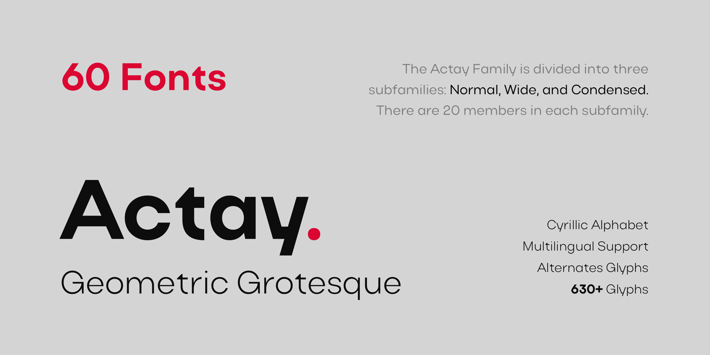
Actay was designed by Serdar Öztürk and published by Arodora agency. A beautiful font for logos, Actay includes unique letter shapes interspersed with more conventional forms, to give a well-rounded yet intriguing blend of novelty and pragmatism.
Experiment with font trends on Looka!
Nostalgic fonts
Nostalgic display fonts play off written mediums of the past, like newsprint, masonry, and hand-written lettering. After two years of uncertainty and likely more to come, font designs are going to mirror a prevailing sense of yearning for better times. Nostalgia refers to a longing for an idealized past: expect to see retro letterforms that give a sense of whimsy and the archaic throughout 2022.
Hernandez Bros (Jan 2022)

Hernandez Bros was named by its designers, brothers Daniel and Eli Hernández, for the Latinotype foundry. It’s already one of the most popular fonts available this year, and we can see why. With elegant strokes and beautifully subtle serifs, Hernandez Bros is both sharp and solid at once.
Avegra (Feb 2022)
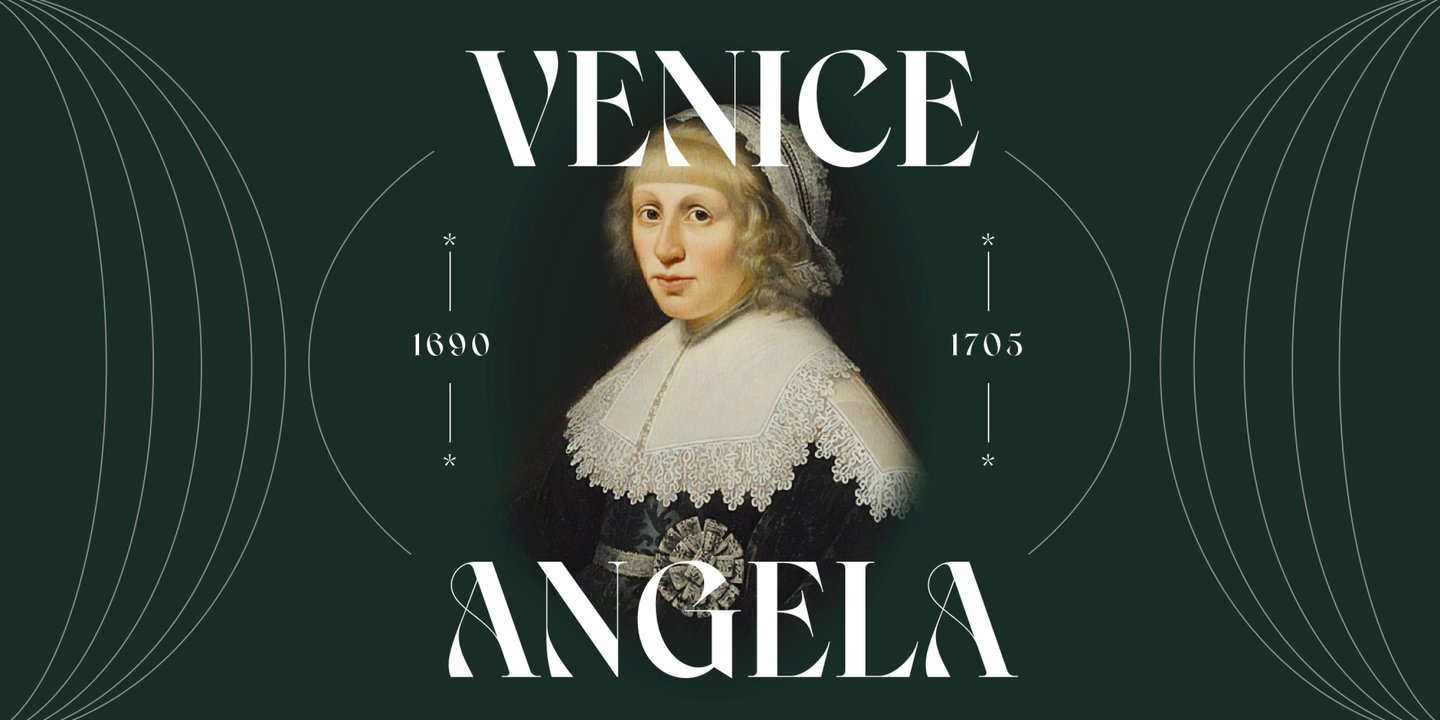
Created by Annas Alam Yahya in February 2022 for Letteralle Studio, Avegra is a stylish modern serif font family. With beautiful twisting terminals and extreme weight contrasts, Avegra has a flowing, masonry-like quality to it that oozes nostalgia and elegance. Ideal for editorial spreads, logos, and other larger display headlines.
Almoneda (Jan 2022)
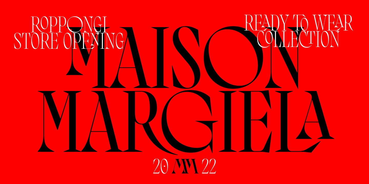
Almoneda is a sizzling Spanish display serif that comes in four weights. The bold and regular weights look beautiful as headlines, with a gothic, edgy attitude to them.
Designed with love by Alejandro Paul for Sudtipos foundry. Almoneda’s elegance lends itself well to print headlines and would be well suited to industries like hospitality, beauty, or for up-market restaurant logos.
Alokary (Feb 2022)
Already a top 20 trending font for 2022 (according to MyFonts), Alokary was designed by Putu Dody Permana and published by Hishand Studio. This boho-inspired sans serif combines strong vertical stems and unique weight contrasts, giving it a unique and whimsical feel.
Logos, social media posts, and brand identities would all be suitable applications for this new sans serif.
Meno Display (Feb 2022)

Meno Display was originally designed by Richard Lipton in 1994, as a modest but elegant workhorse serif. Earlier this year, a newly updated version of the font was released, including 78 styles in the family and a refreshed look and feel for digital devices.
A perfect font for high-end editorial typography applications, Meno is perfect for creating unique font pairings in your logo or brand.
Hastafi Pro (Feb 2022)

Designed and published by Måns Grebäck, Hastafi Pro is a bold serif font reminiscent of old Casablanca, with both European and North African influences. Combining bold thick weight with sleek, elegant lines, Hastafi combines character with grace. Go check out the designer who created this lovely font that’s trending in 2022!
Humorist display
After two years of uncertainty, the world needs a little lightness. Humorism is less of a specific design style, in that it’s not limited to either sans or sans serif fonts, and more of an approach to creating fonts that emphasize lightness, humor, and approachability.
Here are four of our favorites for 2022, two sans serifs (Bradbury Five and TT Arlen), and two serifs (Prody and Fromage).
Bradbury Five (Mar 2022)
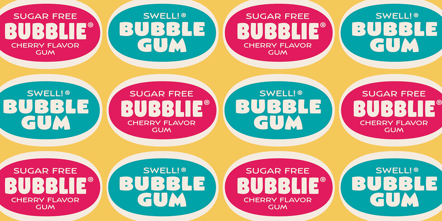
Created by Rian Hughes, Bradbury Five is available in 18 styles. Reminiscent of comic books and retro packaging, Bradbury Five is ideal for logos, headlines, and brand packaging. It looks great blown up and in full color, though it probably won’t suit digital platforms for longer sections of text.
TT Arlen (Feb 2022)
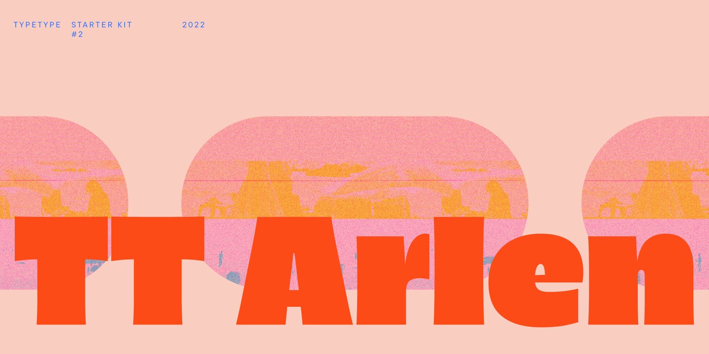
Funny and brash, TT Arlen is a great example of characterful humorist fonts that will cement their popularity throughout the rest of the year. Part geometric sans, part slab-style, this 2022 font was designed by Yulia Gonina and Eugene Tantsurin at TypeType, and would work beautifully for appropriate brand identities and some logo designs.
Prody (Jan 2022)
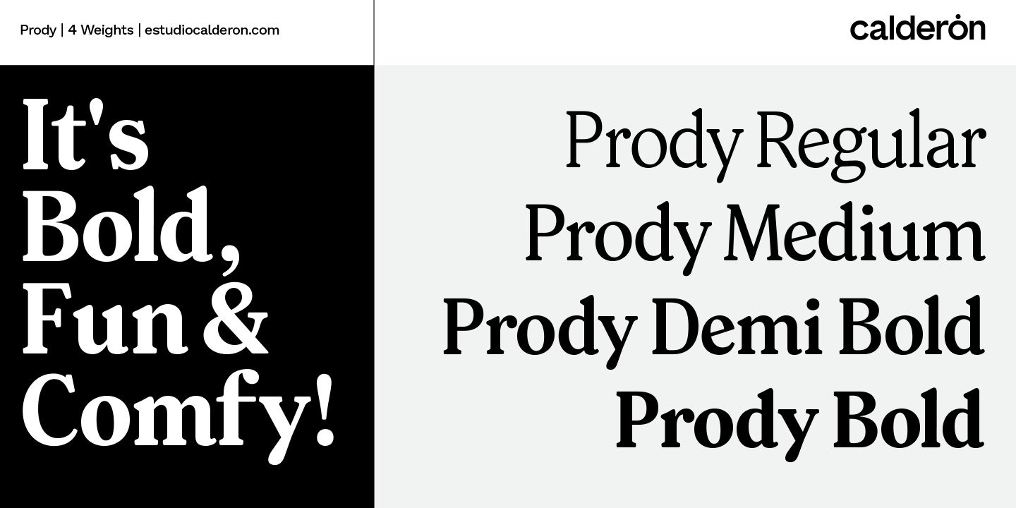
Designed by Felipe Calderón, the eponymous Estudio Calderon published this sophisticated serif font. It’s a beautiful take on a newsprint style font, yet one that doesn’t take itself too seriously. Prody works well both in print and digitally, making it a standout font trend in 2022.

For a great example application, check out Mailchimp’s brand identity, which uses a similar tongue-in-cheek style font. Prody’s flexibility makes it somewhat industry-agnostic. It would work beautifully as a headline text for business cards, for example!
Fromage (Feb 2022)

A fun sans serif with serif sensibilities. Try saying that while you’re drunk! Fromage, which is French for cheese, is neither cheesy nor French. Designed and released by Adam Ladd, Fromage is a classy and sophisticated font with sheared terminals and swirly bits. It’s already one of the trending new fonts of 2022! Go show the designer some love.
Choose a font to help your brand stand out in 2022
Choosing a font in 2022? Use these examples as a guide for your own logo or brand identity. Think about the kind of character you want to portray for your business, and select a font style that fits the criteria.
For example, nostalgic display fonts are elegant and sometimes otherworldly: these would be well suited to brands looking to accentuate a sense of difference or otherness. Beauty, health & wellness, hospitality, food and drink could be a good fit for some of these fonts.
On the other hand, charismatic sans serifs could be used for innovative tech companies looking to accentuate the future, rather than the past. On the more extreme end of the spectrum, with fonts like Bradbury Five, you could also use these to accentuate the fun aspects of your brand. Alternative fast food joints, clothing companies, or entertainment-aligned industries could sit well with fonts like these.
Things to ask yourself while you consider font trends
Overall, ask yourself how a font appeals to your customers and accentuates the right aspects of your brand. Think about how your customer or user will experience the font, by asking yourself the following:
- Who is the customer and what do they want and need?
- What aspects of the customer experience do they value most? Functionality? Tradition? Friendliness?
- How does the font you’re using capture the most important aspects of your brand?
- How does your graphic design approach, more generally, help accentuate the font you’ve chosen?
- What colors would suit the font style you choose?
- Does the font work across multiple mediums, e.g. mobile, PC, print, and social media.
Once you’ve got a rough idea of your answers to these questions, you’re ready to start building a great brand for yourself in 2022. Why not get started by exploring the huge range of font styles available in our logo maker? Keep these font trends in mind as you design!


