Designing the Perfect Food Delivery Logo + 15 Great Examples
By Nisha • 7 min read, May 7, 2020
If there’s one business that is thriving right now, it’s food delivery services. Entrepreneurs and service workers are bringing groceries, meal-kits, and cooked foods to doors around the world. If you’re thinking of starting a food delivery business, you’ll need a logo for people to instantly recognize your service!
Your logo needs to communicate what you do and the value you bring to your customers. Whether you own a restaurant and are looking to expand your delivery service, a small grocery store or food company and want to make food more accessible to people, or provide meal kits to busy but hungry families, we’ve got you covered!
15 examples of food delivery logos:
We’ve chosen a list of our favorite food delivery logos here for you to find inspiration. We’ll tell you what works and what doesn’t and include tips for you to consider when designing your own.
Pyszne.pl
Popular Polish food delivery service, Pyszne.pl, uses bright orange as its primary brand color to catch the eyes of hungry onlookers. A symbol using negative space to show a fork and knife inside a house communicates the obvious.

When designing your delivery company logo, consider using a symbol that clearly communicates what it is you offer.
Grocery Gateway
Grocery Gateway has been overwhelmed by demand from hungry Canadians trying to stay indoors. The logo uses a friendly-looking truck as well as its established date to communicate the type of service this company prides itself on. History and customer service are at the forefront of this logo.

If you’ve been in the food business for a while, you might want to include an established date to show your company is one that customers can count on.
Instacart
The grocery delivery giant pairs a simple carrot symbol with a playful sans-serif font to create a light-hearted feeling. The colors are vibrant, and the iconic carrot communicates a down-to-earth persona. The carrot is minimal and makes for an easily recognizable icon in social media profile photos, website favicon, email signatures, and other brand assets.

When designing your food delivery logo, consider where you’ll need to use it and how the symbol can be used as a standalone icon when your wordmark doesn’t fit.
Skip the Dishes
Skip the Dishes leans into a slightly tilted font to create a sense of motion in this logo. Arguably, the logo doesn’t need a symbol because the angled font does a great job on its own of communicating a sense of timeliness and urgency. The bright red and white color combination does a great job of catching the eye.

When designing your food delivery logo, consider how you can animate your font to communicate what you offer.
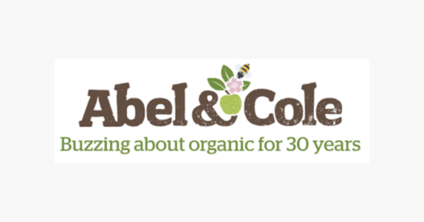
Abel & Cole
Popular British organic grocery delivery uses vintage style font and a small tableau of a bee pollinating a flower above a green apple to effortlessly create an earthy feeling. The included logo slogan helps to emphasize how long they’ve been in business to deliver a sense of care and trustworthiness. The logo uses a vintage color palette to pull its busy structure together.
Grubhub
The Grubhub logo is pretty simple. Bold sans-serif font using a red and white color combination (again!) calls attention from afar. The monogram works really well in print on branded materials.
![]()
Consider designing a monogram option for your logo to be used on other branded materials like packaging, receipts, flyers, and menus.
Postmates
This on-demand food delivery app probably has the most playful logo of all. A nod to the movie E.T, the Postmates logo depicts a cape-clad biker with stars trailing behind it. The unsung hero of overworked America gets full credit in this logo. Since the symbol is relatively complex, the color palette and font remain neutral so as not to overwhelm the eye.

If you plan to use a cheeky, more complex logo symbol, consider pairing it with minimal font and a neutral color palette.
FreshDirect
The FreshDirect logo uses a green and orange color combination, paired with a couple of leaves to create the image of a carrot. Carrot seem to be a favorite food delivery symbol among these brands! We love the color pair in one word. It creates some visual interest while maintaining a clean visual.

You can achieve this look in Looka by selecting the color pairs option under the “more ideas” tab.
Hello Fresh
We love everything about this logo! The chosen font pair, the bright green, and the lime symbol all combine perfectly to create a refreshing, exciting feeling. Precisely the way you’d feel after opening up a box of Hello Fresh ingredients. Green is a great color for food delivery logos. Often associated with wellness, green opens up the senses.
![]()
When choosing a color for your logo, consider how colors are associated with our emotions and how that will affect people’s perspective on your logo.
Riverford
We love the classy, vintage look of this logo. The hand-drawn feel creates the precise sensation you want from an organic farm delivery service. Small batch, locally sourced, sustainably handled—all by caring human hands. That’s what this logo communicates.

If sustainability or locally grown foods is your thing, opt for a logo design that presents a more human touch. If using Looka, use the handwritten font option, and look for illustrative symbols.
Chef’s Plate
In case you thought we were done with the red and white logos—here’s one more! Chef’s Plate uses a circular logo that acts almost like a stamp, or wax seal. The knife, albeit a bit aggressive, communicates a sense of professionalism in food crafting—perhaps alluding to the professional chef you’ll become using their meal kits?
Investigate different logo shapes and choose one that works best for your brand identity and needs.
Foodora
Foodora’s logo uses a tasteful nod at old-world butler service and hotel room service. This concept remixed through an app delivery service is a brilliant blend of old and new together. The logo symbol of a cloche communicates everything you need to know. We like the striking choice of fuchsia pink, a distinctly different color from the oranges, greens, and reds that dominate the food delivery industry.

When designing your logo, think back to food service traditions of days gone by. Look beyond your own culture and see if there’s a concept that fits. Don’t be afraid to pick a color that stands out from the rest, there’s nothing stopping you from using a bright neon pink if you want to!
Mindful Chef
UK’s highest-rated healthy meal-kit service uses a minimal script font for its logo. The boxes come tastefully decorated with a hand-painted design. The result is feeling you’ve been delivered artisan goods, curated just for you.

When designing your food delivery logo, start with the feeling you want people to have from using your service. Do you want them to feel calm, or energized? Inspired, or relieved? Your font, color, and layout choices will all be directed by the feeling you decide on.
Uber Eats
When Uber Eats announced it’s, stripped-down, new logo in 2017, it coincided with a peeled back app that removed unnecessary friction within the app. The minimalist design communicates the ease of use of the app itself, as well as the ease it brings to your own life. No more worrying about what to eat, or how to cook it. Just a few simple steps to have food delivered to your door.

If your food delivery service puts a focus on ease and reducing friction, perhaps a minimal logo design is a good option.
DoorDash
Inspired by the bullet train in Japan, the DoorDash symbol (which also functions as an abstract “D”) was chosen as a representation of a utilitarian and communal service. Beneficial to all. The idea of drawing inspiration from something outside of the food industry that still serves the same purpose of accessibility and convenience is a unique one.
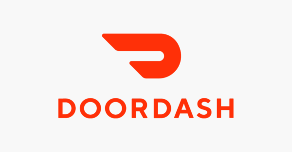
When designing your own food delivery logo, consider drawing inspiration from other services you’ve used, or experiences you’ve had that create the same impact your business will.
Tips for designing a food delivery logo
We’ve gone through a lot of information! To summarize, here are our top tips for designing a stand-out food delivery logo.
Choose your symbol wisely
Your symbol best communicates what your brand does and the value it brings. We’ve seen examples that emphasize different things—time, taste, history, customer service, etc.
If your focus is on efficiency, look for a symbol that includes a sense of motion, or time. To emphasize quality, find a symbol that looks timeless and communicates a sense of taste. If your offering something homecooked or farm-fresh, find a symbol that represents the personal touch of your service.
Let color provoke a feeling
Pick a simple, two-color combination that is memorable and striking. They need to be legible (avoid soft colors) and include contrast. In the examples above, we’ve seen red and white (ok, maybe too much of this), orange and green, and green and white. What are some color combinations that work for your brand identity?
Avoid layering light colors, or dark colors for legibility’s sake. Remember to opt for colors that deliver the feeling or emotion you want to incite in a potential customer.
Use fonts for personality
Remember that fonts convey a lot of personality. Don’t overlook the choice between a hand-scripted font vs a sans serif font. There is very little space to communicate a lot in a logo; each element matters! Use a serif font for a classy, traditional, professional look, a sans-serif for more modern, efficiency-oriented brands, and scripted or vintage style fonts for farm to table, organic delivery foods.