Gradient Logo Design: A Beginner’s Guide
By Cassandra • 5 min read, Apr 14, 2023
Instagram, General Motors, and Tinder…what do all of these brands have in common? A colorful gradient logo design! If you’re looking to design a logo that stands out from a sea of flat competitors, a gradient could be the right choice.
Gradients have made a comeback as a graphic design trend this year, with more and more companies using colorful gradient logos to resonate with their audience and make a lasting impression.
But when is a gradient logo appropriate? And which color combinations make a good gradient? We’ll cover everything from what a gradient is to how to make your own. All with fun gradient logo examples along the way!
What is a gradient?
Gradients (also called color ramps or color progressions) consist of a gradual blend of colors or shades. They can be a blend of analogous colors in the same shade OR a blend of a wide variety of colors. You can also use a gradient that fades from one color into transparency.
What is a gradient logo?
A gradient logo can take on a few different forms. Gradients can be used within a single element of a logo, the logo’s text, or even the background of a logo. There are a ton of ways logos and gradients can come together!
But, to have a true gradient effect, the colors need to bleed into each other — they can’t be stacked side by side. Without the gradual blend, you simply have a colorful design. Here’s an example of this:
![]()
There are six different types of gradients and the one you choose to use will ultimately come down to your logo design goals. Let’s walk through each:

Linear Gradients: Think of a smooth color transition in a straight line from one point to another. Linear gradients are versatile and easily adapt to various shapes, giving your logo and brand a modern touch.
![]() Radial Gradient: Picture colors radiating outward from a central point, creating a circular pattern. This type of gradient can be used to emphasize a specific area within your logo or add a sense of depth.
Radial Gradient: Picture colors radiating outward from a central point, creating a circular pattern. This type of gradient can be used to emphasize a specific area within your logo or add a sense of depth.
![]()
Conical Gradient: With colors transitioning around a center point, conical gradients create a three-part cone or spiral effect. This design adds movement and dynamism to your logo.
![]() Diamond Gradient: This diamond-shaped pattern will gradually fade from the primary color either diagonally or horizontally. Diamond gradients help convey a sense of luxury or sophistication.
Diamond Gradient: This diamond-shaped pattern will gradually fade from the primary color either diagonally or horizontally. Diamond gradients help convey a sense of luxury or sophistication.
![]() Reflected Gradient: Colors in this gradient transition symmetrically from the center point, creating a mirror-like effect. This design emphasizes symmetry in your logo.
Reflected Gradient: Colors in this gradient transition symmetrically from the center point, creating a mirror-like effect. This design emphasizes symmetry in your logo.
![]() Multi-Point Gradient: As the name suggests, this gradient involves multiple colors or transition points. Multi-point gradients can add depth and visual interest to your logo, but can also quickly become overwhelming.
Multi-Point Gradient: As the name suggests, this gradient involves multiple colors or transition points. Multi-point gradients can add depth and visual interest to your logo, but can also quickly become overwhelming.
![]() Each gradient type has a slightly nuanced way of blending different shades and colors together but they all produce a similar gradient effect.
Each gradient type has a slightly nuanced way of blending different shades and colors together but they all produce a similar gradient effect.
When to choose a gradient logo
Looking for a way to stand out from your competitors? A gradient may be the trick to getting noticed.
What is the difference between flat and gradient logos?
Gradients often give logos a 3D effect, which can make a flat design really pop off the screen. Take a look at the designs below — the one on the right has a flat graphic, while the other has a gradient effect applied.
![]()
However, we don’t recommend choosing a gradient logo solely because you want to stand out or because it’s trendy. It needs to fit your brand identity — and, more importantly, resonate with your target audience.
- For example, if you’re looking to create a logo for your boutique law firm, using a gradient probably won’t sit well with your clientele who are used to seeing traditional and plain law logos.
- If you’re making a logo for your online health and wellness blog, you’ll have more flexibility to play with fun styles and contrasting colors.
Is a gradient OK for a logo?
Gradient logos play with color transitions to create a more dynamic and visually engaging design.
Gradients are good for a logo if:
- You’re going to use your logo for (mostly) online purposes. Gradients are usually tricky to print because they consist of multiple colors. If your business is going to be marketing primarily through print materials like menus, business cards, signs, or car decals, then you should strongly consider using a flat (non-gradient) logo design.
- You’re in a more creative industry. If you’re a financial consultant or an ultra-minimalist furniture brand, a gradient isn’t your best bet. But if you’re in a more creative industry, it could be a good fit. Remember: Your logo should match your brand personality and target audience.
- Your logo includes a symbol or monogram. Using a gradient on the business name or slogan is rare because it’s important to keep logo text legible. Instead, gradients are usually applied to the symbol or monogram elements in a logo. If you want a wordmark (text-only) logo, a gradient design probably isn’t for you.
- Your logo design is simple. If you want your logo to have a container, slogan, or all of the above, adding a gradient will make the design too busy and hard to digest. But if your initial design is simple and minimalist, adding a gradient could work well.
Be careful when applying gradients. They can have a significant visual impact on a design, so it’s important to use them sparingly. Without constraints, your design can look intense real quick. We’ll go over some tips on that later.
![]()
Examples of gradient designs
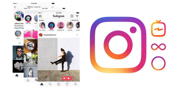
Logos with gradients have been increasingly popping up in the tech industry. App logos have to stand out on phones and other devices, and many incorporate gradients to help make the icon pop.
![]()
Aside from the famous logo examples above, there are tons of other cool logos with bold gradients to pull inspiration from! Search sites like Pinterest and Dribbble to see if you find anything that sparks your creativity.
As mentioned, it’s more common to use gradients on logo elements and symbols rather than the entire logo. This also lends well to app icons, like Instagram and its suite of tools.
The main reason to avoid gradients on text (or exercise caution) is for readability — your company name should always be super clear.
Design your gradient logo now!
Tips for designing your own gradient logo
So how do you make a logo gradient? Not all gradients are made equal or fit with every brand aesthetic, so think carefully before taking the leap.
Before you jump right in, let’s look at the dos and don’ts of creating a gradient logo.
1. Prioritize contrast
- Do: Consider contrast and accessibility when creating a gradient logo.
- Don’t: Use only your own judgment to check if it’s accessible or not. Ask a few friends or family members to see if it’s clear and legible to them!
2. Choose color carefully
- Do: Use a gradient if the logo color combinations are well-thought-out and aligned with your brand.
- Don’t: Use a gradient that looks like it was created without any thought.
3. Test it out in black and white backgrounds
- Do: Optimize your gradient design for print by ensuring it looks clear on multiple backgrounds and materials (having both a white and black version of your logo is highly recommended).
- Don’t: Overlook the importance of readability and print quality at different sizes when designing.
4. Keep it legible
- Do: Ensure punctuation and accent marks are legible when creating gradients. For example, does the dot over an “i” get lost in the background?
- Don’t: Create a gradient design that isn’t suited for the font and style of name.
5. Make it subtle
- Do: Create a solid (and simple) logo design first, then test how gradients look.
- Don’t: Add gradients to your logo that make it hard to read or difficult to reproduce. Subtlety is key!
How do you make a gradient logo?
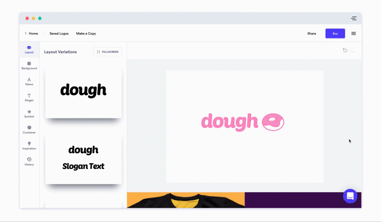
If you’re considering creating a gradient logo for your business, our logo maker is a great option!
You don’t need fancy design skills to try it, and it’s a great way to test and see if using a gradient design is what you want.
Here’s a quick step-by-step of how to create a gradient logo using Looka:
- Click the logo element you want to edit (either the slogan, symbol, or container).
- In the menu above your logo, select the circle on the far left to open up the Color Picker menu.
- At the bottom of the Color Picker menu, select the gradient of your choice.
- Test colors and styles of gradients to see if one works for your design!
When used well, adding gradients can be a great way to add personality to your logo design. At the very least, it’s an option to energize your branding and is easy to test out when designing a logo.
It’s important to note that adding a gradient to your logo doesn’t automatically make it cool and punchy — your design needs to look great both with and without color. Make sure to view it in black and white to test if the basic design works.
And while adding a gradient to your entire logo may be overdoing it, adding a gradient to only the symbol is the most common practice (and for a good reason).
The best way to go about creating your own gradient logo is to start with inspiration, and test out different colors and styles before committing to anything.
Most importantly, don’t forget to think about where you’ll be using your logo most, and if a gradient aligns with the future branding and marketing efforts of your business. Good luck!
Want to know more about color theory? Check out our video for some tips on how to choose the best colors for your logo!