The 6 Core Graphic Design Basics You Should Know
By Dawson • 6 min read, Jul 24, 2020
You know the old saying, right? “First impressions are lasting impressions.”
Think of graphic design as the face of your business. It’s the very first thing people see. If it’s aesthetically pleasing, it has the power to transform your business into a recognizable brand.
With good branding, your company will come across as professional and trustworthy. Strong graphic design encourages people to learn more about your products or services. Consistent graphic design throughout your brand will also help you stand out from your competitors and help your audience form a positive, lasting relationship with your business.
But good graphic design is a lot more than choosing pretty colors, fonts, and graphics and arranging them in a layout you like. As Picasso once said, “Learn the rules like a pro, so you can break them like an artist.”
Here are six graphic design basics that the professionals put into practice.
1. Balance
What it is: Balance is the visual weight distribution of graphic elements in a design layout.
Why it’s important: Every graphic element carries its own visual weight, whether it comes from size, texture, color, or contrast. To achieve balance, think of your design as one of those old fashioned scales. When you add a text block, shape, or image to one side of your design, make sure to balance it out on the other side with graphic elements of a similar mass. Otherwise, you’ll “tip the scales” and your design will look unstable.


The Starbucks logo and Chanel logo are classic examples of symmetrical balance in design. However, a composition doesn’t have to be symmetrical to have good balance. The North Face logo is a great example of an asymmetrical, yet well-balanced design. The bold, all-caps typeface carries a similar visual weight as the solid sloping shape beside it.
2. Alignment
What it is: A critical graphic design basic, alignment is the placement of graphic elements in a design and how they line up in relation to one another.
Why it’s important: A design with poor alignment is like a messy desk — it looks disheveled, disorderly, and nobody wants to look at it! Good alignment, on the other hand, “tidies up” a design by creating a crisp visual connection between all of your graphic elements. When objects in your composition are aligned with one another, they lead your eyes seamlessly from one part of the design to the next.
Good alignment shouldn’t call attention to itself, but poor alignment is hard to ignore. Think of a row of pictures on a wall and how obvious it is when one of them is even slightly crooked. Something just feels “off” about a design when the invisible lines between graphic elements don’t quite align like your eyes expect them to.
![]()
The 7-Eleven logo is a great example of good alignment. You’ll notice the word “Eleven” is the same length as the top bar of the number “7”.
3. Proximity
What it is: Proximity creates a relationship between the graphic elements in a design. These elements don’t need to be grouped together to be in proximity to one another. They just have to be visually connected in some way, whether in color, shape, size, font, etc.
Why it’s important: Proximity is a powerful graphic design tool because it plays into our perceptions. When we see graphic elements that are close together, whether in distance or appearance, we perceive them as related to one another. The more dissimilar they are, or the further they are apart, the less of a relationship they appear to have.
Because of this, blank areas are just as important to design as the areas that are filled in. This extra “breathing room” is referred to as negative space. Negative space strengthens groupings as effectively as it differentiates them from one another, creating focal points and highlighting the parts of the design you want to draw the most attention to.
![]()
A prime example of proximity can be found in the Unilever logo. The “U” is composed of 25 distinct symbols that represent the brand’s values. The negative space between each symbol sets them apart from one another as separate entities. At the same time, the negative space around the outer edges of the U shape links them all together as one group.
4. Repetition
What it is: Repetition is the use of a graphic element more than once in a design. Whether it’s font, shape, color, weight, or texture.
Why it’s important: Repetition is an often overlooked graphic design basic. Simply put, repetition “ties it all together”. Randomly chosen graphic elements can cause confusion. When you see graphic elements repeated throughout a design, however, it creates a feeling of cohesion. And, when you continue to see these same elements across different branding channels, brand identity is reinforced, which leads to brand recognition.
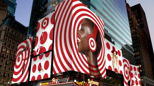
![]()
Think of the Target logo. The clever use of repetition through red and white circles extends into the department store’s branding as well. Each ad is unique, but anyone familiar with the brand will recognize it right away, even without the presence of a logo. Pretty smart, right?
Our brains are primed for pattern recognition, and repetition taps right into that.
5. Contrast
What it is: Contrast is the juxtaposition of two or more graphic elements with opposing qualities. While most people think of contrast as dark vs. light, it can also be thin vs. thick, bright vs. dull, big vs. small, geometric vs. organic, etc.
Why it’s important: Contrast creates the dynamism that makes a design appear to “pop-off” the page. It creates a visual hierarchy that brings key elements to the forefront while simultaneously receding the less important stuff into the background. Think about it: if all the text in a design was the same size, you’d have to skim through it all to figure out the main message — and nobody has time for that.
Contrast can be achieved through weight. Contrasting a larger, bolder font for the main message with a smaller, thinner one for the details separates information into bite-size, easily digestible pieces. Likewise, contrast can be achieved through color combinations. A white shape on a black background is a lot harder to ignore than a gray shape on a slightly grayer field.
![]()
The Marvel Studios logo brilliantly leverages contrast in both weight and color to draw attention to the name of the brand first. Contrast not only grabs your attention from the get-go, but it also guides your eyes straight to what’s important.
6. Hierarchy
What it is: Hierarchy directs the order in which we view the elements of design, from start to finish. The scale, color, or arrangement of graphic elements all determine a design’s visual hierarchy. For example, you’ll probably notice a bright red shape before you’ll notice a pencil-thin line. You’ll also notice an object higher up in a composition before you’ll notice one lower down.
Why it’s important: Visual hierarchy guides your audience through your entire message in an order that makes sense. A design without a clear hierarchy bombards viewers with too many messages at once, without giving them a sense of the whole picture. When you have many elements in a design, you want to make sure that the most significant message carries the most visual weight, and work your way down from there.
![]()
The American Petroleum Institute recently updated their logo using hierarchy as the guiding design principle. A central line divides the logo in half, while bold colors direct the eye to the logomark. We are then guided by lightweight, grey typography to understand the meaning of the API acronym. Within one second, your eye is taken on a journey to grasping the brand’s name and identity. This is all achieved through the use of visual hierarchy.
Time to apply these graphic design basics to your brand
Getting familiar with these graphic design basics will help you achieve a logo design that is both pleasing to the eye and memorable. Why not try out your newly learned design skills in Looka’s logo maker for free?