29 Graphic Design Terms for Non-Graphic Designers
By Dawson • 6 min read, Sep 26, 2022
When you throw yourself into the world of DIY graphic design, it can be tough to find your footing. So many graphic design terms are thrown out there by industry professionals expecting you to know them.
But while being an expert graphic designer is no easy feat, nailing down some graphic design basics is a great way to get started.
“What the heck does visual hierarchy mean, anyway?!”
Don’t worry, we’ll get into that — and many other graphic design words — below.
By learning these design terms, you’ll be on the right path to designing your own logo, marketing materials, website, and much more.
1. Typography
Typography is the arrangement of type, ideally in a visually appealing and legible format. It’s one of the most fundamental graphic design terms and is a broader descriptor for typographic elements like typefaces, fonts, hierarchy, and more.
Learning about typography is a great place to start your design journey, as it plays a vital role in any design it’s included in (and that’s most!).
And because many people confuse the two, or think they’re the same thing, here’s what the terms typeface and font actually mean:
- Typeface: a set of one or more fonts that are put in a single category, due to their shared common design features. Example: Avenir.
- Font: a specific typeface of a certain size and style. Fonts within a shared typeface will often differ in weight, slant, italicization, and more. Example: Avenir LT Std 35 Light.
2. Kerning, Leading, and Tracking
These are three graphic design terms that all refer to the space between type.
- Kerning is the spacing between two specific characters in your type
- Leading is the spacing between two lines of copy
- Tracking is the space between all letters
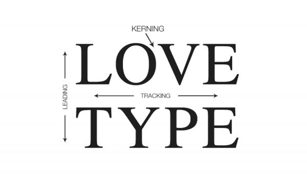
Image source: MGS
All of these elements play a big role in the legibility of your type, and can also be used to convey different emotions.
For example, text that has widespread tracking and leading can evoke feelings of calmness, whereas tight kerning and leading may cause feelings of tension.
When using tools like Photoshop and Illustrator to play around with the spacing between your type, make sure to keep the user experience in mind! It’s better to have text that can be easily read than text that’s overly “stylish.”
3. Serif Typeface
Serif typefaces contain small decorative strokes (also referred to as “feet”), which are at end of each line in the letters. Fonts of this style are often seen as classic, fancy, or professional. Many newspapers use serif typefaces, and they’re also popular in books, brochures, and fine print.

Some examples of this font type are Baskerville, Caslon, Didot, Bookman Old Style, and Times New Roman.
4. Sans-Serif Typeface
Sans-serif typefaces are the opposite of serif fonts: they contain no decorative strokes at the end of each line in the letters, making them appear more modern and simple.
They’re super readable in both large and fine print, which makes them ideal for use on any digital asset, from websites to ebooks.

Some examples of this font type are Avenir, Futura, Circular, Lucida Sans, and Helvetica.
5. Slab Typeface
Slab typefaces are a type of serif that has a thicker, more bold appearance. Because of this, they’re often only used as titles or headlines (or as a company name in a logo), and are rarely used as body text.
In the example below, only the company name is in a slab typeface, while the slogan is sans-serif, giving clear hierarchy.

Some examples of this font type are Clarendon, Black Slabbath, Sentinel, Rockwell, and Arvo.
6. Script Typeface
Script typefaces mimic handwriting, with decorative curls and twists. This style can add romanticism or elegance to a design. Because they can be harder to read at different sizes, script typefaces work best in headings or larger applications.

Some examples of this font type are Hickory Jack, Noelan, Beautiful Bloom, Dancing Script, and Sweet Mia.
7. Visual Hierarchy
Visual hierarchy is the arrangement of design elements to guide a viewer and help them decide what information is most important. It’s achieved through the use of fonts, colors, images, and sizing — such as a brighter, bigger, and bolder company name, with a lighter and smaller slogan underneath.
This is one of the most critical graphic design terms to understand, as it affects the overall user experience.
-

- Logo made in Looka
-

- Logo made in Looka
As you can see above, without the correct hierarchy, the logo on the right becomes unclear. If Terra is the name of the company, then it should be bigger, bolder, and draw the most attention.
Help your viewers out by using the correct hierarchy, and guiding their eyes to your company name or main message.
8. Orphan and Widow
Your eye might start to twitch when you see a text widow or orphan, without even knowing why. Orphans and widows are those lonely words left hanging by themselves at the top or bottom of a block of text. You’ll likely hear these graphic design terms come up around printing designs.
- Orphan: A is a single word (or short line) that is separated from the rest of the text. Often seen at the end of a paragraph, or the beginning of a column or a page.
- Widow: A line at the beginning or end of a paragraph that is separated from the rest of the text.

Image source: type-ed.com
9. Branding and Brand Identity
A brand is the overall essence of a company. It’s what makes your business unique, and stand out (or blend in) from your competitors. You can try your best to communicate exactly what you think your brand is, but in actuality, your brand is what your audience and customers say it is!
– Marty Neumeier
On the other hand, branding is what you actively present to the world. It’s your logo, tone, font choices, colors, messaging, ads, affiliations, and so much more! All of these elements are chosen to communicate in a specific way, and to target a specific demographic.
So, what can you do to help shape a brand identity through graphic design? Understand your customer/audience, and craft your visuals to appeal directly to them.

For example, if you’re a jewelry maker focusing on feminine bracelets and rings, then your brand should reflect this!
Once a company solidifies its brand, they’ll often create custom brand guidelines that help to keep their messaging, tone, and visuals consistent across all touchpoints.
10. Logotype
A logotype is a logo that uses only the brand’s name. Also known as a “wordmark” a logotype is a great option for brands that are looking for name recognition. Logotypes provide more space for information about a company, and can often allow for room a slogan.

11. Brandmark
Also known as the “logomark” this design term is actually the opposite of the one above. Brandmarks are logos conveyed exclusively through a symbol, emblem, or some kind of imagery. Brands typically transition their logos to brandmarks once they’ve gained recognition by the masses and can afford to remove their company name from their logo.


Nike evolved their logo to the “swoosh” symbol in 1995 after decades of building up brand recognition. As a small business, if you like the look of a brandmark, we recommend checking out emblem logos as an option.
12. Contrast
Contrast is the level of difference between two opposing elements. This commonly refers to the juxtaposition between dark vs. light in a photograph or image, but can also account for elements like rough vs. smooth, or thin vs. thick.
The more contrast, the more these elements become different. The less contrast there is, the more they blend together.
13. Negative Space
Negative space (also called “white space”) refers to any area of design that isn’t filled with visual content. The space doesn’t have to be the color white necessarily, but it’s the absence of design.
Designers sometimes use negative space to convey hidden messages or meanings or to tease the viewer into seeing various shapes, symbols, and letters in the white space used.

Check out the famous FedEx logo below, and how it uses negative space to form an arrow between the “E” and the “x”.
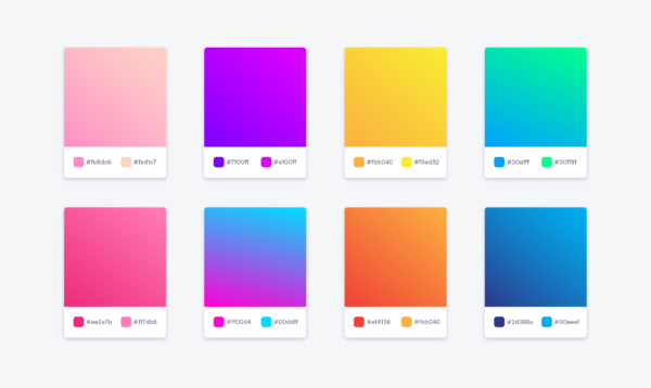
14. Palette
A color palette is a curated selection of colors that complement each other. Color palettes can be comprised of 3-6 colors, and range from neon to moody and fall-inspired.

In design, color palettes are used to represent different elements of your brand.
15. Hex
Hex codes are commonly used in design vocabulary. These codes (seen above) are six-digit codes used to display a color, often used in HTML and CSS.
16. Pantone

Image source: Pantone.com
Developed by the Pantone Corporation, the PMS (Pantone Matching System) is a standardized color system. You’ll hear the design term “Pantone” used in multiple industries beyond graphic design- including fashion and interior design. Overall, it makes it easy for people to find and recreate the same colors.
17. Monochrome
Monochrome is a graphic design term for a color scheme built out of only one color. For example, if you wanted to create a monochromatic image with the color green, you could use any shade of green, including dark and light tones, but nothing outside of this range.

When would you use this scheme? Whenever you want to evoke unity in a visual. Monochrome color palettes are actually a common practice in interior decorating!
18. Transparent Background
Transparent background refers to when graphics or logos have no background color — or really, no background at all.
These designs are often saved as a PNG file and can be placed over top of videos, ads, photos, and more — take this example of a logo being used on a black hat. (Note: When you purchase a Looka Premium or Enterprise package, you get versions of your logo on a transparent background).
19. Clear Space/Exclusion Zone
Clear space (or the exclusion zone) refers to the specific amount of space (or padding) that a logo must have on all sides. No matter where it’s used, there must be this set amount of space around it.
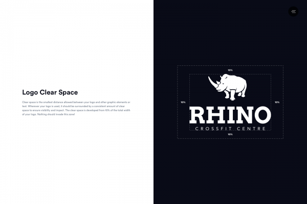
Why does this space exist? To ensure that a logo always looks great, and is clearly visible and not crowded by other elements. It’s usually specified in a brand guidelines document.
20. Gradient
A gradient is a gradual change in color, starting at one tone and morphing into another. You can also use a gradient that fades from one color into transparent, which is an effect often used as overlays on images and designs.
There are two common types of gradients:
- Linear gradients, where each color sits on opposite sides of the frame
- Radial gradients, where one color sits in the middle, and another at the edge
The Instagram logo redesign is a famous example of a gradient in logo design. Though it contains many colors, each color blends into the next gradually, giving this logo an almost retro/psychedelic feel.
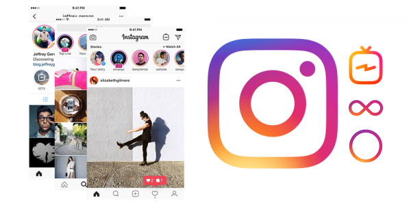
They then used this gradient design and color scheme and applied it across their other app designs: Instagram TV, Boomerang, Hyperlapse, and Layout.
21. Foil
Foil is the metallic look you’ll sometimes see in logos and business cards—gold foil, and silver foil being the most common. The use of foil in logo design is a bold choice that creates a dynamic and luxurious effect.
-

- Logo made in Looka
-

- Logo made in Looka
22. Opacity
Opacity is a regularly used design word that describes the level of transparency in a design. You can adjust the opacity to fade, blend, or brighten an element of your design!

23. Container
At Looka, we refer to the shape that contains your logo information as the “container”. Containers come in many shapes, from circle to square to triangle each with their own significance.

24. Aspect ratio
Aspect ratio describes the relationship between a shape’s (usually rectangular) width and height. Often when building or adding images to your website, you’ll see options like 1:1 (square) or 16:9 (wide). These ratios impact the depth and scale of how you’ll view an image.

Source: presentationpoint.com
1:1 images tend to be more tightly cropped and focus on one element in an image. Wider, more panoramic images will take on a larger ratio, 16:9 for example, and provide a wide-scale view of an image.
25. Alignment (Left, Right, Centre)
Alignment is a common graphic design term that refers to where you place images or text in a design so they line up. Proper alignment creates an order of information. Design elements are often aligned to the left, right, or center to create a sense of organization.
Proper alignment of the brand name, symbol, and slogan of the logo on the left creates an elegant flow of information. Whereas in the logo on the right, the eye is jostled around and the viewer is left a little confused about the placement of the cupcake.
26. Rule of thirds
This is a commonly referred to design and photography trick. Divide your design into three vertical columns, and three horizontal columns. Then place important elements along those lines, or where they intersect. Use the rule of thirds when designing social media graphics to create balanced designs that catch the eye.

27. Resolution
The term resolution describes the sharpness and clarity of an image. Digital resolution is often measured in pixels per inch (PPI). Typically, the higher the PPI, the clearer your image will be. In print, resolution is measured in dots per inch (DPI).
The logo on the right has a much lower resolution than the logo on the left. Notice how much duller it looks? You want your logo to have a high resolution so that it is crisp, eye-catching, and easy to read!
28. Grid
Graphic designers will often use a grid on their screens when designing brand materials to ensure the elements are straight, level, balanced, and aligned.

29. Bleed marks
A little gruesome, but this design term actually refers to the indicators placed around a design where a printer will cut. Bleed marks are typically used when the ink extends all the way to the edge of a design.

Remembering these graphic design terms
While reviewing these graphic design terms may seem overwhelming, it’s important to remember that they won’t all come up at once.
Whenever you’re taking steps to create a new piece of branding — from a logo to a poster to a website — and want to add a design element, ask yourself these three questions:
- How will this improve my design?
- Is it necessary?
- Does this appeal to my ideal customer?
Without constraints, it’s easy to lose sight of your original vision! That said, don’t be afraid to experiment, explore different variations of a design, and have fun.