How to Choose a Design Aesthetic for Your Brand (with Examples)

The aesthetic you create for your brand will come to define it. But what is a design aesthetic exactly? And how do you come up with one? With the help of a few well-known examples, we’ve laid out the core elements of a decent brand aesthetic, plus tips on how to create your own.
In this no-nonsense guide we’ll cover:
- Aesthetic principles in brand design
- Examples of popular design aesthetics
- How to develop an aesthetic for your own brand
Ready to learn the secret sauce? Let’s get started!
What is a design aesthetic in branding?

When we talk about aesthetics in brand design, we’re really describing a set of elements that help tell a story, from the font and color palette to specific design features. Similar to a historical aesthetic, like Art Deco or Gothic, a brand aesthetic follows a generally recognizable pattern.
Decent brand guidelines should articulate the elements that make up a design aesthetic. Generally, however, an aesthetic is something you just sort of know when you see it. It’s the look and feel of a brand when taken as a whole.
Aesthetic principles in brand design
In philosophy, the field of Aesthetics has to do with the nature of art and beauty. The roots of the word “aesthetic” have to do with perception by the senses. Aesthetic principles, therefore, are a set of rules that determine if a sensory experience is attractive to your audience.
But what does this mean in the context of your brand? It’s simple really: does it look, feel, and work in a way that attracts people and gives them a positive experience? In every field of design, from architecture to graphic design and UX, aesthetics is about communication.
Are you telling your story effectively? Do people experience your design in a way that’s effortless, immediate, and powerful? Yes, aesthetics are about how things look, but they’re also about how things work. Whether it’s a building, a brand identity, or a user interface, great design is all about reducing friction.
Popular design aesthetics in branding
Brands use a specific aesthetic because it signals a certain customer base or lifestyle they’d like to associate with. Often it can relate more to the vision and personality of the brand’s founders.
It’s worth pointing out that an aesthetic is not the same thing as a brand. In fact, brands often use more than one aesthetic for a particular product or campaign.
In the beginning, it helps to focus on one aesthetic that will become a kind of ‘baseline’ for your brand’s visual vocabulary. To help you get started, here are a few common design aesthetics and examples.
Baroque design aesthetic
Baroque comes from a movement in the arts and architecture of the early 1700s, characterized by elaborate design elements and exuberant details. Brands that rely on a baroque aesthetic include similarly lavish design elements such as rich color contrasts, elaborate patterns, and classic iconography (like the fleur de lis). The overall look and feel of a baroque aesthetic is attention-grabbing grandeur and expense.
Versace

Founded by legendary designer Gianni Versace in the late 1970s, Versace is renowned for its vivid baroque designs. Versace’s style was heavily influenced by the ancient greek architecture that once flourished in his birthplace, Reggio Calabria. The famous Medusa head logo, for example, reportedly comes from the floor design of local ruins that the Versace children played in. Ultimately, the baroque aesthetic permeates at every level of the Versace experience, from the logo to the website, advertising campaigns, and famous clothing collections.
Louis Vuitton

From clutch bags to…slightly bigger bags, Louis Vuitton’s aesthetic could be summarized as ‘laid-back baroque’. What makes the brand baroque? Repetitive motifs like the cross and flower are emblematic of the heraldry, masonry, furniture, and clothing of the Baroque era, which emphasizes ornate natural structures and repeating patterns. (Also, it’s mad expensive-looking yo!)
Retro
Retro is a broad aesthetic category that can refer to any design style from the 60s to the early 2000s. It’s often rich in pop culture references that echo the electronic media revolutions and culture of the postwar years. Typically, retro aesthetics are composed of expressive fonts, bold lines, and popular cultural tropes.
Air Jordan

Founded by the god of basketball himself, Michael Jordan’s Nike imprint has been dishing up retro classics for years. While the brand is innovative and forward-thinking in terms of both design and functionality, it’s also heavily synonymous with the retro aesthetic.
Coca-cola

Some brands are so enduring that they’ve become a staple part of the corpus of ‘retro’ iconography in their own right. Coca-cola is one of them. The brand has used the same logo font, in one shape or another, since the 1940s, and you’d be hard-pressed to find someone who doesn’t instinctively associate the classic red and white color palette with the Coca-Cola name.
Mailchimp

Mailchimp is a great example of a brand using a retro design aesthetic in a modern context. The color palette is an eclectic mix of pastel colors, which were common in the print-heavy branding of the pre-internet decades. The logo is reminiscent of old-school Americana, and the unique use of an expressive serif font sets the brand apart as a unique retro aesthetic.
Modern design aesthetic
Modern brands typically favor clean designs, simple color palettes, slick photography, and geometric sans serif fonts. Favored by technology companies and consultancies, the Modern design aesthetic emphasizes professionalism and clear communication through inconspicuous design.
Uber

Uber has one of the best brand identity systems out there. Every design element is justified by careful conceptual thinking and is beautifully executed. The aesthetic elements capture the brand spirit perfectly: reliable, useful, and personable.
Samsung

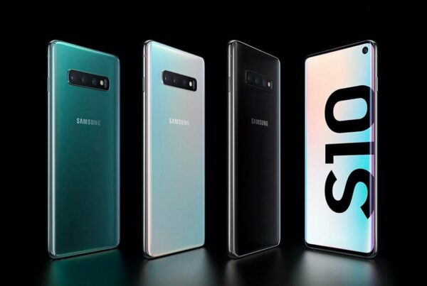
The Samsung brand relies on crisp, clean imagery, basic color systems, and simple geometric fonts to tell a story. Everything from their logo to commercials has an understated yet contemporary quality.
Rustic design aesthetic
Rustic branding emphasizes a connection with nature and country life and includes an array of natural forms, colors, and textures. Typically, rustic branding suggests down-home themes like community and tradition.
Herschel

The Herschel aesthetic has its roots in the prairies of Saskatchewan, Canada. Think big grain elevators, wheat fields, and easygoing country life (with a dash of wanderlust added). The most obvious rustic feature of the brand’s aesthetic is its logo, a vintage trademark now recognizable across the globe.
Original 16

The Original 16 beer company (O’16 for short) are another Saskatchewan brand who stay close to their roots. Using symbols like wheat sheafs and grains, plus muted, earthy colors, O’16 are a great example of how to use a rustic aesthetic effectively.
Luxury design aesthetic
While not as flashy as its Baroque cousin, the luxury design aesthetic denotes similarly sophisticated design with an expensive undertone. You’re most likely to find it wherever there’s a high price tag and an upmarket vibe. Fine dining, cosmetics, fashion, real estate, and hospitality are all common examples of industries that favor a luxury aesthetic.
Chanel

From bags and jewelry to perfume and cosmetics, the Chanel design aesthetic is classy, understated, and sophisticated. The website is worth checking out as an example of how luxury brands often use super-stripped back user interfaces that put their brand identity system in the background and flashy product experiences in the foreground.
The Playford Hotel

This Adelaide hotel combines art nouveau interior design styles with a modern-day upmarket feel, and has a great brand aesthetic to match. From their unique logo, which depicts the unique ironwork above the hotel doors, to the website, The Playford is a good example of how to use luxury branding in the hospitality sector.
Dom Perignon

The Mack Daddy of champagnes, Dom Perignon is the archetype of a luxury brand. Led by their iconic shield logo and liberal usage of gold, ‘the Dom’ has perhaps one of the most renowned luxury aesthetics out there. (They also tout Lenny Kravitz as a creative director, which is pretty cool).
Ready to design a logo that matches your brand aesthetic? Try Looka’s logo maker for free!
Utilitarian design aesthetic
Believe it or not, companies like Google, eBay, and Amazon all have super distinct brand identities – but they work a little differently. The utilitarian design aesthetic favors function over form, preferring to hang back and let the product do the talking. The utilitarian aesthetic is a strange one because it isn’t really an aesthetic at all. More accurately, it tries to stay out the way, while creating enough of a recognizable association to be memorable.

The Google aesthetic is famous for two things: the font (Product Sans), and the quaternary color palette: blue, yellow, red, and green. Perhaps one of the most deceptively simple brand identities ever created, Google has managed to create an aesthetic that’s accessible, friendly, and yet underpinned by a deeply considered logic about what certain colors mean and how to use them.
Amazon

Amazon is built on utility. With a few clicks, you can go from having absolutely no Spongebob Squarepants memorabilia on Tuesday evening, to literally living in Bikini Bottom by Wednesday morning. It’s this famous utility that permeates the Amazon design aesthetic – if you can call it that at all. Everything from the logo to the website’s UX is beautifully simple, unobtrusive, and effective.
How to choose a design aesthetic for your brand
When choosing a design aesthetic for your brand, here are some tips:
- Explore other brands in your space and keep a record of the design elements you like. Initially, try working with your immediate responses to a brand’s overall look and feel, and see if you can pin down a small number of words or phrases, like rustic and organic, or stylish and expensive-looking. Try this with a few brands in your space, and see if any commonalities appear.
- A really great way to think about your brand – in the beginning, at least – is as an extension of your own personality. Scour your memory for any personally-resonant symbols or words and see if these catalyze with what you like about brands you’ve already surveyed. Repeat this process until you have a general idea about the aesthetic you want to create.
- Drop these words, feelings, symbols, memories, and any colors, images, or other visuals into a moodboard to begin pulling together the elements of your design aesthetic
Start planning your brand’s design aesthetic!
Ultimately, a lot of thought goes into a good design aesthetic. But it’s important to reflect on the fact that many of the aesthetically pleasing brands you love have been around for decades. It’s encouraging to remember that most great brands come from the original creative vision of one person. Your brand aesthetic is always developing, changing, and growing into what it could one day become. Keep having a dialogue between yourself and the marketplace to see which one stands out to you, then go from there!