How To Use Negative Space In Your Logo (With Examples)
By Oliver • 7 min read, Feb 18, 2020

To understand negative space in logo design, it helps to know the secret of the entire universe first. Luckily for you, we happen to have it, and we’re going to teach you real quick.
As Einstein pointed out, it’s all about relativity. In logo design, this means that the so-called ‘empty’ space in and around your logo actually has an important relationship to the logo itself. So, when we talk about ‘negative’ space, we really mean where one area of a logo design interacts with another in a meaningful way.
A classic example is the Daoist Taijitu. The ‘Yin-Yang’ symbol is the perfect example of the principle of positive and negative space and the interdependence of the two:

In the symbol, we see two fish – order and chaos, light and dark, yin and yang – chasing each other’s tails. It shows us that there’s no such thing as empty space, only a relationship between different elements. Like other negative space logos, the subject can change depending on your perspective. (Do you see a white fish on a black circle? Or a black fish on a white circle?)
Overall, negative space refers to any contextual space that surrounds or appears within a subject, and it’s a great way to highlight a relationship between different elements of your brand.
How to design negative space logos – and why they work
To help you get started, we’ve put together a few logos in our logo maker, clocking in at about 20 minutes of design time for each (but don’t worry if you aren’t that fast! It comes with practice!)
Common examples of negative space in logos involve hidden imagery, double meanings, or a clever use of overlapped elements. Often, this involves looking at the characteristics of individual letters, shapes, and symbols, and seeing how they might naturally combine with other elements. For example:
![]()
This logo plays off the natural shape created by the two white arrows to create an ‘H’ for ‘Howe’ in the negative space. (Notice how it’s the black, and not the white space, that acts as the negative area for this logo.) See how the logo uses complementary space to bind together the two core elements of the company into one symbol?
When you factor in the elevator-like shape of the logo on top of this, the final effect is a clear and impactful symbol that tells the viewer exactly what Howe Elevators does.
However, negative space isn’t just about creating clever overlays. It’s also a more general way to balance your visual hierarchy and draw the viewer’s eye to meaningful pieces of information about the nature of your brand. Overlays like the above are just one way of doing it, and it’s often hard to find such an ‘exact match’.
![]()
In the above example, there are no tricks of the eye, just a simple use of negative space on the owl’s face to suggest a core aspect of the brand. What kind of product do you think this logo represents? The heart and color suggest love, while the owl suggests wisdom, attention, and 360-degree vision. Coupled with the name, twitwo, this could be a great logo for a dating app, whose brand promise might be ‘find love, the smart way.’
Come to think of it…this is a great brand identity…(*immediately runs to the trademark office*).
![]()
In this example, the lion’s head merges seamlessly with the top part of the column – the ‘capital’, as it’s known to stonemasons (also from the Latin for ‘head’). The cool thing about this logo is how it captures feelings of strength and confidence in the characteristics of the lion, which are also important attributes for reliable stonework. As you can see, negative space is a really effective way to create visual puns that combine more than one brand characteristic.
Ultimately, the use of negative space involves creative combinations of shape, position, shadow, and color, to highlight a relationship between core elements of your brand. Like we said before, it’s all about the relativity, baby!
Design a logo using negative space here!
Example logos that use negative space
Now that you’ve got a sense for how negative space works, and how to incorporate it when designing your logo, here are a few of our favorite examples of other logos that use negative space.
The Academy of Motion Picture Arts and Sciences
![]()
Better known as The Oscars, the legendary ‘Academy’ has a super simple and memorable logo. Here, we see the iconic Oscars award in white negative space against a gold triangle that shoots boldly upward. The overall symbol is a strong A letter shape, indicative of the well-known Academy. Notice the subtle bolding used on the word ‘Academy’ in the logo text? This helps cement the relationship between the negative space monogram letter and the famous brand name.
USA Network
![]()
This is a great example of how to use negative space in your logo without over-complicating things. A simple yet effective overlay with the ‘s’ creates a beautiful flow between what would otherwise be a simple anagram logo. Three dull letters are joined in a more meaningful way to become a unit, giving them all a little bit of character and life in the process. A key design aspect to point out here is the way the terminals (the ending bits) of the ‘s’ line up perfectly with the outside curves of the ‘u’ and ‘a’.
Tosho Knife Arts
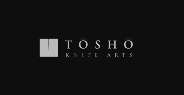
A recurring trend in great logos is their idea and its execution. A simple but effective idea, communicated well, is the basis of great design. That’s why this logo for Tosho, a producer of Japanese knives in Toronto is so exceptional.
Seriously, we freaking love this logo. It’s such a fantastic example of how to use negative space in a logo because so little negative space is used. This is entirely ‘the point’. The space is only used to communicate something important about the relationship being depicted. What’s the relationship? Tosho’s knives are sharp. Very sharp!
ArtHouse (Concept)
This is a great concept by designer Yuri Kartachev. We picked this specifically because there’s no brand name in the logo, to show you how to effectively combine just concepts using negative and positive space. In fact, this is a great way to approach the design process for negative space logos. Take one concept and imagine it as one ‘layer’, and another concept as a new ‘layer’. Often, just playing around with the natural holes and gaps that shapes create can give you the idea for a fantastic conceptual fusion like this.
FedEx

Wait, you thought you could get through a blog post on negative space logos and not see this bad boy? Honey…
This is one of the most classic negative space logos out there. It’s such a great way to subtly hint towards the value the company brings through the use of space. Simply put: they move things!
Zzap (Concept)

Another awesome concept logo that, like the FedEx logo, hides a symbol about the brand somewhere in the text. Letters are a really good place to start if you want to do a negative space logo since they have such a great range of natural combinations. Play around with letter combinations from your logo text, and think about what symbols could represent what you do. Sometimes, but not always, you can find a happy crossing point between one of the symbols on your list, and the shapes between your brand letters.
Levis

And finally, the best negative space logo ever made. Look! It’s a butt! It’s a butt! *dances around with glee* It’s such a subtle design element but once you see it, you can’t unsee it. The Levi’s logo shows you that negative space can also be used on logo containers, while still creating a powerful effect. It doesn’t all have to be text pairings or clever overlays!
Design your negative space logo
So there you have it. We looked at negative space as a principle then addressed a few ways of using it in your own logos. Then we broke down some popular logos that use negative space, as well as some other great examples.
We learned that negative space is about turning ‘empty’ space into a meaningful part of the relationship, and showed how valuable that can be in communicating messages with more than one element. Ultimately, negative space is a powerful way to emphasize particular elements of your logo by:
- Creating depth
- Emphasizing different yet related features
- Creating unique shapes using the natural properties of letters or other shapes
- Communicating dual-meanings
- Creating smart visual puns
- ‘Hiding’ easter eggs and meaningful symbols in your logo
Space is a vital part of logo design. Not all brands or designers understand how to use negative space, but those who do can communicate a lot with little effort. Remember, there are tons of different ways to use negative space. Play around with different symbols, letters, and shapes, and think of ideas for icons that reflect your brand. All that’s left after that is to get designing!