Iconic Logos: How to Create One + 20 Infamous Examples
By Kaejon • 7 min read, Jul 17, 2023
A logo is often the first thing people see when buying products or services. Logos serve as proof that what they’re buying is genuine and legitimate — in other words, they help make a bang-on first impression.
After you make that first impression, you want your logo to remain in the minds of customers and last for months and years to come.
To create an iconic logo, here are five traits to strive for in your design.
1. Simple
The number one trait in iconic logos is simplicity. Simple doesn’t mean boring — it means easy to understand and uncomplicated.
Adding too many elements to a logo can make it feel cluttered, and the human mind deals with clutter the best way it can: by blocking most of it out.
Uninteresting or non-distinctive elements compete for the viewer’s attention, making it easier for them to skip over.
Simple logos are easier to understand and absorb, but more importantly, they’re easier to recall when people see them again. A simple logo will make it easier to catch the attention of someone driving on the highway or make your product identifiable on the crowded shelves at a store.

Case in point: The world’s largest shoe manufacturer, Nike, uses a simple graphic swoosh to represent their brand and stand out.
If it doesn’t strengthen the overall design or your brand message, don’t add it.
2. Appropriate
The second trait is appropriate. A logo must be simple, but not every simple logo is iconic. A company logo must work for its intended use and target audience.
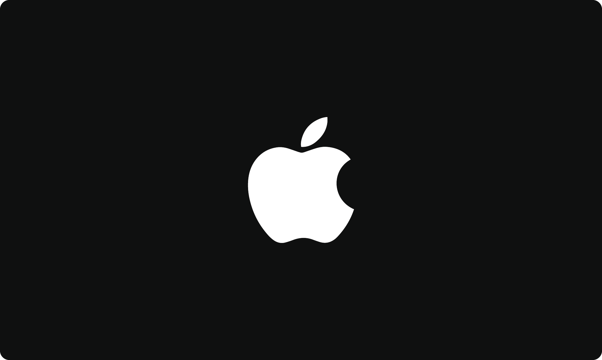
Logos don’t need to say what a company does; instead, they must be appropriate in the feeling they convey. Think about famous logos. The Apple logo is not a computer, the BMW logo is not a car, and the American Airlines logo is not an airplane.
On the other hand, a logo can be literal. Take Target or Shell — these logos are a visual representation of the company name, and that’s appropriate as well.
Iconic logos are also targeted to an intended audience. But this wouldn’t be appropriate for a bank because people wouldn’t take them seriously or trust their business.

The Toys“R”Us logo is a prime example of an appropriate company logo. With the hand-drawn font, backward R, star symbol, and wacky color scheme, it looks like a kid drew it. This attracts children to the store because they can relate to the logo. Check out the iconic Amazon logo as another example!
3. Distinctive
The third trait of an iconic logo is that it’s distinctive. Why do we say distinctive over memorable? Because at the root of something being memorable is its unique qualities that capture someone’s attention.
Many companies overcompensate in a design by using complicated logo elements to stand out. But if a logo is busy, it’s much harder to digest and recall.
Instead, the goal should be to have a distinctive logo for someone to remember after only seeing it once.
A good test for this is to see if someone can redraw a logo on a piece of paper after one glance. (It’s also important to note that iconic logos are recognizable even when they appear without the business name.)
Distinctive logos are more likely to get consumers’ attention and make them want to learn more about the brand.
Remember: If people can’t recall what it looks like when it’s not in front of them, the logo isn’t doing its job.
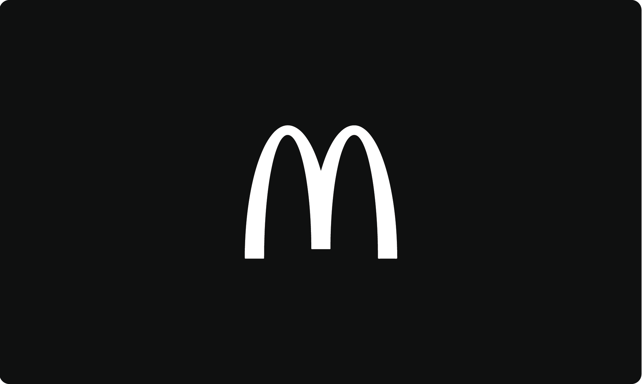
The Mcdonald’s logo is an excellent example of a distinctive design. It’s simple enough to redraw after seeing it only once (and can be seen from far away on a highway billboard), and the two golden arches that create an “M” are identifiable around the world.
Ready to start designing a logo for your business?
4. Versatile
Iconic logos are also versatile. Versatile means that the logo looks equally great in all sizes and applications. It’s effective in any color and functional enough to work in both horizontal and vertical formats.
To create a versatile logo, you must ensure it works for every place you want to use it. Think websites, business cards, signage, labels, vehicles, and beyond. No matter the size — the logo should be both impactful and legible.
When you add too many details to a logo, legibility always suffers. Too many colors and elements will get lost when you try to reproduce the logo in smaller sizes.
Remember that you won’t be able to use a full-color logo all the time. The logo should be able to work in black or white; it shouldn’t rely on visual effects to stand out.
Another option is to have a flexible logo, also known as a responsive logo. These types of logos can change in size, complexity, or even color to accommodate and adapt for different sizes and screens.
The iconic Apple logo is a famous example of a versatile logo. It looks good in both black and white and small and large sizes and can be used as a favicon without altering the logo.
5. Timeless
The final trait — and the hardest one to achieve — is timelessness. It’s the last trait on the list because without the other four traits, it’s almost impossible to achieve.
With design trends coming and going all the time and the world constantly changing, you can’t be sure that a logo will pass the test of time. But you can ensure a logo has the traits to become timeless.
Only once all four traits are achieved can you know that the logo is in the best possible place to pass the test of time. An iconic logo is still in use after 10, 20, or even 50 years. It should stand strong through every trend and state of the company.
We interact with many timeless logos every day: Nike, Coca-Cola, Apple, and more. All of these logos share the following characteristics:
- Simple in shape and form
- Distinctive
- No complicated graphical elements
- Appropriate in the feeling
- Limited number of colors
- Identifiable when scaled up or down
The best rule to remember is not to follow design trends too closely. Logos that rely on trends (glossy shading or complex gradients) often fail to be timeless, as they’re not versatile.

Font and color choice are the two main reasons logos become outdated. A common mistake people make is thinking simple, classic fonts are boring and not unique. Not true! Sticking with classic, well-crafted fonts will help make your logo timeless.
The Coca-Cola logo is a prime example of a timeless company logo. It has stayed almost the same since the early 1900s and is one of the most timeless logos in history.
The 20 most famous logos of all time

Let’s do a deep dive into some of the most famous logos in the world. Each of these brand logos fulfills the criteria of achieving global brand recognition, cultural impact, innovative design aesthetics, longevity, and overall success in representing and communicating the brand’s identity.
FedEx logo
![]()
One of the most iconic logos of all time, the Fedex logo showcases true brilliance in logo design. Created by Lindon Leader of Landor Associates, it’s a prime example of a recognizable logo that communicates a message. The bold purple and orange colors of the wordmark logo catch the eye instantly.
However, what sets this company’s logo apart is the negative space which forms a hidden arrow between the letters “E” and “x.” This instantly recognizable logo represents FedEx’s brand identity of speed and precision in delivering packages.
Google logo
![]()
The Google logo is one of the most recognizable logos of all time, known for its vibrant and playful design. Ruth Kedar, the genius behind this logo, opted for primary colors of red, blue, and yellow, instantly evoking a sense of joy and energy. The tilted “e” in the wordmark adds a whimsical touch, making the company’s logo unique.
This wordmark logo represents Google’s brand identity as a dynamic and innovative search engine, capturing the attention of billions of users worldwide.
IBM logo
![]()
The IBM logo has stood the test of time as one of the most iconic logos. Designed by Paul Rand in 1972, it showcases the power of simplicity. The horizontal blue lines forming the letters “IBM” exude stability and trustworthiness, qualities that IBM has upheld throughout its long history. The clean, bold typeface adds a touch of modernity to the logo.
Sporting the brand’s signature blue and white colors, this logo captures IBM’s brand identity as a tech giant and signifies its enduring presence in the industry.
Pepsi logo
![]()
The Pepsi logo, one of the most famous brand logos in the world, has undergone several transformations while retaining its essence. Designed in 1973 by Lippincott & Margulies, the Pepsi logo has undergone multiple evolutions resembling a bottle cap. The most recent design pays homage to the retro 70s era of Pepsi’s logo design.
The blue and red colors create a sense of refreshment and energy, while the wave captures the brand’s youthful spirit. Pepsi’s logo design represents the company’s commitment to delivering fizzy enjoyment to its customers.
Starbucks logo
![]()
The now iconic Starbucks logo encompasses the essence of the brand’s coffee empire. Designed by Terry Heckler, the circle logo features a twin-tailed siren in the waves. The logo pays homage to the mythical mermaid-like creature, capturing the allure of discovery and indulgence that Starbucks provides.
The iconic green color palette adds a touch of freshness and tranquility to the logo. This memorable logo represents Starbucks’ brand identity as a destination for premium coffee and a cozy atmosphere.
National Geographic logo
![]()
The National Geographic logo, with its iconic yellow rectangle and bold wordmark, is synonymous with exploration and adventure. Designed by Walter Bernard, this famous logo has represented the renowned magazine and media brand since 1988. The vibrant combination of yellow and black immediately evokes the organization’s magazine covers and documentary films.
The rectangular shape represents the frame through which National Geographic invites us to view the world. This logo effectively captures the brand’s identity as a trusted source of knowledge and visual storytelling.
Apple logo
![]()
The Apple logo, considered one of the most famous logos of all time, has become synonymous with innovation. Designed in 1977 by Rob Janoff, this instantly recognizable logo features a bitten apple silhouette in monochrome.
The logo’s simplicity is its standout characteristic, representing the brand’s commitment to minimalist design. Over the years, the Apple logo has become a symbol of cutting-edge technology and sleek elegance, solidifying the brand’s visual identity.
Burger King logo
![]()
The Burger King logo is known for its red and yellow colors. This logo has gone through several transformations since its inception in 1969. The iconic golden crown, often positioned above the wordmark, instantly grabs attention and signifies the brand’s promise of treating customers like royalty.
The ketchup red wordmark in a rounded display font mirrors the look of a juicy patty. The logo is altogether appetite-inducing.
Rolex logo
![]()
The Rolex logo, with its iconic crown emblem, represents the epitome of luxury and precision in the world of watches. Created in 1908, this famous logo showcases the brand’s unwavering commitment to craftsmanship and excellence. The crown atop the wordmark symbolizes Rolex’s authority and mastery in the realm of timepieces.
The green and gold palette reflects the signature colors used in Rolex’s products. Rolex’s logo design has stayed close to the original logo with only two iterations since then– a rare occurrence in a world with such fast-moving design trends.
Nike logo
![]()
The Nike logo, known as the “swoosh,” is a globally recognized logo symbol that has become one of the most famous logos in the world. Graphic designer Carolyn Davidson, created this logo in 1973. It’s a prime example of a simple yet powerful design. The swoosh, with its fluid curves, represents movement and speed, perfectly capturing Nike’s brand identity as a leader in athletic footwear and apparel.
The logo’s simplicity allows for versatility, making it recognizable across various mediums. The Nike logo exudes energy and motivation, inspiring athletes and enthusiasts worldwide to push their limits and “Just Do It.”
McDonald’s logo
![]()
The McDonald’s logo, with its famous golden arches, has become a global symbol of fast food. Designed in 1962, this logo has undergone subtle modifications while retaining its core elements. The golden arches, formed in a distinctive “M” shape, are easily associated with the brand. The logo’s boldness and simplicity reflect the brand’s commitment to delivering fast, tasty, and memorable meals.
The McDonald’s logo has become an enduring emblem of convenience and indulgence that has left an indelible mark on the fast food landscape.
Facebook logo
![]()
The Facebook logo, known for its lowercase “f” within a blue square, has become an integral part of our digital lives. Designed in 2005 by Joe Kral and Cuban Council, this logo perfectly captures Facebook’s brand identity as a social media platform. The lowercase lettering adds a friendly and approachable touch to the logo, inviting users to connect and share.
The blue color signifies trust and reliability, establishing Facebook as a go-to platform for communication. The Facebook logo has become a symbol of digital interconnectedness, connecting billions of people and reshaping how we socialize and share information.
Mercedes-Benz logo
![]()
The Mercedes-Benz logo, with its three-pointed star, is a symbol of luxury, elegance, and automotive excellence. Designed in 1909, this logo signifies Mercedes-Benz’s dominance in the realms of land, air, and sea. Each point of the star represents the brand’s commitment to performance, durability, and safety.
The logo’s minimalist design, featuring a clean and refined typeface, adding to its timeless appeal. The Mercedes-Benz logo exudes a sense of prestige and sophistication. This famous logo has become a visual representation of top-tier automotive engineering and craftsmanship.
Disney logo
![]()
The Disney logo, with its distinctive cursive script, is synonymous with enchantment and storytelling. Designed by the company’s founder Walt Disney himself, this now iconic logo captures the essence of the Disney brand. The cursive typography adds an element of whimsy and elegance, reflecting the magical and timeless nature of Disney’s characters and narratives.
The castle in the logo serves as a visual gateway, inviting audiences into a world of imagination and dreams. The Disney logo evokes joy and nostalgia, reminding us of cherished childhood memories and family-friendly entertainment.
Adidas logo
![]()
The Adidas logo, known for its three parallel stripes, symbolizes athletic prowess and style. Designed in 1971, this logo perfectly represents the brand’s commitment to performance and innovation. The clean, sleek design of the stripes adds a dynamic and energetic element to the logo, reflecting Adidas’ brand identity as a leader in sportswear.
Whether seen on sneakers, apparel, or sports equipment, the Adidas logo has become a rallying cry for athletes, urging them to push their limits and strive for greatness.
Twitter logo
![]()
The Twitter logo, featuring a vibrant blue bird in flight, is a great logo symbol for social media communication. Created by Simon Oxley in 2006, this logo captures Twitter’s brand identity as a platform for real-time conversations and sharing. The stylized bird signifies the power of brevity and the platform’s focus on concise messaging.
The upward direction of the bird’s wings represents progress and growth, mirroring the constant flow of tweets. Arguably, thanks to its recent take-over by Elon Musk, the Twitter brand has seen the last of its thriving days. However, the logo remains one of the most memorable logos of the digital age.
Instagram logo
![]()
The Instagram logo, with its camera symbol, represents the realm of visual storytelling and social sharing. Designed by Kevin Systrom, the logo has evolved from its original Polaroid camera-inspired design to a simplified and vibrant version. The logo embraces a gradient of red, purple, and orange, reminiscent of a radiant sunrise.
The simplified camera symbol represents the power of visual communication and reflects Instagram’s purpose of capturing and curating moments. The Instagram logo exudes a sense of creativity and inspiration, inviting users to share their stories through captivating images.
Shell logo
![]()
The Shell logo, one of the most famous logos associated with energy companies, showcases the power of logo design. Created in the 1970s, it features a striking red and yellow scallop shell. The logo’s bold colors make for easy spotting while on the road, making it both useful and memorable.
The simplicity of the design allows the logo to be easily associated with the company’s name.
Chanel logo
![]()
The Chanel logo, renowned as one of the most famous logos in the fashion world, exemplifies elegance and sophistication in logo design. Created by Coco Chanel herself, it features interlocking “C”s, forming a timeless emblem of the brand. The logo’s clean and minimalistic design evokes a sense of high fashion and luxury.
The Chanel logo represents the brand’s enduring legacy and has become a symbol of impeccable taste and style. It stands as a testament to the power of a well-crafted logo in defining a company’s identity.
Playboy logo
![]()
The Playboy logo, considered one of the most famous logos in the realm of adult entertainment, embodies the power of effective logo design. Designed in 1953 by Art Paul, it features the silhouette bow-tie-wearing bunny. The logo’s distinct design instantly grabs attention and represents the brand’s playful and glamorous identity.
The Playboy logo has become an iconic symbol, recognized worldwide as representing the company’s brand image. It is a testament to the enduring impact that a well-designed and widely recognized logo can have on a company’s identity and reputation.
Up-and-coming famous logos
These logos are on their way to icon status as they solidify their presence in the global zeitgeist.
Slack
![]()
After undergoing a redesign in 2019, and achieving unprecedented growth during the pandemic, the Slack logo is one most people have now interacted with.
The logo’s lozenge and speech-bubble shapes come together to form an abstract symbol representing Slack as a dynamic and user-friendly communication tool for teams. The bright colors symbolize the convergence of ideas, fostering creativity and productivity among team members. The Slack logo is versatile, and serves as a goal-post to all app logo designs.
Open AI
![]()
While we are almost guaranteed to see many redesigns of this logo in the future, we anticipate the Open AI logo will be one to watch.
The OpenAI logo embraces simplicity and symbolism. The abstract symbol in the logo featuring interconnected rings signifies the organization’s infinite possibilities in a contained platform. The sans serif wordmark is a simple, if not bland, choice for such an innovative company. We’re excited to see how this logo changes over time!
TikTok
![]()
Sweeping the world by storm, the TikTok logo is one that over 50 million people interact with daily. The TikTok logo features a music note, symbolising the platform’s focus on music-driven content. The (unnamed) graphic designer of the TikTok logo was inspired by the lighting effects at concerts and chose to add the cyan and fuchsia shadows.
This logo captures the youthful and energetic spirit of TikTok.
Airbnb
![]()
Introduced in 2014 by DesignStudio, the Airbnb logo features the company name a custom, rounded, and lowercase font. The memorable “Belong Anywhere” symbol, resembling a heart, conveys the idea of a loving and welcoming community that Airbnb strives to foster. The soft pink and white logo colors encourage the feelings of safety, security, and protection which are important to the brand.
Getting to an iconic logo
An iconic company logo is simple enough to digest at a glance, appropriate in communicating a feeling, distinctive enough to commit to memory, versatile enough to work for any size or application, and designed well enough to pass the test of time.
One final note for when you’re designing your logo: think more about subtracting elements than adding them. This doesn’t mean you should remove everything from the logo. Instead, think about why each element is needed and how it communicates your brand to the world. Try designing a logo using Looka’s logo maker today!