Journey to Rebrand: From Logojoy to Looka
By The Looka Team • 6 min read, Jan 26, 2019

We’re all about helping people at the very start of their entrepreneurial journey — that moment when they’ve decided to go for it and make their business a reality.
So in light of our recent rebrand to Looka, it’s fitting to go back to when our CEO, Dawson Whitfield, launched Logojoy on November 22, 2016 — a moment that, after two months of intense solo work, was both terrifying and exciting.
The logo maker gained immediate attention on sites like Product Hunt and Indie Hackers, and within a few months, Dawson was raising the first round of funding, hiring employees, bringing on co-founder Rares Crisan, and serving hundreds of customers a day on the app.
And even though Logojoy was helping other businesses get great branding, that wasn’t the company’s top priority early on.

“When I was one guy in a coworking space, it was all about, how do I make a good product?” Dawson says. “After launch, I pretty quickly thought about changing the name when I realized it could hold us back. But the business was delicate then — up until now, we’ve been in a more vulnerable position as we prove ourselves as a company.”
Fast forward to the fall of 2018. Logojoy had grown to 30 employees, served more than 3 million users on the app, and closed a Series A funding round.
The rebrand conversation surfaced: to accomplish the mission of making great design accessible and delightful for everyone, we needed a name and brand that would support us in reaching that next level of growth.
It was time to make a move.
The story of a new name
When you’re picking a name at the infancy of a business, it’s exciting: You’re starting something brand new, and no one knows who you are.
When you’re picking a new name for an existing company, that excitement is overshadowed by responsibility. Your name has value and meaning to customers, employees, investors, and anyone else who has come in contact with your brand; switching it comes with no shortage of pressure.
While Logojoy’s offerings had extended beyond logos, the goal of being the best logo maker in the world remained. That meant we had to weigh taking the word “logo” out of our name and forgoing some of the website traffic and recognition that came with that.
– Dawson Whitfield, CEO
We looked at startupnames.com, conducted hundreds of searches, and played around with prefixes, suffixes, and Latin words. There was even a debate about making “sub-brands” under Logojoy (too bad “Business Card Joy” doesn’t sound great).
To sum it up, the name needed to meet the following criteria:
- Short, distinctive, and easy to spell (because our customer base is global)
- Nearly impossible to mispronounce
- Had a .com URL available
An internal “rebrand task force” brainstormed 150+ names and narrowed it down to a shortlist, relying on hallway conversations and extensive Googling to make sure names didn’t have negative connotations.
While there was no immediate “yes, that’s it!” option, the name Looka kept coming up as the frontrunner. And eventually, after it passed all the checks, it won out.
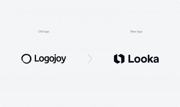

“When I say Looka, I think of one of our customers saying ‘look at this!’” says Dawson. “And when I think of one of our customers saying it, they’re proud of their design and what they’ve done — they want to show it off to their friends.”
Designing a new logo (no pressure)
We’ll start by saying that while the Logojoy logo was created on our AI-powered platform, the Looka logo was not.
Here’s why: When you start a business, you don’t want to spend a ton of time or money on your logo — you want to get your business off the ground as quickly as possible. With Logojoy, the logo came first, and the company and brand were built around it. Many of our customers work the same way, and it’s something we encourage!
But when you’re a fast-growing, two-year-old business and you want to rebrand, you do have the resources to invest in a logo and build a more intentional brand.
With Looka, we had the opportunity to demonstrate our beliefs about what makes a good logo — to lead by example.
The criteria?
- A combination mark (a logo with both a wordmark and a symbol)
- Simple in shape and form
- A distinctive symbol that could be used on its own
- Versatile enough to work across all applications and platforms
Our in-house designer and logo guru Kaejon Misuraca spent time creating the symbol first, aiming for a simple, geometric mark that tied back to the name Looka.
He began to explore an “L” shape, abstracting it in any way he could think of to make it look unique. But he didn’t like the “L” on its own — it wasn’t memorable enough.
Kaejon decided to try two abstracted “Ls” instead, sketching variation upon variation in his notebook. The shape looked like two hands “finger framing,” the gesture someone makes when they’re trying to frame a photo or design.


After trying many iterations of this mark (spacing, corner radius, size, and alignment), he decided to round the corners of the “Ls” in the middle and outside points to match the logo font (Circular) and make the design friendlier and more unified when used as a combination mark.
“Symmetry is really important because it makes it easier to commit the design to memory,” Kaejon explains. “I wanted to do something that made us look professional but not too corporate, cheesy, or out-of-reach.”

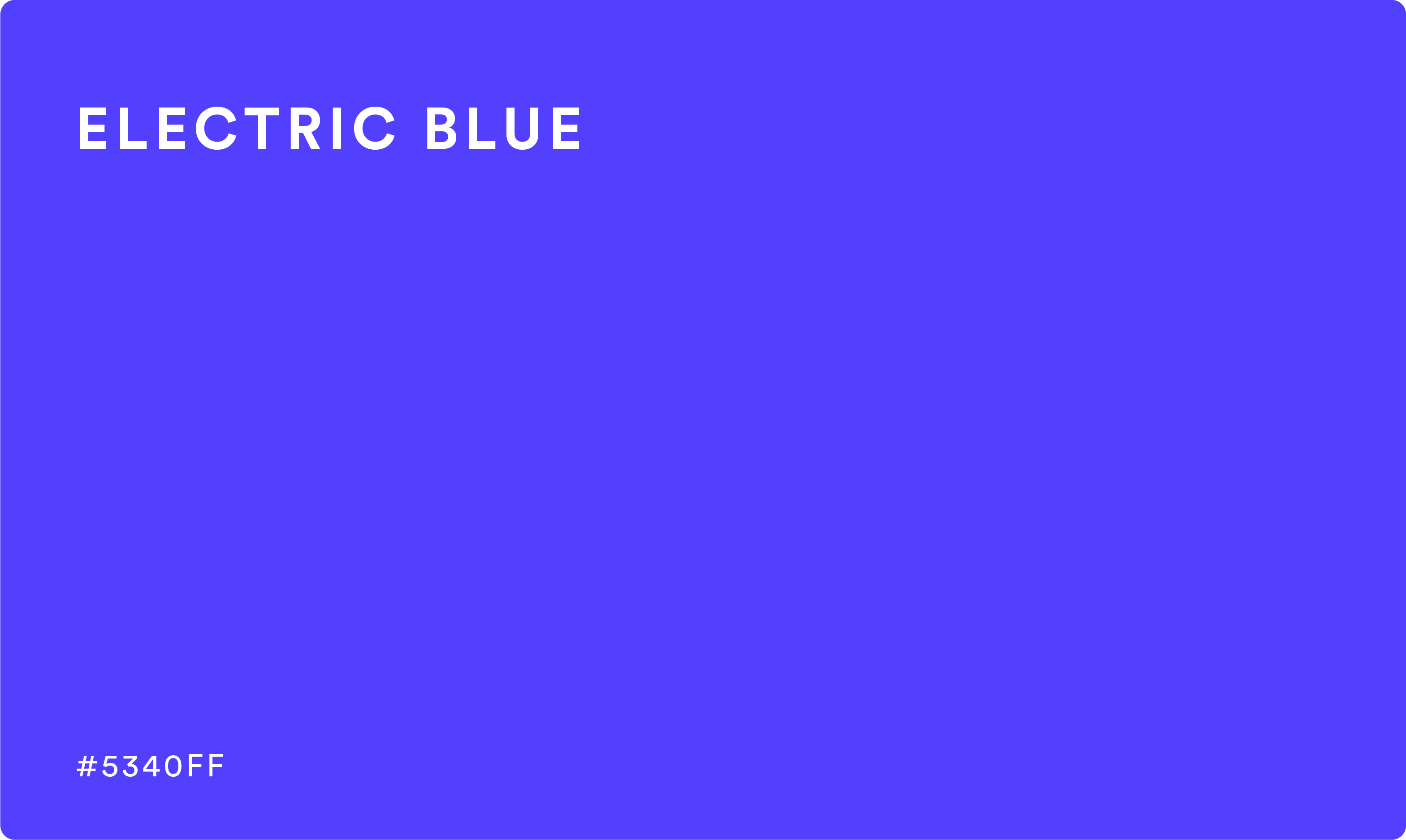
And then there was the color — Kaejon and Dawson loved the approachability of the Logojoy blue but wanted something punchier. They explored purple options but decided that purple could have associations with being too high-end (it’s the color of royalty, after all).

The winner? A brighter, more saturated blue (HEX #5340FF), one that straddles the line of purple. The color passes contrast on both dark and light backgrounds, making it eye-catching, fun, and accessible.
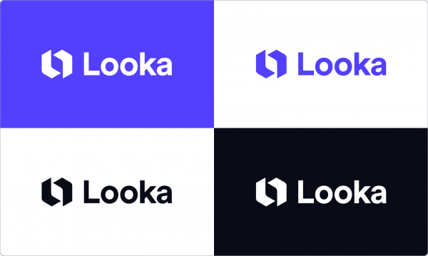
And, of course, the logo still looks great in black and white for specific applications.
Spreading the Looka love
To achieve memorable branding, you have to extend your identity past the logo. The logo is the starting point and the foundation — you can then take elements from it and extend them to every touchpoint with your customer.
Looka’s brand is bold and approachable. Our designers took the things customers love about our AI-powered platform — fun, easy to use, flexible — and built it into a design system. Here’s a quick rundown:
Logo lockups
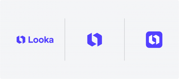
The primary Looka logo is a horizontal lockup with both the symbol and wordmark. When horizontal space is tight — in a social profile photo or favicon, for example — we’ve created two symbol-only lockups that can be used.
Color palette
To complement the new “Looka Electric Blue” and the vibrant look of the website, the secondary color palette includes functional colors for buttons and messages, pastel colors for backgrounds, and a handful of bright accent colors to use in conjunction with the primary blue.

Typography
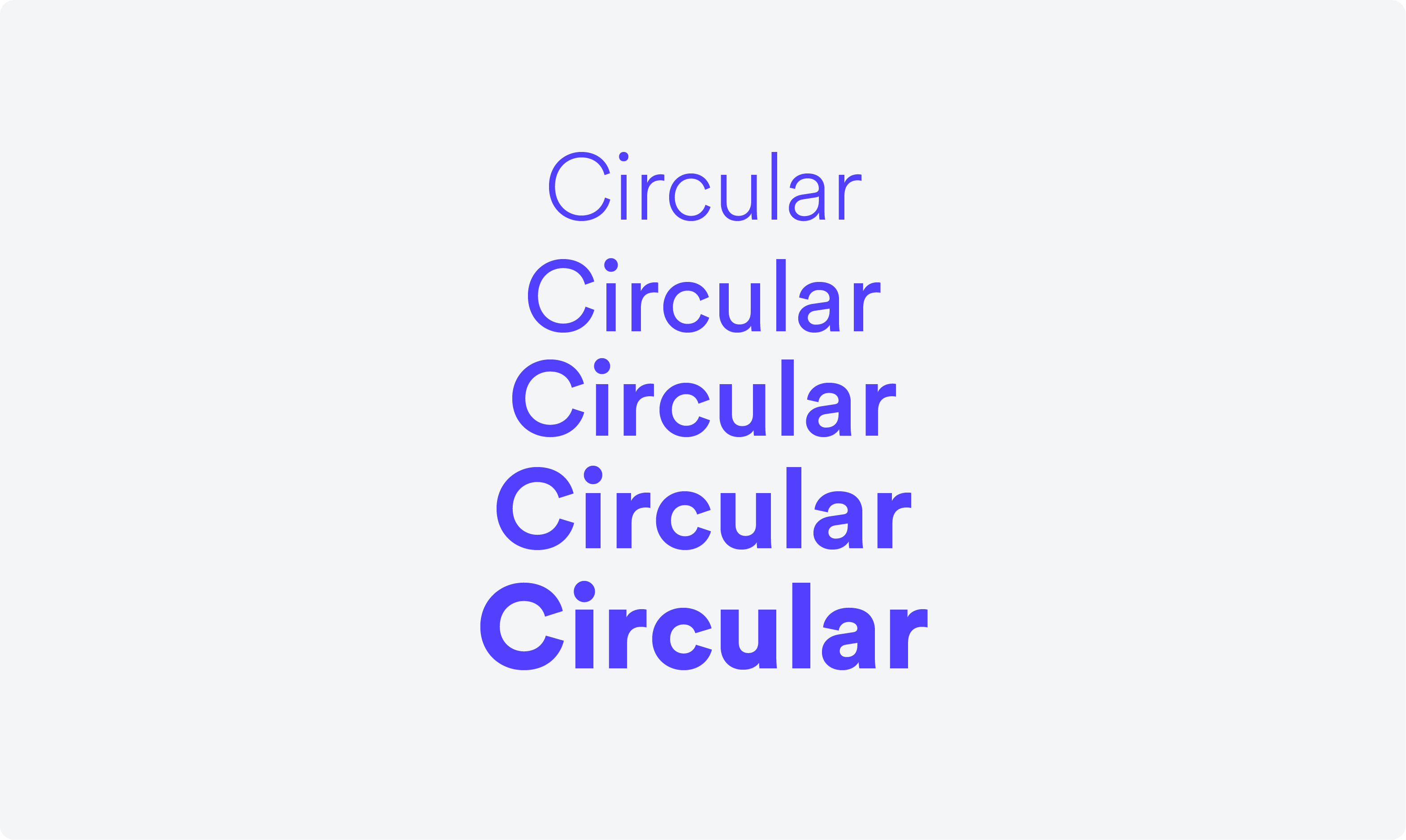
The ultra-readable Circular typeface, a geometric, sans-serif created by Swiss designer Laurenz Brunner, carries from Looka’s logo to all headline and body text on the website and beyond (can you tell we love it?!).

“L” Framing
To push the brand identity past the logo, we created an “L” frame using the symbol from the logo (a.k.a. the logo mark). This framing helps us build consistency and recognition across all branded assets, including ads, stationery, email templates, and more.


Delightful UX
Because our mission is to make great design accessible and delightful for everyone, our Senior UX/UI Designer Jose Bento put a lot of thought into Looka’s website and app. He designed new website animations, transitions between different hover states, and a grid system that gives everything a more consistent, easy-on-the-eyes look.

Looka-ing to the future
With the rebrand from Logojoy to Looka complete, we’re in a place where we can expand beyond logos with confidence and clarity.
Right away, that means giving more attention to other products, including business card designs, social media kits, and our newest offering — websites!
Our data team has also launched the first batch of 100% unique, AI-generated symbols in our logo maker to help people bring their vision to life in new and exciting ways. AI-generated fonts are close behind.
And finally, after making the switch to Looka, we can see a clearer path to achieving our mission — there’s no cap on how far we can go. Thank you for being a part of the journey!