50 Logo Color Combinations to Inspire Your Design
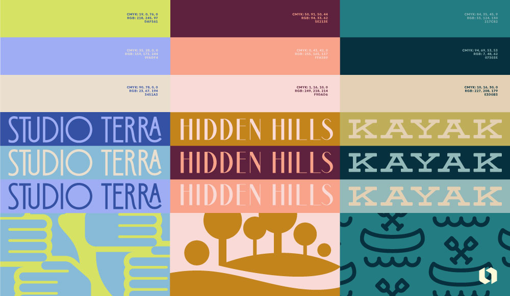
Our brains are hardwired to react to and remember color combinations. If you close your eyes and think of three famous brands, chances are you’ll be able to conjure up the company’s logo colors immediately. Starbucks: green and white. Ikea: blue and yellow. FedEx: purple and orange.
Picking the right color combinations can be tricky business. Lucky for you, there’s actually a science to it called color theory that’ll make it easier for you to select your brand colors.
Types of color combinations
Working with the color theory wheel is the best way to start when choosing your logo colors. The color wheel contains warm colors (red, yellow, orange) on the left side and cool colors (blue, green, and purple) on the right. Understanding the relationship between colors and how they interact on the color wheel is the key to successful design.
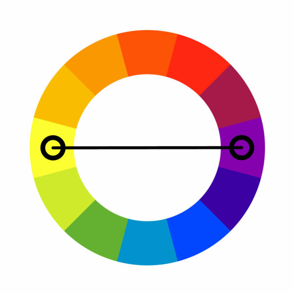
- Complementary
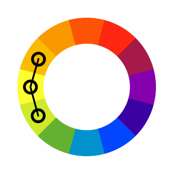
- Analogous
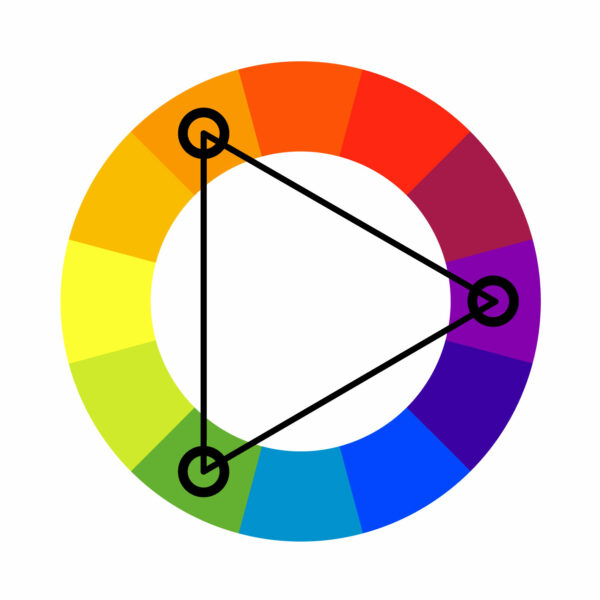
- Triadic
- Complementary color combinations are colors that sit on opposite sides of the color wheel. These two colors create contrast and make for high-impact, legible brand designs.
- Analogous color combinations are two to five colors that sit beside each other on the color wheel. These colors generally create a sense of harmony and balance. Analogous color schemes are often found in nature, where one color dominates and the others support its depth.
- Triadic color combinations are rich and vibrant color combinations. Use the triadic color theory if you’re looking for a dynamic three-color palette. Simply draw a triangle on the color wheel and you’ll hit three colors that are evenly spaced out.
We’ve chosen some of the best color combinations (complete with a bit of color psychology) to inspire your next logo design. Let’s dive in!
Design a colorful logo now!
50 Logo color combinations for unique designs
Let’s dive into logo color combinations paired with logo designs ideas!
1. Tea green and moss
This logo color scheme echoes the serenity of nature. Tea green, with its soft, calming hue, contrasts subtly with the deeper, earthier tone of moss. Monochromatic are a logo color trend this year, offering a refreshing yet grounded aesthetic that’s pleasing to the eye.

2. Clay and beige
This comination carries a warm, inviting, and neutral feel. Clay, with its rustic and earthy undertone, harmonizes perfectly with the soft and serene beige. Together, they create a sense of calm and tranquility. This pairing resonates well with industries that emphasize natural and minimalist styles. Like interior design and fashion!

3. Electric blue and dusty gray
The vibrant electric blue offers a vivid splash of color, which is harmoniously tempered by the muted tone of dusty gray. This contrast strikes a balance between energy and subtlety. It’s an ideal choice for industries that strive for a modern, engaging, and sophisticated aesthetic, such as technology or digital marketing.

4. Blazing orange and mahogany
Blazing orange and mahogany evoke warmth and intensity. The bright hue of blazing orange beautifully contrasts with the deep tone of mahogany, making it ideal for modern industries like marketing or food and beverage. This pairing conveys strength, depth, and opulence!

5. Aqua and evergreen
Aqua and evergreen create an invigorating palette inspired by the vitality of nature. The bright, refreshing aqua complements the deep, robust evergreen, achieving balance and invigoration. This combination resonates with sustainable business brands promoting health and wellness.

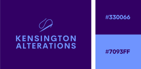
6. Royal purple and periwinkle
Royal purple and periwinkle create a regal and soothing color palette. The deep hue of royal purple beautifully contrasts with the soft tone of periwinkle, blending intensity with tranquility. This combination balances richness and calmness. It resonates well with the beauty and fashion industries for a sense of sophistication and serenity.
7. Pine and lavender
Pine and lavender creates a harmonious blend of freshness and tranquility. The deep, earthy green of pine complements the aromatic light hue of lavender, balancing between richness and lightness. This palette resonates well with industries like wellness and home decor. It’s a calming aesthetic logo that brings a sense of peace and rejuvenation.

8. Stone blue, pastel blue and sand
Stone blue, pastel light blue, and sand create a calming seaside color palette. The deep undertone of stone blue blends harmoniously with the soothing pastel blue, while the warm and neutral sand hue adds balance to the cooler colors. This beach-inspired aesthetic appeals to industries like tourism and interior design.

9. Teal, sky blue and mustard
Teal, sky blue, and mustard create a vibrant color trio that exudes energy and professionalism. The cool tones of teal and sky blue provide a calming backdrop, offset by the bold and warm Mustard.It’s the perfect color for visual contrast! This palette suits creative industries like design agencies or startups, projecting confidence and uniqueness.

Real estate logo make on Looka
10. Neons on black
Neon green and violet on black create a vibrant color combo that’s visually striking and exudes a modern, edgy vibe. Neon colors are trending this year, and this bold color scheme works well in entertainment, fashion, or any field where distinct branding is desired.

Real estate logo made on Looka
11. Yellow & red
This bold color combination immediately draws your eye to the center of the logo. The vibrant red and unique layout of the company name pops against the happy shade of yellow, creating a sense of energy and playfulness. We love this color pairing for its versatility
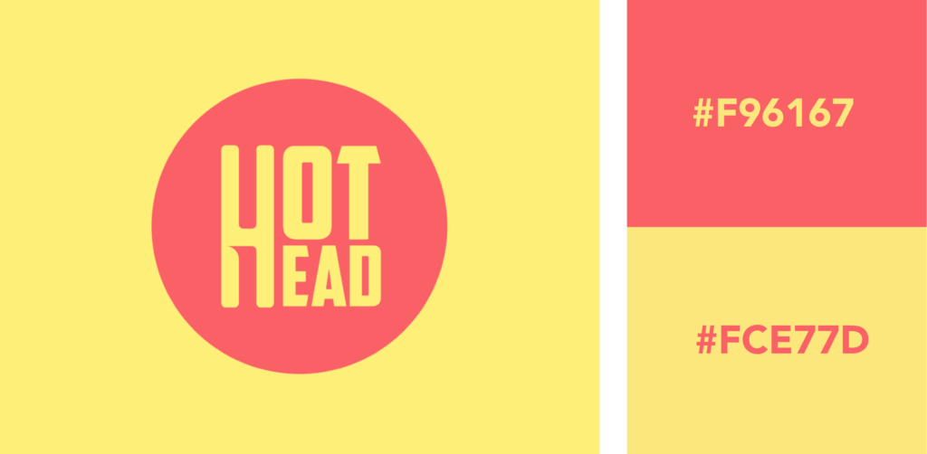
Hex Codes: Coral #F96167, Yellow #FCE77D
12. Black & yellow
Like the smiling monkey symbol in this logo, the bright yellow used is full of energy and delight. The almost-black shade of grey, popular within the entertainment industry (especially nightclubs), has an air of mystery and intrigue. Black and yellow are two colors that go really nicely together.

Hex Codes: Yellow #F9D342, Charcoal #292826
13. Purple & pink
Warmth, playfulness, and ambition wrapped in one! The bright pink in this logo adds a spark of energy, while the purple acts as a mature counterpart. This color combination is often seen in industries such as beauty and blogging.

Hex Codes: Pink #DF678C, Purple #3D155F
14. Blue & green
Blue and green are often associated with tranquility, but this electric blue and lime green exude energy and youthfulness. A bright color combination works particularly well in the fashion, media, and entertainment industries.

Hex Codes: Green #CCF381, Purple #4831D4
15. Orange & purple
Uncommon color combinations can be risky, but when they work, they work! This pairing of warm peach and eggplant purple is both elegant and unique. Consider this combination for a fashion, beauty, or home furnishings brand.
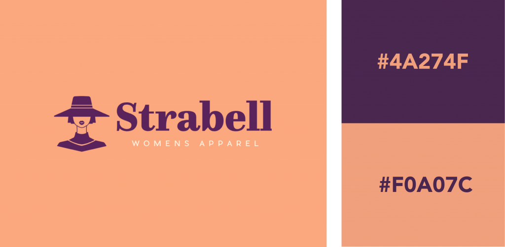
Hex Codes: Purple #4A274F, Orange #F0A07C
16. Red, navy, & yellow
Feeling bold? Try an electric trio of colors! The bright red in this logo complements the cheery yellow and regal navy, exuding power and confidence. Try using a color combination like this for an entertainment or restaurant brand.
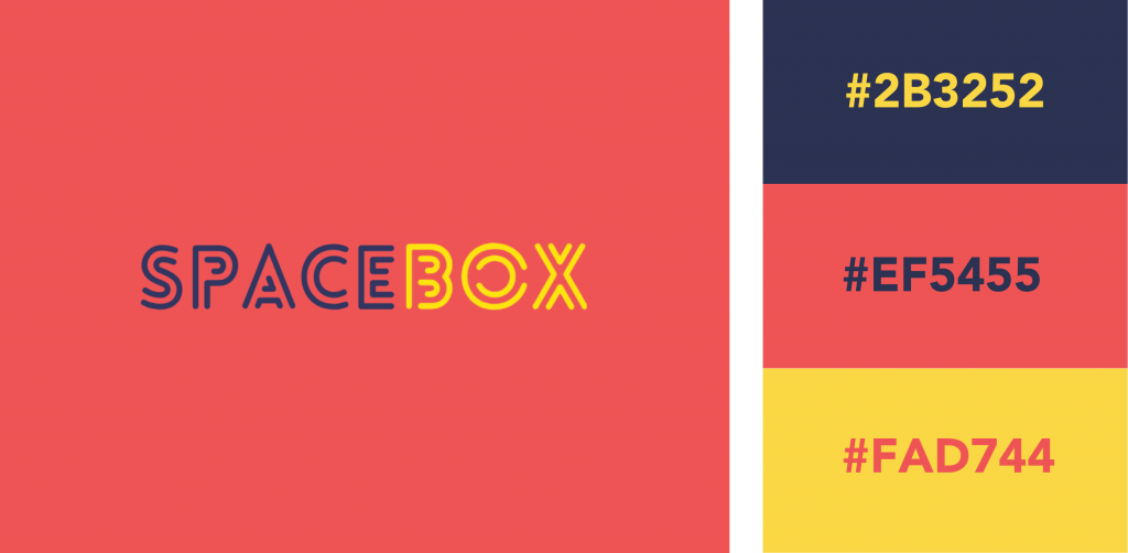
Hex Codes: Eggplant #2B3252, Red #EF5455, Yellow #FAD744
17. Purple & yellow
Want a logo full of wisdom? Use an optimistic and energizing yellow with a rich purple to spark feelings of creativity. This classic complementary logo color combination is popular in the restaurant and education industries.

Hex Codes: Yellow #FFF748, Purple #3C1A5B
18. Pink & blue
A delicate pink paired with navy blue gives off a playful yet trustworthy vibe. The navy pops against the light background, creating a beautiful contrast. Consider this pairing for a logo if you’re in the beauty, blogging, or wedding industries.

Hex Codes: Blue #2F3C7E, Pink #FBEAEB
19. Black & red
Daring and surprisingly inviting, this fierce logo color combination dominates and instills a sense of power and energy. The intense red draws the eye to the company name, while the black provides a grounding background color. Red signals passion, danger, and intrigue in color psychology. It can be used to generate excitement, especially when paired with a color as stark as black.
Hex Codes: Red #EC4D37, Black #1D1B1B
20. Blue & turquoise
If it’s intelligence, confidence, and trust that you’re after for your logo, try combining blue and turquoise. The colors are from the same color family but are different enough to create a striking duo, with the turquoise used sparingly. Tasteful use of bright colors can really make a design pop! Bright teal pairs well with almost any darker, muted color.
Hex Codes: Mint #8BD8BD, Blue #243665
21. Orange & blue
Make your audience feel excited about your brand while instilling trust with an orange and blue logo. This complementary color duo is a classic yet powerful pairing and is popular in the technology and banking sectors.

Hex Codes: Navy #141A46, Orange #EC8B5E
22. Blue & white
This peaceful sky blue and white combo is a definite crowd-pleaser, communicating feelings of trust and tranquility. Creating a logo with this combination ensures flexibility across industries, from non-profit to tech to health. Remember that white is a color in design, and can be used to create negative space and draw the eye towards an important design element.
Hex Codes: White #FFFFF, Blue #8AAAE5
23. Yellow & green
This youthful yellow brings life and energy to the otherwise calming green in this logo color combination. Yellow and green are colors frequently found in nature, and thus often seen in industries like agriculture, cleaning, and environmental services.
Hex Codes: Green #295F2D, Yellow #FFE67C
24. Black & orange
This black and orange logo is a strong yet friendly pairing. The orange provides a dose of optimism, while the black is a professional and grounded counterpart. This logo color combination would work well for the film and music industries.

Hex Codes: Orange #F4A950, Black #161B21
25. Blue & pink
Want your logo to evoke professionalism while maintaining a friendly look and feel? Opt for a navy and hot pink logo color combination. The vibrant pink radiates against the blue and works well for industries like beauty and blogging.

Hex Codes: Pink #ED2188, Purple #080A52
26. Brown & mustard yellow
We love this vintage color combination. Great for professional services looking to give off a sophisticated and traditional vibe. These colors would complement any artisinal services, as well as restaurants and cafes with a more traditional feel.

Hex Codes: Brown #4A171E, Mustard #E2V144
27. Lipstick red & white
This color combination packs a punch! Red is an exciting and energizing color, and when used in a hue this bold, should be paired with something calm and neutral. It’s a great logo color combination for teams, as well as retail spaces. Any brand that needs to catch the eye from afar could benefit from this duo.

Hex Codes: Red #D2302C, White #F7F7F9
28. Teal & coral
Combined, teal and coral bring a fun and creative vibe to your logo. They are bright and joyful colors without being too demanding to the eye. This is a great color scheme for creative consultants, and education-based businesses.

Hex Codes: Teal #358597, Pink #F4A896
29. Yellow & electric-purple
Neon and psychedelic colors are making a big comeback in design these days. It’s a bold move to use a color combination like this, but if your brand is loud we definitely recommend going for it! This color pair is great for beauty businesses, and bloggers.

Hex Codes: Yellow #E7D045, Purple #A04EF6
30. Charcoal grey & taupe
This is a very classy combination, great for hospitality logos as well as photography logos. Use the black as a background color and bring the taupe in as an accent to make a sophisticated statement.

Hex Codes: Charcoal #262223, Rose #DDC6B6
31. Beige with a red gradient
This red gradient paired with black text and a beige background maintains a highly professional feel. A great fit for tech businesses, the red gradient establishes seriousness and professionalism.

Hex Codes: Beige #F4EFEA, Red Gradient #7D141D + #FF1E27
32. Light purple, mint, and butter
This logo uses a triadic color scheme to create a soft, yet dynamic effect. Lavender purple looks great with yellow, and the green accent color adds the perfect flair. This is a beautiful pastel logo with very spring-inspired colors!

Hex Codes: Purple #AA96DA, Mint #C5FAD5, Yellow #FFFFD2
33. Grey & green gradient
Just like in nature, our eyes are accustomed to seeing various shades of green. By applying a green gradient over a light background, your design will radiate with life and energy. Like smelling fresh-cut grass.

Hex Codes: Grey #F7F7F7, Green gradient #006838 and #96CF24
34. Royal blue & pale yellow
This logo uses a royal blue color combined with a soft butter-yellow. Royal blue is a very professional color—great for tech, finance, and legal industries. This complementary color palette evokes a sense of history, stability, and trustworthiness.

Hex Codes: Blue #234E70, Yellow #FBF8BE
35. Pink with a purple gradient
Easily capture anyone’s attention with a bright purple gradient. Purple communicates royalty, luxury, and power as well as creativity, fun, and wisdom. When paired with a lighter color of a similar shade, your logo will feel balanced and luxurious. Pink and purple might seem like a youthful color combination, but a gradient helps to mature the visual impact and add a modern flair.

Hex Codes: Pink #FFE8F5, Purple gradient #8000FF and #DE00FF
36. Black & gold foil
Everybody loves a bit of gold foil! Black and gold make for a very sleek and sophisticated color combination. The color pair is modern yet approachable and looks great in print materials.

Hex Codes: Black #191919, Gold #B88746 and #FDF5A6
37. Pink & red
This red and pink palette is an analogous color combination. It’s soft but very modern and maintains high enough contrast to remain perfectly legible. Pink and red pair surprisingly well together, so long as their tones are kept far enough apart to create a visual hierarchy between them.

Hex Codes: Red #CC313D, Pink #F7C5CC
38. Royal blue & lilac purple
We’re loving this analogous color combination that strikes a balance with deep royal blue and soft lilac purple. It’s an eye-catching pair that could be used for almost any industry. Royal blue offers a sense of trust and longevity, it’s a stable reliable color for any brand. While soft purple lightens the mood and provides a sense of balance to the logo.

Hex Codes: Purple #E2D3F4, Blue #013DC4
39. Eggplant & yellow gradient
This is a very royal color palette. Yellow and purple are the perfect complementary color scheme, but the gradient here adds a new level of dimension to this logo design. This is a very warm gradient, blending yellow and orange to make a rich, honey-colored gold. Very uplifting and perfect for a wellness business!

Hex Code: Eggplant #533549, Yellow gradient #F6B042 and #F9ED4E
40. Fushia & neon green
Now, this is a cool color combination! Using trendy cyberpunk colors, neon green, and fuchsia, this logo is hard to look away from. Pink looks great with a green accent (they’re complimentary colors after all) and these deeply saturated colors generate the kind of excitement you’d expect out of a spin class.

Hex Codes: Green #99F443, Pink #EC449B
41. Black & silver
What color goes with silver, you ask? Nothing works better than black. Black is the perfect neutral tone to allow a silver foil really shine. A stark, professional, yet intriguing and mysterious color combination, black and silver make a very sophisticated pair.

Hex Codes: Black #050505, Silver gradient #616161 and #E6E7E8
42. Peach & burnt orange
Here’s a monochromatic color scheme that uses the analogous color theory. A soft peach background makes way for this louder, burnt orange. This color pair does well because it maintains a balance between the two tones. One is stronger than the other—there is no battle for attention between the two.

Hex Code: Orange #EE4E34, Beige #FCEDDA
43. Navy & orange gradient
This logo uses complementary colors blue and orange, as well as a gradient to make a high-impact statement. It remains professional while still being visually interesting with the use of an orange gradient to outline a mountain range.

Hex Codes: Blue #072C50, Orange gradient #B88746 and #FDF5A6
44. Beige & rust
Here we have a beige and rust color pair that exudes warmth and maturity. This sandy beige is a stable, relaxing color and the rust maintains a sense of sophistication. This warm color palette is perfect for businesses in real estate, travel, or lifestyle because it generates a sense of ease you want your clients to feel when working with you.
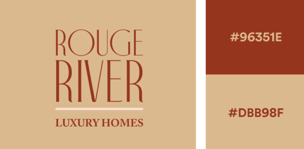
Hex Codes: Terracotta #96351E, Sand #DBB98F
45. Teal & lavender
This one’s an unconventional color palette, but teal and purple look great together so long as one remains the dominant color. Here, we’ve used a soft lavender to create contrast against a darker background. This color combination is moody and magical.
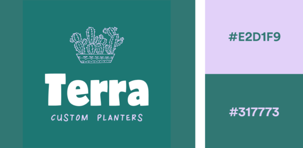
Hex Codes: Purple #E2D1F9, Teal #317773
46. Jungle green and linen white
This exotic green and white color combination is clean, crisp, and highly flexible. Mixing green with white creates a sense of refreshment and revitalization. Brands in medical, healthcare, and environmental awareness can benefit from a green and white color pairing. There’s a real sense of color harmony when green and white are combined.

Hex codes: Green #53A57D, Linen White #FBF7F4
47. Cyan and bubblegum pink
Cyan and hot pink are two vibrant colors that make an excellent logo color combination. It’s cyberpunk and pop princess all in one! These bright, high-contrast colors embody an excitement that is ideal for more playful brands. Think scene/punk branding.

Hex codes: Hot Pink #FF69B4, Neon Blue #00FFFF
48. Sage green and dark purple
You won’t have to look much further than sage green and dark purple to create color harmony. Green is one of those colors that goes well with purple. These two can be extremely complementary colors when selected in contrasting shades.
Both purple and green are luxurious colors that fill a design with increased vitality and energy

Hex codes: Sage #CFCAA8, Dark Purple #635E87
49. Vintage mustard and earthy greens
Here we have a very retro color combination! Vintage mustard, sage, and forest green. These three colors come together to form the ultimate earthy color palette. These colors are perfect for natural brands and suitable for logo design, web design, product design, and packaging.

Hex codes: Mustard #E3B448, Sage #CBD18F, Forest Green #3A6B35
50. Creamsicle orange and yellow
Pastel orange, peach, and custard combine to create a dreamy orange gradient creamsicle. This analogous color palette shows how well orange and peach colors go with yellow. This combination is ideal for cosmetic or fashion brands who want a fun, and peaceful feel. Use this bright and cheery color palette when creating flyers, Instagram posts, and invitations.

Hex codes: Pastel Orange #FFA351FF, Peach #FFBE7BFF, Custard #EED971FF
Choosing the right logo color combination
The psychology behind color plays a huge role in our lives. Every day, we subconsciously make associations in our brains that trigger positive or negative emotions.
Remember this when creating your logo — the color combination you choose tells a story, and you want that story to reflect your brand while resonating with your target audience.
Want more insight into how to combine colors in your logo and their meanings? Head over to our logo colors pages for more inspiration, and watch our logo color theory video above! Try some color combinations using Looka’s logo maker!
