The Top Logo Redesigns and Trends of 2018
By Erin • 5 min read, Dec 1, 2018
*Check out the most recent logo redesigns blog here!*
It’s our favorite time of the year — logo review time!
After researching companies that rebranded in 2018, we compiled a list with both dramatic logo redesigns — ones with major color, typeface, symbol, and name changes — as well as those on the subtler side.
The first half of this list falls on the “big change” side, while the second half features logos that have moved in a more modern direction with easier-to-read fonts and flat design.
Rebrands are about much more than logo design. They often involve new design systems, refreshed mission statements, product updates, and more. But we’re focusing on logos because they’re the most public-facing part of a rebrand.
Let’s dive in and take a look at these 16 logo redesigns of 2018!
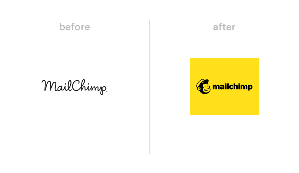
1. Mailchimp
One of the splashiest rebrands of the year came from the marketing platform Mailchimp. The new logo gives the company’s mascot, Freddie, a permanent spot in the design and changed from a script typeface to a blocky, cartoon style in lowercase letters (note the no-longer-capitalized “C”). The brand also adopted a cheerful new color: Cavendish Yellow.
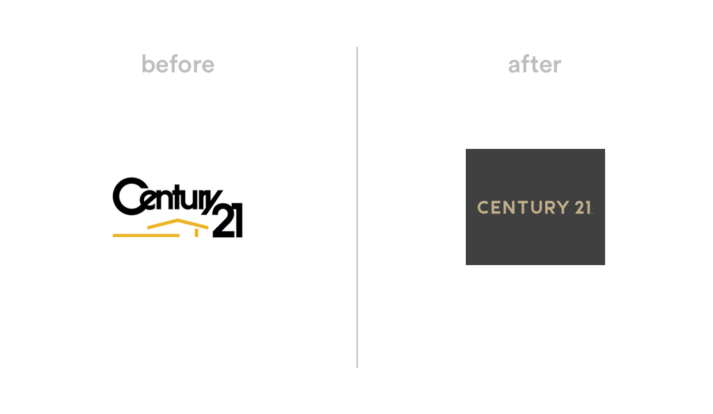
2. Century 21
As one of the world’s most prominent real estate brands, Century 21 didn’t take modernizing its decades-old logo lightly. The company got rid of its stacked-text design in favor of a clean, sans-serif wordmark in a subdued black-and-gold color palette. It also introduced a “C21” monogram, which acts as a symbol or pattern on signs, business cards, and brochures.
3. Animal Planet
Another “change everything!” 2018 rebrand came from Animal Planet. The TV channel’s new logo is a departure from the quirky mismatched text of its previous design. It features a blue elephant symbol and a black wordmark in lowercase letters — a logo that offers flexibility across platforms and is easily scalable.

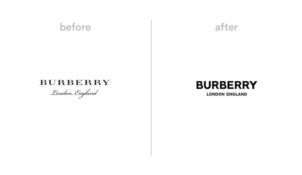
4. Burberry
The iconic fashion brand changed its logo for the first time in 20 years, calling on designer Peter Saville, who did Calvin Klein’s logo redesign. A heavier modern typeface replaced the traditional serif wordmark; Saville also gave the “London, England” portion of the logo the sans-serif treatment and axed the comma.
5. WW
The WeightWatchers rebrand made headlines with a name change to “WW,” highlighting the company’s transition from a weight loss brand to a wellness brand. The famous design firm Pentagram designed the new monogram logo: two white uppercase Ws set on a dark blue circle, which works well on social media channels and imagery.

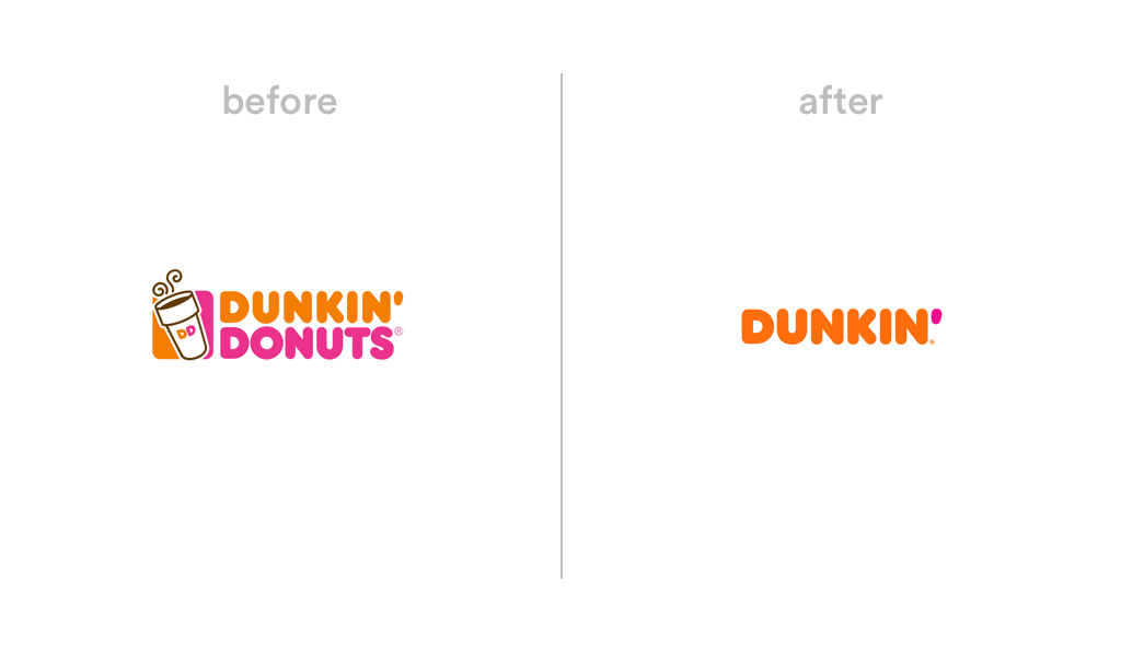
6. Dunkin’
Dunkin’ — formerly Dunkin’ Donuts — was another company that chopped its name this year. The new logo keeps the cheerful colors the brand has had since 1973, but scraps the coffee cup symbol and turns the apostrophe bright pink. According to the press release, the company tested the logo at various locations before finalizing the design.
7. ClassPass
Fitness company ClassPass updated its logo for the first time since launching in 2013, introducing a new rounded sans-serif typeface (Circuit Bold), a symbol, and a bright blue color. The monogram-inspired symbol includes a clever effect that illustrates movement, adding more personality to the brand and app.

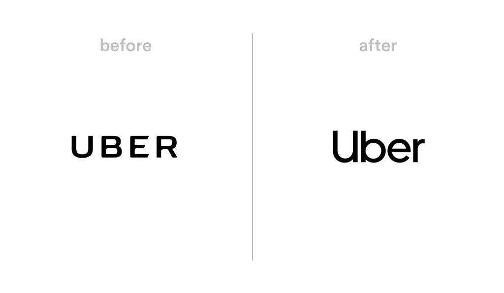
8. Uber
The controversial ride-sharing app revamped its logo with help from design firm Wolff Olins. The logo is a case study in simplicity — a sans-serif wordmark that looks clear and confident in black-on-white and vice versa. Instead of choosing a monogram or symbol for the app icon, the full logo carries over to phone screens. Readability for the win!
9. Rolling Stone
The long-standing magazine’s logo got a subtle update, with the removal of the drop shadow and white outline for a cleaner, more digital-friendly look. The logo’s original designer, Jim Parkinson, worked on the redesign, making edits to the custom typeface and creating a new “RS” monogram that works well on social channels and website graphics.

10. Rotten Tomatoes
Rotten Tomatoes updated its almost 20-year-old logo with a flat design, a new color, and a repositioning of its classic tomato and “splat” icons. Using a tomato red color in the logo makes it stickier, and the simpler design and corresponding “RT” monogram are easier to read across online platforms.

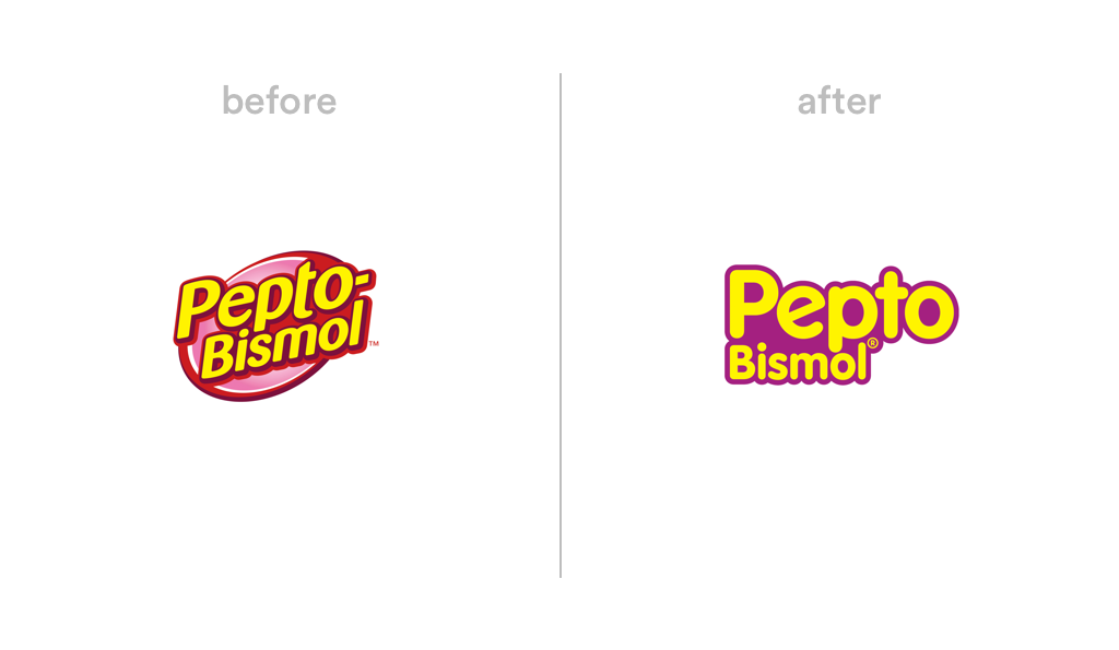
11. Pepto Bismol
Continuing on the trend of getting rid of drop-shadows, Pepto Bismol flattened its logo, removing the circle container and switching to a rounded sans-serif font with a tilted “e.” The company also took the red out of its design for a more simplified color palette and removed the dash from its name for a cleaner look.
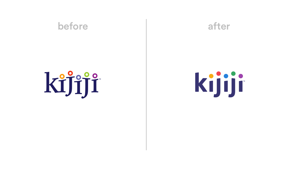
12. Kijiji
The Toronto-based online classified ad service introduced a simplified logo in October to coincide with the redesign of its website and app. The typeface switched to sans-serif but kept the slanted tops on the Is and Js. The colored dots also changed from outline to solid, resulting in a more streamlined (but still fun!) design.
13. Houzz
The online platform for home improvement and design streamlined its logo with a shorter, bolder typeface and a reimagined “H” house symbol with a brighter green color. The new logo has two variations for different uses: the symbol stacked on top the wordmark and the symbol placed beside the wordmark.

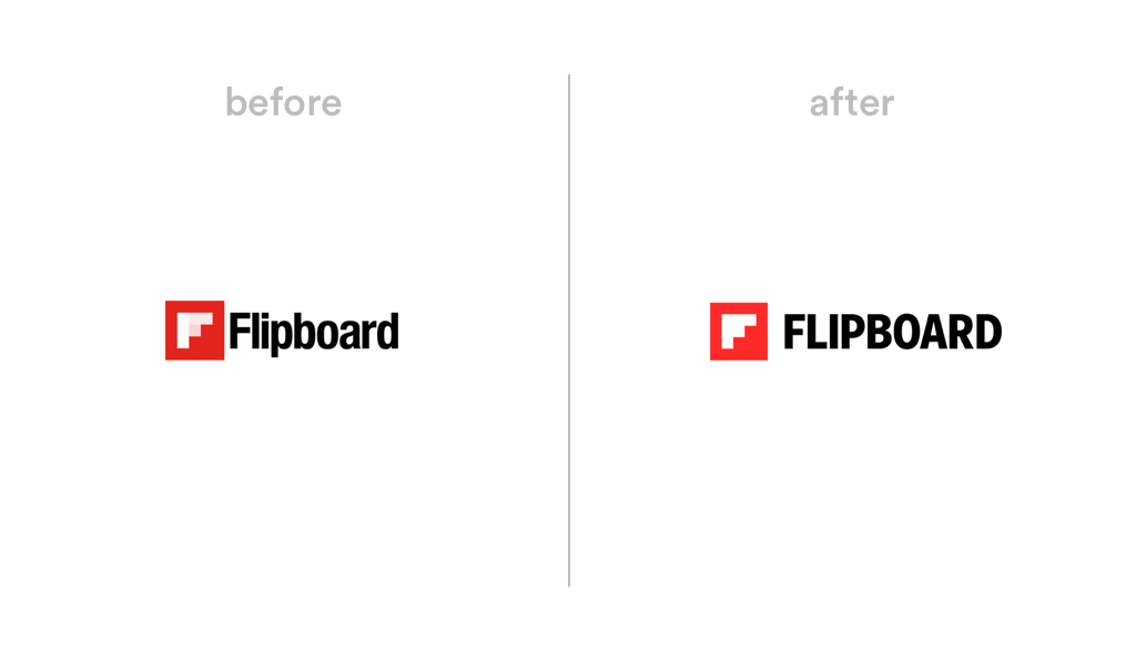
14. Flipboard
Keeping on the “subtle redesign” train, online news aggregator Flipboard updated its logo in April, introducing an all-caps typeface, a single-color symbol, and a brighter shade of red. The new “F” symbol — which represents a window — can now be used on top of imagery with the background showing through, communicating transparency and perspective.
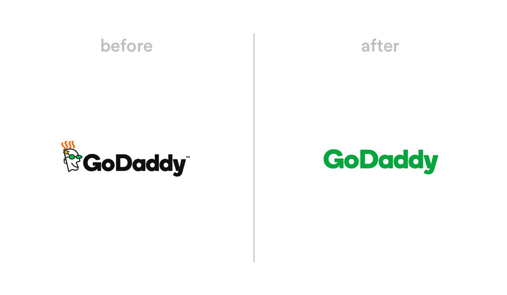
15. GoDaddy
Unlike Mailchimp’s addition of a mascot to its logo, GoDaddy went the other direction and dropped its cartoonish “guy” symbol — a bold move considering it’s a strong identifier for the company. The logo kept the typeface introduced in its 2016 redesign, with a color change from black to green.
16. Dupont
Dupont is a prime example of a classic, long-lasting logo — it hasn’t changed since the company launched in 1907! The tasteful redesign moves the “Du” and “pont” closer together, eliminating the oval container, and using a thicker, bolder font that’s easier to read.

The above list demonstrates that logo design keeps moving in a simpler direction — one where adaptability and flexibility are top priorities.
The top logo trends to note:
- Using all uppercase or all lowercase letters in wordmarks (see: Mailchimp, Classpass, Animal Planet, Flipboard)
- Subtracting symbols or words (see: GoDaddy, WeightWatchers, Dunkin’)
- Getting rid of drop shadows, 3D effects, and outlines (see: Rolling Stone, Rotten Tomatoes, Houzz)
- Use of bolder, easier-to-read fonts (see: Century 21, Dupont, Burberry)
- Creating new monogram versions of a logo for digital and social applications (see: Rolling Stone, Century21, Rotten Tomatoes)
- The brightening of logo colors (see: Mailchimp, Flipboard, Houzz)
To see more big-brand logo redesigns, check out the biggest media company rebrands of 2018.
And to learn more about what goes into creating a logo, check out our logo design guide for non-designers!