Check Out the 30 Best Logo Redesigns of 2020
By Oliver • 7 min read, Dec 8, 2020

Every now and then, your logo will need a redesign. Sometimes, drastic changes in the culture or direction of your brand demand radical new approaches to the logo. More often than not, however, designing a logo is a process of small, incremental refinements.
One of the best ways to understand how and why to redesign your logo is by studying the big guys. And despite the challenges 2020 brought us, agencies and designers have managed to create some of the best logo redesigns we’ve seen in a long time.
Logo redesign trends we’ve noticed in 2020
As 2020 comes to a close, it’s clear that a couple of trends have dominated.
First off, logos everywhere got cleaned up, stripped down, and their colors refreshed, as part of a wider push by many brands for better versatility and accessibility.
Secondly, a ton of global brands turned back to their roots, revitalizing old retro logos in new digital formats.
Let’s jump in and see how they do it!
1. GoDaddy

This new logo breathes life back into the ailing GoDaddy brand. The updated wordmark combines the letters G and O to form a heart. This generates the effect of a personable brand with heart. Plus, the updated color palette suits a more modern context.
2. Durex
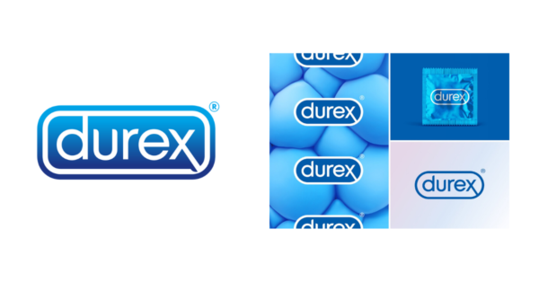
As Durex reposition their brand to become more sex-positive and inclusive, the logo got a much-needed refresher. London-based Havas replaced the clinical-looking capsule logo of the last few years with a clean, casual, single-line logo. The new look acts as a clean, simple stamp on the evolving brand. Lastly, they added a new font system called ‘One Night Sans’ (lol.)
3. Heinz

Playing off the familiarity of the brand’s existing visual vocabulary, JKR agency tweaked the classic sans-serif logo and surrounding elements to unify the brand worldwide. The theme of ‘Simple Greatness’ relies on existing visual marks like the label outline, and builds on the simple, declarative power of the original logomark.
4. Adobe
![]()
In a recent blog post, Adobe spoke about the need to update its logo and wider brand elements to suit its growing and diverse community:
“The changes we’re making focus on ensuring the mark is as functional as possible at all sizes and across all surfaces. With that context, we are shifting to a single color, all-red logo, and are refreshing the specific color red to be warmer and more contemporary.” —Sonja Hernandez, Senior Experience Design Manager, Brand, Icons, and EGD at Adobe
It’s not a huge change, but the updated font and stacked logo symbol certainly help modernize the brand.
5. Girls Who Code
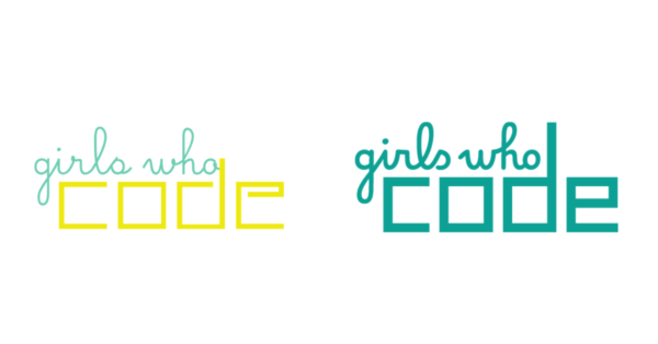
Girls Who Code is a global not-for-profit that encourages women towards technology careers. GWC’s old logo had a solid amount of recognition that needed updating for a modern context. As the centerpiece of a huge rebrand by Hyperakt, the new logo has been thickened up and the color simplified, giving it a bolder, more immediate presence that can adapt to multiple contexts.
6. Cadbury
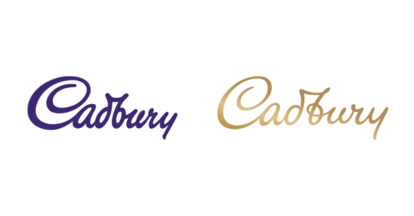
A lot of brands in 2020 are recreating historic logo elements with new digital executions. Birmingham, UK-based Cadbury’s wanted to humanize its existing logo by drawing on the original signature of William Cadbury, the grandson of the firm’s founder. The company came under fire for allegedly paying £1 million for the simple logo refresh. However, when you consider that it’s actually part of a global brand refresh for a multi-billion dollar legacy, the price tag makes more sense!
7. Watties

New Zealand’s food producer Watties has a beautiful rescripting of their old logo, removing the drop shadow and container, which were still pretty cool, but a little too dated for a modern context. We love this logo update. The result is a simplified vintage style logo that really stands out.
8. Popeyes

A bright, modern revamp of a classic, which artfully keeps the spirit of the old logo. The color palette was simplified to a bold, bright orange, and the addition of a fun, modern wordmark makes Popeyes’ 2020 logo redesign one to beat.
9. Iron City Beer

Beer and brewery logos are a hot one for 2020, and Iron City’s revamp is a great example. The Pittsburgh Brewing Co. imprint freshened up their classic emblem logo with punchier colors, a bold sans-serif font, and new packaging. We think the update is one of the coolest modern beer logo rebrands of the year.
10. Badoo
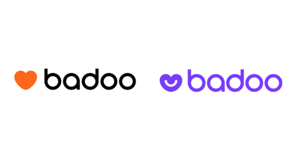
Opting for a change to the ‘swipe till your thumb bleeds’ mentality that’s dominated some dating apps, badoo cooled down their color palette and softened up their logo. The addition of a smile to their heart-shaped logomark breaks the mold in the dating space. Importantly, this shows how much a logo redesign can shape your image.
11. TGI Fridays
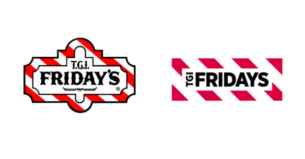
From ‘Thank God it’s Friday’s’ to simply ‘Friday’s’, the restaurant icon released a surprise brand update this month that gives the brand declarative energy with a hint of the old quirky Americana vibe. Dropping the TGIs from the logo makes the brand a little less ‘you will literally find this restaurant in every movie theatre you visit’, and a little more trendy and postmodern. Nietzsche would have been proud. And drunk. And probably depressed.
12. National Instruments
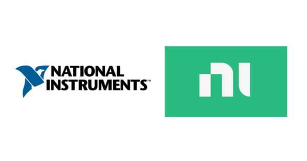
No, it’s not a marching band. National Instruments – now just ‘NI’ – is an American-based producer of automated test instruments and virtual implementation software. The logo refresh is a super simple monogram that spearheads the new, modern feel of the brand. This is probably one of the most drastic logo redesigns of 2020! If you need a quick, immediate logo to represent your brand, a monogram logo can be a great place to start.
13. Festik

Festik, a portmanteau of ‘Festival’ and ‘Tickets’, is a Toulouse-based ticketing service. The new logo features a fun and punchy sans-serif with a negative space ticket stamp detail on the K. The new logo works well because both the word and symbolism mutually reinforce one another.
14. Atlanta Brewing Co (Formerly Red Brick Brewing)
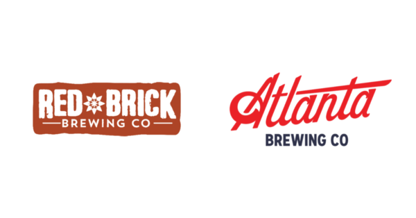
Beer branding agency CODO Design was approached by Red Brick Brewing to consolidate its brand identity and multiple product lines under one banner, while embodying an authentic sense of craft brewery culture. The result? A new name and brand: ‘Atlanta Brewing Co,’ features a faultless script logo and an amazing visual identity system to contextualize it. We particularly love the interplay between the stunning script logo mark and the fun sans-serif slogan text. Awesome!`
15. BMW
![]()
German car giant BMW updated their logo earlier this year with a goal to make it more appropriate for digital formats. Although the logo has been teased on physical applications, for now, its primary role is to represent the brand in 2D communications (like print and online). From where we’re sitting though, the transparent and pared-down modern aesthetic looks awesome on the cars too.
16. Oneplus
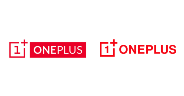
The Oneplus 2020 logo redesign features a curvier number 1 and a new font system for legibility. While it’s arguably a minor update, it sets the tone for a more flexible brand direction and integrated identity system. Additionally, the move away from the negative space font of the prior logo is a great choice in this respect.
17. Tripadvisor

The review website kept their iconic owl but flattened its colors for a more punchy and flexible identity system. Far from killing their character, Tripadvisor did a great job infusing the brand with energy and immediacy, thanks to the new capitalized font and bold logomark.
18. Fnatic

Gaming giant Fnatic’s new 2020 logo is a continuation of their existing logomark with a few adjustments. A bolder orange takes the stage (we’re seeing a trend here). Plus, the symbol was further paired down to become a truly minimal logo. As one of the most recognizable icons in the eSports world, Fnatic did well to simply clean up what they had, without rocking the boat.
19. Fisher-Price

Fisher Price’s new logo is a more playful and flexible version of the old one. The four-piece container was reduced to three semi-circles, symbolizing the three founders: Herman Fisher, Irving Price, and Helen Schelle. It also represents the intersection between kids and adults. Additionally, the font was redrawn and monogram versions of the logos were added for use in multiple contexts.
20. Gordini
![]()
Gordini is a Vermont-based ski and snowboard glove company, founded in 1956. In 2020, Cali’s Libre Design Studio redesigned the entire brand identity to bring it up to date for 2020. We love the simple, effective symbol in the shape of a G—notice the mountain on the inside? And the improved font adds a kind of Patagonia-esque vibe.
21. uscellular
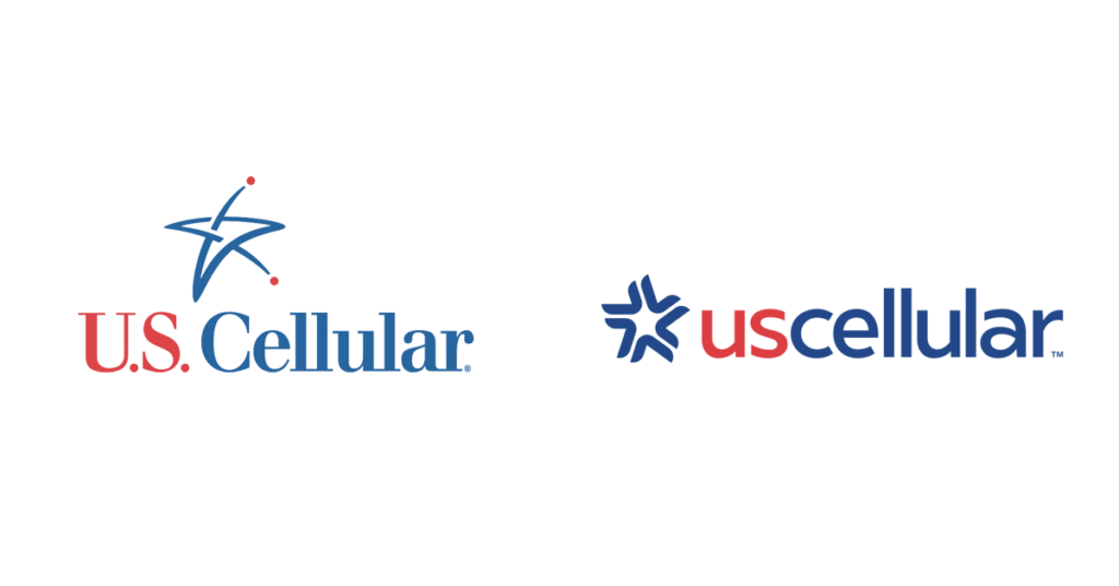
The States’ fourth-largest postpaid carrier took its brand forward with bold colors and a unification of their font. The new lowercase ‘us’ is designed to emphasize the brand’s commitment to its customer community.
22. Userzoom
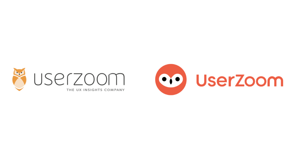
Userzoom is a ux insight provider based in London. The new brand identity and logo by agency How & How thrust Userzoom into the modern age, while helping to cement their brand positioning as a friendly, functional brand.
23. Starlight

Design agency Hulsbosch spent the latter part of the year working with Starlight Children’s Foundation on a lovely update of the organization’s old logo. It’s a perfect example of how to keep hold of unique logo elements that suit a brand (like the playful text and silhouette), while updating the execution.
24. Dictionary.com and Thesaurus.com
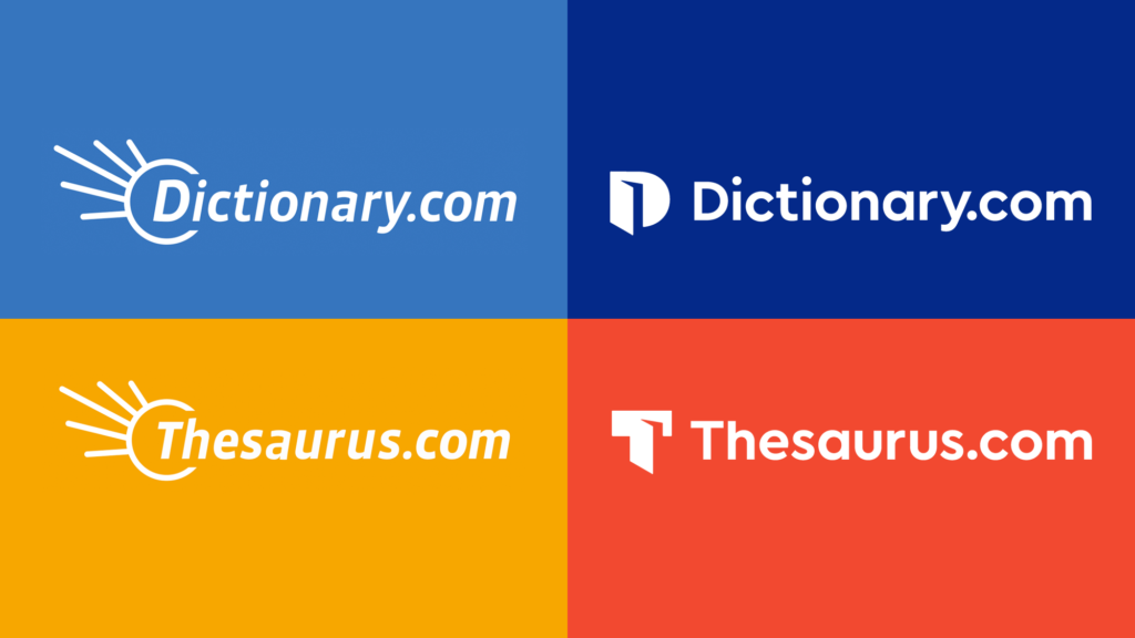
In what is probably one of the more well-known brand updates of 2020, brand agency Tolleson revamped Dictionary.com and it’s sister site, Thesaurus.com, with a new set of logo icons and beautiful brand identity to boot. The case study is well worth checking out and is a great source of inspiration if you’re looking to build your logo into a full brand identity, too.
25. Toyota
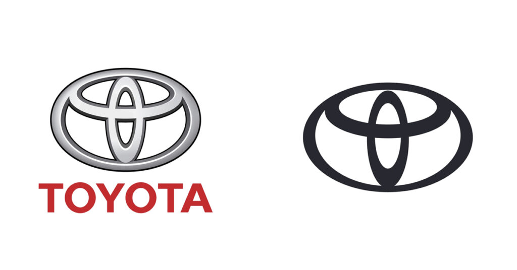
Following the likes of BMW earlier in 2020 and Volkswagen back in 2019, Toyota has modernized its logo for use in a new digital, global age. Citing the brand’s increasing visual recognition in Europe, the Japanese car giant decided to do away with the Toyota wordmark in favor of a simple, symbol-only logo – and we love it!
26. Simplex

Simplex followed their namesake and made their logo simpler. lg2’s new logo and brand identity is bold, yet beautifully engaging on the eye. One of our favorites of the year hands down.
Tip: Keep it simple! Often the difference between a good logo and a great one is getting rid of extraneous details that the logo could live without.
27. Belgian Pro League
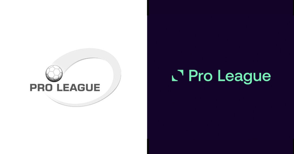
Cleaner, simpler, sharper. The new logo, font, and brand assets for Belgium’s top-flight football league is a big win, modernizing the league’s image for the digital age in a long-needed design overhaul.
28. World Triathlon
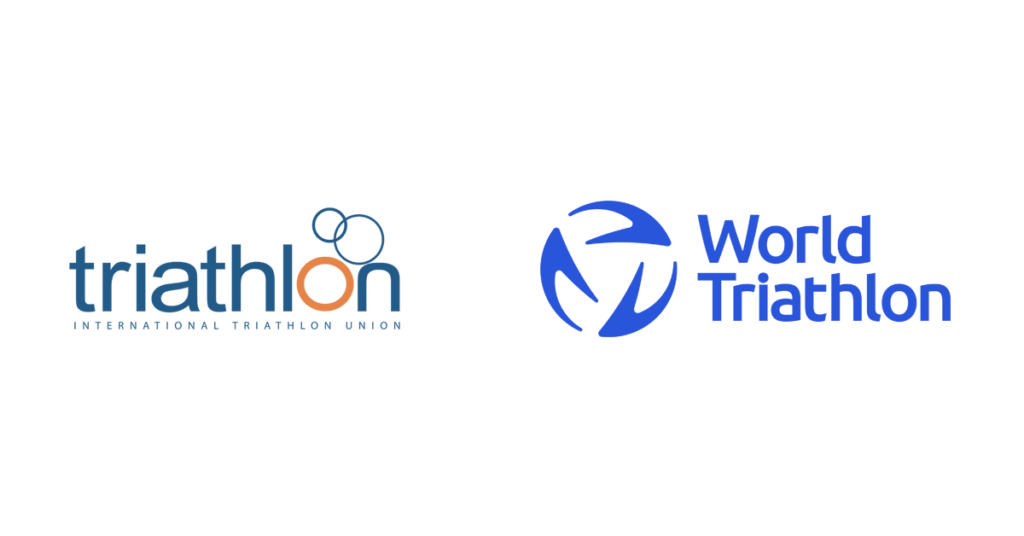
Another sports organization with a bold, modern revamp. Following extensive research into the world’s triathlon communities, brand agency RBL invoked the spirit of motion and potential with this brilliant blue 2020 logo redesign for World Triathlon.
29. Viva Air
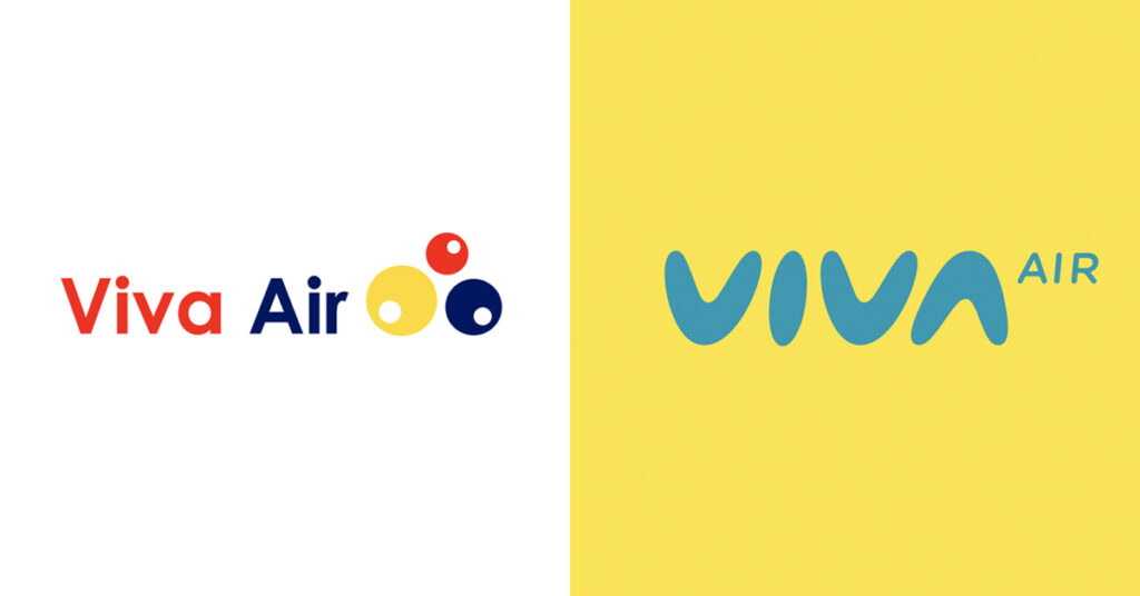
A new logo, livery, and identity for an industry in need of some bright news after 2020. ‘Inspired by the shape of a boomerang,’ says SmartBrands, ‘it is an aerodynamic logo that projects agility, confidence, closeness, modernity, and simplicity.’ Couldn’t have put it better ourselves!
30. Nissan

Now, one more for the road. Literally. The new Nissan logo is a digitization of the old metal crest the brand has worn for years, but was called in for renewal in 2017. With the end of 2020 in sight, the company just officially released the logo for some new models starting in the new year.
Time to update your logo?
Your logo is the first part of your brand that people see. So, it’s important to think about a few things if you’re considering a redesign.
- Is your current logo legible, clear, and simple?
- Does it work in multiple contexts, like print, social, and on your website?
- Does it have enough character? This doesn’t have to be anything complex. Something as simple as a small visual element, or perhaps a slight adjustment to the font, can go a long way to creating a better story for your logo and brand.
- Is your logo relevant to your industry? Does the design ‘feel right’ for your intended audience?
Ultimately, redesigning a logo is a process. The more you see how other companies in your space are doing it, the better your instincts will get. Great logo design is about making something that represents both yourself and your customers in a simple yet effective way.
Keep exploring other great logos as inspiration. If you’re ready to take on 2021, why not get started by designing a logo for your brand in our logo maker?