The 20 Best Logo Redesigns of 2022

There have been a handful of great logo redesigns in 2022. In this post, we’ll share some of our favorite logo updates of 2022, plus design tips and insights on how to design your own logo.
Right off the bat, there are a couple of clear logo design trends emerging this year. Think of these less as strict design guidelines and more design approaches. Here are the two hottest logo design trends we’ve noticed in 2022:
- Retro-vitalizing. Tons of companies are looking back to their roots to push forward into the future. With major brands trying to connect their new direction to their heritage and tell a more coherent story, expect to see more logo redesigns that playoff companies’ historical elements in subtle, or not-so-subtle ways.
- Connected branding logos. Increasingly, brands are starting to think more intelligently about how their logo reflects and informs their wider brand identity. Expect to see a lot of visual elements from logos repeating themselves in brand applications like websites, apps, and advertisements. GSK and Minecraft’s new logos are a couple of great examples of this trend.
Let’s take a look at some logos!
1. M&M’s

The new M&M’s logo is a design update for a progressive world. According to Mars, this slight logo adjustment from an angled logo to a straight one brings your visual focus to the ampersand, signaling the brand’s focus on belonging and togetherness. M&M’s character set has also changed, notably with the footwear some of the Ms are wearing.
Why we like it: from a design perspective, the new logo really does draw your eye to the ampersand. It’s a great exercise in visual hierarchy, and using subtle design elements like the spacing around the letters to draw focus and build off Mars’ concept.
2. Instagram

The lines are thicker and the gradient is friendlier. Instagram’s 2022 logo redesign is a great example of how you can update your logo for positive effect without changing anything too drastically.
According to Instagram, the new brand identity is ‘designed to embrace continued evolution to help…create more immersive and inclusive experiences.’ Cool!
Why we like it: Instagram’s new logo update is small but mighty. The bold gradient helps the app logo stand out on mobile devices. Plus, it had been a while since Instagram had updated its logo. A logo redesign is a smart way to pique people’s interest and get people talking about your brand.
3. Baskin Robbins

The new Baskin Robbins logo is less synthetic looking and definitely more retro. The company has stated the new rebrand comes as a way to attract new audiences to the brand, after finally retiring its nostalgic old logo. By reviving the pink and brown used in Baskin Robbins’ original advertising campaign in 1953, the brand is going back to its roots to revitalize itself.
4. CNET
Turkish coffee shop? Markings found on a Russian space rocket a hundred years after the fall of mankind? No, it’s Cnet’s new logo.
A surprise favorite for logo redesigns this year, the 2022 CNET logo redesign is an attempt to give trust and dependability to the tech news website, which is looking to expand its impact beyond tech.
The new wordmark logo is an amazing use of a bold font to establish character. This update succeeds in giving CNET a much-needed grown-up-ness to a brand that once just looked like a tech news blog.
5. Minecraft
Another example of subtle changes to an existing logo having a strong impact. The new Minecraft logo and refreshed visual identity by Bold includes an updated visual frame perspective and enhanced coloring. The new logo is sophisticated, flexible, and retro-cool.
6. Stanley Cup Playoffs

Beautiful to see for a brand designer. Hard to watch as a Leafs fan. 2022 saw a towering, monumental logo update to the greatest show on ice: the Stanley Cup Playoffs.
The new Stanley Cup logo takes elements from hockey lore and memorabilia to re-ignite the tournament’s brand. The shape of the shield reflects the championship banners raised in the arenas of the trophy’s winners.
The logo font for ‘Stanley Cup’ matches the original tournament cup engravings. Finally, the font pairing for the word ‘Playoffs’ reflects the writing on Montreal’s Windsor Hotel, site of the founding of the NHL in 1917.
Why we like it: the new logo’s updated design is more fitting for a storied sporting event than the old one, which looked like a logo for a Beyblade tournament.
7. Indeed
Designed to help all people get jobs. That’s the tagline for job site Indeed’s new brand identity. Now, while they technically didn’t update their logo at all, this one’s worth mentioning. With a focus on a dynamic color range and ‘kind and authentic’ imagery, Indeed’s brand has gone from 2021’s ‘every generic tech company ever’ blue to an updated, beautiful website and brand system.
8. GSK
Bringing together science, technology, and talent – or at least that’s how design firm Wolff Olins describes GSK’s new logo and brand identity. It’s a familiar theme we’ve seen in logo redesigns of this year: reaching back into the brand’s history and heritage to push it forwards into a new future.
Why we like it: GSK’s new logo is a good case study of how your brand identity should be an extension of your logo (and vice versa), with shapes and elements of the logo appearing repeatedly throughout the company’s website.
9. Nākd
A staple of hikers, lunchboxes, and office snacks, the Nākd snacks brand underwent a refresh by BrandMe earlier in June this year. Losing the grungy edges and booger green from the old logo, the snacks giant has opted for a fresher, more flexible hand-drawn logo that should serve the brand for years to come.
Why we like it: Simplicity works wonders. The new Nākd logo is cleaner, crisper, and reads beautifully to the eye.
10. Batman

Marking the arrival of a new creative head, Chip Zdarsky, and a new era in the comic, the Batman logo has been updated for the first time since 2011. Created by designer Jorge Jimenez, Batman #125 will debut the new logomark on July 5, 2022. Featuring the shadow of the bat symbol, the new logo is punchier, grittier, and gives the comic a powerful re-vamped feel.
11. Buick

The new Buick logo is part of a larger logo trend over the last few years for the automobile industry, namely, revitalizing retro brand systems with a digital-first aesthetic. Buick’s brand-new logo takes the classic tri-shield logomark and pairs it with a slick, modern typeface. According to the company, the new Buick logo ‘drives the brand forward to an electric future’
Why we like it:
Although the new Buick logo has its critics, we think it’s a great middle ground between older classic car logos and the pared-back, modern logos of today’s electric automobile trend.
12. Hootsuite

Hootsuite’s new branding situates their brand icon ‘Owly’ as a more central character, to help emphasize their vision of a friendlier social platform and world. Created in-house, Hootsuite’s new brand system emphasizes approachability and expressiveness for brands that rely on social networks.
Why we like it: Prior to COVID, a lot of tech brand logos were super utilitarian. While this was great for accessibility and multimedia applications, a lot of these logomarks seemed devoid of personality. Hootsuite’s new logo reintroduces a refreshing human element and paves the way for other brands to express themselves more.
13. Sprite
![]()
Sprite’s new logo is part of a global brand refresh, a first for Coca Cola Group’s second-largest beverage brand. Working with global agency WPP, Sprite’s new logo is a stripped-down version of the iconic flash logo of years past.
Why we like it: The new logo retains visual appeal, particularly in unique font design elements, but takes the wordmark to a whole new level by breaking away from the old border, and enhancing the text’s sense of movement (a font trend we’re seeing consistently this year.)
14. Toblerone
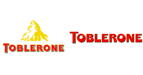
Another iconic food and beverage brand gets a rare refresh. Toblerone’s new logo design is part of a wider brand revamp, and one of the best examples of the connected branding approach we mentioned at the start of this post.
Why we like it: Toblerone’s new logo is a great example of a brand that feels integrated, from the logomark to packaging applications and other visual design elements. The new logo is an almost psychedelic reimagining of the old one, which suits the brand’s new expressive color palette perfectly.
15. Zapier

Zapier, an application integration platform used by thousands of companies worldwide, recently updated its brand and logo for the first time in the company’s ten-year history. As part of a push to capture the ‘magic and motion’ of Zapier’s customer base, the brand ditched the old dull IT company logo for a brand new logo and refreshed brand identity.
Why we like it: Another example of a tech brand trying to instill a greater sense of personality into the brand, Zapier’s addition of the red underscore to the logomark, plus a bold, retro font, has made a once stale logo way more fun and punchy.
16. Citroen
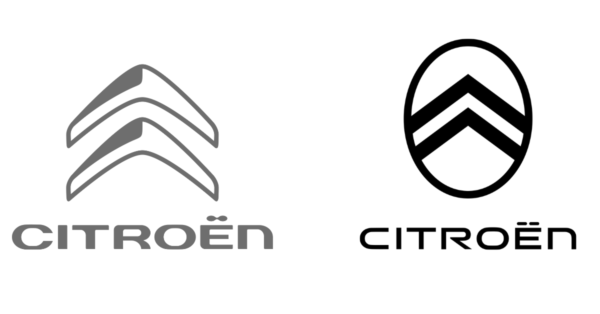
European car giant Citroen recently followed in the wake of nearly every other major car retailer on the planet, by updating its logo to reflect its aspirations as a digital-first automobile brand. Similarly, the company opted to revitalize an older logo from the past, rather than designing a brand-new logo.
Why we like it: The reintroduction of André Citroën’s oval logo gives physical applications of the logo (namely, on Citroen’s cars) a more modern feel, by reducing the clutter of the old logo and replacing it with more geometric shapes. The logo design has a sleek and economical aesthetic.
17. Skoda

A stereotypically boring and literally indestructible European old-man car might actually become…cool? Skoda’s new logo and brand identity feature a bold new logomark, font, and utterly gorgeous color palette.
Why we like it: The new pale neon green is a stunning enhancement of the brand’s old snot green color, and the simplification of the prior logo makes the logo symbol pop like never before. The new logo font is clean, sharp, and minimalistic. One of our favorite new logos of 2022, for sure.
18. Bugatti

Buggati’s new corporate identity marks the company’s ambition to move beyond the automotive world. In partnership with global design consultancy Interbrand, the center of the new Bugatti branding is a bold new wordmark logo, featuring classic elements of the carmaker’s ‘EB’ logo.
Why we like it: Stripping back the old logo’s heritage elements and focusing on the EB wordmark has allowed Bugatti to look less like an obscure European beer brand, and more like the luxury automotive powerhouse that it is. In combination with the brand’s new color palette, the 2022 logo design is punchy, powerful, and packed with prestige.
19. Intuit

Intuit started as an alternative to pencil-on-paper accounting. Now, the company is a global financial technology company with a host of other brands under its umbrella. To reflect its evolving service offering, Intuit recently underwent a complete rebrand, including a simple, sophisticated new logo.
Why we like it: Although the changes are subtle, the new logo is a more serious logomark for a more serious brand. By removing the counters from the ‘i’s in the logo and capitalizing the typeface, 2022’s Intuit logo design provides a clear sense of the company’s new direction.
20. Aston Martin
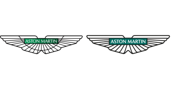
After recently throwing their hat in the ring for 2021’s F1 season, Aston Martin has made their first major logo update since 2003. Designed by Peter Saville, Aston Martin’s 2022 logo update is another example of a car giant playing off its heritage logo elements to revitalize its brand.
Why we like it: Aston Martin’s new logo shows that you don’t have to reinvent the wheel to improve your logo significantly. A few simple redesign choices – like ditching the old gradient and adding weight to the wings and font – have given Aston Martin one of the best new logos of the year.
Tips from the top logo redesigns of 2022
2022 saw some of the world’s biggest brands update their logos. If you’re looking to build a new brand, or just breathe more life into your existing logo, keep these tips in mind:
- The world’s becoming a more inclusive and accessible space for everyone. Lots of companies are rethinking their logo designs to reflect that.
- Think about cool story elements for your brand that could inform your logo. A logo is a great way to capture your brand’s character in the simplest, smallest application possible. Think about how your logo font and primary logo symbol capture your brand.
- Simplicity, legibility, color, and visual hierarchy are probably the most important elements to think about when designing, or re-designing your logo. What simple ways could you enhance your logo, without totally rocking the boat or rebranding?
If you’re ready to take a step in a new direction, and you want to tell your brand’s story through a new logo, why not head over to our logo maker, and get designing!