8 Logo Lessons from 2018’s Biggest Media Brand Redesigns (So Far)
By Erin Jun 21, 2018
Media outlets face intense public scrutiny when they rebrand. With loyal followers, an established spot in the cultural landscape, and highly visible logos, there’s great expectations for great design.
Fortunately, the latest media logo redesigns haven’t disappointed — they’re fresh, exciting, and filled with takeaways for amateurs and experts alike. We took a look at 8 popular brands — from news to podcasts — and analyzed their new looks.
1. Slate
Slate started 2018 with a new all-caps logotype featuring a sliced “A” and a deeper shade of maroon than its previous identity.
The online magazine (and podcast producer) shared that it was “sorely in need of a visual update to bring our look up to the level of our stories.”
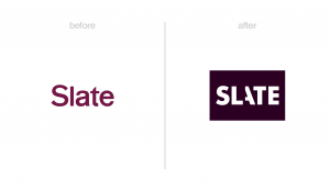 Lesson: Don’t underestimate the power of a wordmark logo. Slate used a bolder typeface and a creative flourish on the “A.” These traits add more personality to the brand — and make it more memorable.
“We’re employing some lovely new typefaces: Retina from Frere-Jones Type for body text and supporting copy and Register from A2-TYPE for headlines. Both typefaces have a delightful idiosyncrasy to them, economical in their proportions while featuring a trove of considered details.” – Jason Santa Maria, Slate’s designer director (via Slate)
2. Chicago Sun-Times
The Chicago Sun-Times revealed a new identity in March, working with Ogilvy on the massive redesign project, and positioning itself as “the hardest working paper in America.”
The new logo features a cleaner sans-serif font, with “Chicago” getting the same visual treatment as the rest of the name. It also brings a stronger identity with the red star symbol, as seen on the Chicago flag.
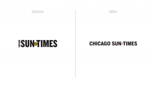 Lesson: Simplicity wins again! The new look is cleaner and easier to read online and in print, and the logo adapts well to a monogram version used on social media. It also has better visual hierarchy — with the word “Chicago” the same size as the rest of the name, it’s more legible and memorable.
“The new Sun-Times logo incorporates a star from the Chicago flag. That’s a nod to the Chicagoans in every neighborhood who’ve helped keep the paper in business by reading it each day and coming to its website; to the businesses that advertise with it, and to the investors who fund its work…” – Chicago Sun-Times Staff (via its website)
3. This American Life
Podcast pioneer This American Life introduced a new logo in January, adding a symbol: a line-drawn American flag in the shape of a speech bubble.
It also dropped its chopped-up text in favor of a more digestible wordmark, and simplified the look by using only two colors (red and white) instead of three.
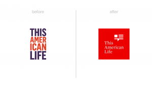 Lesson: If you have a longer name, choose a logo symbol (or monogram) that represents your brand while keeping its identity as a standalone image on smaller target areas like social media profiles. Take time to choose or create a symbol that matches your brand attributes and is visually consistent with the rest of your logo.
“The wordmark uses Mercury by foundry Hoefler & Co, a typeface originally developed for a newspaper chain. This conveys the show’s solid reputation for reporting, and – compared with the previous bold, all-caps type – gives the branding maturity, clarity and a more classic image.” – Writer Jenny Brewer (via It’s Nice That)
4. The Guardian
The Guardian launched a new, downsized newspaper format, website, logo, and font to create a more consistent and clear identity across all mediums.
The new logo is a black wordmark in an attention-grabbing typeface. Note that capital letters were added back in, which further demonstrate confidence and authority.
 Lesson: Find a typeface that’s appropriate for your brand. The Guardian chose a more suitable typeface to represent its British heritage, and it makes the logo more impactful.
Also: consider a stacked text logo if you have two words in your company name. This layout leaves less negative space when placed in a square — and it can be easier to read on different applications.
“We have introduced a font called Guardian Headline that is simple, confident and impactful. This was a collaboration with the design experts Commercial Type, who created the original Guardian Egyptian, and is easier to read.” – Guardian editor-in-chief Katharine Viner (via The Guardian)
5. MAD Magazine
MAD Magazine had the same logo for more than six decades, so the unveiling of its new look in April was a big deal.
The brand took its original 1950s logo and tweaked it slightly; it features an entirely different (and always-changing) color, style, and typeface than the previous black-and-red logo. It also features small but purposeful imperfections, like the sizing and positioning of the holes in the A and D.
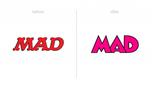 Lesson: When embarking on a rebrand, ask yourself, how can I make my logo more appropriate for my company? In the case of MAD, the new logo better represents the brand’s crazy style and quirkiness, as seen in its multi-color variations and imperfections.
Also: Don’t be shy about showing off your new look! We love how MAD unabashedly posted its new logo on its Instagram feed in multiple color variations and chopped up into pieces.
“We wanted to give MAD a new look, but people often hate new things, and we had plenty of perfectly fine old things already. We were influenced by Harvey Kurtzman’s logo from MAD’s first few issues, back when it was strictly a comic book. So if our new logo looks familiar, that’s because it’s a modified version of the 66-year-old original.” – MAD Magazine Editors (via MAD Magazine)
6. Glamour
Glamour launched a new look with its May 2018 issue, including a complete overhaul of its wordmark logo. Gone is the bold lettering (which often appeared in pink); in its place is a black-and-white geometric typeface with a drop shadow.
The typeface (Landmark by Jonathan Hoefler) also appears throughout the magazine’s pages and on its website.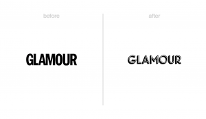 Lesson: Glamour’s rebrand has seen mixed feedback, but it demonstrates the case for making a radical change: the magazine wanted to shed aspects of its old image and what they stood for to usher in a new era.
It also shows the power of picking a recognizable typeface — one that Glamour now “owns” and can use in many more places than the logo, including print pages, social media images, and more, adding up to a strong and consistent identity.
“In an era when women are more connected than ever, how do we continue to grow the Glamour tribe and become an even more vital part of women’s lives? It was in answering these questions that we developed the new look and four new sections for Glamour print.” – Glamour editor-in-chief Samantha Barry (via Glamour)
7. Rotten Tomatoes
Rotten Tomatoes updated its almost 20-year-old logo with a flat design, a new color, and a repositioning of both its classic tomato and “splat” icons.
Pentagram design studio spearheaded the rebrand, and Rotten Tomatoes asked fans for their opinions throughout the process.
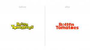 Lesson: Choose an appropriate color! It makes sense for the Rotten Tomatoes logo to include a tomato-red color, as it makes it stickier and more memorable. Dropping the drop-shadow also makes this logo bolder and easier to read at different sizes.
“Our goal with the Rotten Tomatoes redesign was to preserve the brand essence our fans have come to know and trust, while building a modern and cohesive visual identity that can live across all platforms in the digital and physical worlds––from mobile to video to live events.” – Jeff Voris, VP, Rotten Tomatoes (via Pentagram)
8. Ad Age
Ad Age made the long-overdue step of officially shortening its name at the end of 2017 to match how everyone refers to the well-known industry publication.
The new logo borrows from the brand’s 1930s logo, which featured a similar typeface with a standout “g.”
 Lesson: Less is more. A shorter name is more digestible and memorable — and more flexible when used across mediums. For example, Ad Age’s new logo can be stacked in its favicon, used vertically on business cards and other collateral, and paired with other sub-brands while upholding a strong visual identity.
p.s. Don’t underestimate the impact of a character feature (as seen on the “g”)
“The descending “g” serves as a focal point that acts as a purposeful, consistent clip, and can be affixed to whatever deserves your attention—from headlines to images to critical data—while serving as a building block of the entire branding system.” – Ad Age’s creativity editor Ann-Christine Diaz (via Ad Age)
p.s. Want more visual branding tips? Check out our roundup of logo redesigns from 2018.