How to Design a Mountain Logo that Reaches New Heights

Mountains are powerful symbols that communicate strength, confidence, adventure, and purpose. They also represent nature and the expansiveness of the great outdoors.
It’s no surprise, then, that mountains are popular symbols in logo design, especially in industries like beer, bottled water, tourism, camping, outdoor equipment, and more. (Also, if you have the word “summit” in your company name, there’s a good chance you’ll have a mountain in your logo!)
Let’s start by taking a look at a few iconic companies with mountain logos:
Paramount Pictures
Paramount has a classic logo that’s sometimes referred to as “Majestic Mountain” — it was reportedly inspired by the Ben Lomond Mountain in Utah. Housed in a circle crowned by stars, it still appears at the beginning of each film the studio produces and has remained constant over many decades.
Toblerone
This Swiss Alps-inspired logo echoes the triangular shape of the classic chocolate bar. Look closely and you’ll see a bear hidden in the mountain through the use of negative space — the bear is a symbol of the city of Bern where Toblerone is made.
Adidas
This iconic logo is a three-stripe representation of a mountain — it’s reminiscent of the brand’s previous (and classic) “trefoil” logo. As an athletic brand, the mountain represents “the challenge to be faced and the goals to be achieved,” according to former Adidas creative director Peter Moore.

Coors Light
The latest Coors Light logo embraces flat design with a solid grey triangle mountain symbol topped with a classic red script typeface. The brand’s beer cans depict more realistic looking, snow-capped mountains.

Evian
Evian’s logo includes mountain peaks that sit atop its wordmark. The 2013 redesign of this logo kept the blue gradient on the mountains, but simplified their outline and removed the pink circle container for a cleaner look.
Mountain Logos: Design Considerations and Tips
As you can see from the above examples, mountain logos can range from rugged and epic-looking to flat and graphic.
Here are some questions to ask yourself if you want to include a mountain symbol in your logo:
- Do you want a geometric, dimensional mountain style (like Paramount’s) or a simple triangular look (like Coors or Adidas)?
- Do you want your mountains to have detail like negative space, gradient, or snow caps — or will they be a solid color?
- Do you want the mountain symbol to appear above the wordmark or beside it?
- Do you want a sun or other elements (trees, clouds, or stars) in the symbol alongside the mountain?
- Do you want the mountain in a circle container?
- What color do you want your mountains to be? (Grey, blue, and white are the most popular color choices.)
- Can the mountain symbol you choose stand alone from the wordmark? (e.g. If you want to use the symbol only on social media, your favicon, etc.)?
Once you have an idea of what you want for your mountain logo, follow these three tips:
1. Match your font style with the style of your symbol (or vice-versa)
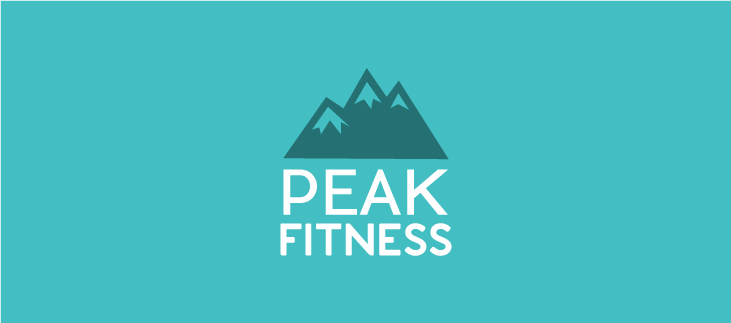
In the below logo, the mountain symbol has geometric forms that create negative space. We’ve chosen a geometric, sans-serif typeface to match the style of the symbol with the style of the company name to make it look more professional. If the symbol had rounded forms, then a more playful font with similar forms would work well.

2. Provide contrast between logo elements
In the below logo, we chose teal for the background color. Instead of opting for a white mountain symbol to match the color of the text, we changed the symbol to a deeper shade of teal to create contrast. By doing this, the eye is drawn to the most important element — the company name — first and the symbol second.

3. Ask yourself, “What do I want the viewer to see first and why?”
The below Blue Stone logo has three elements. The order of hierarchy (visual importance of elements) is company name, symbol, and then slogan. Let’s take a closer look:
- The company name is in a black, bold, sans-serif typeface to make it stand out as the first element that people see. The company name is the most important element and needs to be strong enough to stand alone from all the other elements.
- The symbol has a soft blue gradient to make it stand out (but not overpower) the other elements. By making it the same height as the company name and slogan, it brings your attention to that element and makes it strong enough to stand alone as a company mark (for example, as a favicon or profile photo in social media).
- The slogan is a tint of black (grey) and smaller in width than the company name, which makes this element slightly less prominent.

Ready to make a logo with sweet, sweet mountain peaks? Try our online logo maker, and be sure to search “mountain” when you get to the symbols section.
Or read our guide to designing a logo (even if you’re not a designer)!