How to Use Pantone’s Color of the Year 2022: Very Peri
By Nisha Dec 15, 2021
Pantone has unveiled its 2022 color of the year, and it’s a little different from what we’d expect. Straying away from the popular earthy tones and muted neutrals we’ve seen in recent logo redesigns – Veri Peri is a warm and uplifting periwinkle purple.

Source: pantone.com
Pantone describes the color as a symbol of the transition period we’re going through, where our physical and digital lives have merged in new ways.
Our experiences in isolation over the last two years have weaved our ideas of physical and digital spaces together. We’ve witnessed exciting growth in technology, expanding interest in the metaverse, a rise in completely new business categories, and a growth in online artistic communities. PANTONE 17-3938 Very Peri brings the fusion of digital and physical realms together, representing our new reality.
Pantone 2022 color of the year color combinations
Looking for colors to pair with PANTONE 17-3938 Very Peri? This nostalgic purple-y blue pairs well with muted greens, bubblegum pinks, and saturated blues. Here are some potential color combinations for the 2022 Pantone color of the year.
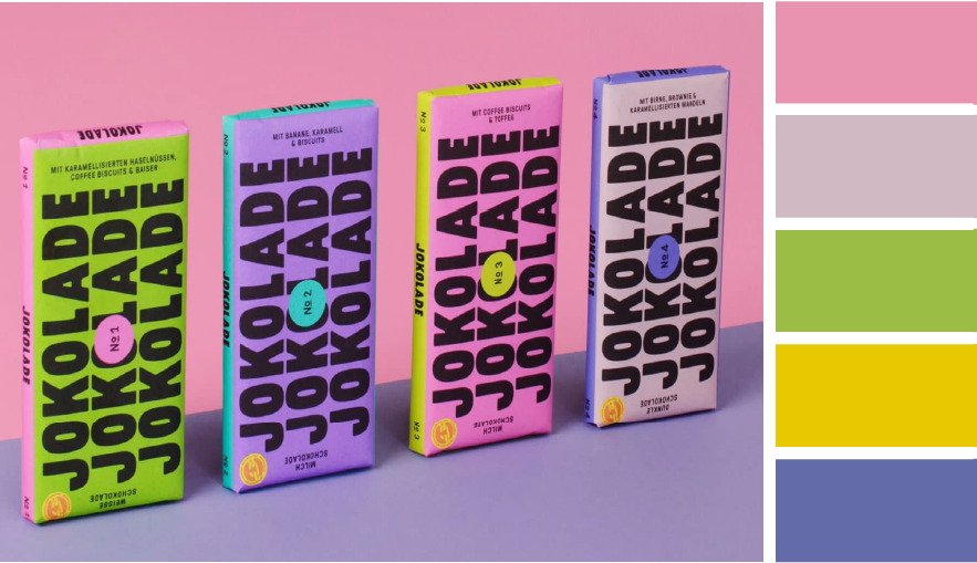
Combine Veri Peri with bold saturated colors to create an electrifying color palette that immediately grabs people’s attention. Try combining it with zesty lemon yellow or lime green for contrast.

Incorporate Very Peri into a soft, muted color palette for a sophisticated yet colorful look. Try combining it with a warm plum, or cool teal color.

Add Very Peri as a dose of cool to an otherwise warm palette to bring balance and form to your brand identity.
Pantone 2022 color of the year branding examples
Looking for ways to apply this color to your branding? We’ve pulled some beautiful examples from brands that are ahead of the trend.

Source: kineuphorics.com
Non-alcoholic adult beverage brand, Kin Euphorics, uses the Pantone 2022 color of the year as a font color. Veri Peri is a dark enough shade to be used as a logo color choice or in product packaging.

Source: candle + friends
Here, Candle + Friends pairs Veri Peri with a crimson red, and dynamic orange to bring balance to their color palette. Use this periwinkle hue to add a sense of calm to your branding.

Source: Tatcha.com
Beauty brand, Tatcha, uses a soft periwinkle blue as the base color on its product packaging. The color is both mysterious and inviting.
Notice how Veri Peri can create a sense of calm when used with soft, muted colors like the meditation logo above? Contrastingly, we see how its use can also bring an electric sense of action to a logo when paired with brighter colors.
What types of businesses can use Pantone’s 2022 color of the year?
It’s the versatility of this color is what makes it a great option for branding in 2022. The color is suited well for digital businesses as well as those with physical products.
- Technology
- Consulting
- Beauty
- Wellness
- Creative arts
Try using this periwinkle shade in your logo design using Looka’s logo maker!