Well Played: The Evolution of the Roblox Logo

The Roblox logo is one of the most recognizable gaming logos worldwide. Roblox extends beyond simply a game – it represents a vibrant community where passionate creators can interact.
The game has steadily garnered attention over the years, with its demand surging significantly during the pandemic and beyond. As an accessible form of entertainment and engagement, users can connect with others through this gaming world.
But the notable Roblox wordmark as we know it didn’t always look the same. The brand’s logo went through several evolutions before landing where it is today.
Creating the Roblox community

Roblox started as a simulated 2D physics laboratory game called Interactive Physics. As the game evolved, the name GoBlocks took hold in 2003.
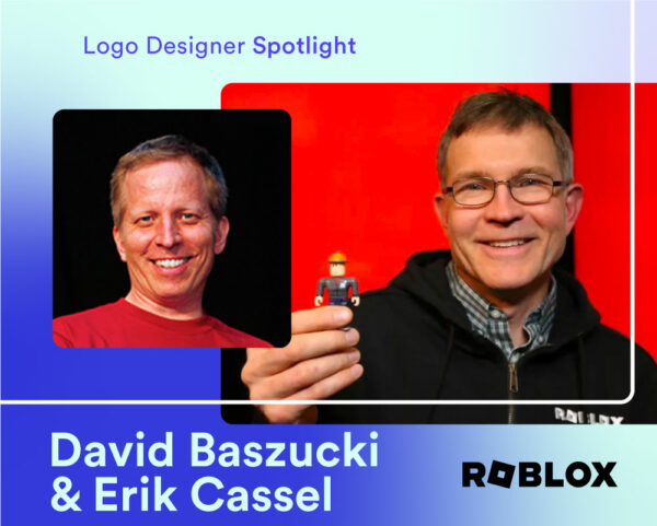
In 2004, founders Erik Cassell and David Baszuck launched the beta version of Roblox under the name DynaBlocks. This domain name quickly transitioned to the name we’re all familiar with– Roblox.
Over time, the Roblox wordmark would represent a rapidly expanding community of young creatives. The brand underscores a playfulness in its logo evolution as a testament to its youthful players– 67% of Roblox users today are under the age of 16.
Roblox logo evolution summary
The Roblox logo underwent numerous iterations over the years. Today, the logo is black and white, symbolizing its innovation and authority in the gaming world.

- Interactive Physics (1989-1997): The physics simulation program became the building blocks for the gaming platform we know today. The Interactive Physics logo aesthetic had a far more mature and serious tone, vastly differing from any of the future Roblox wordmarks.
- GoBlocks (2003): As a short-lived foray into the name GoBlocks, this was the first attempt at naming the game. Its color scheme, however – a simplistic green and blue two-tone – was extinguished just as quickly as the experimental title.
- DynaBlocks (2003-2004): With the notion of “blocks” still holding strong, this was the final naming attempt before Roblox came into being. While the prototype didn’t quite stand the test of time, the team attempted to carry over its multi-colored text and a similar script choice into the next iteration.
- Roblox is officially born (2004-2005): Both the color scheme and platform name were completely reimagined by this time, focusing on distinctiveness and boldness. The interconnected bubble letter font was red and white, with all letters on the same plane. The trademark accent above the “O” appeared here for the first time.
- A bigger and bolder iteration (2005-2006): Redesigned as a larger, edgier version of its predecessor, this Roblox iteration had a game-like, virtual reality element.
- Kid-friendly and playful (2006-2017): All versions of this next redesign, which spanned beyond a decade, incorporated feelings of child-like playfulness. The cartoonish letters appealed to a more youthful user category.
- Seeing red (2017-2018): An opaque and unique typeface was introduced at this time. The all-red design was a paired back, geometric version of the previous Roblox logos – the most notable change being the replacement of the accented “O” with a square, gear-like “O”.
- Bold in the shade (2018-2022): This new black logo was identical to its red counterpart, reiterating the brand’s future thinking in its tilted, square “O.”
- A standout symbol (Today): A simple yet powerful update to the previous wordmark, Roblox’s current logo is its most easily identifiable version yet.
Design a gaming logo today!
1989-1997: Interactive Physics and where it all began

Created in 1989 by Knowledge Revolution, a company founded by David Baszucki (one-half of the brains behind Roblox), Interactive Physics was a physics simulation program. The program gained popularity as an educational tool for teaching students about physics in a 2D environment.
Interactive Physics allowed users to manipulate parts, hinges, ropes, and springs to create and measure various physics experiments in a virtual lab. The program ultimately played a pivotal role in the development of Roblox.
The company had a more serious overall font tone, presented in a combined black, all-caps “INTERACTIVE” overlapping an italicized red, cursive “Physics”.
2003: A short-lived GoBlocks

During the early stages of development, the Roblox team prototyped the game under the name GoBlocks. Reflected in a green and blue sans serif font, this initial option played a major role in influencing the final name choice.
GoBlocks was one of three names that the team considered for Roblox – though this first stab at it didn’t remain in use for long.
2003-2004: Back to the drawing board with DynaBlocks

The GoBlocks name went out almost as soon as it came in in favor of DynaBlocks.
While the DynaBlocks name was never officially associated with the Roblox brand, a mockup version of the wordmark was present on the website for a time. This mockup featured a thickened, sans-serif text in a rainbow of colors.
It was this multi-colored wordmark that inspired the very first Roblox logo.
2004-2005: Introducing, Roblox

The name “Roblox” emerged from its predecessors as a simplistic, more memorable name.
Originally, the first Roblox logo donned various colors, similar to the DynaBlocks color scheme. The text was presented in a shadowed, sans-serif title case, each letter using a different color. It also mimicked the aesthetic of Google’s earlier designs too closely, which likely quelled its staying power.
By mid to late 2004, Roblox changed its wordmark again to text with striking, red outlines and an accent over the ‘o’ – indicating a long vowel sound.
This distinctly early-2000s look would be the first official logo used on the website.
2005-2006: Levelling up the logo

In 2005, David Baszucki’s father-in-law took on the challenge of updating and redesigning the new Roblox logo. This wordmark was shown on the company’s website during its later development and beta testing phase.
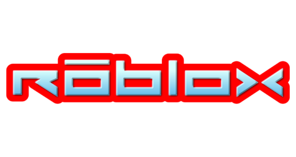
Maintaining its bold, red outline and its accent mark above the first “o,” the logo adopted a different typeface, a mix of upper and lowercase letters, and a blue gradient hue on each letter. These visual combinations had clear video and computer gaming vibes.
At the time, this design had an engaging and memorable quality, significantly shaping Roblox’s future logos.
2006-2009: Cartoon effect

In 2006, the Roblox wordmark underwent another update, again changing its appearance. While the red outline remained, the blue gradient hue was removed altogether, and the font shifted to a more cartoon-like style, with a marker-stroke effect.
With the intention of engaging with a younger audience, this logo had an animated element, projecting a fun, kid-friendly feel.
This new logo was initially just a mockup for the website redesign. The team, however, became so enamored with it, that it became the official Roblox logo.
2007-2010: Slight tweaks

In the second iteration of this Roblox logo, the brand made slight hue and design modifications, shifting the type of red used, elongating certain letters, and widening some of the negative space within a few of the letters. The logo could be used in print at higher resolutions in this newly polished vector version.
Until 2009, this iteration served as a secondary logo for merchandise and featured in the “Happy Home in Robloxia” map as the welcome decal.
2017–2018: Switching gears from the previous logo

In 2017, marking the first logo change in over 10 years, Roblox introduced a brand new logo in a modified Gill Sans Ultra Bold font. Roblox would even sporadically use this logo up until 2022.
This logo is similar to what users recognize today. Its geometric letters and tilted gear-like first “O” symbolize the building blocks of Roblox’s unique world of game creation.
This logo would sometimes include the “Powering Imagination” tagline in its bright red hue. According to David Baszucki, this Roblox logo symbolized the brand’s dedication to a cross-platform vision and its mission to inspire imaginations on a global scale.
2018–2022: Paint it black

Roblox maintained the identical typeface of the previous logo but updated the red wordmark to all-black. This revised logo was officially adopted in early 2019, and in its color transition, it could be more easily placed on any medium or background.
2022–present: Making refinements

In 2022, Roblox made a minor logo refresh.
The logo’s font changed from Gill Sans Ultra Bold to Gotham, resulting in a slimmer appearance. Additionally, the second “O” was changed from a square to rounded shape, while the first “O” retained its prominent, tilted square.
The Roblox logo’s notable font
The Roblox logo turned from a quirky display font to a more legible sans serif. No matter the iteration, the typographic style was boldly geometric and attention-grabbing.
The current Roblox typeface is by far the easiest of all its iterations to read from a distance, with bigger spaces inside the letters “R’, both “O’s”, and the B. With such identifiable individual letters, the text is hard to miss.
It’s design choices like these that give Roblox an edge when it comes to memorability and scalability.
Roblox’s icon significance

David Baszucki, the company’s co-founder, explained that the current Roblox logo really stands out due to its characteristic “O” tilt.
This gear-like square symbolizes construction, advancement, and movement – all of which are relevant to the gaming platform.
Through enhancing its logo, Roblox preserved the essence of its iconic tilt while mirroring the platform’s evolution.
Frequently asked questions
1. Who are the founders of Roblox?
David Baszucki and Erik Cassel founded the gaming platform Roblox in 2004 and released it in 2006.
2. Did Roblox have any other names?
Before the name Roblox became official, the team prototyped two other names: GoBlocks and DynaBlocks. The physics simulation program Interactive Physics inspired the concept for Roblox.
3. What is Roblox?
Roblox is a virtual gaming platform and game creation system.
If you’re starting a business and want an easy way to design a logo in under 10 minutes, try Looka’s logo maker today!