Looka-This Update! New Color Schemes and Stacked Text

At Looka, we care about feedback and are always looking for ways to help you create the logo you want with ease. This month, we’re excited to tell you about two new features we’ve added to our logo maker that will help you create your dream logo!
With one click, you can now try out different color palettes, and stack the text of your brand name. Keep scrolling to learn about these new features.
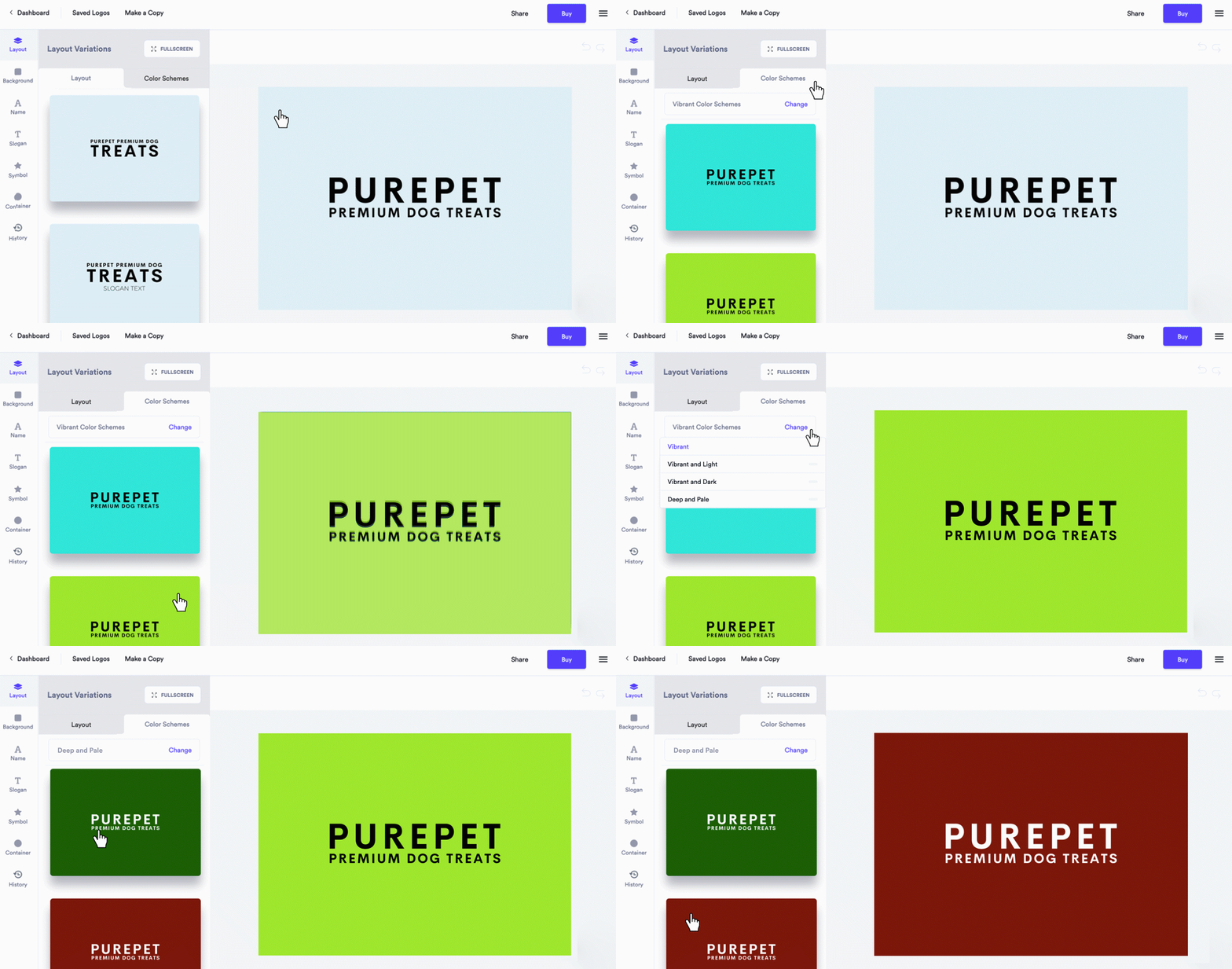
Introducing color scheme variations

Our team has worked hard to provide you with the best logo color combinations. Instead of changing the color of each element separately, you can now head to Layout, and hit the Color Schemes tab to view alternative color variations to choose from.
We’ve put special care into developing a color generator that considers your initial color choices more carefully. Our generator will now produce variations of your logo with colors that better complement each other, and pass color contrast tests. These color combinations ensure your symbol, brand name, and slogan are easily legible, pop, and look great!
Stacked text brings more flexibility to your design

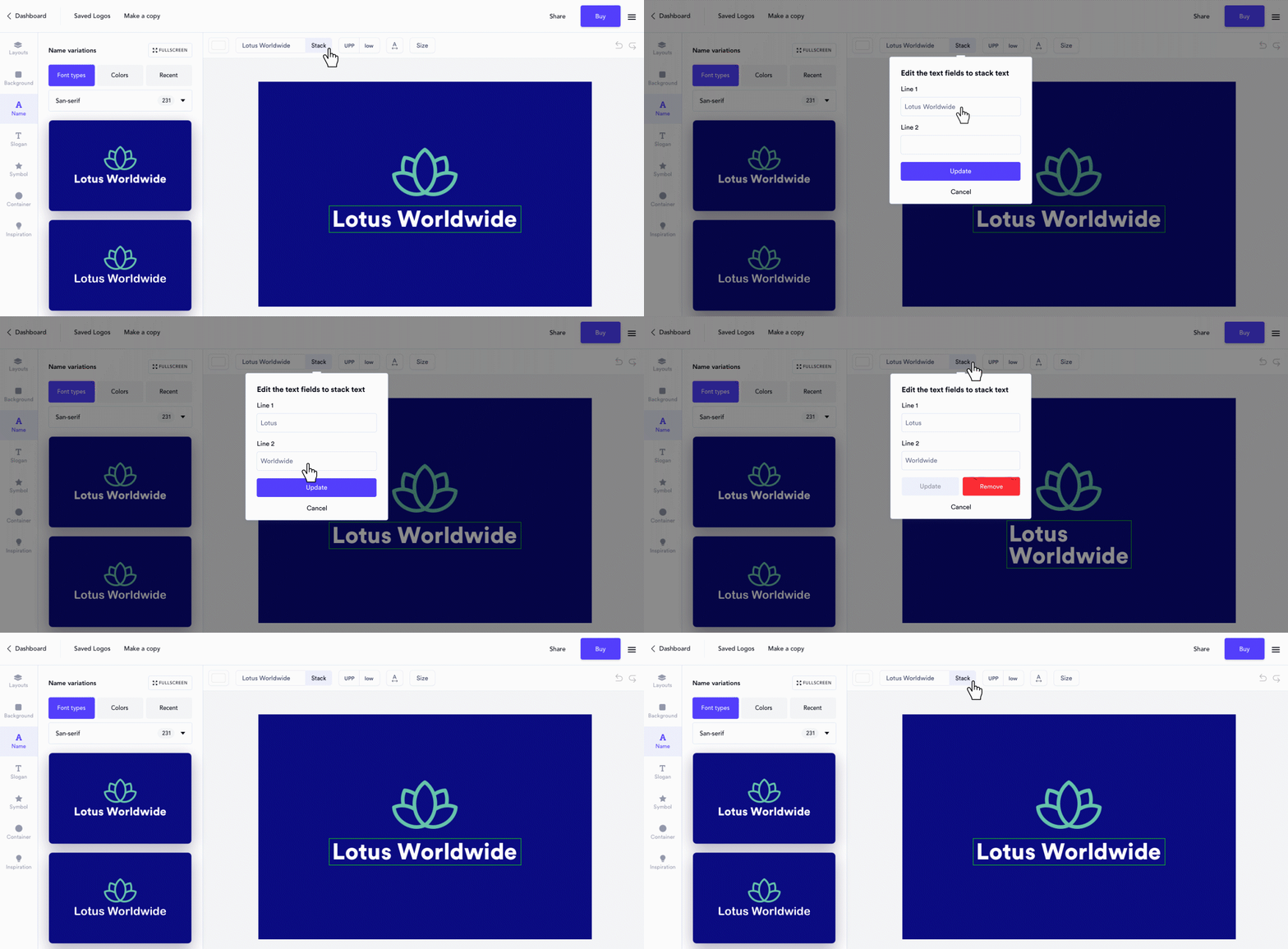
You’ve spoken, we’ve heard. Sometimes logos just look better with stacked text! Particularly companies with multiple words in their brand name, like Lotus Worldwide. We’ve made it a whole lot easier for you to put your company name on multiple lines, unlocking the flexibility to create layouts that are dynamic and balanced.
Here’s how to stack your brand name:
- Click on your brand name
- Look for the text box your brand name is in on the action bar
- Click the Stack button next to your brand name
- Click Update!
We hope these updates make creating your logo even more seamless. We’ll be back with another round of updates soon. Stay tuned!
Start designing your logo now.