26 Vintage Logos for Inspiration + Tips to Make Your Own

Vintage logos are powerful. If you drew one in the sand on an empty beach, a hundred hipsters would instantly emerge from the sea, looking for adventure, freshly ground coffee, and scented beard oil.
Vintage is the sign of the open road, the Walt Whitman of logo styles. It insists on rugged self-reliance, a love of the good earth, and facing the unknown with whatever tools you happen to have at hand.
And while a vintage logo is sometimes hard to define, you know when you see one. So saddle up and dust off your work boots, because we’re about to go lookin’.
What is a vintage logo?
What makes a logo ‘vintage’, anyway?
At its heart, vintage logos are about storytelling. Think prohibition-era USA, or the Golden Age of Exploration. Think mountaineers, pioneers, and Henry David Thoreau in his cabin with a Herschel backpack.
Whiskey-makers, for instance, still use the same techniques they have for decades, so it makes sense to incorporate this into their brand identity.
At other times, Vintage inspires a restlessness for the outdoors. A good vintage logo should make you want to quit your job immediately to hit the road and plunge into the wilderness. (Disclaimer: don’t do this, a bear WILL eat you).
Who can use a vintage logo?
From liquor companies to adventure gear and coffee shops, vintage is a versatile style favored by an eclectic group of industries.
However, it’s important to note that vintage logos aren’t industry-specific. It’s the underlying themes like self-reliance and – paradoxically – togetherness and teamwork, that often make vintage logos so appealing to some sectors.
But how does a vintage logo actually look? Here are a few pointers to get you started:
Common themes and symbols in vintage logos
A vintage brand identity or logo often involves one or more of these visual themes:
- Adventure
- Nostalgia
- Homegrown
- Rural
- Rustic
And they often contain one or more of the following logo symbol motifs:
- Faded textures
- A cursive flourish of text (the brand’s name)
- All-caps trademark text (what the company does and when it was established)
- Ropes
- Hooks
- Compasses
- Anchors
- Barley
- Wildlife
As we mentioned, these aren’t hard rules, but guidelines to help you orient yourself.
Famous brands with vintage logos
Studying famous vintage brands is a great way to prepare for designing your own logo. Here are a few of our favorites!
1. Jack Daniel’s

The logo that reads like a six-word Hemingway story: “Old No.7 Brand. Tennessee Whiskey.” Say no more. Jasper ‘Jack’ Newton Daniel’s famous charcoal-mellowed whiskey has a classic vintage design, known the world over.
2. Levi Strauss
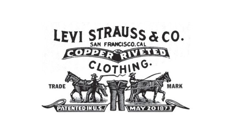
If we say “vintage” and you don’t instantly imagine yourself in a pair of Levi’s, do you even have legs? Although they recently went through a logo evolution, Levi Strauss still incorporates the original trademark on its clothing and jeans from time to time.
3. Herschel Supply Co
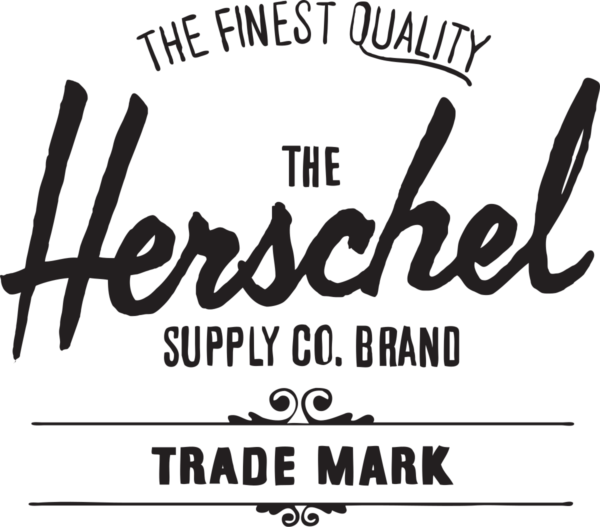
Two Sasky boys from the prairies of Herschel, SK, who now run one of the most successful clothing and backpack brands in the world. Herschel is a great example of a vintage logo that’s inspired by a brand’s homegrown roots.
4. Cabela’s

Now we don’t mean to curse, but Cabela’s is a gosh darn Canadian icon! With a more subtle vintage feel, the Cabela’s logo still uses common vintage motifs like a simple cursive wordmark logo in a vintage color palette.
5. Sailor Jerry’s
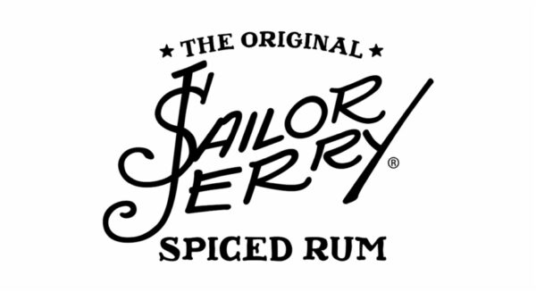
You’ve just pulled into port after spending a long week tangled up in the main sheet. Your poop deck is totally swabbed, your new tattoo is peeling because you forgot to keep it out of the sun, and your Dropkick Murphy’s CD got eaten by a narwhal. At least while you’re drowning your sorrows, you can admire one of the best vintage logos ever.
Design your vintage logo now!
6. Nellies

Nellie’s is like your grandma’s secret cleaning product recipe. Without any complicated (and harmful) chemicals, Nellie’s was made to honor that simplistic way of cleaning and living. The branding reflects a retro 1950s style with a simple cursive font and a mascot logo of your pal Nellie. Simple products and a vintage logo do the trick in this case!
7. Altoids

Bad breath has plagued people for centuries. Altoids ushered in a new century of minty-fresh breath. Its simple tin box branded packaging and capitalized serif font vintage logo have the perfect look of tradition and old-world craftsmanship – along with a tried and tested mint formula!
8. Trader Joe’s

Like walking to a farmers market on a Sunday morning, Trader Joe’s aims to preserve that traditional and community-oriented feel with its old-school logo and unique product offering. The whimsical font style and simple vintage color palette give it that approachable and established look.
9. Peroni

Few traditions have been around longer than beer making. The Italian brand Peroni has been around since 1846, launching its beer in 1963. It has kept its historic emblem and used a simple wordmark logo and decorative ribbons to portray its tradition and long-standing reputation. The vintage logo is a natural choice when you’ve been around this long!
10. Ben and Jerry’s

Ben and Jerry’s doesn’t cut corners regarding to taste and tradition, so its logo has to do the same. Its handmade-looking logo creates a fun and artisanal look that makes the brand feel like it churned the milk in its own backyard. The playful fonts and colors also add a nostalgia for being young again completing its times-gone-by allure.
10 vintage logos for retro inspiration
It’s not just famous brands that use vintage logos. Let’s look at a few more inspirational examples to help you understand why these vintage logos work!
11. Frankowitsch
- Source: Frankowitsch on Behance
- Source: Frankowitsch on Behance
A simple red cursive font paired with pastel colors and vertical stripes is all you need to think of a summer’s day in a seaside town in Europe. This brand and logo capture the classic look of tradition and use pastels to create a playful look.
12. Boa

Source: Boa by Robyn Gardner on Behance
Sometimes a vintage font is all you need to make things look classic. Boa uses a neon green to give it a modern pop but sustains its unique antique-like look.
13. La Diplomate

Source: behance.net/gallery/10326055/La-Diplomate
A beautiful prohibition-era vintage style with overtones of art deco, this tea seller in Bordeaux has a fantastic logo and brand identity to match. Rice Creative has done a great job using color and line to encapsulate their client’s customer experience; a bright gold against a dark palette invokes the richness and aroma of the fine tea that La Diplomate sells.
14. Farm Boy

Farm Boy is an organic market-style grocer based out of Canada. Its logo perfectly encapsulates vintage style with a rough, imperfect sketch, all-caps serif font, and curved container.
15. Pera Cafe

Source: Cafe Pera on Behance
This vintage logo is elegant and dainty, using a delicately drawn logo symbol to differentiate itself and highlight its attention to detail. A simple serif font and minimalist color palette can create a luxurious look that oozes tradition and class.
16. Attitude Denmark
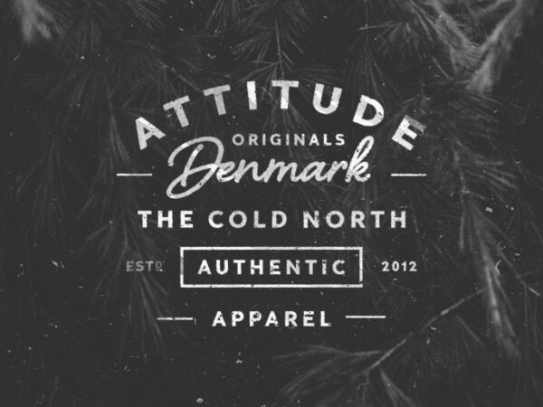
A great, Herschel-esque clothing logo. The designer does a great job showing how even simple arrangements of text and texture can combine to give a vintage feel.
17. Farmers Union
https://instagram.com/p/BrGymkKBOmh/?utm_source=ig_share_sheet&igshid=5e7dcchbfo2u
Cbt.design incorporates subtle color tones into this vintage-inspired logo. The muted pastels and faded textures combine to give just the right vibe for Farmer’s Union Coffee Roasters.
18. Aster and Golden vintage logo
This font has an industrial look to it – with powerful block-like capitals creating a strong and solid look. Fitting for a vintage furniture business! The mustard and black color combination gives a bold impression, with the orange slogan striking the perfect balance in the layout.
19. Fairfield Butcher
Adding a monogram logo design gives this butcher great flexibility for different platforms. Think about what elements you might take from your ‘full’ logo to use in a monogram. What is the defining feature of your logo as it is? Could it be turned into a monogram somehow?
20. Scripted vintage logo

Source: theinspirationgrid.com
Beatles lyrics! Exotic birds! Color! Texture! (begins hyperventilating). Basically, this is a beast of a logo. A great use of contrasting font to tell a story, unified within one beautiful vintage logo mark.
21. Butters Bakery
Handcrafted-looking logos are the quickest way to communicate a traditional business or product. Butters’ faded and hand-drawn monogram logo looks weathered and established, with the capitalized letters further adding an unapologetic look to it.
22. High Tight Barber Shop
Kowaleski and Co. (whose own logo is awesome) have an amazing range of vintage logos, from barbershops to indy grocery stores.
23. Caffeine Tattoo

Source: behance.net/mateuszwitczak
Truly stunning text pieces by Polish designer Mateus Witczak. Witczak uses a tattoo-script inspired style to tell stories using just words and their shape. A unique take on using shape to convey meaning in logos.
24. Morridge Coffee

Source: Morridge Coffee by Sadi Agency on Behance
Logo shapes and containers are a great way to add character and uniqueness to a logo design. This half-oval shape with curved text and layers is enough to distinguish this logo no matter where it is. The highly detailed symbol illustrates traditional craftsmanship that places it in the vintage realm.
25. Looka vintage logo
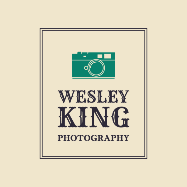
Made in our very own logo maker, this logo combines a vintage color palette with an old-style film camera and heavy typeface for that ultimate vintage feel.
26. Open Bar Tavern

Source: dribble.com
One more for the road. Notice how this hand-drawn proposal piece by Dalibor Momcilosvic incorporates the word ‘tavern’ into the flare of the cursive text. Really cool!
Tips for designing a vintage logo
The first question to ask yourself is: is vintage the right style for my industry? If you work in Cybersecurity, the chances are it’s not.
As you consider designing a vintage logo, think about the objects that directly relate to your industry. Look at old signage, trademarks, and photographs of your city back in the day, or watch old movies to get a sense of how things looked. Start building a visual catalog for yourself.
Collect as much classic visual ephemera as you need to help you decide on:
- A primary font style
- A sub-font style (often all caps)
- Your logo’s shape
- Your logo’s color combination
- One or two visual motifs either directly related to what you do (eg ice creams for an ice cream company), or thematically related (the bicycles at Toronto’s Handlebar)
Make your own vintage logo!
Just to show you that anyone can make a vintage logo, here’s one I rustled up in 5 minutes using our logo maker.

I kept things simple, using basic but effective elements to tell a story. The inkwell for the i-dot was super simple to achieve, by just adding a symbol and getting creative with the positioning.
- For the brand text, I chose a vintage font and only capitalized the ‘O’, giving it a little bit of dynamism and setting up the shape of the logo nicely.
- For the trademark text, I told a story about what I do. ‘Copywriter’ is about as interesting as the resume it’s written on, so I switched things up and told a story.
- For colors, I chose a nice complimentary setup between a rich, dark teal and a bright but muted yellow.
With a little flash of character, anyone can make a vintage logo in no time!
Tell your story with a vintage logo
Ultimately, vintage is a style that tells a story, and a vintage logo is a great way to start that story. If you’re looking to capture a sense of adventure, or perhaps a nostalgia for bygone days, a vintage logo is a great way to do just that.
Overall, the best way to create a brand is to fall in love with the process and tie it to your own brand personality. Yes, it’s about your customers, but it’s who you are that will resonate with your customers most.
So embrace that wanderlust, journey back into the past, and make a kick-ass vintage logo design for your brand today!

