Visual Identity 101: Creating a Magnetic Brand for Your Business

The power of a brand’s visual identity is in its staying power- the ability for people to recall the look and feel of brand instantly.
Think about a brand you love. What comes to mind? A logo, a slogan, an ad, or perhaps its Instagram feed? It’s what you see – the visual identity – of the brand that you likely first recall.
What is visual identity?
Visual identity is a set of visible elements that help customers identify and differentiate a brand from its competitors.

It includes, but isn’t limited to a brand’s:
- Logo
- Fonts
- Colors
- Graphics
- Websites
- Animations
- Social media posts
- Merchandise
- Storefronts
- Business cards
- Signage
Visual identity vs. brand identity vs. branding…what’s the difference?
If visual identity is about a brand’s “image”, then what is a brand identity? And what about “branding”? Are they all the same?
In short, the answer is no.
Think of a pie. If brand identity is the pie, then visual identity is the pie’s crust. And branding is the process of making the pie.
Visual identity: The filling
This is the visual component of a brand identity. It includes logos, colors, typeface, graphics, imagery, and overall style. It’s what you see first!
Take Coca-Cola. What you see – the Coca-cola logo, the red and white color palette, the fonts – are the brand’s visual elements.
Brand identity: The crust
Brand identity is the holistic concept, or framework, of a brand. It includes visual, linguistic, and strategic elements that form the brand: the brand story, vision, mission, core values, brand voice, and visual cues.
Coca-cola’s brand identity encompasses not just the visual elements but also its marketing campaigns such as Open Happiness and Real Magic.
Branding: The baking process
Branding is the process of creating the brand and visual identity that shapes customer perception of a business, or product.
Implementing Coca-Cola’s brand strategy to create its visual and brand identity is branding,
All three need to work together to shape a strong brand image.
Six elements of a winning visual identity
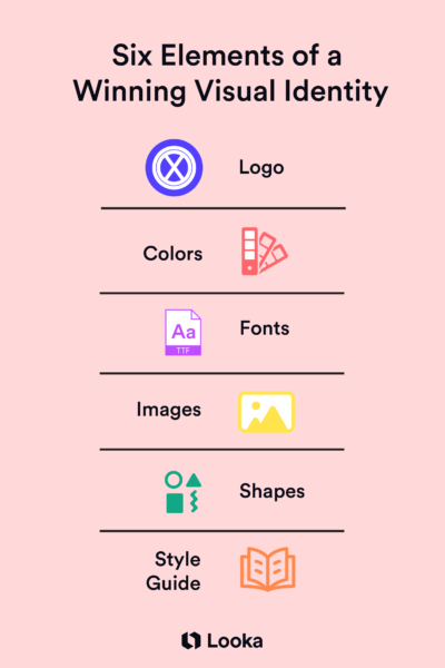
Let’s look at six major visual elements a brand should have to craft a strong visual identity.
1. Logo
A logo is the first thing that comes to mind when people think about a brand’s visual identity. This “ID badge” gets plastered on all your products and marketing campaigns. So, it’s essential to make it memorable.
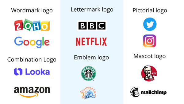
Your logo can be icons, typography, or a combination of both.
Some designs illustrate an idea or metaphor related to the business. Take a look at a few famous logos and see how varied they are.

Based on the brand’s name and product, a company can design its logo easily using design tools like Looka.
Design a logo with Looka in less than 5 minutes!
2. Typography
Like logos and colors, font selection is another non-verbal cue a brand sends out. Fonts and how they’re used are seemingly intangible elements that evoke emotions from potential consumers.
Fonts embody the brand’s personality: minimalistic, modern, vintage, fun, romantic, professional, etc. So it’s crucial to ensure the brand’s typography complements its other elements to maintain the integrity of your brand’s personality.
3. Colors
Colors communicate almost instantly. A company’s color palette spreads across different visual elements like storefronts, packaging, websites, marketing ads, or social media posts. So a brand’s color choice should be well-thought-out.

Consider the meaning, cultural connotations, and versatility of colors from various visual elements before selecting. A company’s color palette includes a primary color from its logo and secondary colors for background and accents. Strong brands use colors so consistently that it creates a sense of ownership over the color.
Source: “Brand Identity Essentials, Revised and Expanded” by Kevin Budelmann, Yang Kim
4. Imagery
Imagery includes a brand’s choice of photos, videos, illustrations, icons, and graphics. In the age of Instagram posts and Tiktok reels, images aren’t just supplemental. They have become central to how the audience perceives the brand.
The color, composition, aesthetics, and style of imagery go a long way in defining brand identity.
Whether you use stock images or create your photos in-house, the images should be consistent with your style. Creating a style guide or preset for your imagery is a great way to keep it in tune.
5. Shapes and patterns

Using shapes and patterns consistently is essential for creating continuity throughout your visual aids. Product packaging, posters, and marketing materials are places you can show off your brand’s shapes and patterns.
6. Style guide
Creating a coherent brand might feel like madness, but there is a method to it!
A complete style guide for all your visual elements usually includes rules on how to use those visual elements. Here are some key elements that a style guide covers:
- Logo – variations, size, placements
- Typography – typeface, fonts, size, spacing
- Color palette
- Icons
- Style for imagery
- Web-specific elements
- Rules and templates for designing all visual elements
Creating a visual style is a time-consuming process. But the results that come from putting in the work from the beginning are worth it.

Why does visual identity matter?
From cave paintings to Tiktok videos and NFTs, visuals enamor humans. Consider how tribes used to differentiate themselves with markings, language, dance, and other visible and verbal signs. This instinct to use visuals to signify identity is still applied today in business.
It builds brand recognition: Having a solid visual identity is vital for brand recognition in a crowded marketplace. It crafts a distinct look in the minds of consumers.
Visual identity positions your brand: Visual elements represent your company’s values and mission. Consider the Japanese apparel retailer Uniqlo. From logo to Instagram posts, its visuals convey the minimalist style of the clothing they sell.
It creates an emotional connection: Brand visual identity goes a long way in creating an emotional connection with consumers. Nike’s signature swoosh and “Just Do It” slogan reflects the company’s brand identity and inspire strong emotions.
Visual identity builds loyalty: Think about the unboxing experiences that people share on social media these days. Brands that create a unique visual experience with their packaging and designs can turn potential customers into loyal brand ambassadors.
Traits of good visual identity
Designing a brand isn’t just an opportunity to represent your brand beautifully, it also clearly communicates the brand’s purpose and personality. A well-designed brand visual identity is:
- Immediately recognizable and different. It stands out. Think Coca-cola
- Consistent. Great brands are always in tune. Consistency doesn’t need to mean the exact repetition of content or design. It can mean consistency in being distinct or vibrant.
- Clear. It’s simple and easy to understand.
- On message. Every visual asset should work together to send a cohesive brand message.
- Flexible. Visual assets work across different media and styles. For instance, the color of the logos and other visual assets should work in black and white as well.
- Scalable. A well-executed brand visual identity scales across mediums: digital, online, or offline.
How to design a winning brand visual identity
Building a visual identity encompasses a purposeful strategy rather than just putting together nice images. Customers will think of your visual identity when your brand comes to mind so ensure that it’s everything you wish your brand to be.
Identify and lean on your brand identity
Use your brand identity as the foundation for your visual choices. Each visual element should reflect your brand’s personality, mission, and message. Be intentional with the application of these visual assets, and consider them within the framework of your overall brand identity.
For instance, you shouldn’t suddenly start using memes and gifs if you’ve never used them in your brand marketing and content before.
Know your audience
“Brand is not what you say it is. It is what they say it is,” notes Marty Neumeier.
Having data about your audience tells you what they want to hear when they want to hear it, how and where you should send it, and how.
Craft your buyer’s persona with a clear picture of their wants, needs, and pain points. Create visual elements that speak to these particular interests.
Pay attention to the market
While you shouldn’t bank your entire brand’s visual identity on what’s trending, it’s important to pay attention to the evolution of design.
Brands that look outdated are less enticing to customers.
Pay attention to the kinds of fonts, colors, images, videos, and even logo styles that have become popular in the last decade. Make sure your brand is aligned with them.
Develop a consistent style guide and follow
Once you create your visual assets, develop a style guide with templates and universal standards for all your brand assets. A style guide ensures your visual identity is consistent even when multiple designers and teams work individually.
In its brand style guide Netflix, for instance, mentions how to use its wordmark and letter “N.” From specifications like sizing, placement, and the red color, the guide helps ensure Netflix owns the red “N” everywhere.
Keep the medium in mind
When the medium changes, the way you convey a message also changes. A billboard poster, a newspaper ad, and an Instagram reel will be different. Tweak the message to suit other platforms while staying consistent.
It can be a small change like making sure the logo appears in the same color and size on various platforms or a significant adjustment like the photograph and graphics used. Keep the medium in mind and change your visual assets accordingly.
Four best brands for visual identity
Let’s look at some examples of global brands that show what a solid visual identity can do.
1. L’Oréal: sophisticated, simplistic

Source: Future Brands
L’Oréal embodies boldness, passion, simplicity, and sophistication. Its visual identity has evolved over time, but its message has stayed consistent and relevant throughout 112 years. Its logo is a simple wordmark. And the color palette of bright red, black, and white makes for a contrasting and striking color palette.

Source: Future Brands
Despite having multiple products under its umbrella, the style guide is consistent. And it gives room for varied expressions across its portfolio.
2. Nike: power, autonomy

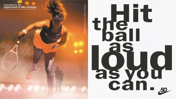
Even if no “Nike” is explicitly mentioned underneath, people know what the swoosh means. That’s how powerful Nike’s brand messaging is. A striking aspect of Nike is how it tells stories of unrelenting efforts and sportsmanship through nothing but powerful visual imagery.
3. Apple: innovation, minimal
Undoubtedly one of the most recognized brands, Apple is known for its unique and minimal designs. The iPhone maker positions itself as creative, innovative, cutting edge, and sleek. Its visual elements reinforce this message left, right, and center with their minimalistic and practical designs.
The brand exudes simplicity and professionalism, from a simple logo to a monochrome color scheme.
4. McDonald’s: cheerful, friendly

Source: adage.com
You get a handful of images when you think about McDonald’s: the golden arches, Big Mac, and the red tub of fries. But a few years ago, McDonald’s struggled with its visual messaging. Its franchises used inconsistent color palettes, fonts, and logos, sending chaotic messaging.
McDonald’s completely overhauled its visual image. It created a custom typeface and color palette for standard icons and creative logo use. It made an exclusive design hub with cheat sheets on how to use its visual assets so franchises could maintain consistency.

Source: Issuu
5. Deloitte: professional, reliable

Source: Branding Style Guides
One of the big four consulting firms, Deloitte has striking visual elements. The brand has an easily recognizable wordmark logo with the signature green dot. It reinforces its signature green dot in all its imagery by using only circular motifs. The company has an exclusive brand space that teams use to maintain consistency and flexibility to use visual elements freely.
Good design is good business
A picture is worth a thousand words. But sometimes, it’s worth a multimillion-dollar company. Businesses today are only as strong as their brand. And nothing apart from visual identity offers much leverage to build your brand image. Start investing in your visual identity today to bolster your success for years.