15 Website Design Trends You Don’t Want to Miss in 2024

In recent years, website design trends have given way to animation and boldly interactive design. Colorful, vibrant, and complex visuals have stepped in, swinging the design pendulum toward playful design.
Moving into 2024, expect a tilt toward dynamic movement. Brands are using web design to impress their visitors through animation, moving elements, and illustrations. The goals for modern web design in 2024 are to generate engagement and create an authentic brand experience for site visitors with every scroll and click.
For brands, keeping up with website design trends and understanding what’s important for users is critical to making decisions that support web traffic, engagement, and conversions in 2024.
Top web trends of 2024:
- Animation stimulation
- Scrapbook layering
- Geometric aesthetic
- Mini-sites
- Visible grids
- Moving type
- Cursor animations
- Retro resurrection
- Interactive design
- Bare-bones brutalism
- Atmospheric scroll
- Multimedia as a focus
- Bold typography
- Illustration takes the lead
- Gaussian blur
Find out more about 15 web design trends for 2024 below, including what cool web designs are out there using these trends now.
But first, some technical web design trends
Before diving into top web design trends, it’s important to understand the technical trends behind them. Staying up-to-date on technical trends helps your site perform better in search engine results and with critical behavioral metrics such as time on page.
Here’s a look at a few items that are top factors going into 2024:
Artificial intelligence and web design
AI is shaping web design trends, revolutionizing eCommerce, and enhancing UX in 2024. With AI, web designers can add personalized suggestions, recommendations, and prompts for each unique user.
Customer service will be supercharged with AI chatbots to help users with inspiration, brainstorming, and questions about the products or services. Lastly, AI use in eCommerce will add a personalized touch to product suggestions based on user behavior.

IBM watsonx Assistant on Medium
Although these trends are still in their infancy, they’ve taken leaps and bounds in the past year alone. Expect these trends to gain momentum in 2024 as AI becomes more embedded in web design practices.
Page speed and page load times
Google considers page speed a factor in overall page quality. Because of this, beautiful pages that take forever to load may not perform well in the search engine results pages (SERPs).
It doesn’t matter how great your web design is if people aren’t sticking around to see it.
Mobile-friendly websites
Mobile devices account for around half of all internet traffic, so sites that aren’t mobile-friendly risk alienating half (or more) of their target audiences. Google’s mobile-first initiative means a site that’s not mobile-friendly might not show up in SERPs at all, reducing chances of organic traffic.

Source: Circle of Life by Multiways Team on Behance
Accessible web design
Sites need to be accessible and operable by anyone, so accessibility can be a major ranking factor. AI is making accessibility easier through voice-powered commands and replies. In 2024, pages that don’t account for accessibility issues may not rise high in the page results.
It’s also just good business to ensure your web design works for as many potential consumers as possible.
15 top website design trends of 2024
What are the current trends in website design? If you’re looking for some of the best web design tips for this year, these 15 latest web design trends are a great place to start.
1. Animation stimulation
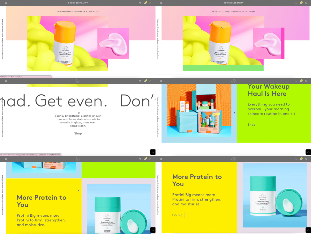
Movement and animation have taken over the web, with many brands differentiating themselves from competitors through animated web design that shows off their brand colors, fonts, and dynamic personalities.
These interactive websites indirectly increase a visitor’s time on the page and decrease your bounce rate – making your website authoritative in any search engine’s eyes. Micro animations are also coming up as a unique and less in-your-face approach to interactive web design.

Source: meplace.com
Meplace is a nursery with a contemporary website design that embodies a handful of web design trends in 2024. It has micro animations on geometric elements, moving typography that aligns with scrolling, and scrapbook-like imagery of its services.
But be wary of loading times! Make sure you keep your loading time low as you add animations.
Create a brand identity now
2. Scrapbook layering

Source: Cominguproses.com
Layering images over other design elements is a great way to add a unique human touch to your website. This modern web design trend is more personal and playful, adding a touch of craftiness to an otherwise high-tech website. It gives the designer more opportunities to be creative and show off colors, fonts, and imagery that make a stronger impression on website visitors.
Above, Coming Up Roses uses scrapbook layering to embed her personalized approach with her clients into every part of her web design.
3. Geometric aesthetic

Source: Drinkproxies.com
Shapes convey meaning. Using shapes deliberately in website design can generate emotion and influence the viewer. Designers are taking advantage of this and using shapes to frame headings, images, products, and CTAs to make them bolder and more visually appealing.
Proxies use squares and ovals with softly rounded edges to add a sense of organization and unity.
4. Mini-sites

Source: Laufen Space on Webflow.com
Sometimes, less is more. If you’re a freelancer or storefront that simply needs a page with contact information and links, this is the most efficient way to go about it.
Mini sites also work well for selling services by having a straightforward page that conveys information directly and at breakneck speeds. The above mini-site is a perfect example of a single landing page effectively conveying a studio brand with a modern font and fewer images.
5. Visible grids
The visible grid web design trend provides a transparent, retro look that gives the viewer immediate insight into how the designer meant the page to be organized. The benefits include easy-to-navigate sections and control over where the viewer’s attention is directed.
Check out how Acid League uses a visible grid to separate product images and information so users can scroll quickly through to find what they’re looking for.
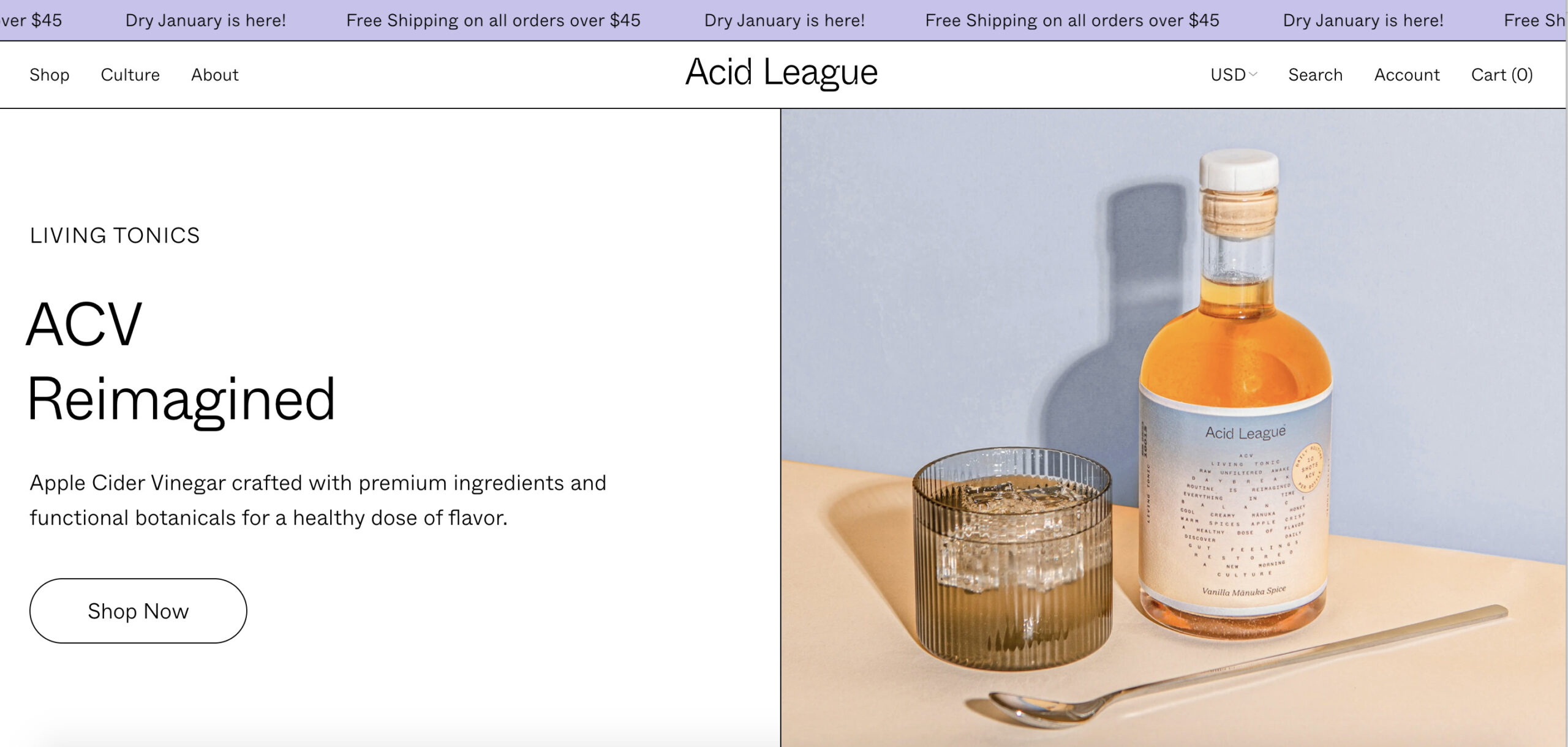
This type of structure works well if you want to promote your site on social media. You can quickly turn content from each grid into images for social posts, so all your design efforts do double duty.

Source: gumroad.com
Gumroad embraces the grid layout showcasing crisp and clean separations and site organization. It also takes full advantage of our 13th website design trend – bold typography!
6. Moving type
Your font and all other visual elements can be moving in an emotional sense. But literally moving type can be powerful too.
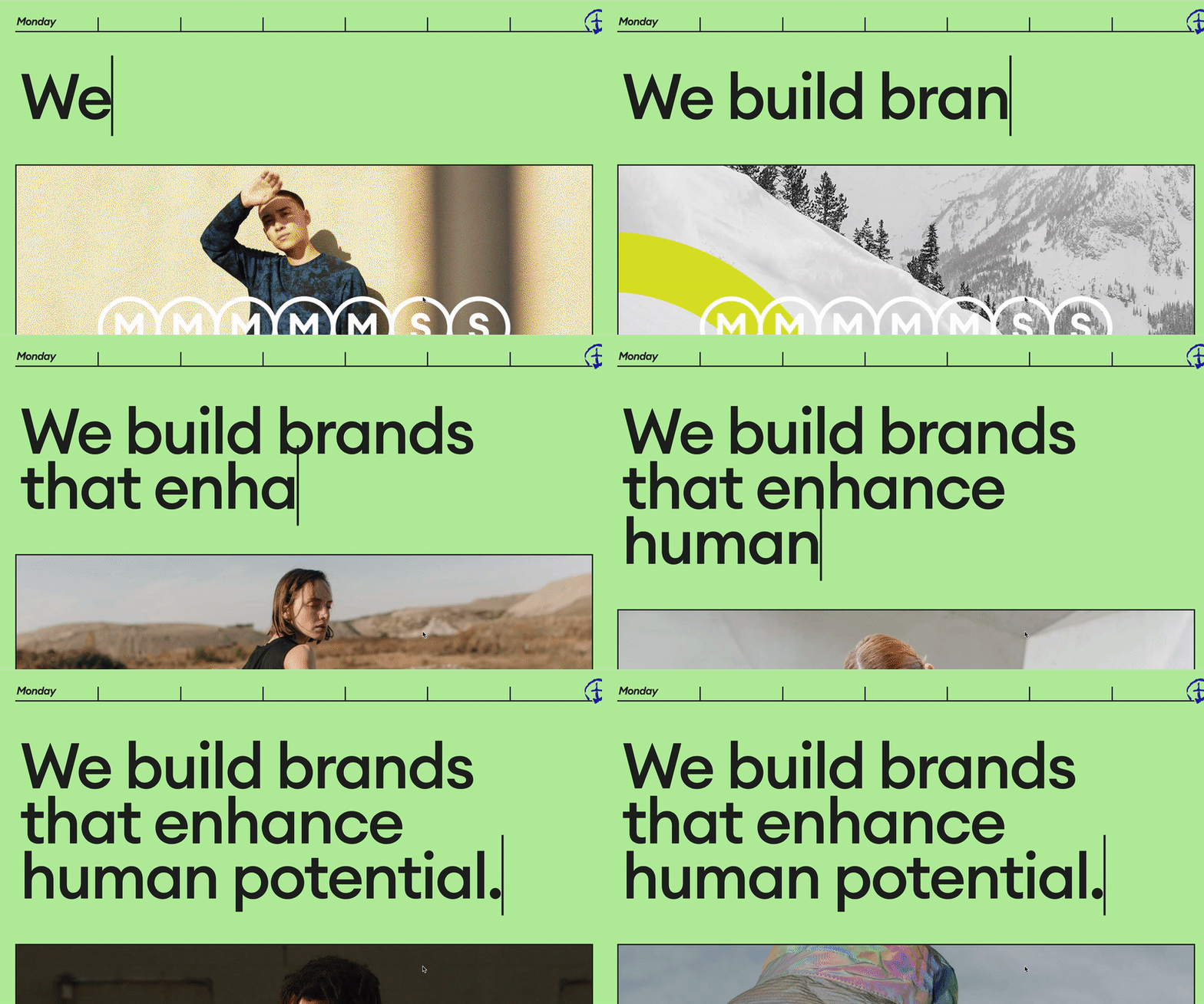
Web designers are adding animated elements to text to convey information more strikingly, and moving text creates a dynamic appearance that captures the eye. For example, Monday Creative’s bold header immediately grabs and holds the reader’s attention and draws them into the page.

Source: regrocery.co
Above, Re grocery uses animations to highlight headings and move them in sync with the scrolling. It’s also a great example of bold typography in web design.
7. Cursor animations
The rise in cursor animations reflects a broader trend toward dynamic and immersive online experiences.
From hovering over text to reveal hidden information, to interactive animations that follow the cursor’s movement, these micro animations delight users and keep them engaged with the content. Like the design studio below!

Source: cocotastudio.com
8. The retro resurrection
Whether it’s the bubbly, unhindered design of the 90s or the colorful craziness of the 70s, one web design trend in 2024 is looking to the past for inspiration and steering away from more recent minimalism.
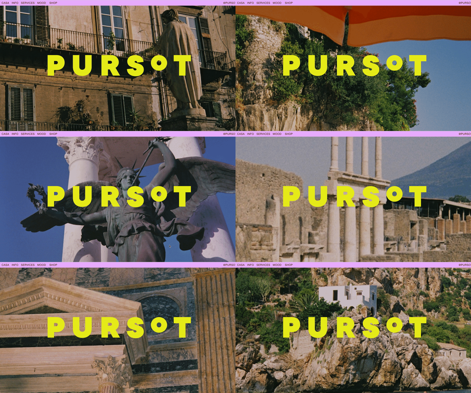
Pursot bold colors in web design trends 2024
Bright, contrasting colors, presentations that “break the rules,” and vintage fonts and images are all on display. Pursot’s attention-grabbing homepage is one example — the bright brand name stands boldly against a rapidly changing set of background images.

Source: experimentbeauty.com
In 2024 we’re seeing a merge of modern and Y2k. Think of it as Y2K but more tech-savvy. Experiment Beauty’s website is 2YK-themed with a touch of alternative. The design uses 3D silver lettering and bubbly fonts to convey their brand personality.
9. Interactive design
The right interactive design elements add intrigue to web content while driving up engagement. Meaningful interactions express brand identity while drawing the user further into the site, organically.
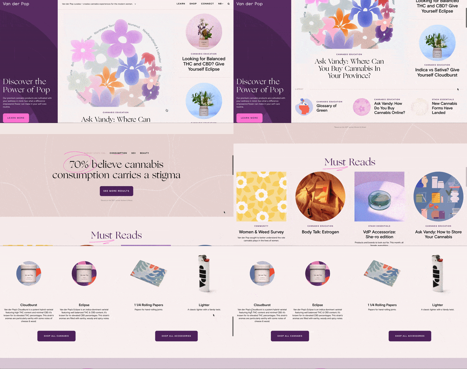
Hover effects and interactive clickable and scrollable elements are examples of simple design concepts that can drive deeper engagement.
Van der Pop’s site is rife with fun interactive elements, including color tones that lighten or darken when you hover over images, lots of scrolling opportunities, and plenty of clickable buttons. Visitors may find themselves clicking and scrolling even before they realize it.
10. Bare-bones brutalism with a kick
This web design trend is almost grunge in its simple and non-conforming nature. In a world where cramming in more is the common default, this trend is looking to do less while capitalizing on the same benefits of brand recognition, visitor engagement, and conversions.
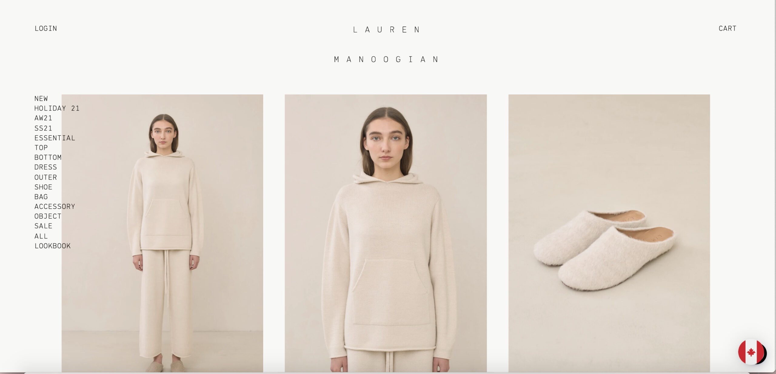
The traits of bare-bones brutalism include default fonts, plain colors, asymmetry, and a lack of order and hierarchy. Fewer hamburger menus, more simple lists — you can see the concept on display in the Lauren Manoogian digital shop.
In 2024, this trend is getting a little kick with pops of modern color and typography or overall interactiveness. Couple brutalism with your brand colors or an image synonymous with your company.
11. Atmospheric scroll
The rabbit-hole scroll is an adventure for the visitor. Think Alice falling down the rabbit hole and all the odd and exciting things that happen to her, and you understand this design trend.
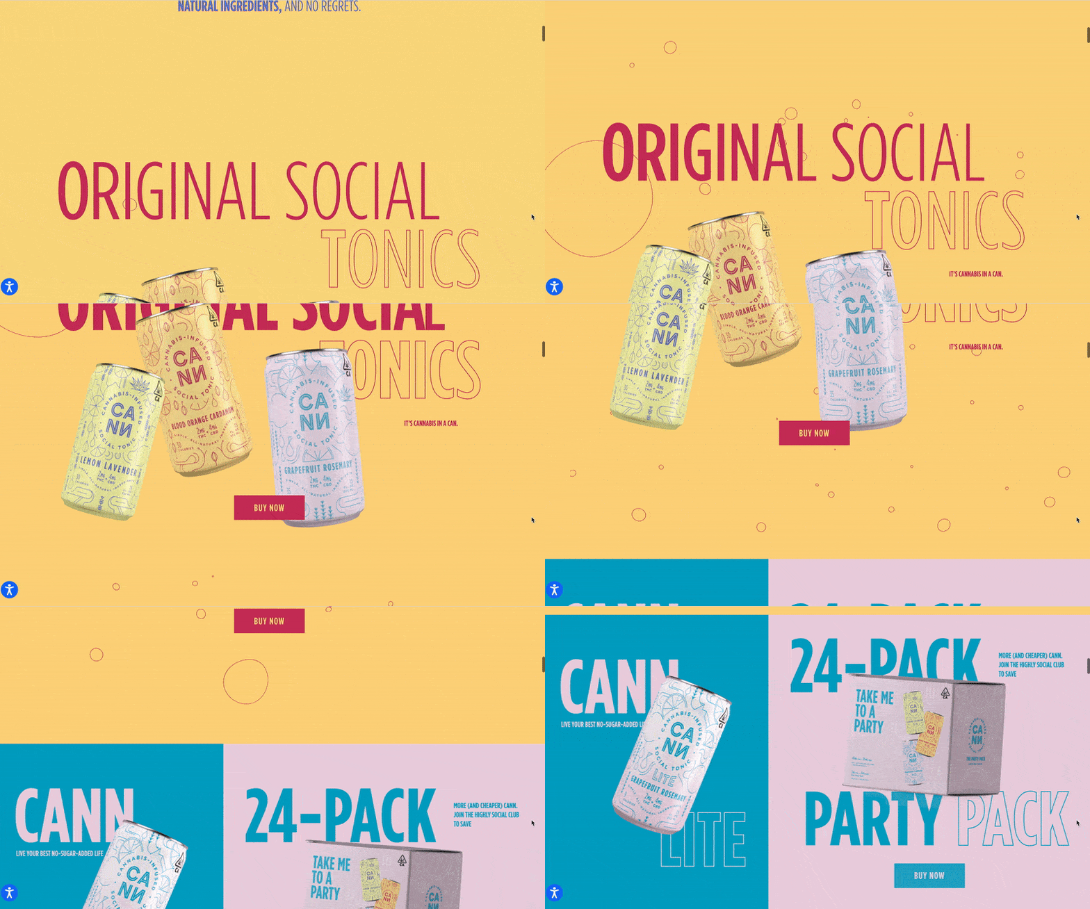
Drink Cann makes use of this trend with elements that move up and over the page as you scroll. The 3D-like images draw the eye to each block and make the entire page visually interesting.
Web designers working on branding that’s creative and outside-of-the-box can use this approach, with surprising elements like horizontal and parallax scrolling, to create an experience that feels like an exploration.
12. Multimedia as a focus
Almost 70% of people say they prefer watching short videos to interacting with other forms of content, and more than 80% of marketers feel video keeps people on web pages longer. So, it’s no surprise that dynamic video or animations in headers are a design trend in 2024.

Source: Hunterandhare.com
Dynamic elements let you incorporate brand personality and grab visitor attention. It helps people get a visual for your brand story and what you’re all about in mere seconds.

Source: eatbehave.com
Create an animated logo or go all-in with short videos incorporated above the fold to test this website trend for your brand.
13. Bold typography

Designers are leveraging bold, eye-catching typography to make a statement, capture users’ attention, and convey their message succinctly. This trend is about strong visual impact. Bold fonts, when used strategically, can guide users through a website, highlight key information, and help create a visual hierarchy.
Moreover, they offer designers an opportunity to express a brand’s personality and reinforce its identity within the first few seconds.

Source: Milray Park on Behance
Sans serif fonts are a traditional go-to for designers due to their legibility and flexibility. The minimalist fonts are web-friendly and size up and down on various screens well. But, designers are tired of working with a single font type. In 2024 and beyond, expect serif fonts to stage a major comeback.
14. Illustrations take the lead
Alongside serifs, you may also see a lot of illustrations and patterns. These elements create a more personalized look on pages and add a touch of humanity to the digital world. In 2024 we’ll see a rise of personalized experiences that try to be more human and whimsical.
From doodles to hand-drawn mascots, it’s all about connecting emotionally to the web visitor.

Source: malukacollective.com
From doodles to hand-drawn mascots, it’s all about connecting emotionally to the web visitor.

Source: Circle of Life by Multiways Team on Behance
15. Gaussian blur
The Gaussian blur is a minimalist, slightly psychedelic effect that creates a soothing ambiance. It draws viewer attention and helps bring focus to the right area of your page. This is one of the most popular website design trends because it’s easy to implement, adds an artistic flair, reduces visual noise, and creates more depth on the page.
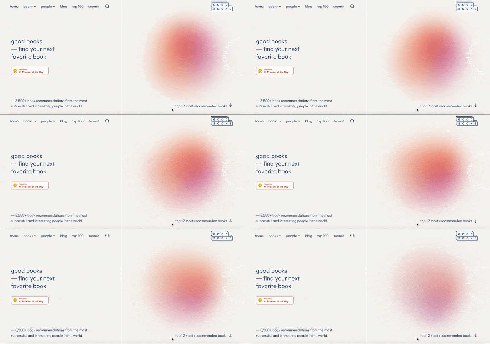
Check out how Goodbooks blends a number of 2024 web design trends including the Gaussian blur, brutalism, and visible grids to create a stunning and easy-to-navigate website.
Upgrade your web design with these 2024 trends!
The best website design starts with the basics, including a strong domain name, a great logo, and a solid brand identity. Get your business online with a website from Looka. With customized copy and tailored images, you can publish your website in under a week!