6 Website Logo Fails — and How to Avoid Them
By Kate • 6 min read, Apr 5, 2018
A website is one of the first and most important places your logo will live. To do your brand justice, you’ll want to display it proudly and avoid common website logo fails, such as the logo appearing too small, too big, blurry, or cut off.
Start by thinking about some of the websites you visit every day — Netflix, Google, Amazon, Facebook, or even your bank — and you’ll notice something similar: logo placement.
On all these websites (and thousands of others) the company’s logo is in the top-left corner, doubling as a clickable button to bring you back to the homepage.
While the left corner has become a standard logo placement design choice, you’ve probably seen logos in two other places on a company’s website: centered and — in much fewer cases — in the top right.
Despite the surge in mobile-first website design favoring centered logos, and the desire to try a right-aligned logo, both research and tradition support the case to lean left. Let’s take a closer look.
The appeal of the left-aligned logo
The popularity of a company’s logo displaying in the top-left corner of a website isn’t a fluke – it has been the trademark placement since the dawn of the Internet.
Why? We automatically look to the top left when searching for the homepage button. And for those of us who read our native language left to right, that same instinct kicks in when browsing a website.

Research by Nielsen Norman Group found that centered logos can hurt website navigation. The user experience experts discovered that returning to a site’s landing page is six times harder when the logo is in the center of a page instead of the top-left corner. That’s significant!
Nielsen Norman Group also found that users are 89% more likely to remember your brand if your logo is in the traditional top-left spot on your website compared to the right.
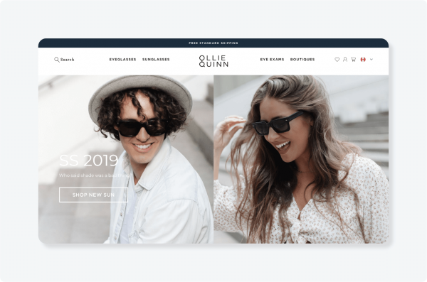
If you’re determined to have a centered logo on your website, don’t worry – it can still be done. Make sure it’s paired with a simple navigation bar that allows the design to shine, as seen on Ollie Quinn.
Avoiding common website logo fails
Once your logo is in a prime spot on your website, there are a few common design mistakes to watch out for that can negatively impact your brand.
When it comes to logo placement on a website, these elements may seem trivial. However, they can have repercussions on your bottom line if potential customers find your site confusing, and click away (or fail to remember you).
Fail #1: Logo is too small
If your logo is too small, someone visiting your site may not be able to distinguish your logo elements at a glance or read your company name.
With the below example of a yoga studio website, we see what can happen when text within a logo gets lost when the design is scaled down.

To avoid legibility problems, consider using a symbol-only version of your design on your favicon and any smaller places where your logo shows up.
Standard logo placement rules call for a logo that’s larger and more prominent than your navigation menu, so it stands out in your website header. You don’t want users drifting to the top menu before acknowledging your brand and remembering where they are.
No matter what website platform you’re using, you can learn how to swap out standard header text for a clickable logo that leads a visitor back to the homepage. Instructions for adding a logo to your website will depend on the service you’re using to build it.
Check out these articles from Etsy, Squarespace, GoDaddy, Shopify, Weebly, and Wix for more information on adding a logo to each of these platforms.
Fail #2: Logo is too big
On the other end of the spectrum, you can also run into issues if your logo is too big.
A large logo can occupy so much prime real estate that other branding elements and navigation items get lost.
It’s also possible that your logo or company name is unnecessarily used twice in the “above the fold” portion of the page, as seen here on McMaster University’s website.

Think about visual hierarchy. Ask yourself, what else do I want to be in the top fold of the website? What do I want my visitors to know first?
Another design option is a “sticky” website header. The logo appears one size when a visitor first lands on the site and shrinks as you scroll down the page (but remains visible at the top of the page, hence the “sticky” name).

Fail #3: Logo doesn’t stand out
If your logo color is similar to your website theme, it could get lost in the background.
On the homepage for the wellness company shown below, the company’s logo is too large and doesn’t stand out against the colored background. The slogan also gets lost because it’s placed on a different color.

Remember that your logo needs to shine here, so don’t place it on top of colors where it doesn’t stand out. (Brand guidelines can help you avoid this.)
Choose secondary colors for your theme that make your design pop, and test the different color options in contrast to your theme: full-color, black, white, and even inverse.
Tip: Create or request different color variations of your logo to avoid having a light logo on a light background or a dark logo on a dark background. (Looka’s Premium Package includes versions of your logo on a transparent background, as well as black, white, and colored variations.)
Fail #4: Logo is blurry
Don’t overlook the quality of your logo’s image file. If it’s not the right size, your logo may become pixelated when scaled. That may also mean your logo text isn’t legible — a huge no-no. You’ll want to test the logo at different sizes to double-check that your company name remains readable.
A surefire way you can avoid a blurry logo is to use a PNG file type instead of a JPEG. Why? With a JPEG file, image information is tossed when the file size is reduced. But with a PNG, you don’t have to worry about seeing a change in quality when scaling the size up or down.
Look at how crisp this example from Blue Apron is — beautiful!

Fail #5: Logo looks inconsistent across devices
Whether someone is pulling up your site through a Google search on their laptop or clicking on an Instagram link from their smartphone, you’ll want your website to have a responsive design that maintains the quality and appearance of your logo across all devices.
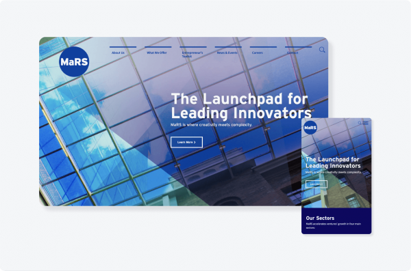
MaRS shows us what happens when you nail a layout for desktop and mobile. Good job!
Thankfully, WordPress and Squarespace allow you to preview how your site appears on mobile, tablet, and desktop screens.
Remember to keep a close eye on logo alignment, whether it’s left justified or centered in the header. You’ll be able to immediately see if the design is delivering your vision and quickly make changes.
Fail #6: Logo is cut off or easy to miss
While it’s important to consider placement and colors, your logo must also adequately represent your brand on your website and help visitors navigate back to your landing page.
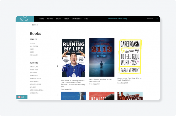
Make sure your logo isn’t cut off when you put it in your website header — a mistake we see with the publishing website below — or placed so close to the margins that it doesn’t look quite right.
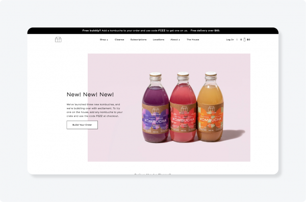
With Greenhouse Juice, the brand’s symbol-only logo would pop more if it was larger and had extra padding.
More logo placement tips
- Apart from a header logo, think about adding your logo elsewhere on your site. You can reinforce your brand in the footer, product photos, and as part of the checkout experience if you’re running an ecommerce site.
- It’s also a good idea to incorporate your brand’s colors (as seen in your logo) in other areas of your website. Places like call to action buttons, text, headlines, and image backgrounds.
- If you don’t have brand guidelines or a logo yet, you can still win at online branding by being consistent across your website and social media channels.
The task of putting your logo on your website may seem simple. But it often requires time and experimentation to get it to look just right. Don’t rush it!
And to learn more about making your own website from scratch, read our 9-step guide to getting it done.