Brand Guidelines: What They Are and How to Create Them (With Examples!)

When you’re starting a new business and you’re not a designer, the idea of building a brand identity and creating brand guidelines can be daunting.
But here’s the thing: consistency is the backbone of an authentic, trustworthy, and recognizable brand and customer experience. This means consistency in the way you look, speak to, and service your customers can build trust and ultimately boost your business.
In fact, a consistent brand presentation can boost revenue by as much as 23%!
Staying consistent takes effort. But more importantly, it takes rules.
This is where brand guidelines or a brand style guide come in. They outline all of the brand details and put them in a shareable master document.
This way, brand consistency is easier to maintain, whether you’re a company of 1 or 100. And your partners and printers will love you.
In this article, we’ll cover:
- What are brand guidelines
- What brand guidelines include (and where logo guidelines fit into the overall picture)
- How to create brand guidelines
- Brand guidelines examples
What are brand guidelines?

Brand guidelines, or brand style guides, are a set of rules about how to represent your brand across channels and assets, helping your business build credibility and recognition as you grow.
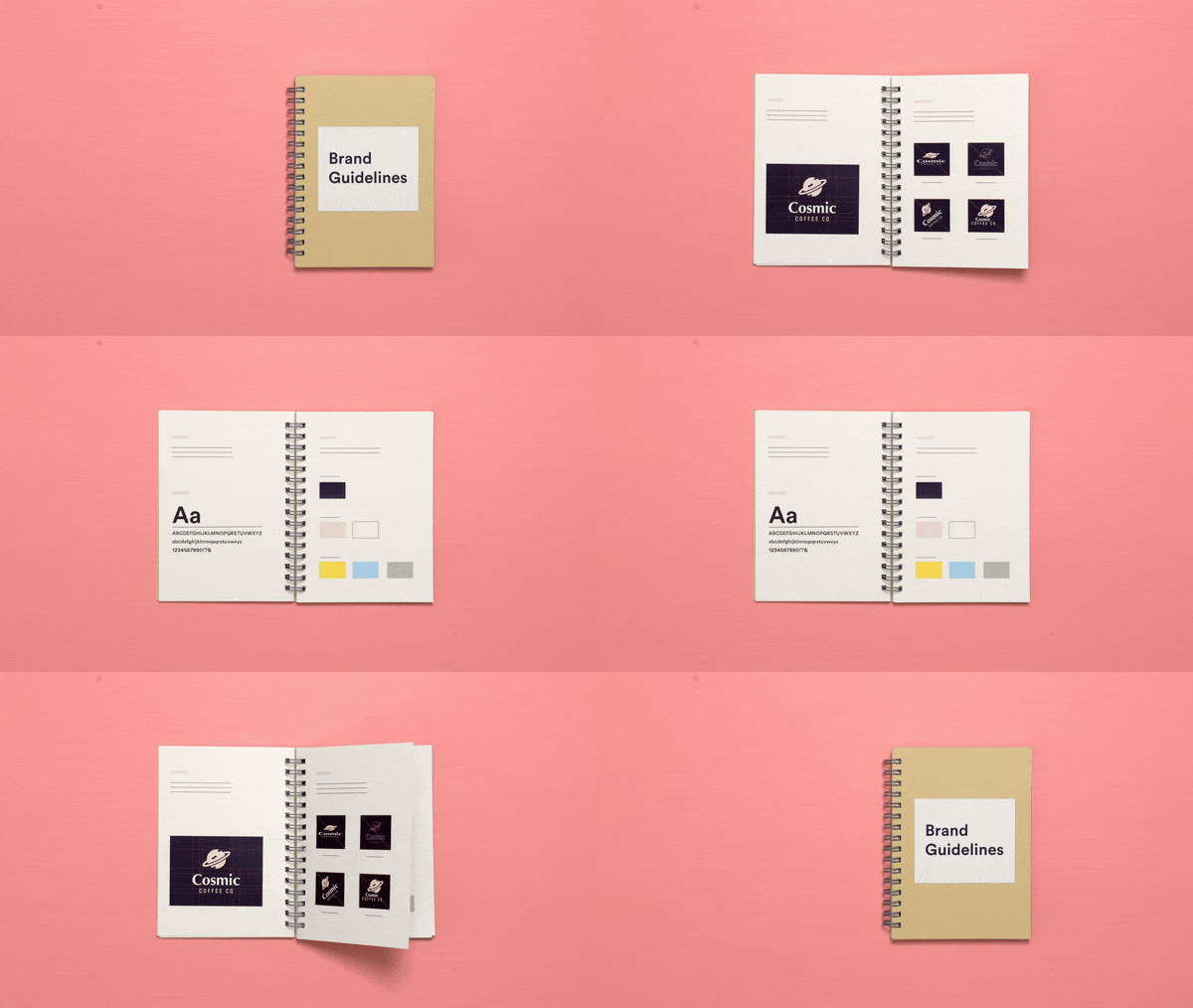
Brand guidelines always include visual guidelines (logo usage, color palette, typography); they can also cover your company’s mission, brand voice, imagery, and more.
Choosing a logo is a solid starting point for creating brand guidelines.
After you’ve designed your logo, you’ve simultaneously determined the colors and typography your business will use — two key brand building blocks.
What do brand guidelines include?
Brand guidelines aren’t the same for every company, nor should they be. While prominent brands require more detailed rules and scenarios, startups and small businesses can get by with a pared-down set of guidelines and add to them over time.
Brand guidelines should always include:
- A cover page
- Logo guidelines
- Color palettes
- Typography
- Usage examples
They can also include a mission statement, visual rules around images and icons, brand voice guidelines, and specifications for brand marketing assets like packaging, email campaigns, and more.
How to create brand guidelines
Below, we’ll cover the elements you need to gather to create solid brand guidelines that’ll save you time and effort as you grow your business.
1. Logo guidelines
Your logo is the face of your brand. If it appears differently across channels and assets, it will lose its recognition and dilute your brand.
Logo guidelines include:
- Logo elements – A visual guide to the elements that make up your logo, including wordmark, icon, and slogan (where applicable).

- Color variations – The primary (colored) version of your logo, as well as black-and-white versions, transparent background options, and any other color variations that are allowed.

- Clear space (also called exclusion zone, safety space, padding, etc.) – Your logo size guidelines should always be surrounded by a consistent amount of clear space to ensure its visibility and impact. Looka determines clear space by taking 10% of the total width of your logo. No graphic elements or text should invade this zone!

- Unacceptable uses – To ensure your logo doesn’t get altered, it’s important to show examples of what not to do with the design — for example, don’t change the color, don’t make it semi-transparent, don’t rotate or play with scale, etc. This section can also include the minimum size your logo can appear.

2. Color palettes
Two color palettes are usually determined based on your logo:
- A primary color palette, which consists of the exact colors used in your logo, including color names and codes for different uses (CMYK for print, HEX and RGB codes for digital).
- A secondary color palette, which consists of complementary brand colors that can be used for text, headlines, and other components of branded assets.

3. Typography
This section of your brand guidelines document will show the main types of fonts used in your logo, as well as secondary fonts that can be applied to headlines, body copy, and more. Don’t forget to include the font sizes you want to use!

4. Usage examples
When possible, it’s helpful to show examples of your logo, colors, and fonts applied to items like business cards, packaging, T-shirt designs, and more.

Optional sections to add to your brand guidelines
- Mission statement: Boiling your company’s “what” and “why” into a one- or two-sentence mission statement takes time, but it’ll set the tone for future branding efforts — and many other company decisions.
- Imagery: Examples of the types of images you’ll use in your branding; can include either stock or original photography.
- Illustrations/icons: Examples of custom or purchased illustrations or icons you’ll use.
- Design specifications: If your business focuses on email marketing, packaging, ads, or other specific branded assets and channels, you may want to include specific guidelines on how to design them. If you’re just starting out, these specifications can be added over time.
- Brand voice: Brand voice is a good thing to keep in mind. To start, write down a few simple adjectives of how you want your brand to sound — for example, friendly, helpful, and unfussy. If you’ve written “about us” copy for social media or your website, you can include it as “boilerplate” copy for use in future marketing like press releases.
What format should brand guidelines be in?
Brand guidelines usually take the format of a PDF or flippable online booklet.
Google Docs, Microsoft PowerPoint, or Google Slides are programs you can use to lay out your brand guidelines. These programs allow you to easily incorporate images, words, screenshots, and more. When you’re ready to share, save it as a PDF.
This way, you’ll have the master file secured and handy as your brand evolves. You can easily tweak the details and re-share it as a PDF whenever you need to.
If you use Looka’s logo maker and purchase a Brand Kit, we’ll provide you with brand guideline templates that already include your logo fonts, color codes and color variations.

Once you have a brand guidelines document, here are three ways to make sure it gets used and maintained:
- Share one copy (non-editable by others) and store it in an easy-to-access place like a shared drive, updating the file when any changes arise.
- Send the document to anyone who joins your company or works on your brand (including freelancers and printers).
- Assign someone to own the original document and review the guidelines annually or semi-annually.
When do I use brand guidelines?
Use your brand guidelines when you’re:
- Designing brand assets like websites, brochures, social media accounts, packaging, etc.
- Working with a designer (or someone else building brand assets for you)
- Working with a printer or print shop
- Bringing on a new employee
- Building your brand as you grow your business
Brand guidelines examples
There’s no single “right” way to create brand guidelines, and what they include will largely depend on your company’s size and visual branding needs.
Some businesses create loads of different assets, while others may be fine with a simple website and social media channel setup (especially if most of their communication happens offline).
1. Slack
Slack’s brand guidelines are a prime example of simple, stripped-down rules on how to use (and not use) the company’s logo and name. It uses a unique color combination to create a one-of-a-kind look. Paired with an abstract logo symbol and a simple sans serif font, Slack uses color to differentiate itself.

2. Uber
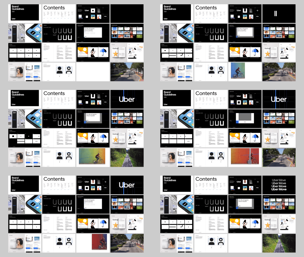
Uber’s brand guidelines are the result of extremely deliberate, minimalistic choices. Its wordmark logo type is modern and direct, with black and white as its main brand colors.
The logo font is minimalistic and padded with ample spacing for added emphasis. Uber uses the bare essentials to get their brand across, relying on its imagery and crisp interface to deliver a reliable and futuristic look.

3. Arc’teryx Used
As a sustainable initiative, Arc’teryx released a used clothing line to extend the life of their products. Arc’teryx’s main brand guidelines use sleek black and white brand colors with an abstract symbol and futuristic modern font. For its used line, it added a neon green “U” and included circles in its visual branding to represent a full lifecycle. The neon green creates a stark difference between the two, highlighting the pre-loved items and the brand’s commitment to product and planet longevity.

Source: Monday Creative
4. Kotn
Kotn is a sustainable clothing brand that challenges the norms of fashion. Much like its products, Kotn’s brand guidelines are minimalistic and earthy. It has a simple minimalist font with neutral brand colors that are inspired by the hot and arid environment that cotton grows in. The guidelines are crisp and clean, with lots of white space and symmetry.

5. Help Scout
Help Scout’s guidelines delve into three areas: visuals, copy, and code (it’s a software company). It uses soft watercolor as brand colors to create an approachable and airy look. Help Scout uses illustrations to give off a handmade look that contributes to their human and organic brand values. It’s a great example of how company values can be used to steer brand guidelines!

Whether you create your brand’s assets (website, business cards, etc.) or outsource the job to others, think of brand guidelines as a rule book to build a consistent, authentic identity and avoid common design mistakes as you grow. It’ll save you time and effort when you need to think about creating any type of design (virtual or real) for your business.
Even if you’re a one-person startup, getting these rules documented puts you on track for building a strong brand.
To produce brand guidelines, determine what sections will be most relevant to your business, how you’re going to create them, and where you’ll store and share them.
Then get down to marketing your amazing products or services with confidence. Consistency for the win!