15 Full Bodied Wine Logos + Tips to Design Your Own

There are two types of wine enthusiasts. Some know every vineyard, region, and undertone, and others just like an attractive label. For wine merchants, the best quality means nothing if your branding is boring.
If you want your company to grow, then it’s essential to nail the logo. It should speak on your personality and give the customer an idea of what they’re buying into. The best branding works because it’s a powerful symbol of the brand itself.
The first step is to know who you are as a retailer. The second is to understand your market. Fortunately, we’ve done the hard work and summed up the current winery and vineyard landscape – so you can find where you fit!
Popular styles for vineyard and wine logos
Wines come in numerous combinations. Deep and full-bodied, sweet and sparkling, a cheeky rosé; you name it, they’ve made it. Each one has its own unique set of traits.
Wineries also have strong personalities. Maybe you have a hipster garage set-up? A renowned local establishment, or a modern tech-forward vineyard?
Consider who you are and the wine you make and use those ideas to inform your wine logo style choices.
Check out some of the popular wine logos of the moment for inspiration.
Minimal
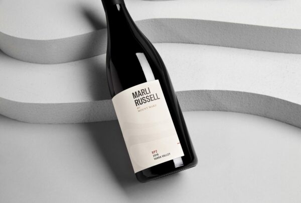
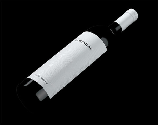
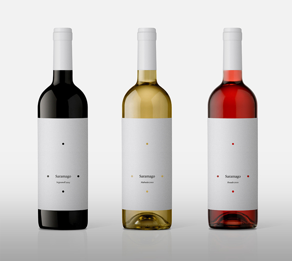
The internet age has inspired a minimalist trend across all industries. Minimalist graphics are sleek, simple, and impactful – including no embellishment or realistic traits. They’re easily transferred onto all media, great for wineries and vineyards that have an active social media presence. A simple wordmark or icon can be visually pleasing. However, make sure you consider negative space when using this option for wine and vineyard logos.
Vintage
Wine-making is an ancient and respected practice all across the world. Many companies play on this heritage with ornate vintage logos. They draw inspiration from the Baroque style, family crests, heavily serif-ed fonts, and royal color schemes. The effect is a classical and elegant logo that shows the high-regard of vinification.

Source: Caymus.com

Source: italianfood.net
Animal symbols
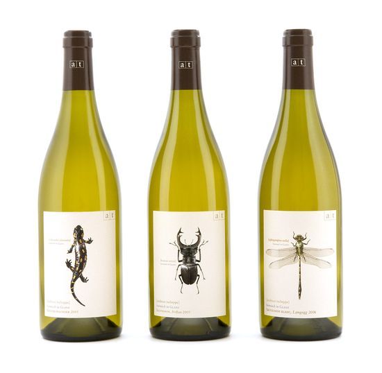
Animals have held symbolic power since the beginning of time. Whole countries, dynasty families, and big businesses have used animal imagery to represent themselves. To pick an animal, consider where you’re based. Is there a famous local animal? Also, think about the personality of different species. Which one best fits the message you’re trying to convey?

Source: thedieline.com
Playful
Sometimes a memorable logo means stepping out from the crowd. Most wine logos are traditional, so adding some playful elements makes a unique splash. Try brightening up color schemes or adding gradients to grab attention. Remember that your logo represents your brand, so only choose this option if you like the silly side of life.

Source: Marios Karystios

Source: thedieline.com
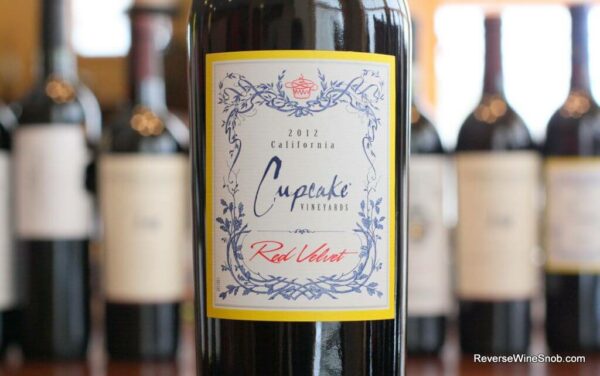
Floral
Some wines pride themselves on being light and fresh, perfect for spring afternoons. These brands might want to consider a floral design. You can either opt for a more feminine angle or stick with the traditional look by adding vines and leaves as decorative embellishments. It’s a diverse style that works great for numerous wine types.

Source: Worldbranddesign.com

Source: bestproducts.com
Modern
There’s a rising trend in organic and vegan wines, climate change concerns for manufacturing, and a move away from traditional vineyard locations. If you’re at the vanguard of the wine industry, then you want to make that known in your branding.
Chic, minimalist, and abstract designs all scream modernism. Aim for slab fonts and simple colors for a logo that pops with innovation.

Source: thedieline.com

Source: Bpando.org
Design the perfect logo for your wine or vineyard
Now you’ve got a general idea of what’s out there, let’s start designing your wine logo. No matter which style you opt for, certain elements of the logo need tending to. Each choice adds to the final feel, so it’s essential to make sure you’ve made the right decisions to show off your unique wine.
Have a look at these rules/ideas and start brainstorming the elements that make your brand unique and desirable.
Fonts are important
Fonts are probably the most critical style choice you have. Remember these simple rules. Serif’s give a traditional feel while slab fonts feel more modern. Scriptwriting suggests elegant exclusivity, whereas simple typefaces are more playful and unique for wine brands.

Source: vinepair.com
Optimizing for space
Wine labels aren’t that big, so you have to fit all the important details in limited space. Choosing a type of logo can help start this process. Do you want a wordmark or icon? Would a simple monogram work? Once you know the main shape, you can consider where the extras go in the negative space.
Grabbing attention
Brands need to be attention-seeking. There are two routes you can go here. Either aim for a logo that’s so bright and bold that it jumps out from the shelf, or aim for the most aesthetically-pleasing design you can manage. Humans are attracted to pretty things, so create synergy between your logo, font choices, and color schemes.
Defining your brand
Before you even start designing your wine logo, you need to establish your brand identity. Many factors determine who you are as a company. Consider these four elements when developing your brand – vision, mission, values, and voice. Once you’ve got a style guide, you can use it to make sure your marketing matches your store and vineyard experience. Think of your brand as a personality; lot’s of different factors that define who you are.
Communicating your brand
Once you’ve defined your brand, you need to know how you’re going to communicate it to the public. Start by determining where your brand will exist. Will you focus on social media following? Or will your marketing efforts be more localized? How does it affect your logo if you’re going to print it onto merchandise, verses existing mainly online? How easily will it scale to different sizes?
Make your wine logo now!
We’ve already mentioned that different wine types have a different feel. As a vineyard or winery, you’re not just going to produce one wine – that would be bad for business! So, you have to pick branding that will work for your entire range.
Here are a few considerations for each color of wine and what their drinkers expect.
Red wine logos
Red wine drinkers are serious people. They like their drink full-bodied and brooding. Most red wine labels are traditional, which curled serifs and gold embellishments. You also have to work with the hue of the wine itself. The deep red won’t match all colors, so try a moody fall palette for an aesthetically pleasing final product.
White wine logos
White wine is known to be ‘lighter’ that its red companion. Think fresh fish starters and spritzers in the sun. White’s need an equally refreshing logo to match their light personality. You can also experiment with a broader range of color possibilities since the wine’s color provides a blank backdrop.
- Made in Looka
Rose wine logos
Rose wine is often associated with the feminine – due to its pink color and fruity taste. Floral designs work perfectly here, but you mustn’t isolate your male drinkers in the process. Despite the stereotype, it’s not just women that enjoy a glass of rose. Try stepping away from pink flowers for a more inclusive bottle.
Sparkling wine logos
Sparkling wine means celebration time. New Year’s eve, birthdays, and engagements all call for a bottle of the bubbly. Try and reflect this in the design, and it will increase your allure to buyers. Fireworks, florals, and elaborate patterns are all standard features for sparkling winery logos.
Finally, remember that your design doesn’t have to be consistent on every bottle you produce. Most companies create a unique wine label design for each formula they create. This is where branding is your best friend. If you can keep your brand personality coherent, then you can create hundreds of designs that will all be recognizable. Using the same logo, font, and style will ensure consistency.
Create a logo & start your wine legacy
You don’t need to be a top designer to create great branding. A strong understanding of your vision and good instincts is all you really need. Just make sure you don’t neglect the logo design. You’ve spent so long perfecting your signature taste; the packaging is just as important.
Try out our logo maker to experiment with different styles and designs. Then you’ll be able to create a brand you truly love.


