Make your own community logo for free
Select
Enter your business name and select logo styles, colors, and symbols -- it only takes 2 minutes! Our AI-powered logo maker will use your inspiration when generating logo options.
Review
You’ll be presented with 100s of custom logo mockups based on your preferences. Click your favorites and preview how they look on T-shirts, business cards, and more.
Perfect
Use our logo editor to perfect your design and make your vision come to life. You can easily change colors, fonts, layouts, and spacing -- no fancy design skills required!
Design a custom logo for free. Only pay if you’re 100% happy!
Community logo best practices
Color
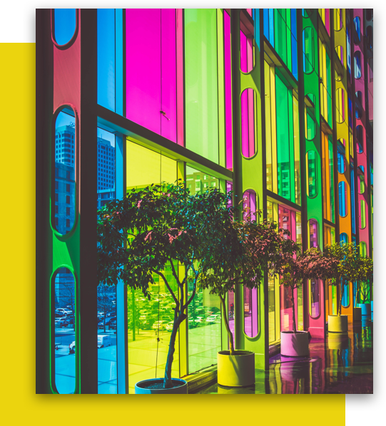
Make people feel welcome, by choosing soft, approachable colors for your logo. Muted shades evoke a sense of kindness and openness, while multi-color logos communicate inclusion and diversity. For any color you consider, think about the community you’re serving and whether it would resonate with the people within your organization. After all, it’s their logo too!
Layout
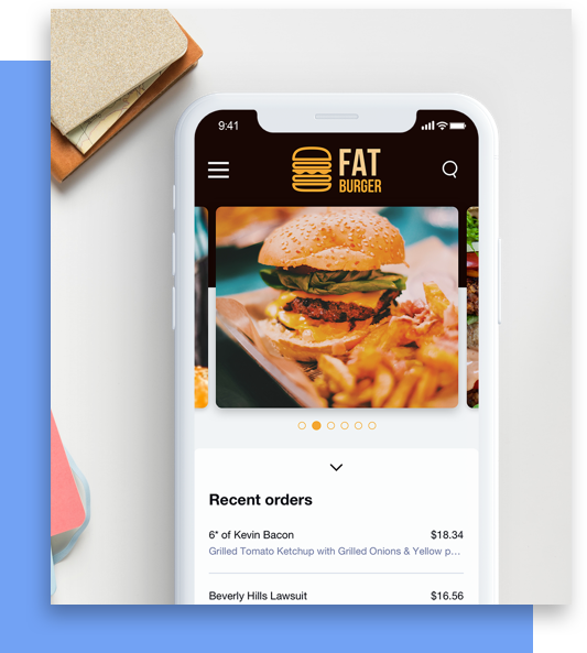
As you start designing, think about where you’ll be using your community logo and select a layout that will work for your chosen mediums. Will you need signage for in-person fundraisers? A website to list upcoming meetings? Letterhead for your non-profit’s mailers? If you’re unsure of where you’ll be using your logo or what will look best, opt for a clean, simple layout.
Typography
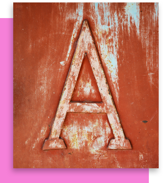
Fonts can say a lot about the organization they represent, so look for fonts that reflect the voice and character of your community. Sans-Serif fonts are a popular option, as their open, airy design gives logos a friendly look. Whatever font you go with, make sure it’s easily readable at every size, to better accommodate members of varying vision levels.
Symbol
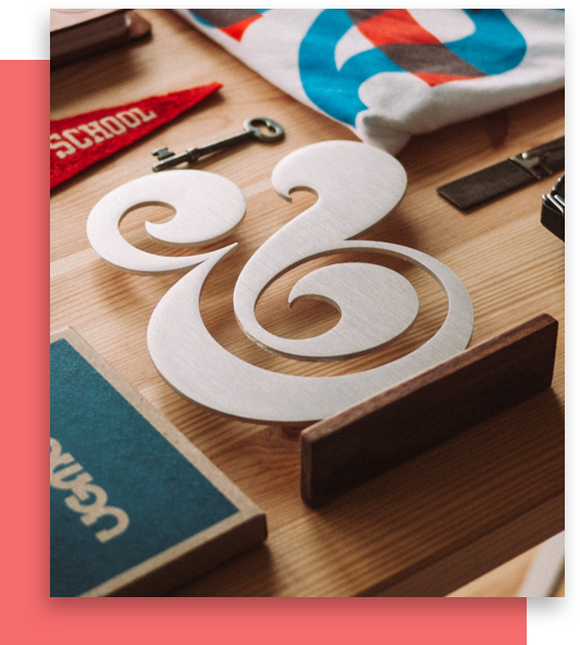
Your symbol can capture the spirit and cause of your community at a glance, telling potential members exactly what you stand for. Look for symbols that reflect the work your organization does and the impact you’re looking to create. For any symbol you select, make sure it matches the rest of your design elements, so your logo creates a unified impression of your community.
Special Features
If you want your community logo to stand out from the crowd, try using some of Looka’s special features. Add diversity to the look of your logo with font and color pairs. Different text styles and text colors can communicate different aspects of your community. With the right pair, you’ll show off every side of who you are. For a logo that stands tall, try stacking your text. Or add impact around your symbol by framing it in a container. With a special feature or two, you’ll be ready to take your community from grassroots to global.
Get started today!
Use Looka's AI-powered platform to create a business logo, design a website, and build a brand you love.


