Make your own construction logo for free
Select
Enter your business name and select logo styles, colors, and symbols -- it only takes 2 minutes! Our AI-powered logo maker will use your inspiration when generating logo options.
Review
You’ll be presented with 100s of custom logo mockups based on your preferences. Click your favorites and preview how they look on T-shirts, business cards, and more.
Perfect
Use our logo editor to perfect your design and make your vision come to life. You can easily change colors, fonts, layouts, and spacing -- no fancy design skills required!
Design a custom logo for free. Only pay if you’re 100% happy!
Construction logo best practices
Color
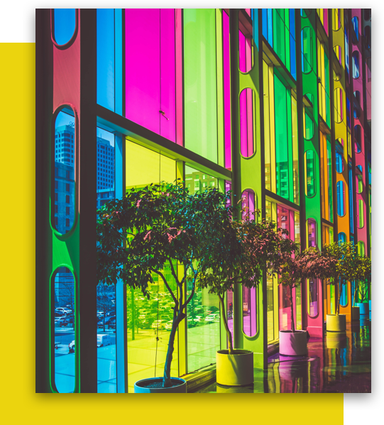
Choose a color palette that resonates with your construction clients and reflects the kind of work your company does. If you're using a complex symbol or typeface in your construction logo, it's best to stick with black and white. For a pop of color, yellow is a popular choice, since it represents safety while also standing out visually.
Layout
Whatever kind of construction business you're in, a clean logo layout is a great choice. Simple layouts scale well, so your logo will look just as good on your business cards as it does on the side of a truck. For a bit of added flexibility, you can also opt for a few logo variations that you can use for different mediums.
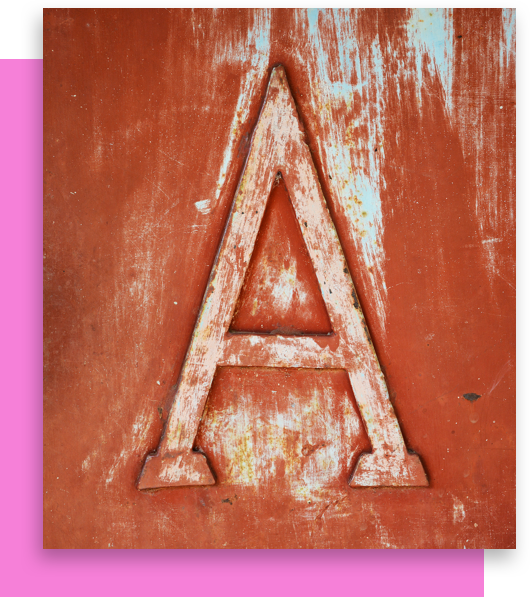
Typography
Construction logo fonts typically leverage bold, blocky typefaces to represent the trade. But they aren't the only option. Depending on your clientele and the type of construction your company does, a slimmer or Sans-Serif option might fit your brand better. Most importantly, your font should be legible across sizes and mediums, so clients can learn the name behind the work.
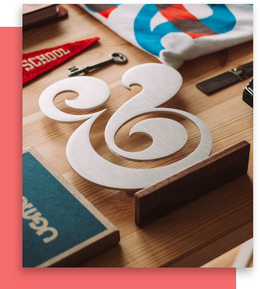
Symbol
While optional, symbols are a great way to quickly communicate your brand's offering. Many vintage-style construction logos incorporate images of tools, while some more modern logos include abstract, architectural symbols. If you do include a symbol, make sure it suits your construction business, your other branding elements, and the mediums you plan on using your logo.
Special Features
Once you’ve laid the foundations for your construction logo, add some curb appeal with Looka’s special features. Create a sense of strength by stacking your logo’s elements. Stacked text and stacked symbols concentrate your logo features in one area—generating a solid impression of your brand. Looking to build name recognition? Try framing your construction company’s name inside of a container. Classic rectangular and square containers add structure, as well as a sense of focus. With a few of Looka’s special features in your toolkit, you’ll be ready to get your construction company on the market in no time.
Get started today!
Use Looka's AI-powered platform to create a construction business logo, design a website, and build a brand you love.
