Make your own dating logo for free
Select
Enter your business name and select logo styles, colors, and symbols -- it only takes 2 minutes! Our AI-powered logo maker will use your inspiration when generating logo options.
Review
You’ll be presented with 100s of custom logo mockups based on your preferences. Click your favorites and preview how they look on T-shirts, business cards, and more.
Perfect
Use our logo editor to perfect your design and make your vision come to life. You can easily change colors, fonts, layouts, and spacing -- no fancy design skills required!
Design a custom logo for free. Only pay if you’re 100% happy!
Dating logo best practices
Color
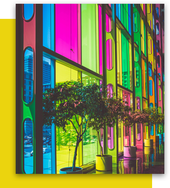
Red might be the color of love, but it’s not your only option when choosing a palette for your dating app logo. Look for colors that reflect your users, what they’re like and what they’re seeking. Bright hues suit users looking for fun, while black and white create a more exclusive air. You’ll also want to check that your colors differ from direct competitors, to ensure customers don’t mistake their dating app for yours.
Layout
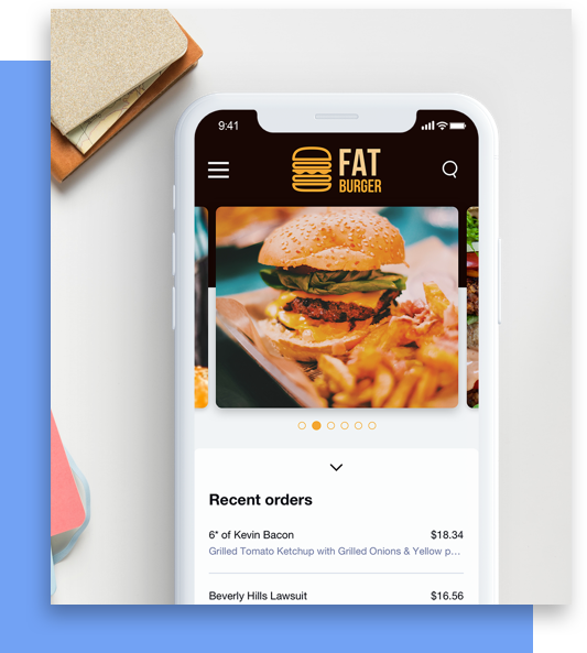
You want your customers to love your logo as much as you do, so remember to put yourself in their shoes as you design. Logo layouts that are too complicated or hard to decipher on small screens can make it hard for customers to connect with your brand. Instead, opt for a simple layout that will look great across desktops, tablets, mobile devices, and anywhere else your users might be swiping.
Typography
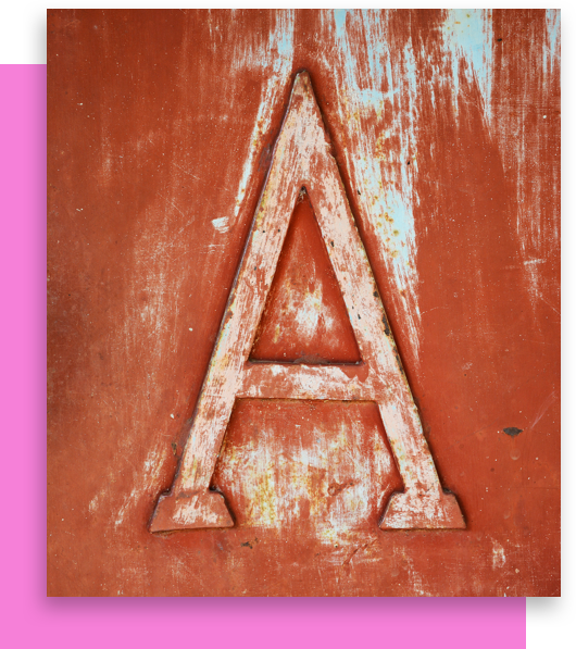
When you’re searching for a font to commit to, don’t let looks blind you. The perfect font for your dating app logo will be more than just beautiful—it’ll also be legible across a variety of mediums. Whether you go with a flirty Script font, traditional Serif font, or adventurous Modern font, readability should be a top priority. Test for readability by simply scrolling through Looka’s mockups feature to see your dating site logo come to life.
Symbol
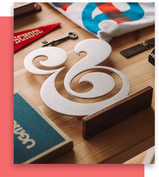
As you explore symbols for your dating logo, aim for something that captures the heart of your brand. For many dating apps, this heart comes in the form of, well, a heart symbol. If you want to stand out from the crowd, try using a less literal symbol. Once you’ve found a symbol you want to settle down with, make sure to check it’s compatible with your other logo elements.
Special Features
If you’re looking to spice up your dating app logo, try Looka’s special features. Start by bringing your text and symbol closer together with advanced layout options. Symbol between text replaces space with a symbol. While symbol replace text lets you swap out a letter for a symbol. Create a more intimate design by closing the spacing between letters. Or go all the way by overlapping two letters from your name. Finally, put a ring (or rectangle) on it with a container. Containers offer the perfect finishing touch to stand out on app icons.
Get started today!
Use Looka's AI-powered platform to create a dating business logo, design a website, and build a brand you love.


