Make your own fitness logo for free
Select
Enter your business name and select logo styles, colors, and symbols -- it only takes 2 minutes! Our AI-powered logo maker will use your inspiration when generating logo options.
Review
You’ll be presented with 100s of custom logo mockups based on your preferences. Click your favorites and preview how they look on T-shirts, business cards, and more.

Perfect
Use our logo editor to perfect your design and make your vision come to life. You can easily change colors, fonts, layouts, and spacing -- no fancy design skills required!
Design a custom logo for free. Only pay if you’re 100% happy!
Fitness logo best practices

Color
Create a powerful first impression by choosing a bold color palette for your logo. Bright reds and striking blues are favorites for fitness logos. Many fitness brands also incorporate grays and blacks to ground the look of their logo. Whatever colors you choose, make sure they fit your brand’s personality. If you like to mix fun and fitness, try a playful pop of yellow or purple. If you’re serious about pumping iron, a gritty gray or muted red will work well.
Layout
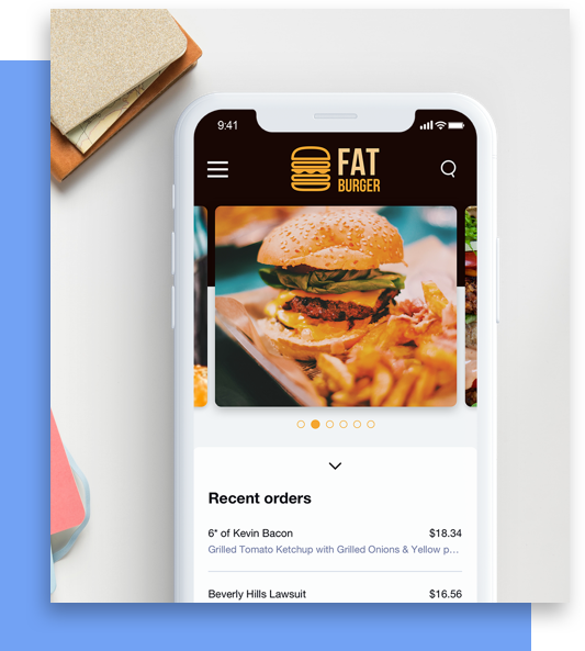
As you design your fitness logo, consider where you’ll use it most. On a website selling your athletic gear? On flyers advertising your workout classes? On personal trainer business cards containing your contact info? Look for logo layouts that suit your most-used mediums. In Looka’s mockups, you’ll see how your logo looks across websites, signage, and more. When in doubt, get back to basics with a simple, streamlined logo layout.
Typography
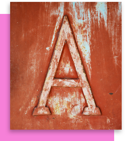
Many fitness fonts use bold, all-caps lettering to convey strength and stability. But that doesn’t mean your fitness logo needs to do the same. Fonts are a great place to flex your fitness brand’s personality. So try out a few different fonts and see which one speaks most to your brand’s voice. As you try on fonts for size, be sure to also check for readability. If customers can’t read your name, it won’t matter how well your font fits your brand.
Symbol
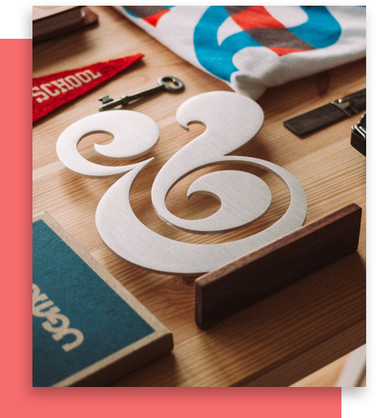
Barbells, muscles, and weightlifters are all fitness symbol mainstays. These symbols take a literal approach, quickly letting customers know what your brand does. If you want to exercise a bit more creativity, try using an abstract symbol for your fitness logo. Abstract shapes can capture the movement your brand inspires—while standing out from competitors. Be sure your symbol also matches the rest of your logo, to create a unified image for your fitness brand.
Get started today!
Use Looka's AI-powered platform to create a fitness business logo, design a website, and build a brand you love.
