Make your own gym logo for free
Select
Enter your business name and select logo styles, colors, and symbols -- it only takes 2 minutes! Our AI-powered logo maker will use your inspiration when generating logo options.
Review
You’ll be presented with 100s of custom logo mockups based on your preferences. Click your favorites and preview how they look on T-shirts, business cards, and more.

Perfect
Use our logo editor to perfect your design and make your vision come to life. You can easily change colors, fonts, layouts, and spacing -- no fancy design skills required!
Design a custom gym logo for free. Only pay if you’re 100% happy!
Gym logo best practices
Color
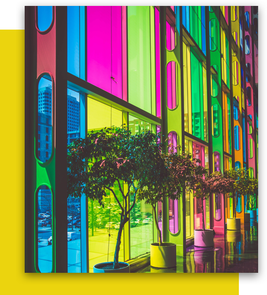
Whip your gym logo into shape with a strong color palette. Bold reds and blues convey power, yellows and greens add energy, while black and white display discipline. As you select your brand colors, think about the type of exercise and atmosphere offered at your gym. The right brand colors can give members a sense of what it means to belong to your gym—before they even break a sweat.
Layout
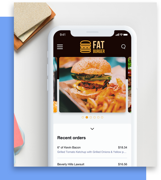
When you’re designing a gym’s layout, everything needs a place. The same goes for your gym’s logo. Look for logo layouts that give your name, slogan, symbol, and container sufficient space to spread out. Within this space, you'll want to focus on your logo's core. For some gyms, this might mean putting your symbol in the spotlight. For others, it might mean your name takes the top spot. Whatever logo layout you consider, check Looka’s mockup feature to make sure it works across mediums.
Typography
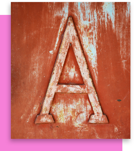
Your gym logo’s font can speak volumes about your brand—so choose your words carefully! Bold, all-caps fonts communicate energy and intensity. Slender, widely-spaced fonts add a sense of grace and precision. Simple Sans Serifs show a focus on the fundamentals. Your gym’s area of expertise should guide your gym's fonts. But you should also consider readability across mediums and sizes. By balancing readability and personality, your logo will be at peak performance.
Symbol
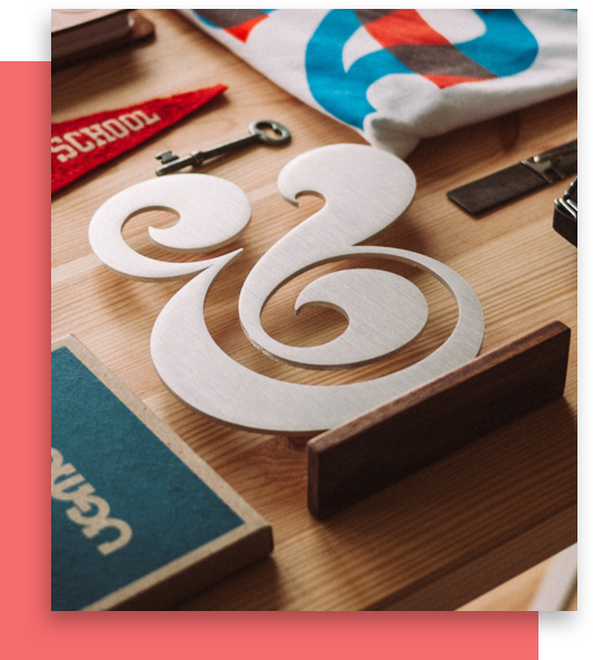
If you need gym symbol inspiration, take a lap around your gym. Gym equipment like barbells and bicycles are popular options. Some gym logos take a more bodily approach, featuring muscle and weightlifter symbols. Others go abstract, choosing shapes to capture movement and strength. Whether you go literal or abstract, make sure your symbol fits the rest of your logo. A logo that matches from color to symbol will make a strong impression anywhere you use it.

Special Features
To pump up your gym logo for knockout branding, incorporate some of Looka’s special features. Features such as gradients, symbol replacing letter, and stacked text can be a great way to show off your muscles and stand out amongst your competitors. After playing around with Looka’s editor, your gym or fitness center logo will be looking as strong as Equinox, SoulCycle, CrossFit or LA Fitness.
Frequently asked questions (FAQ) about gym logos
-
What makes a good gym logo?
There are four key qualities to a great gym logo: it’s simple, it’s memorable, it’s scalable, and it’s relevant to your audience. By keeping these qualities in mind, you’ll be sure to have a logo that’s in tip-top shape, winning recognition and trust from your clients. Create your very own logo and you can knock any template right out of the ring!
-
What colors look good with a gym logo?
Your gym logo colors should reflect the values that you want to communicate to your customers. As you choose your brand colors, mull over the types of exercises and environment your fitness center provides. For instance, bold reds and blues bring toughness to mind, whereas yellows and greens can be energizing.
-
What is the best font for a gym logo?
The best font for a gym logo will depend on your area of expertise and image that you want to project. For instance, capitalized fonts communicate vigor and enthusiasm, whereas simpler sans serif typefaces can demonstrate a focus on the basics. Just be sure your choice is legible from all distances and across all mediums.
-
What icons work well for a gym logo?
When it comes to gym logo design, use symbols which reflect your offerings and the values that you want to communicate. Get inspired by the elements within your gym, such as the equipment you may have, or the members themselves. Bike and weights symbols could work just as well as muscle or strong body part icons. Just be sure that your symbol fits with the rest of your design elements to build a consistent brand.
-
How do I design my own gym logo?
You have a few options for creating your gym logo. You could hire a professional graphic designer to design your logo for you. If you’re on a tight budget and prefer to do it yourself, you could use an online gym logo maker like Looka — simply enter a few inputs and you’ll have a stunning new logo in minutes. Plus, it’s more powerful to customize your logo than to simply rely on gym logo templates. Get ready for a logo download that’s fit for a champ!
Try the gym logo maker trusted by over 20 million small businesses
Learn more about logo design
Get started today!
Use Looka's AI-powered platform to create a gym business logo, design a website, and build a brand you love.


