Make your own infrastructure logo for free
Select
Enter your business name and select logo styles, colors, and symbols -- it only takes 2 minutes! Our AI-powered logo maker will use your inspiration when generating logo options.
Review
You’ll be presented with 100s of custom logo mockups based on your preferences. Click your favorites and preview how they look on T-shirts, business cards, and more.
Perfect
Use our logo editor to perfect your design and make your vision come to life. You can easily change colors, fonts, layouts, and spacing -- no fancy design skills required!
Design a custom logo for free. Only pay if you’re 100% happy!
Infrastructure logo best practices
Color
Depending on the area of the infrastructure industry your business operates in, some colors will work better than others. Shades of gray look great in concrete company logos, while greens work well for outdoor-focused products and services, and reds add a sense of strength to construction businesses. Look for colors that differ from your direct competitors, to ensure your company stands out.
Layout
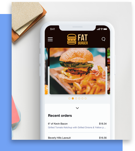
Your infrastructure logo might appear on everything from machinery to business cards, so look for a layout with flexibility. Logo layouts with fewer elements and cleaner features tend to scale both up and down well. For maximum flexibility, keep your symbols simple and ditch the slogan entirely. The more streamlined your logo, the more usage you’ll be able to get out of it across different mediums and sizes.
Typography
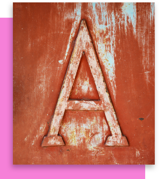
Strength. Reliability. Confidence. These are the features infrastructure logos need to convey to potential clients. Create a powerful first impression by choosing fonts that reflect the quality and durability of your work. Look for fonts with heavier weights, stronger lines, and sharper corners, to add a sense of solidity to your logo. These types of fonts also tend to scale well, making it easier for customers to remember your name.

Symbol
Choosing the right infrastructure symbol for your logo comes down to the specific products and services your company provides. The symbols that work well for a granite company’s logo might not make as much sense in a concrete logo. Aside from matching your company’s infrastructure offering, your symbol should also match your logo’s other elements—to create a unified brand for your business.

Special Features
Looking to elevate your infrastructure brand? Use Looka’s special features to take your logo from prototype to finished product. Symbols are often the cornerstone of infrastructure logos. Give your infrastructure symbol a boost by framing it in a container. Or integrate your symbol into your name using the symbol replace text feature. For a more subtle approach, play with spacing to overlap symbol and text. Once your symbol is set, bring the building blocks of your logo together with Looka’s professional-grade color schemes.
Get started today!
Use Looka's AI-powered platform to create an infrastructure business logo, design a website, and build a brand you love.


