Make your own insurance logo for free
Select
Enter your business name and select logo styles, colors, and symbols -- it only takes 2 minutes! Our AI-powered logo maker will use your inspiration when generating logo options.
Review
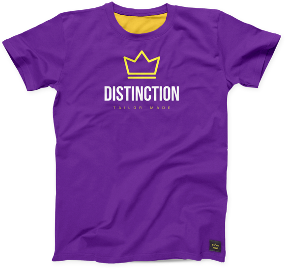
You’ll be presented with 100s of custom logo mockups based on your preferences. Click your favorites and preview how they look on T-shirts, business cards, and more.

Perfect
Use our logo editor to perfect your design and make your vision come to life. You can easily change colors, fonts, layouts, and spacing -- no fancy design skills required!
Design a custom logo for free. Only pay if you’re 100% happy!
Insurance logo best practices

Color
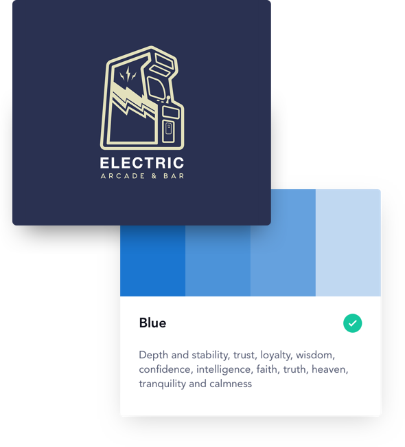
Color is often the first thing people will notice about your logo. Create a great first impression by choosing colors that reflect the way you want clients to feel while interacting with your insurance agency. Many insurance logos come in shades of blue, which is associated with calm and intelligence. To add a pop of positivity, yellow is a popular accent color in the insurance industry. For any colors you choose, aim for more muted tones over anything too bright or busy.
Layout
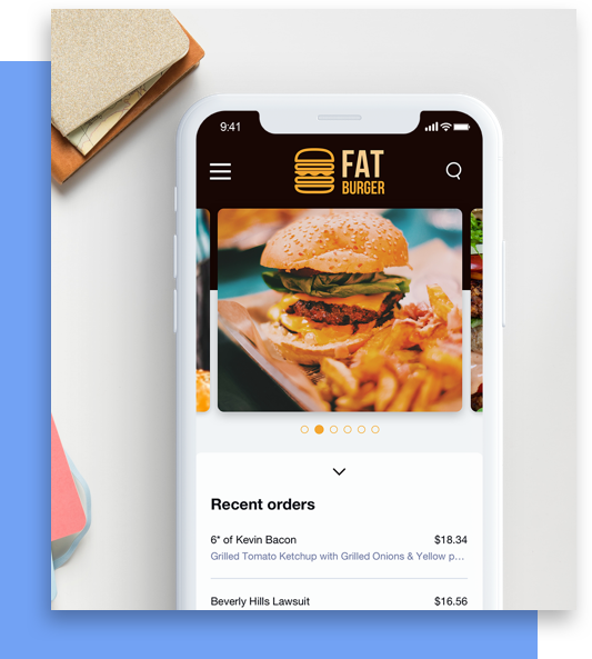
Your insurance company’s logo might appear on everything from websites, to TV ads, to billboards, to business cards. To ensure your logo looks just as good in digital advertisements as it does on your insurance agents’ business cards, opt for a simple, streamlined logo layout. For a bit of added insurance, you can always design multiple variations of your logo for different sizes and mediums.
Typography
Many insurance agencies choose classic Serif fonts for their logos. These fonts are associated with stability and tradition, which makes them a good match for an industry founded on trust. If you want a more modern look for your logo, the streamlined look of Sans Serif fonts offers an updated silhouette. Both Serif and Sans Serif fonts balance personality with legibility, making them client-friendly options for your logo.
Symbol
The best symbol for your logo will depend entirely on the type of insurance your company provides. If you offer home insurance, a house symbol will be a good fit, while a heart symbol might make more sense for a health insurance company. After making sure the symbol you choose matches the services you provide, you’ll also want to check that it matches your logo’s other design elements—to create a unified impression of your brand.
Get started today!
Use Looka's AI-powered platform to create an insurance business logo, design a website, and build a brand you love.


