Make your own travel agency logo for free
Select
Enter your business name and select logo styles, colors, and symbols -- it only takes 2 minutes! Our AI-powered logo maker will use your inspiration when generating logo options.
Review
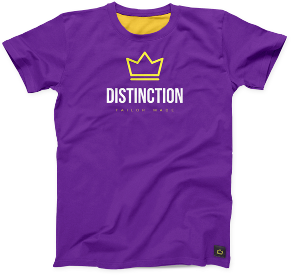
You’ll be presented with 100s of custom logo mockups based on your preferences. Click your favorites and preview how they look on T-shirts, business cards, and more.

Perfect
Use our logo editor to perfect your design and make your vision come to life. You can easily change colors, fonts, layouts, and spacing -- no fancy design skills required!
Design custom travel agency logos for free. Only pay if you’re 100% happy!
Travel agency logo best practices
Color
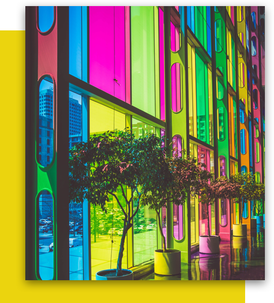
The color palette you choose for your travel agency logo should paint a picture of the experiences you have to offer. Warm red and yellow tones evoke sandy beaches, while cool blues recall more icy adventures, and shades of green recall lush forests. If you’re looking to add a premium feel to your travel brand, try keeping things black and white. For any colors you choose, keep your audience in mind and consider what will resonate with their tastes.
Layout
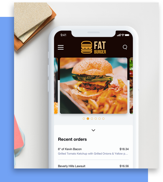
Are you a travel agency that uses business cards? Or maybe a tour company that needs branded buses? Or a travel blog that creates social media posts? Depending on the nature of your travel business, your logo might appear in different places. Consider where you’ll be using your logo and look for formats that will work with those applications. If you’re unsure what will look best in the sizes and mediums you use, you can’t go wrong with a minimalist layout.
Typography
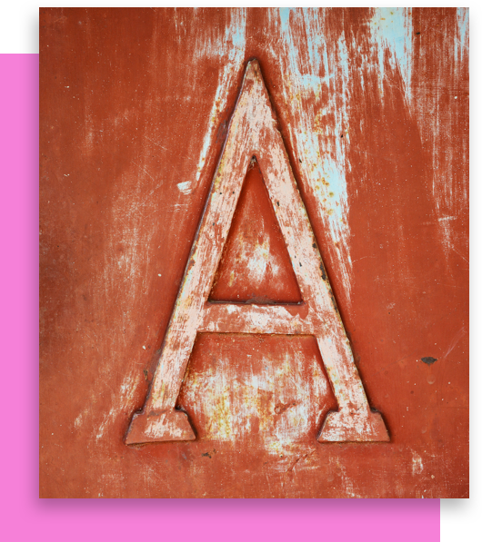
Your logo’s typography should capture the tone and voice of your travel brand. As you explore different options, look for fonts that reflect your brand’s personality and destinations. Serif fonts work well for high-end experiences, Script fonts evoke playful retreats, and Sans Serif fonts speak to more modern getaways. While your travel agency logo’s fonts should reflect the experiences you specialize in, they should also be legible—so your audience can easily remember your name.

Symbol
Travel agency logos typically feature symbols related to either the journey or the destination. Icons of airplanes, boats, beaches, and mountains can all be a good fit, depending on the nature of your travels. If you want to be more adventurous, try an abstract symbol that evokes the spirit of wanderlust or discovery. Whatever symbol you go with, make sure it matches your logo’s other elements. By keeping your icons consistent with your colors, format, and fonts, you create a unified image for your travel brand.

Travel agency logo maker features
Try using one of Looka's special features to create some truly unique travel agency logos. Some of our most popular features include curved text and using symbol as text. For example, you could curve your company name around a globe icon, or you could even replace the letter "O" in your name with a compass icon. Looka's logo editor makes designing a travel agency logo a breeze, so that you can instead focus on planning your clients' dream getaways.
Frequently asked questions about travel agency logos
-
Why do I need a logo for my travel agency?
A logo is an important element of your travel agency’s brand identity. It serves as a visual representation of your services and can help you to establish a professional, reliable, and trustworthy image that stands out from competing travel agencies.
-
What makes a good travel agency logo?
There are four key qualities to a great travel agency logo: it’s simple, it’s memorable, it’s scalable, and it’s relevant to your audience. By keeping these qualities in mind, you’ll be sure to have a great logo that your clients will recognize and trust the next time they plan a dream vacation.
-
What colors look good with a travel agency logo?
Your travel agency’s logo colors should reflect the experiences that you offer to your customers. Pick bright, vibrant colors like red or yellow if you specialize in warm, sunny destinations. If you offer winter excursions, you could pick various shades of blue. Just be sure to keep it simple and pick no more than two or three colors.
-
What is the best font for a travel agency logo?
The best font for a travel agency logo will depend on the particular style and image that you want to project. You could go with a Serif font to appear more traditional and show that you offer high-end, luxurious travel experiences. On the other hand, a Sans-Serif font conveys a more modern, budget-friendly offering.
-
What icons work well for a travel agency logo?
When it comes to travel agency logo design, use symbols which reflect your area of expertise or the values that you want to communicate. You can’t go wrong with icons of planes, maps, cars, or even landmarks if your agency specializes in tourism for a specific country or city. Just be sure that your symbol fits with the rest of your design elements to build a consistent brand.
-
How do I make a travel agency logo?
You have a few options for creating your travel agency logo. You could hire a professional graphic designer to design your logo for you. If you’re on a tight budget and prefer to do it yourself, you could use an online travel agency logo maker like Looka — simply enter a few inputs and you’ll have a stunning new logo in minutes.
Try the travel agency logo maker trusted by over 20 million small businesses
Learn more about logo design
Get started today!
Use Looka's AI-powered platform to create a travel agency business logo, design a website, and build a brand you love.


