Make your own tv logo for free
Select
Enter your business name and select logo styles, colors, and symbols -- it only takes 2 minutes! Our AI-powered logo maker will use your inspiration when generating logo options.
Review
You’ll be presented with 100s of custom logo mockups based on your preferences. Click your favorites and preview how they look on T-shirts, business cards, and more.

Perfect
Use our logo editor to perfect your design and make your vision come to life. You can easily change colors, fonts, layouts, and spacing -- no fancy design skills required!
Design a custom TV logo for free. Only pay if you’re 100% happy!
TV logo best practices

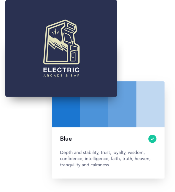
Color
Choose a color palette that resonates with your television viewers and reflects the content you produce. Cheery comedies work with brighter colors, while serious dramas pair well with black and white, and educational content suits more muted shades. As you select your palette, you should also consider contrast. With a high contrast color palette, you can ensure your logo will be clearly visible on even the smallest of TV screens.
Layout
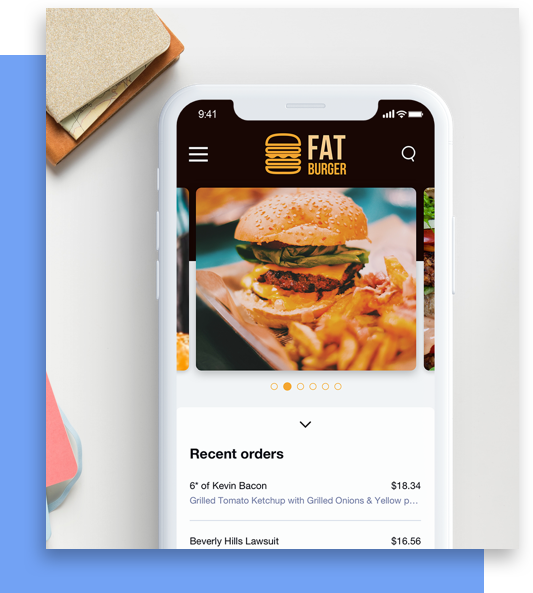
Speaking of screens, your TV logo should be formatted to look its best across a wide variety of screen sizes. Whether you’re creating a TV show logo that will appear in opening credits or a TV network logo that will be used in on-screen graphics, you should design your logo layout with your medium in mind. This means creating several layout variations, to suit the different on-screen appearances of your logo.
Typography
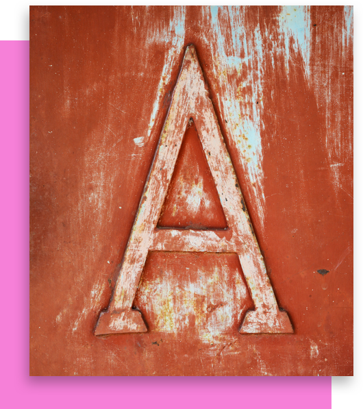
Look for fonts that speak to your TV content’s genre, to give viewers a preview of what you have in store. Sans-Serif fonts are seen as modern, while Script fonts are more fanciful, and Serif fonts evoke a sense of history. Across typefaces, bolder fonts are favored by television logos, since they’re easier to read at small sizes. With the right balance of personality and readability, you’ll create the perfect first impression for your TV brand.
Symbol
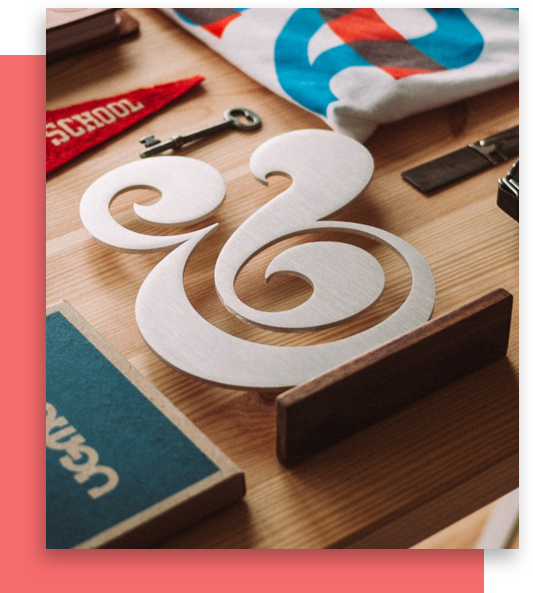
Many TV channels and networks opt to omit the symbol entirely. Instead, they use a monogram version of their logo to represent their brand at smaller sizes. If you do choose to include a symbol, leave any complicated design details on the cutting room floor. In television, simple is best. A simple, distinct symbol in high resolution can set your TV logo apart at a glance, and help you hold the attention of even the most dedicated channel surfers.

Special Features
From black and white programs broadcast over the airwaves to endless content streamed over the internet, television has changed a lot over the years. But one thing hasn’t changed: the importance of a great logo. With a few of Looka’s special design features, you can be sure your television logo meets broadcasting standards. Make use of limited screen space by stacking your logo’s text. Or follow in the footsteps of famous channels like BBC, NBC, and CBS, by creating a monogram logo. Whether you write your name in full or stick to initials, framing your design with a container will keep your logo looking sharp.
Frequently asked questions (FAQ) about TV logos
-
What colors look good with a TV logo?
It’s best to choose colors that will resonate with and be memorable to your viewers or potential customers – depending on the kind of TV program you’re running. Whether it’s an infomercial or sit-com, high contrast can really make your TV logo colors pop. Bright colors tend to suit upbeat comedies, whereas dramas with serious subject matter often pair fittingly with black and white. No matter the color palette, it’s helpful for TV logos to be visible on all screen sizes.
-
What is the best font for a TV logo?
Choose fonts that represent your genre accurately, giving viewers a preview of what your TV content is all about. Modern genres often include sans serif typefaces, while historical genres typically use serif fonts. Bolder fonts allow for an easier reading experience for your viewers, on all screen types, and at any distance.
-
What icons work well for a TV logo?
Keep your symbol uncomplicated. A simple symbol choice for your TV logo can help catch the eye of your fans, as well as attract channel surfers. If you decide against using a symbol – which is common for certain channels and networks – a monogram version of your logo can be just as useful, especially across many sizes.
-
How do I design my own TV logo?
The right design elements are essential to a standout brand. You have a few options for creating your TV logo design. You could hire a professional graphic designer to design your logo for you. If you’re on a tight budget and prefer to do it yourself, you could use an online TV logo creator like Looka — simply enter a few inputs and you’ll have a stunning new logo in minutes.
Try the TV logo maker trusted by over 20 million small businesses
Learn more about logo design
Get started today!
Use Looka's AI-powered platform to create a TV business logo, design a website, and build a brand you love.


